XY(x, y, fit="loess", fit_se=0)
As with any statistical procedure, the validity of the analysis requires satisfying the underlying assumptions. If the assumptions are violated, the output of the analysis cannot be trusted. The estimated coefficients may be biased, the fit indices may be over generous, or the significance test of each coefficient may have the wrong \(p\)-value.
The assumptions for regression analysis focus on the properties of the residuals.
From lessR version 4.5.2.
Core assumption of least-squares regression: Residuals only reflect random, chance fluctuations.
The assumption implies that the model has accounted for all the structure in the data. After the fitted value is computed, all that remains is random, unaccountable error.
Each way in which the residuals can exhibit non-randomness corresponds to a specific assumption. Any systematic content of the residual variable violates one or more of the assumptions. If so, explicitly revise the model to account for this systematic information instead of relegating it to the error term. Often this correction includes adding one or more predictor variables, accounting for a nonlinear relationship, or using an estimation procedure other than least-squares.
The least-squares estimation procedure requires the following three conditions.
A fourth assumption pertains to the appropriateness of the significance tests of the estimated coefficients.
Next, examine the meaning and detection of violations of these assumptions.
For each value of \(\hat y_i\), that is, for each vertical line drawn through the scatter plot, the residuals about the corresponding point on the line should be approximately evenly distributed in the positive and negative regions. Moving across the values of \(x\) from low to high, the patterning of positive and negative residuals should be random, without any discernible structure. As shown below, lack of this randomness can indicate non-linearity in the data.
To facilitate this comparison the graph contains a dotted horizontal line drawn through the origin. If the residuals for individual values of \(\hat y_i\) are not evenly balanced about the horizontal zero line, the relationship between response and predictor variables is likely not linear as specified.
To visually evaluate this assumption for a model with a single feature, examine a scatter plot of the target and feature variables. Figure 9.1 shows some very nonlinear data, and two associated curves/lines plotted through the data.
XY(x, y, fit="loess", fit_se=0)
Figure 9.2 shows the regression line plotted through these data. The line is flat, \(b_1 = 0\) to within two decimal digits. Note that the analysis correctly shows no linear relationship between the variables \(x\) and \(y\). Note also that no linear relationship does not imply no relationship.
XY(x, y, fit="lm", fit_se=0)
Figure 9.3 illustrates the non-random structure of the residuals. A residual is defined as \(y_i - \hat y_i\), where \(\hat y_i\) is a point on the regression line. Accordingly, points below the regression line have negative residuals, and points above the line have positive residuals.
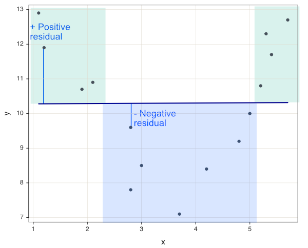
Negative residuals relative to the flat regression line predominate for values of x between values of x from a to b in Figure 9.3. Positive residuals predominate for all other values outside of this region. If the residuals were only due to random influences, their ordering would be random in terms of + and -. Instead, a block of mostly positive residuals precedes a block of mostly negative residuals, which precedes again a block of mostly positive residuals.
When there is more than a single feature, how to evaluate the randomness of residuals across the values of the features? Once beyond two dimensions, the scatterplot of the data requires more than a flat surface. Instead of a scatterplot of the data, construct the scatterplot of the fitted values, \(\hat y\), directly against the residuals.
This fitted-residual scatterplot is the standard reference for evaluating the distribution of the residuals. The points in the plot should be symmetrically distributed around a horizontal line in the scatterplot. An indication of a “bowed” pattern, indicates that the model makes systematic errors for unusually large or small fitted values.
Figure 9.4 is standard output from the lessR Regression() function. The output includes not only the scatterplot, but also the best-fitting non-linear curve that summarizes the relationship, as well as labeling the point with the largest Cook’s Distance. The “bowed” pattern is clearly evident in the scatterplot.
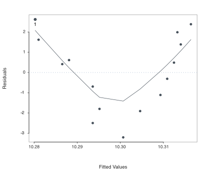
The pattern of residuals in the more general Figure 9.4 is the same as the scatterplot of the data about the flat regression line in Figure 9.3. Accordingly, the data scatterplot need not be separately plotted. Instead, rely upon Regression() to provide the more general scatterplot for evaluation of the patterning of the residuals, such as for the detection of non-linearity.
Of course, another way to detect non-linearity between a feature and the target is to examine the corresponding scatterplot. Even with multiple features, individual feature-target scatterplots can indicate non-linearity The overall scatterplot of \(\hat y\) with the residuals may expose more general issues with the multiple regression that simultaneously considers all variables.
If non-linearity is an issue, it can be addressed by transforming the values of the affected variables, discussed in the transformation section.
The second assumption of least-squares regression is a constant population standard deviation of the estimation errors at all values of \(x\), the equal variances assumption. There is a standard deviation of the residuals, \(\sigma_e\) in the population that applies to the variability of all points on the regression line. Estimate this one value, \(\sigma_e\) from the data with \(s_e\).
The one value of the standard deviation of the residuals implies that the value of \(y\) should be no more or less difficult to accurately predict for different values of \(x\). Any difference in the standard deviation of residuals for different values of \(x\) should be attributable only to sampling error.
Homoscedasticity: Standard deviation of residuals are the same to within sampling error for any value of the predictor variable.
Violation of homoscedasticity also has its own name.
Heteroscedasticity: Standard deviation of residuals differs depending on the value of the predictor variable.
If heteroscedasticity is present, there is no one standard deviation of residuals, but different (population) values at different points along the regression line.
The typical pattern exhibited by heteroscedasticity is a gradually increasing or decreasing variability as X gets larger or smaller. The scatterplot in Figure 9.5 illustrates the scenario of increasing variability of \(y\) as the value of \(x\) increases. Accordingly, the size of the residuals about the regression line also tend to increase as the value of \(x\) increases.
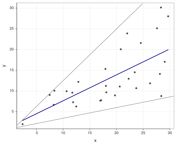
Beyond the scatterplot of the data, Figure 9.6 illustrates the scatterplot of the fitted values (\(\hat y\)) with the residuals. This scatterplot reveals the pattern of heteroscedasticity even more starkly than does the data scatterplot.

When heteroscedasticity occurs, the corresponding standard errors of the regression coefficients are not correctly estimated. Some intervals will be too wide and others too narrow. The associated \(p\)-values and confidence intervals are also incorrect. Further, the standard deviation of the residuals is not a single value, though the estimation algorithm assumes that it is a single value. So some estimated prediction intervals are too wide, and others are too narrow.
There are statistical adjustments that, when applied, can lower heteroscedasticity, usually some version of what is called weighted least squares. However, the issue, in my opinion, is to understand the reason for the heteroscedasticity. For example, maybe there is a missing variable in the model that, when not present, results in the heteroscedasticity. To do statistical adjustments without understand what contributes to the anomaly avoids the most important issue. Still, if the regression model must be used in the presence of heteroscedasticity, correction methods such as weighted least squares can be appropriate.
The third assumption of least-squares estimation is uncorrelated residuals with any other variable, including each other. Randomness correlates with nothing. For time-series data, the residuals at one set of time periods should not correlate with the same residuals shifted down one or more time periods.
The size of one residual provides no information about the size of a second residual. There should be no trend or pattern exhibited by the residuals, and the residuals should not correlate with the predictor variable.
This randomness of the residuals is the same concept illustrated by flipping a coin. If the first flip of a fair coin is a head, the second flip is just as likely to be a head or a tail. The accuracy of this uncorrelated residuals assumption merits particular attention for the analysis of data collected over time.
Time-series data: Data collected for a variable over successive time points.
A company’s gross sales on a monthly basis over several years represents time series data.
How to predict next month’s gross sales? One method is with a special form of regression analysis in which the only variable in the analysis is the variable of interest, such as a month’s gross sales. The variation is the variation of the variable over time.
Time-series regression: Express the target variable as a function of its values at earlier time points.
Usually the time variable is named t.
\[y_{t+1} = b_{t}y_{t} + b_{t-1}y_{t-1} + b_{t-2}y_{t-2}+ \ldots + e\] In this example, \(y_{t+1}\) is next month’s gross sales, \(y_t\) is the current monthly sales value, and, \(y_{t-1}\) is last month’s gross sales, and so on. Each time period also has its own residual, how far the forecast for that time period’s value departed from the actual value.
The issue is that time series regressions often have correlated adjacent residuals, which represent adjacent time points.
Autocorrelation: Correlation of successive residuals over time.
The reason for autocorrelation in time series data is that successive values may follow a specific pattern, such as gradually increasing or gradually decreasing. In data such as these, if one predicted value of \(y\) is an underestimate, then the next time value is also likely to yield an underestimate. Knowledge of the sign of one residual yields predictive information about the sign of the next residual, indicating autocorrelation.
For example, sales of swimwear peaks in Spring and Summer and decreases in Fall and Winter. The residuals around a regression line over time would reflect this seasonality, systematically decreasing and increasing depending on the time of year. Analysis of time-oriented data typically requires more sophisticated procedures than simply fitting a regression line to the data.
Autocorrelation in time-series data can often be detected visually by plotting the residuals against time. Any emergent pattern indicates a violation of the assumption. Autocorrelation can be quantified by correlating the residuals with a new variable defined by shifting the residuals up or down one or more time points.
For example, the residual for the 1st month is paired with the residual for the 2nd month, the residual for the 2nd month is paired with the residual for the 3rd month, and so forth. For the assumption not to be violated, the resulting correlation of the two columns of residuals should be approximately zero.
Figure 9.7 shows two variables, the residuals for six time points and their corresponding Lag 1 residuals.
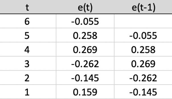
The same values are in the two columns, just that values in one column are shifted down one time period. If there is no autocorrelation, the correlation of the two columns will be zero to within sampling error. If the correlation is larger than zero beyond sampling error, then the variables autocorrelate, in this example, a Lag 1 autocorrelation.
A fourth assumption of regression is that the residuals are normally distributed for each value of X. This assumption is not needed for the estimation procedure, but is required for the hypothesis tests and confidence intervals previously described. To facilitate this evaluation Regression() provides a density plot and histogram of the residuals, which appears in Figure 9.8. The residuals appear to be at least approximately normal, satisfying the assumption.
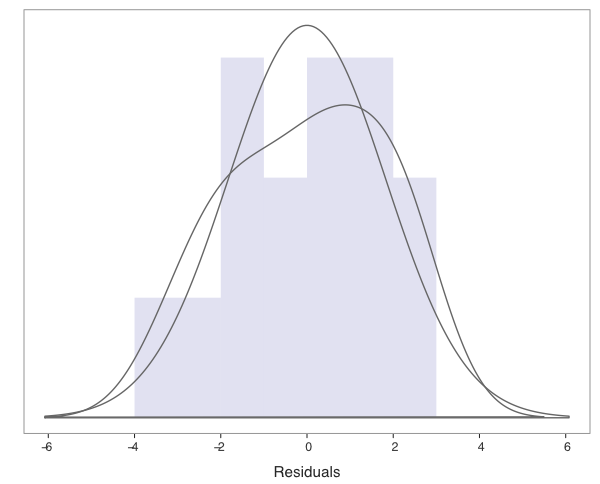
To assist in the visual evaluation of normality, two density plots are provided. Both the general density curve and the curve that presumes normality are plotted over the histogram.
A linear regression model expresses a linear relationship between the features and the target. What if the relationship between a feature and the target is not linear? We can still often proceed with linear regression by transforming either the relevant features. Then run the linear regression on the transformed variable(s). Other transformations include transforming the target variable, or transforming all the variables.
How to choose a transformation to obtain linearity? Usually the answer follows from trial and error. Try different transformations, discussed below, in the search to locate the transformation that most increases fit, usually \(R^2\).
Consider two fundamental types of transformations.
Linear transformation: Transform the values of a variable with a linear function, multiplying each value by the same constant and adding a constant.
Of course, division is multiplying by the reciprocal, and subtraction is adding a negative number.
One example of a linear transformation is conversion from one measurement scale to another, such as feet to inches, or degrees in Fahrenheit to degrees in Celsius. Another example is standardization, the computation of \(z\)-scores from the variables expressed in their measured units.
A key property of linear transformations is that they preserve the relationships between variables. The relationships are the same before and after a linear transformation, only the units of measurements change. If looking a scatter of the variable with another variable, after a linear transformation the scatterplot would look exactly the same as before, just different units on the variable’s axis. The correlation of the variable of interest with another would also not change.
Other transformations do not preserve relationships, and can be useful for that reason.
Nonlinear transformation: Apply a non-linear function to the values of a variable.
Examples of a nonlinear transformation of variable x taking the square root of the values of a variable, or converting the values to their logarithms. Our interest in nonlinear transformations is that the relevant transformation may transform a nonlinear relationship into a linear relationship.
Once transformed to linearity, apply the standard linear regression analysis. The slope coefficients from the analysis of one or more transformed variables necessarily are expressed in the metric of the transformed variables. If studying Gross Sales, for example, we usually do not care as much as to the impact on the square root of USD Gross Sales or the logarithm of USD Gross Sales for a predictor variable on Sales as we do the impact of the predictor variable on Sales in USD. For the final interpretation, transform back to the original metric.
Read and plot the data in Figure 9.9, returning to the same data from Figure 9.1.
XY(x,y)
The data are extremely non-linear, and non-monotonic, both decreasing and increasing as the value of \(x\) increases, resembling a quadratic relationship. As the values of \(x\) increase to about 3.75, the values of \(y\) decrease. As the values of \(x\) increase beyond 3.75, the values of \(y\) increase. There is a strong relationship between the variables, but not a linear relationship.
Figure 9.10 (and Figure 9.2) illustrate the futility of fitting a linear function to these data.

The slope of the regression line is 0, as is \(R^2\).
r = reg(y ~ x, graphics=FALSE)
r$out_fit
Standard deviation of y: 1.8311
Standard deviation of residuals: 1.9002 for df=13
95% range of residuals: 8.2101 = 2 * (2.160 * 1.9002)
R-squared: 0.000 Adjusted R-squared: -0.077 PRESS R-squared: -0.357
Null hypothesis of all 0 population slope coefficients:
F-statistic: 0.001 df: 1 and 13 p-value: 0.981How to address this non-linear data to build a predictive model? Continue to use linear regression, but on transformed data. Because the data appear to be related by a quadratic function, define a new variable that is the square of the feature variable.
d$x2 = d$x^2
head(d)
x y x2
1 1.1 12.9 1.21
2 1.2 11.9 1.44
3 1.9 10.7 3.61
4 2.1 10.9 4.41
5 2.8 7.8 7.84
6 2.8 9.6 7.84Add that new quadratic variable to the regression equation.
r <- reg(y ~ x + x2, graphics=FALSE)
r$out_fit
Standard deviation of y: 1.8311
Standard deviation of residuals: 0.7466 for df=12
95% range of residuals: 3.2534 = 2 * (2.179 * 0.7466)
R-squared: 0.857 Adjusted R-squared: 0.834 PRESS R-squared: 0.783
Null hypothesis of all 0 population slope coefficients:
F-statistic: 36.105 df: 2 and 12 p-value: 0.000The enhanced model shows dramatically improved fit, from \(R^2 \approx 0\) to \(R^2=0.857\).
Figure 9.11 plots the fitted values with the residuals. Unlike from the previous example from the linear regression of these data shown in Figure 9.4, this plot is of a more or less random relationship.
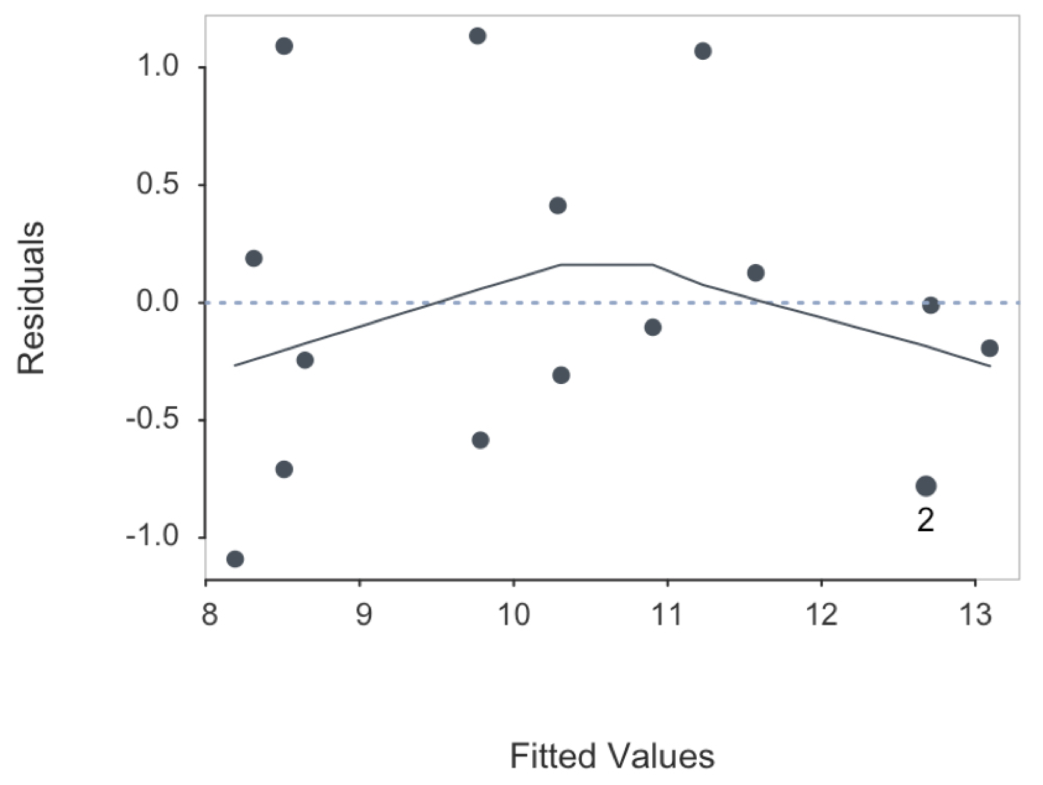
Adding the squared value of \(x\) to the model clearly improves fit with approximately randomly distributed residuals. The squared term by itself, however, does not yield a viable regression. Both \(x\) and \(x^2\) need be included.
When the data values are increasing faster than linear, one possibility to consider is the square root transformation. The scatterplot indicates that \(y\) increases as \(x\) increases, but reflect only one side of the general quadratic curve illustrated in the previous section.
XY(x,y, scale_x=c(0,10,10), scale_y=c(0,80,8))
Still, the relationship is non-linear.
XY(x,y, fit="lm", fit_se=0)
To approximately linearize the data, apply the square root transformation to the target variable \(y\).
d$y_sqrt <- sqrt(d$y)Linear regression is appropriate for the transformed target variable.
XY(x, y_sqrt, fit="lm", fit_se=0)
To express the estimated relationship in terms of the variables’ original metrics, obtain the estimated regression coefficient of \(b_0\) and \(b_1\) from the regression of the transformed data.
r <- reg_brief(y_sqrt ~ x, quiet=FALSE, graphics=FALSE)
b0 <- r$coefficients[1]
b1 <- r$coefficients[2]
Express results in the original metric from the back transformation. Here, undo the square root transformation by squaring the entire estimated regression equation.
d$y_back <- (b0 + (b1*d$x))^2Plot just the regression version of the data.
XY(x, y_back)
Or, plot the regression output as well as the data.
XY(x, y, fit="quad")
With the back transformation, compute fitted values for the non-linear fitted curve in terms of the original metric of the data. This example calculates the fitted value for \(x=6\).
(b0 + (b1*6))^2Fitted value for x=6: 32.30172 Exponential data shows explosive growth of the values of \(y\) as \(x\) increases, growth faster than described than can be accounted for by the square root transformation. An exponential function expresses the variable, \(x\), as an exponent to a given constant, \(b\), called the base.
\[y=b^x\]
The same exponential relationship can usually be expressed as an exponential function regardless of the choice of the base. From calculus, the generally most convenient base is Euler’s constant, \(e =\) 2.7182818. To obtain values of \(e^x\) for given values of \(x\), R provides the exp() function.
Exponential functions are characterized by explosive growth, often applied to time. The system grows slowly at first, then grows rapidly, explosively. In particular, the system is non-linear.
Read some sample data and plot.
XY(x,y)
An exponential relationship can be approximated by a line, but clearly only a crude approximation.
XY(x,y, fit="lm", fit_se=0)
How to model this exponential relationship? The issue is that linear regression is only applicable to linear relationships. To perform a least-squares regression analysis on this exponential data, the data must first be transformed to a linear relationship.
Linearize exponential data by taking its logarithm. A logarithm is an exponent. The logarithm, \(l\), of a given number, \(a\), is the exponent to which another fixed number, the base, such as \(e\), must be raised to produce that number \(a\). Expressed as a formula, \(\; e^l = a\) so the logarithm of \(a\) is the exponent \(l\) for the base \(e\). For example, for \(l=2\) and \(a=7.38906\):
\[e^2 = 7.389056, \; \; \textrm{so} \; \; log(7.389056) =2\]
The value of the exponent that transforms \(e\) to 7.389056 is 2, the logarithm. When the exponential function is based on \(e\), the logarithm is called the natural logarithm. The corresponding R function is log(), which defaults to the base of \(e\). Here, transform the target variable.
d$y.ln = log(d$y)The relationship of \(x\) with the logarithmic version of \(y\) is linear, amenable to linear regression. Obtain a good-fitting predictive model with the transformed data.
XY(x, y.ln, fit="lm", fit_se=0)
Of course, this analysis expresses the predicted values from this regression equation in terms of the logarithm of \(y\), not the value of \(y\) directly. After transforming \(y\) to obtain linearity, next transform the obtained solution back to the original metric.
Back transformation: Transform the values back to the original metric of the data with the inverse of the original transformation.
The back transformation expresses the estimated relationships in the original metrics of the variables as entered into the analysis.
To accomplish the back transformation, first obtain the values of \(b_0\) and \(b_1\) from the regression of the transformed data.
r <- reg_brief(y.ln ~ x, quiet=FALSE, graphics=FALSE)
b0 <- r$coefficients[1]
b1 <- r$coefficients[2]
The exponential function is the inverse of the logarithmic function. To undo the logarithmic transformation, set the entire regression equation as the exponent, here stored ast the variable y_back in the d data frame.
d$y_back <- exp(b0 + (b1*d$x))This back transformation expresses the results of the linear regression as an exponential relationship.
XY(x, y_back)
Visualize the result by plotting the obtained curve superimposed on the data, specified by the parameter fit set to "exp".
XY(x, y, fit="exp")
Given the back transformation, we can predict a specific value of \(y\), here for \(x=7\).
exp(b0 + (b1*7))(Intercept)
1406.411 The process of choosing the most appropriate transformation of the data to achieve linearity may proceed according to trial and error. Choose a transformation and see how well it works. Transform the target variable, or transform a feature variable.
Table 9.1 lists several frequently encountered transformations.
| Model | Transform | Regression | Fitted |
|---|---|---|---|
| No Transform y | |||
| linear | --- | y=b0 + (b1)x | ŷ=b0 + (b1)x |
| Transform y | |||
| quadratic | sqrt(y) | sqrt(y) = b0 + (b1)x | ŷ=[b0 + (b1)x]**2 |
| exponential | log(y) | log(y) = b0 + (b1)x | ŷ=exp[b0 + (b1)x] |
| logarithmic | exp(y) | xxx | xxx |
| Transform x | |||
| semi-logarithmic | log(x) | y= b0 + (b1)log(x) | ŷ=b0 + (b1)log(x) |
| Transform x and y | |||
| double logarithmic | log(y), log(x) | log(y)= b0 + (b1)log(x) | ŷ=exp[b0 + (b1)log(x)] |
Of course, many other transformations are possible, but those listed in Table 9.1 are the most frequently encountered in regression analysis. Although the choice of transformation is often based on trial and error, an optimal transformation can dramatically increase \(R^2\). As always, if you explore different models with the training data, always verify your chosen model on testing data.