
The compelling feature of least-squares regression analysis is the guaranteed optimization of the estimated regression model on the given training data. No linear model other than the model defined by the estimated coefficients chosen by the least squares algorithm results in as small a sum of the training data squared errors, \(\Sigma e^2_i\). Guaranteed the best. Unfortunately, “best” only applies to the training data, a single sample presumably from the population of interest, but not the population itself.
6.1 Influential Outliers
The sampling error necessarily inherent in any sample, evidenced by the random fluctuations of data from sample to sample, implies that the estimated training data model fails to optimize on new data for prediction. The lack of generalizability worsens when “weird” data values drastically influence the estimated regression model. Without the “weird” values in the new sample of data, the predictive power of the estimated model decreases even more than from the usual amount of sampling error.
Of course, “weird” is not the proper statistical term for describing these data values far different from most of the others.
Outlier: Data value far from most of the other values.
One fundamental analysis to apply to any data sample is the search for outliers. In many contexts, the outliers are the most interesting data points. Understanding why a data value is an outlier uncovers insights regarding that specific data value, often leading to a better understanding of all the data.
One possible source of the “weird” values is sampling error. Flip a fair coin 10 times and get 8 heads, an event that will occur with a probability of only 0.0107. Still, the probability is above 0. Weird samples only due to sampling error can happen, not so often, but they happen. In the case of sampling error, the outlier is a transient event. Another sample and the outlier would likely no longer be present.
Alternatively, a “weird” outcome can result from a systematic bias in which some data values were unintentionally sampled from another population.
A summary statistic correctly summarizes data sampled from a single population, that is, data generated by a single process.
Data in a sample should only be drawn from a single population; only a single process should generate the data. No meaningful conclusions regarding real-world decisions result from data summaries from multiple processes, no matter how quickly calculated and accurate are the underlying computations.
Consider an extreme example of sampling from different processes: The sample mean of eight SAT scores and two annual GNP values. The mean of this conglomerate is uninterpretable because the process that generated the data values differs for different data values. The ease and precision by which the computer computes statistics from samples of data can deceive. The computer calculates the mean of eight SAT scores and two annual GNP values as easily as computing the mean midterm score for a class. When calculating the mean, however, there is no assessment if the data are a mixture of different processes.
The statistical summaries from such mixed data, such as mixing SAT scores with GNP values, by definition, do not describe any real-world process. In this example, if the goal is to summarize SAT scores, the two GNP values would be outliers with respect to the SAT scores. The result is that presence of the GNP values in a sample of mostly SAT scores would systematically bias the estimated mean of the SAT scores. This bias renders the computed mean uninterpretable, or worse, mis-interpreted if the outliers in the data are not detected.
6.1.1 Univariate Outlier
Two fundamental types of statistics are parametric statistics, which include the mean and standard deviation, and order statistics.
Order statistic: A statistic calculated from a distribution in which the values are ordered from the smallest to the largest.
The values of statistics such as the mean and standard deviation change dramatically in the presence of outliers. Order statistics are more resistant to outliers than statistics such as the mean because the extreme values in a distribution are ignored. Order statistics include the median, which corresponds to the mean as an indicator of a distribution’s middle, and the inter-quartile range, which corresponds to the standard deviation as an indicator the variability of a distribution.
6.1.1.1 Influence
To illustrate an outlier in a single distribution of data values, consider a sample of 10 annual Salaries from a company, with 9 sampled from employees paid hourly, and one a C-level salaried executive.
$29750 $35250 $48840 $58750 $62440 $64320 $75000 $84330 $98280 $183800Two different processes of assigning salaries generated these data values. Most of the sampled employees are paid based on hours worked, whereas only one employee is salaried. A statistical summary of these data values describes no corresponding real-world process.
Another issue is that one or more outliers may dramatically impact the statistical estimates, such as the mean. Some data values have more impact on the resulting statistical estimates than do other data values. For example, the mean of the preceding 10 salaries is $86,506, a value that drops to little more than $53,473 when the outlier is removed.
The consideration of differential impact upon statistical calculations leads to the following definition.
Influence of a data value: Amount a summary statistic changes when the data value is removed from a sample.
A data value is influential when the computed value of a statistical summary, such as the mean or regression coefficient, changes dramatically when the data value is removed from the sample. An influential data value has a disproportionate influence on estimated statistical values.
Influential data values are outliers for a univariate distribution.
Best practice identifies and then removes outliers generated by a different process than the remaining values of the sample.
To understand if an extreme data value is sampled from a different population requires an understanding of how the data value was sampled, an understanding that extends beyond statistical analysis per se. Judgment is involved. Does an outlier result solely from sampling error, or is its value also due to some underlying bias?
6.1.1.2 Box Plot
Data analysis identifies anomalies for further examination and judgment. One way to understand the characteristics of a distribution of data values of a continuous variable is to sort the values and then split into equal-sized groups.
Median: Numeric value, not necessarily a data value, that splits a sorted distribution into two groups of equal size.
The median separates the bottom-half of the values from top-half of the values. For a distribution with an odd number of values, the median is the data value that lies exactly in the middle of the sorted distribution. For a distribution with an even number of values, the median is the average of the two values in the middle.
Quartiles: Three numeric values, not necessarily a data value, that divide a distribution of sorted data values into 4 groups of equal size.
The first quartile identifies the smallest 25% of the data values, etc. The second quartile is the median. The third quartile identifies the largest 75% of the data values.
Interquartile range: Distance between the first and third quartile, the middle 50% of the values of the distribution.
For the values of a single variable, a common criterion labels a value an outlier more than 1.5 inter-quartile ranges below the 1st quartile or above the 3rd quartile. The classic corresponding visualization is the box plot, defined in Figure @ref(fig:bx).
The length of the box extends from the first and third quartiles. The height of the box is arbitrary. The middle vertical line in the box is the median. An advantage of the box plot compared to the histogram for displaying the values of a distribution is that the box plot flags outliers. The classic, though somewhat arbitrary, definitions follow.
- Potential Outlier: Values between 1.5 IQR’s and 3.0 IQR’s from the edges of the box
- Outlier: Values more than 3.0 IQR’s from either box’s edge
The whiskers extend from either side of the length of the box to the smallest or largest data value that is not an outlier. So all points outside of the whiskers represent outliers.
The box plot of the 10 salaries with the superimposed scatter plot of the salaries in Figure @ref(fig:bxEg) illustrates the detection of an outlier.1
1 lessR function BoxPlot() plots a box plot, which is an alias for the more general Plot() function that can also provide the scatterplot and violin plot.
d <- Read(“http://web.pdx.edu/~gerbing/data/Salary.csv”)
BoxPlot(Salary)
Plot(Salary, vbs_plot=“bs”, xlab=“Salary (USD)”)
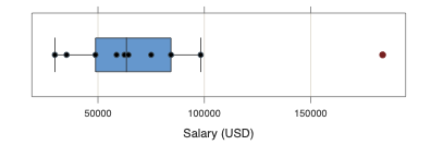
Given such an outlier encountered during analysis, explore the conditions that generated this outlier. Did the outlier result from a weird sampling by chance or by systematic bias, sampled from another population than the other data values? One clue is if the outlier shows discrepant data values for other variables in the data set? The more discrepant other data values in the same row of data are across other variables, the more likely the data value is an outlier.
6.1.2 Multivariate Outlier
6.1.2.1 Applied to Regression
Applied to regression analysis, expand the concept of an outlier from a data value for a single variable to a row of data values for two or more variables.
Multivariate outlier: A set of data values for a single example (row of data) considerably different from most remaining corresponding sets of data values in the sample.
An outlier in a regression analysis is a multivariate outlier defined over two or more variables.
For a regression model with one predictor variable, the resulting point for the \(i^{th}\) row of data plots in two dimensions. Each plotted point corresponds to a vector of two data values for each row of data:
\[<x_i, y_i>\]
Of interest is the search for outliers that disproportionately influence the estimated model relative to the other values. Do any individual examples (rows of data, instances) have an unusually high level of influence on the calculation of the estimated model coefficients? Such observations are likely outliers, perhaps sampled from a process different than what generated the remaining data values.
Not all outliers in a regression analysis, however, are necessarily influential. A point can lie far from the other data values in the plot, but fall on or near the regression line. Only points that lie far from the regression line (surface in general) by a considerable distance are influential data points. And, if the influential point is also far from most other points, then the point is also an outlier.
6.1.2.2 Confidence Ellipse
A search for outliers of distributions of more than a single variable typically depends on the assumption of multivariate normality, a generalization of the normal distribution for a single variable to multiple variables. The multivariate normal distribution for two variables, called a bivariate normal distribution, involves a third variable corresponding to the joint frequency for each pair of values for \(x\) and \(y\). Figure @ref(fig:mvn) displays the theoretical bivariate normal distribution for two variables that do not correlate, and for two variables that correlate 0.75.
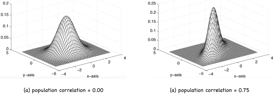
From this three-dimensional surface of a bivariate normal distribution we obtain a useful technique for identifying outliers.
Confidence ellipse: For a density plot of the joint values of \(x\) and \(y\), a slice through the 3D surface parallel to the \(x-y\) plane that contains the specified percentage of the population values.
For a correlation of 0.0, the ellipse is a circle. As the correlation of \(x\) and \(y\) increases, the confidence ellipse becomes increasingly narrow, reflecting less scatter.
The closer the slice is to the \(x-y\) plane, the more data values would be included in the ellipse. Describe the scatter of the points in relation to a corresponding confidence ellipse, usually the 95% confidence ellipse. The 95% confidence ellipse is far down enough of the surface to include 95% of all data values in this theoretical bivariate normal curve. For sample data, of course, the 95% confidence ellipse would approximately include 95% of the data values.
6.1.2.3 Outlier Detection
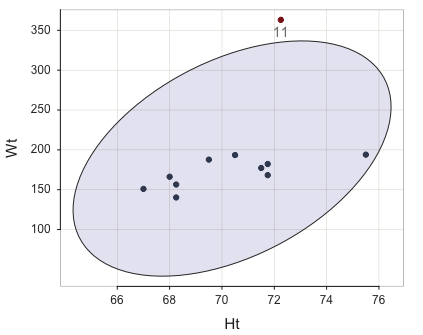
Following is an example data set that contains an outlier in the last, the eleventh row of data, which includes a particularly large value of weight, 363.16 lbs.
       Wt    Ht
1  182.25 71.75
2  168.25 71.75
3  194.00 75.50
4  140.25 68.25
5  156.50 68.25
6  187.75 69.50
7  193.50 70.50
8  177.25 71.50
9  151.00 67.00
10 166.25 68.00
11 363.15 72.25
Define points outside of the ellipse as outliers, as shown in Figure @ref(fig:bivariate).2
2 lessR function Plot() plots a scatterplot, parameter ellipse informs to show the 95% confidence ellipse, out_cut here specifies to list only the largest potential outlier, and ID_size indicates the size of the label for any outlier, with outlier points displayed in red by default.
d <- Read(http://web.pdx.edu/~gerbing/data/bodyfat_outlier.xlsx”)
Plot(Ht, Wt, ellipse=TRUE, out_cut=1, ID_size=.9
Is the outlier influential? Consider Figure @ref(fig:bivariate), in which the solid line is the regression line computed from all 11 points, and the dotted line is the regression line with the outlier removed.3
3 lessR function Plot() plots a scatterplot, enhance informs to show the 95% confidence ellipse, outliers, and the regression line with and without the outliers, out_cut here specifies to list only the largest potential outlier, and ID_size indicates the size of the label for an outlier, with outlier points displayed in red by default.
d <- Read(“http://web.pdx.edu/~gerbing/data/bodyfat_outlier.xlsx”)
Plot(Ht, Wt, enhance=TRUE, fit_se=FALSE, ID_size=.9)
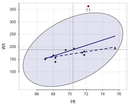
The presence of the influential outlier changes the slope of the regression line. The least-squares analysis minimizes the sum of the squared errors, yet the square of a large number is considerably larger than the square of a smaller number. An influential point has a large residual, which becomes disproportionately larger when squared. The influential point “pulls” the regression line towards it (to be anthropomorphic). With the outlier in this example, the least-squares regression line has a considerably steeper slope than without the outlier. Accordingly, the estimated model does a poorer job of fitting a line through the remaining 10 points, and, as such a poorer job predicting data values for a data set without the outlier.
The same principle generalizes to multiple regression, though not so geometrically obvious. A multiple regression model with three predictor variables consists of four variables, and so plots in a (hypothetical) 4th dimensional scatterplot. A vector of four data values defines each point, corresponding to a row of data, in this space.
\[<x_{i1}, x_{i2}, x_{i3}, y_i>\]
Although we have no direct visualization, the same principle from the two-dimensional example applies. There is presumably a cloud of points across the values of the X variables. This scatterplot of the points indicates some overall functional form, such as a linear surface in four dimensions. Most or all of the points do not lie precisely on this surface, but for a good fitting model they are reasonably close. Regardless of the number of dimensions (variables), for a good fitting model, the standard deviation of the residuals, \(s_e\), is not large.
However, perhaps some point lies far from the others, far from the cloud of the regular points. The value of one of the X variables or \(y\) variable may be far from the corresponding values of this variable for the other examples in the date set. Or, all the values may differ, or some may be similar and others quite different. And some of these outliers could be influential points that should be evaluated for their impact on the regression model and their appropriateness in the sample.
The task, particularly in the absence of a visualization, is to provide statistics that facilitate the discovery of influential data points. An influential example (sample, instance, observation, row of data) should always be inspected, and its role in the analysis assessed. Sometimes an influential example is just a data coding or entry error, yet one that would have changed the entire analysis had it remained in the analysis.
6.2 Assessment of Error
The lessR function Regression() provides for a variety of influence statistics computed for each row of the data table.
-- Data, Fitted, Residual, Studentized Residual, Dffits, Cook's Distance
   [sorted by Cook's Distance]
   [n_res_rows = 11, out of 11 ]
-------------------------------------------------------
         Ht      Wt  fitted   resid rstdnt dffits cooks
   3 75.500 194.000 243.641 -49.641 -1.294 -1.333 0.826
  11 72.250 363.150 208.980 154.170 12.203  5.071 0.737
   2 71.750 168.250 203.648 -35.398 -0.639 -0.237 0.030
   4 68.250 140.250 166.321 -26.071 -0.478 -0.212 0.025
   8 71.500 177.250 200.981 -23.731 -0.420 -0.148 0.012
   1 71.750 182.250 203.648 -21.398 -0.380 -0.141 0.011
   5 68.250 156.500 166.321  -9.821 -0.178 -0.079 0.003
   6 69.500 187.750 179.652   8.098  0.141  0.048 0.001
   9 67.000 151.000 152.990  -1.990 -0.039 -0.024 0.000
  10 68.000 166.250 163.654   2.596  0.047  0.022 0.000
   7 70.500 193.500 190.316   3.184  0.055  0.017 0.000
These statistics are discussed next: residual (resid), Studentized residual (rstdnt), DFFITs (dffits), and Cook’s Distance (cook).
6.2.1 Residuals
To understand how to detect outliers and influential points, begin with the direct indicator of lack of fit, the residual. For any given row of data in the data table, referred to as the \(i^{th}\) row, define the residual \(e_i\) as the difference between the fitted and actual data values.
Residual: For the \(i^{th}\) row of data, value of \(y\) minus its fitted/forecasted value, \[e_i \equiv y_i - \hat y_i\]
A large residual indicates an outlier. (The three-pronged equal sign, \(\equiv\), indicates true by definition, whereas the two-pronged equal sign, \(=\), indicates true by derivation, such as the application of algebra. No math to figure out for anything true by definition, just an arbitrary symbol to replace a longer expression.)
What is a large residual? The residual is the distance that separates the actual data \(y\) from the value fitted by the model, \(\hat y\), expressed in terms of the unit in which \(y\) is measured. If \(y\) represents length, for example, then the residual for each row of data for the same model is much smaller if distance is measured in meters instead of centimeters. The same distance between \(y_i\) and \(\hat y_i\) is 100 times larger when expressed in centimeters compared to meters.
To obtain a version of the residuals free from the specific measurement scale, standardize the residuals. Standardization linearly transforms each original data value, subtracting the mean and dividing by the standard deviation of the distribution. Standardized data are the classic \(z\)-scores from introductory statistics. Because the transformation is linear, the standard score for a data value is the same if the values are measured in meters, centimeters, yards, or inches.
Standardize the residuals with their standard deviation, their standard error.
\[z_i \equiv \frac{e_i - 0}{s_e}\]
Standardized residual: A residual divided by the estimated standard deviation of the residuals, \(s_e\).
Because the standardized residual for an observation, \(z_i\), is the same regardless of the measurement scale of \(y\), the standardized residuals provide a common scale for assessing their sizes. Given normally distributed residuals, the usual situation, the corresponding probabilities can be calculated. Figure @ref(fig:normal) presents the normal curve in terms of the values of the variable of interest, here \(e\), and the associated \(z\)-values. The usual introductory statistics display of normal curve probabilities is modified here for the special case of \(e\), with its mean of zero. The \(\sigma\) represents the standard deviation of \(e\).
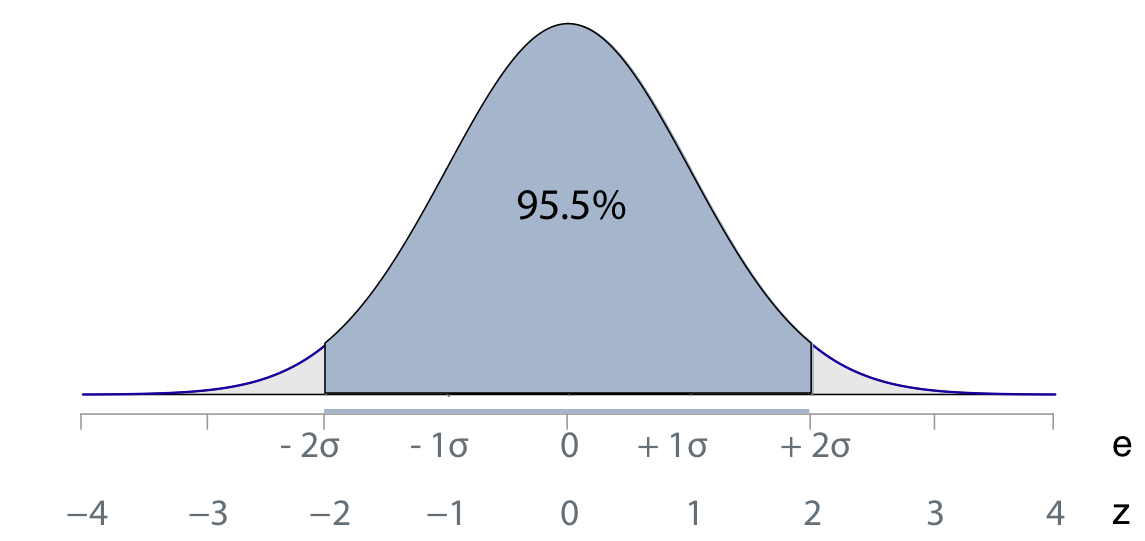
Over 95% of all values in a standardized normal distribution of \(z\)-values fall between -2 and 2. Values larger than 2 or smaller than −2 should be infrequent, and values larger than 2.5 or 3 or smaller than −2.5 or −3 should be rare, and so represent a potential outlier.
6.2.2 Case-Deletion Residuals
An even more useful set of transformed residuals follow from the concept of a case-deletion statistic, where the word case is synonym for example, sample, and instance, all of which refer to a single row of data. The following two steps apply the concept of case-deletion to the computation of a residual.
- Calculate a regression model for each row of training data based on all other rows of data with that specific row deleted.
- Apply that estimated model to calculate the fitted value for the chosen row of data, then the corresponding residual.
Case deletion residual: Residual calculated from a regression model estimated from all other rows of data in the data table.
Apply the same procedure to each row of data, estimating the model from all the remaining rows of data, then calculate the residual from the one row of data from which the model was not estimated. So 1000 rows of data means estimating 1000 different regression models, each one based on 999 rows of data, then applying the model to the one row for which the model was not estimated. Fortunately, the computations are done with formulas based on the estimated model with all the data, and not literally recomputing each regression. Still, the computations are considerable for large data sets.
From the perspective of an estimated model based on a single row of data with that row deleted from the estimation process, those data values are new, unseen data values. The chosen row serves as the testing data. The resulting case-deletion residual is analogous to residuals from applying the model to testing data.
Apply this concept of case-deletion to the residual, or, even better, the standardized residual.
Studentized residual: The case-deletion version of a standardized residual.
How large is the error when the model is estimated on the remaining rows of data, and then applied to compute the fitted value and corresponding residual for the deleted row of data? Because the estimated model applied to each row of data was estimated without that row present in the training data, the corresponding residual tends to be higher than the usual residual calculated from a model estimated with all data values in the data table. This size differential is especially noticeable for influential points, because for the case-deletion residual the point no longer contributes to the estimation of the model. Without “pulling” the line in the direction of the outlier, the case-deletion residual is substantially larger than an ordinary residual.
Of the various forms of a residual, the Studentized residual tends to be the most useful for detecting outliers and influential points. Refer back to the table that displays the residual information for the data set of with an outlier, Row #11.The annotated relevant excerpt is listed below.

The Studentized residual for the outlier is 12.203, almost 10 times as large as the next largest Studentized residual, for Row #3, -1.294. Compare this ratio to that of original residuals for Rows #11 and #3, 154.170 to -49.641. The residual for the outlier is only about three times larger than the next largest residual. Focusing on the Studentized residual more clearly delineates true outliers, a result that also applies to data sets with less stark examples of an outlier than this example data set.
The Studentized residual has the additional advantage of following the \(t\)-distribution with degrees of freedom of \(n−k−1\), where \(n\) is the sample size and \(k\) is the number of predictor variables in the model. The \(t\)-distribution can then be used to evaluate the significance of an Studentized residual Accordingly, the Studentized residual is named in honor of William Gosset, who developed the \(t\)-test based on the \(t\)-distribution, writing under the pseudonym Student.
6.3 Case-Deletion Statistics
The concept of case-deletion can also be applied to other statistics that assess influence.
Case-deletion statistic: A statistic based on the computation for each single row of data (point, case, observation, sample) based on a model in which that particular row of data did not contribute to the estimation of the model.
Some case-deletion assess influence and one assesses the fit of the model.
6.3.1 DFFITS
One way to directly assess influence of an example (case, row of data, sample, instance, observation) is to observe the direct impact of the change in the \(\hat y\) from a model estimated when the observation is deleted from the analysis. Compute \(\hat y\) from a model with the observation in the analysis, and then estimate the model without the observation. Then calculate \(\hat y\) from the estimated model without that observation. How much did \(\hat y\) change across the two models?
DFFITS: A case-deletion scaled measure of the change in the fitted value for a specific observation, calculated from a model with that observation in the analysis, and then from a model estimated without that observation.
More specifically, DFFITS represents the number of standard errors that the fitted value for a data point has shifted when calculated from the model in which it was not used in the regression fit. Large values of DFFITS indicate influential observations. A general informal cutoff to consider is 2. Also compare the values of DFFITS for different observations (rows of data). A large drop of sorted values could indicate a threshold of high versus low DFFITS values.
6.3.2 Cook’s Distance
Another example of a case-deletion statistic is Cook’s Distance, also a direct assessment of influence, here for the change in the estimated regression coefficients (slopes and intercept). What is the influence of a specific row of data values (observation, sample, example, instance) on the estimation of the coefficients for a regression model?
Cook’s Distance, D, summarizes the distance for a single observation between all of the regression coefficients in a model from two different regression analyses:
1. calculated with the specific observation included in the analysis
2. calculated with that observation deleted in the analysis.
With powerful modern computers, the analysis consists of the equivalent of a separate regression analysis for each row of data in the data file.
Cook’s distance, assessed for a single observation (case, row of data), indicates how much the model coefficients change when that observation is deleted from the analysis. If deleting a row of data has a considerable influence on the estimated coefficients, then the deleted example (observation, sample, instance, case) may very well be an outlier with undue influence on estimating the model coefficients.
Perhaps the most useful interpretation of Cooks Distance follows from assessing the relative sizes of the D’s. When one or a few observations result in a large D value, both in terms of the overall magnitude, and also when compared to the remaining values, then identify a specific observation as a likely influential point (row of data, observation, sample).
         Ht      Wt  fitted   resid rstdnt dffits cooks
   3 75.500 194.000 243.641 -49.641 -1.294 -1.333 0.826
  11 72.250 363.150 208.980 154.170 12.203  5.071 0.737
   2 71.750 168.250 203.648 -35.398 -0.639 -0.237 0.030
To better understand a large Cook’s Distance value, view the scatterplot with all the points labeled, as in Figure @ref(fig:labeled).4
4 lessR function Plot() plots a scatterplot. Set parameter add to "labels" to label the points.
Plot(Ht, Wt, enhance=TRUE, fit_se=FALSE, ID_size=.9, add=“labels”)
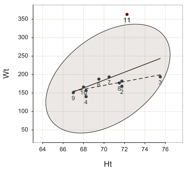
Row #11 is clearly the most provocative outlier, with Row #3 in second place. However, as a case-deletion statistic, Cook’s Distance for Row #3 is the largest. Why? Cook’s Distance for Row #3 was computed without Row #3 in the data table, but Row #11 was included. When there is no Row #3, Row #11 has an even greater “pull” on the regression line, with the result that the outlier tendency of Row #3 is emphasized even more as the regression line is pulled away from it.
Cook’s Distance clearly flags Rows #3 and #11 as problematic. The Studentized residual for Row #11, 12.203, is much larger than for any other row, including Row #3. From an examination of these case-deletion statistics, the recommendation is to drop Row #11 and re-run. Realize, however, that this example demonstrates that the set of influence statistics is an inter-related system. Do not start dropping all rows of data in which Cook’s Distance exceeds a certain threshold. As this example demonstrates, deleting one row can “fix” the other row.
With Row #11 deleted, the ellipse is much narrower than with the outlier included, as shown in Figure @ref(fig:Plot10scaled). To emphasize the impact of the outlier on the ellipse, first plot the remaining 10 points on the same scaled axes as when Row #11 was included.5
5 The d[1:10,] subsets the first 10 rows of the d data frame, which removes the outlier, in Row 11. The lessR function Plot() plots a scatterplot. Parameter scale_y sets the beginning and ending labels on the vertical axis, with the number of labels, to show the plot with the same vertical axes as with the outlier.
d <- d[1:10,]
Plot(Ht, Wt, enhance=TRUE, fit_se=FALSE, ID_size=.9, add=“labels”, scale_y=c(130,360,5))
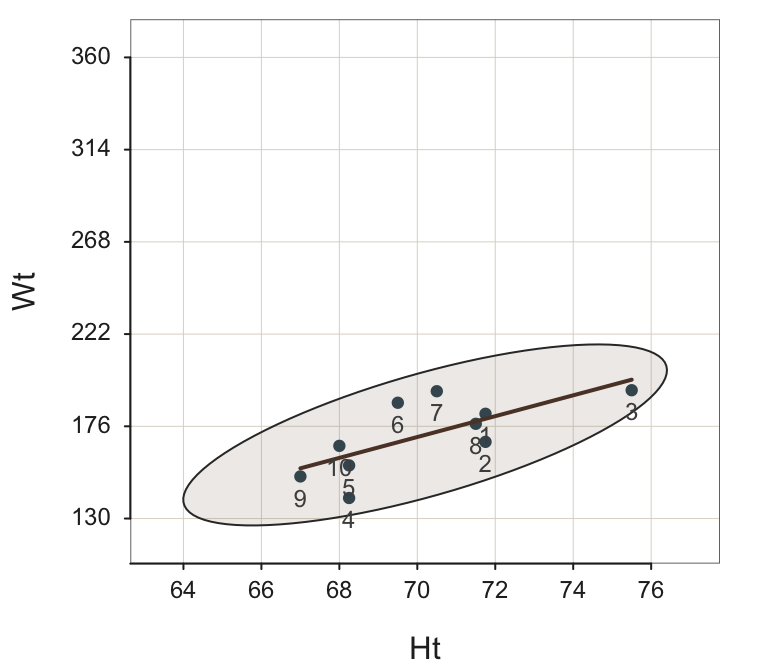
Now plot again in Figure @ref(fig:Plot10), adjusted for the scale of the remaining rows of data, to better visualize the relation of Ht and Wt for the remaining 10 pairs of data values.
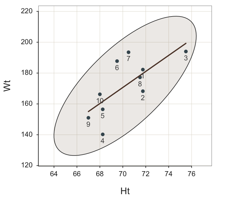
With the obvious outlier removed, Row #4 appears to be a stronger potential outlier than Row #3, but neither of these rows of data (points, observations) lie outside of the 95% confidence ellipse, and so neither would ordinarily be labeled as an outlier. The statistical output reinforces the information provided by the visualization.
The Cook’s Distance values for Rows #3 and #4, 0.289 and 0.253, are larger than for the other points, but both values are small. Row #4 has the largest Studentized residual of -1.999, but not so large to indicate an outlier.
-- Data, Fitted, Residual, Studentized Residual, Dffits, Cook's Distance
   [sorted by Cook's Distance]
   [n_res_rows = 10, out of 10 ]
-------------------------------------------------------
         Ht      Wt  fitted   resid rstdnt dffits cooks
   4 68.250 140.250 161.557 -21.307 -1.999 -0.891 0.289
   3 75.500 194.000 199.268  -5.268 -0.573 -0.681 0.253
   6 69.500 187.750 168.059  19.691  1.693  0.590 0.141
   7 70.500 193.500 173.260  20.240  1.751  0.589 0.138
   2 71.750 168.250 179.762 -11.512 -0.897 -0.364 0.068
  10 68.000 166.250 160.256   5.994  0.460  0.218 0.026
   9 67.000 151.000 155.055  -4.055 -0.329 -0.203 0.023
   5 68.250 156.500 161.557  -5.057 -0.382 -0.170 0.016
   1 71.750 182.250 179.762   2.488  0.184  0.075 0.003
   8 71.500 177.250 178.462  -1.212 -0.089 -0.034 0.001
A relevant conclusion from these analyses to identify influential points is that all the data interacts with all the other data. Expect changes when obvious outliers are deleted. Standard procedure is to re-run the analysis after deleting one or more obvious outliers.
6.3.3 \(R^2_{PRESS}\)
Regrettably, the \(R^2\) statistic shows how much the proposed model reduces the sum of squared residuals from the null model as computed from the training data. The goal, however, is prediction, the application of the model to new, previously unseen data. \(R^2\), as well as the related fit indices, the standard deviation of residuals, \(s_e\), only describe sample properties. These indices do not indicate model performance in new samples because there is no accounting for sampling error. A high \(R^2\), or a low \(s_e\), is desirable but not sufficient to indicate a useful model for prediction.
How can \(R^2\) be modified to apply to new data when only the training data is available? To generalize to new data, calculate the usual \(R^2\) statistic but as a case-deletion statistic.
To calculate a case-deletion version of \(R^2\), apply this same \(R^2\) equation to the case-deletion residuals instead of the original training data residuals. The case-deletion residuals, computed from testing data, represent residuals from a true predictive situation. The corresponding \(R^2\) statistic calculated with the case-deletion residuals is called the PRESS \(R^2\), for PRedictive Sum of Squares.
\(R^2_{PRESS}\): Case-deletion version of \(R^2\), computed with the usual R2 formula applied to case-deletion residuals instead of the original residuals from the training data.
\[R^2_{PRESS} = 1 - \frac{SS_{PRE}}{SS_{Y}}\]
The expression \(SS_{PRE}\) replaces SSE, the traditional sum of squares about the regression line, in the expression for \(R^2\).
\(R^2_{PRESS}\) evaluates fit for a k-fold validation analysis in which each fold is a single value. \(R^2_{PRESS}\) is the predictive version of the descriptive statistic calculated from the training data, \(R^2\), which describes fit to the training data. The more conservative \(R^2_{PRESS}\) describes fit for predicting to new (e.g., testing) data. One assessment of model fit, then, is the evaluation of overfitting. \(R^2_{PRESS}\) compared to \(R^2\). If \(R^2_{PRESS}\) is much lower, then the model overfits the training data.
In summary, the evaluation of model fit requires testing data. Case-deletion statistics provide a means by which to simulate testing data with only the training data available. As such, case-deletion statistics become an aspect of any proper regression analysis.