David Gerbing The School of Business Portland State University
2.1 Data
Understand the general pattern that the data exhibit before beginning a formal forecast. The forecasting model you specify for analysis will differ if there is only a linear trend instead of a trend and seasonality or seasonality with no trend. Begin each forecasting analysis by reading and then visualizing the data.
2.1.1 Read
Record sales for a swimwear product for the last four years, in units of $10,000. From this time series data, forecast sales for the four quarters of next year so as to maintain inventory levels.
To begin, access the functions in the lessR package from the R library.
library(lessR)
lessR 4.3.9                         feedback: gerbing@pdx.edu
--------------------------------------------------------------
> d <- Read("")   Read text, Excel, SPSS, SAS, or R data file
  d is default data frame, data= in analysis routines optional

Many examples of reading, writing, and manipulating data,
graphics, testing means and proportions, regression, factor analysis,
customization, and descriptive statistics from pivot tables
  Enter: browseVignettes("lessR")

View lessR updates, now including time series forecasting
  Enter: news(package="lessR")

Interactive data analysis
  Enter: interact()
Attaching package: 'lessR'
The following object is masked from 'package:base':

    sort_by
style(suggest=FALSE) # turn off suggestions to save space
Read the sales data into the d data frame, then view the variable names and related information.
d <-Read("http://web.pdx.edu/~gerbing/data/Sales07.xlsx")
[with the read.xlsx() function from Schauberger and Walker's openxlsx package]
Data Types
------------------------------------------------------------
character: Non-numeric data values
integer: Numeric data values, integers only
double: Numeric data values with decimal digits
------------------------------------------------------------

    Variable                  Missing  Unique
        Name     Type  Values  Values  Values   First and last values
------------------------------------------------------------------------------------------
 1      Year   integer     16       0       4   2015  2015  2015 ... 2018  2018  2018
 2       Qtr character     16       0       4   Winter  Spring ... Summer  Fall
 3     Sales    double     16       0      15   0.41  0.65  0.96 ... 2.11  2.25  1.74
------------------------------------------------------------------------------------------
There are only 4 yrs x 4 qtrs = 16 rows of data, so view them all.
d
   Year    Qtr Sales
1  2015 Winter  0.41
2  2015 Spring  0.65
3  2015 Summer  0.96
4  2015   Fall  0.57
5  2016 Winter  0.59
6  2016 Spring  1.20
7  2016 Summer  1.53
8  2016   Fall  0.97
9  2017 Winter  0.93
10 2017 Spring  1.71
11 2017 Summer  1.74
12 2017   Fall  1.42
13 2018 Winter  1.36
14 2018 Spring  2.11
15 2018 Summer  2.25
16 2018   Fall  1.74
Unlike previous data sets we have analyzed, this data set has no date field. Instead of a date field, the year is reported (as an integer) with the quarter listed as Winter, Spring, Summer, and Fall (as a character string).
2.1.2 R Time Series Object
Until now, we have plotted a time series from two variables, the dates as an R Date variable and the value of the time series at each date, generically labeled \(y\). Plot values of \(y\) on the vertical axis and the corresponding dates on the horizontal or \(x\) axis.
R provides another format for creating a time series plot, from an R time series or ts object. Many functions that analyze time series data, including some we use here, analyze data as a ts object. For data collected at regular, equally spaced intervals, create a ts object with the R function of the same name ts().
Construct a time series object from only a single variable, a column of continuous \(y\) values, the numerical values of the time series.
Time series dates
The time series object specifies the date for each value ot the time series, it does not refer to any dates in the data frame even if they exist.
Refer to this variable as the first parameter value in the function call to ts(). Because ts() is from the Base R stats package, there is no default for the d data frame, so add a d$ in front of the variable name to identify its location (or whatever is the name of the corresponding data frame).
The time series consists of regular repeating intervals within a given unit of time.
Time unit: The length of time over which the time series data are organized.
For the analysis of company data such as sales, data are often organized by year, but the concept of the time unit applies to any time unit, not just years. Within the time unit of a year, data could be collected every quarter, every month, every week, or every day. Then, within this time unit, there is a sequence of observations over the times the data are collected.
To define a ts object, the dates are not obtained from the data, but instead specified when creating the ts object. Inform the ts() function of how the dates align with the data, \(y\), values. Specify the dates corresponding to the data values according to two ts() parameters.
Given the starting value for a given time unit, such as a year, what are the number of periods in the data that define the underlying seasons?
ts()frequency parameter: Number of observations per time unit, such years or months, after which the time unit repeats.
If the data have four observations per a time unit of a year, then the data are quarterly. The fifth quarter is back to the 1st quarter of the year, so a frequency of of 4. If 12 observations per year, then monthly data, so a frequency of 12.
ts()start parameter: Time of the first observation, a vector of usually two values, the starting value of the general time unit followed by the starting period within the time unit.
The frequency and start values define the corresponding time at which each data value occurred.
For a time unit of a year, specify a starting value of a year, such as 2015. Then, for each period within the year, a season, specify the starting value. For yearly data, set frequency to 1, essentially no seasons within the time unit of a year, just annual data. For quarters, with frequency set to 4, this starting value would be a number from 1 to 4, or, for months, a starting value from 1 to 12. For weekly data, set the frequency to 52. To account for leap years, set the frequency to 365.25/7.
In the following example, convert the data in the d data frame for the variable Sales to a ts object, with the name Sales_ts. Store this new object, Sales_ts, not in a data frame but as an object in the user’s workspace, the global environment (contents viewed in the Environment tab, upper-right corner in RStudio). Because sales_ts is not stored within a data frame, there is no d$ in front of the name of the time series object, just the variable name Sales_ts. If the value of a parameter consists of multiple values, such as for the start parameter, then define the multiple values as a vector grouped by the R function that defines a vector: c().
Data is quarterly, with the first value starting at the first quarter of 2015:
A limitation of ts() is that it requires data collected at equally spaced intervals, the only type of dates that it can generate from its frequency parameter and its start parameter. As such, ts() applies better for quarterly or monthly data. The problem with daily or weekly time series is that there is not always 365 days in the year and a year is not exactly 52 weeks long.
For daily or weekly times series, ts() provides an approximation, but still works. However, better to use the xts package that accommodates irregular time sequences as well when generating a daily or weekly time series. To use the corresponding time series function, xts(), specify the dates directly, so they can be regularly spaced or not. See the daily time series reading for more detail.
2.1.4 Visualize
Begin each analysis by visualizing the time series data to provide an overview of the general time series pattern. Previous examples of times series plots with the lessR function Plot() were from two variables in a data frame: a column of type Date data values, and a second column of \(y\) values, the values plotted. Plot() also plots a time series object directly from a ts object.
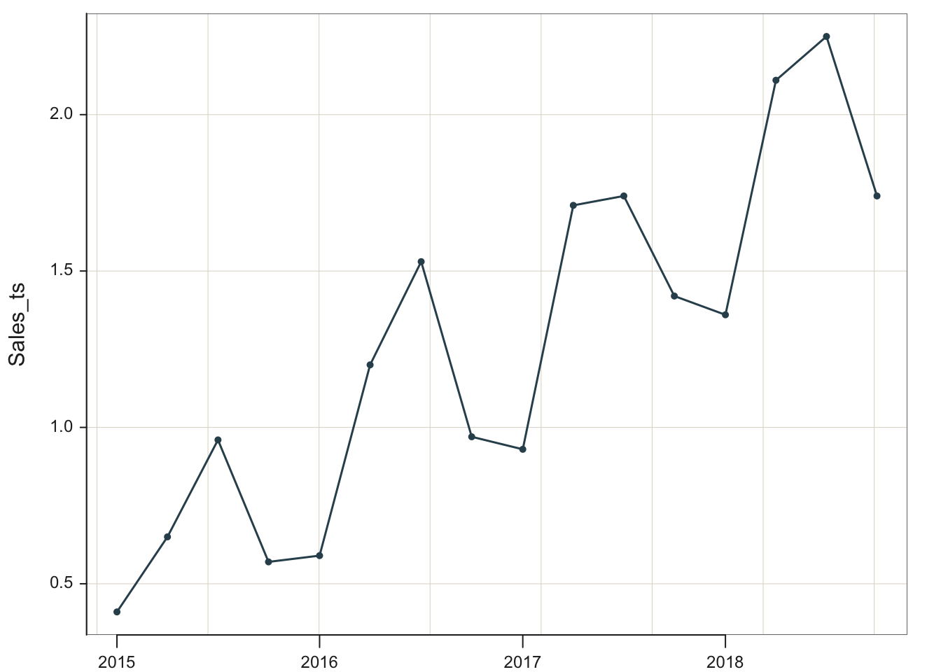
Plot(Sales_ts, quiet=TRUE)
We see that the swimwear sales in 2015 began at less than $5000, then climbed to a maximum value of approximately $25,000 in 2018.
We must first understand the time series’s general form to apply the appropriate forecasting technique. From viewing the data, the sales data indicate an increasing trend with quarterly seasonality. The trend is at least approximately linear. The seasonal effects are additive because the size of the seasonal cycles is constant, neither growing nor diminishing over time.
To summarize, the lessR function Plot() accepts a variety of input data objects for creating a time-oriented visualization. Plot() plots a:
Run chart from a single numerical variable \(y\) with the parameter run set to TRUE, which instructs to plot the data values in the order in which they occur without dates but numbered from 1, 2, …
Time series chart from two variables, a column of dates paired with a column of numerical \(y\) values, ordered from the earliest time to the latest time
Time series chart from a single time series object created with the R function ts() from which the dates have been assigned
The run chart plots the data values \(y\) without dates, simply listing the order in which the data values occur. The time series charts plot the value of \(y\) against the date in which the data value occurred.
2.1.5 R class() Function
We take a slight detour from forecasting to discuss an essential R function, class(). Multiple R objects are often created during a single R session. The function class() lists the type of the object referenced, which indicates how that object interacts with other R functions. Using class(), we can track the types of objects we are creating during a working R session.
For example, verify that d is a data frame and Sales_ts is an R time series.
class(d)
[1] "data.frame"
class(Sales_ts)
[1] "ts"
As different R objects are created from an ongoing analysis, use the class() function to observe the types of objects created.
2.2 Forecast
Because the trend is linear, we can properly do a linear regression, albeit, with an adjustment. Because the seasonality exists at constant levels, first deseasonalize with an additive model.
Generate the sales forecast for next year by extending the regression line of the deseasonalized data for four quarters, then add back the seasonal effects.
Accomplish all of these steps automatically with Rob Hyndman’s R forecast package, probably the easiest and generally best way to forecast from a variety of different time series patterns.
Access the forecast package via the fpp2 package, which loads forecast plus other useful packages as well several data sets. As with any contributed package to the R ecosystem, first install the package, then access its functions with library() for each new R session.
The # sign in front of install.packages() in the following R code indicates a comment, so remove it to install the package. Install the package on your computer only once, not every time this code is re-run. However, as with any contributed package such as lessR or fpp2, you do need the library() call each time you begin an R session and want to use functions from that package.
Whenever I re-run this section of the posted material as I write to develop and revise the content, I do not want to re-install the fpp2 library.
#install.packages("fpp2") # one time only, remove leading # to runlibrary(fpp2)
Registered S3 method overwritten by 'quantmod':
  method            from
  as.zoo.data.frame zoo
The forecast package contains many helpful forecasting functions. Given the created time series object for input into the forecasting system, follow the steps below to obtain a forecast of a time series of trend and seasonality with error bands and the corresponding visualization. First estimate the model, forecast into future time periods, then generate its visualization.
2.2.1 Step 1: Estimate the Model
The forecast package function for the regression analysis of time series data is tslm(), for time series linear model. Specify the model with standard R model notation: Response variable on the left, a tilde, ~, and then the predictor variables on the right, each separated by a plus sign, +.
An advantage of tslm() is that it recognizes the pre-defined variables trend and season. If requested, tslm() estimates the the trend and seasonality components.
When using tslm(), if the time series only exhibits trend, just include the trend component. Same for the seasonality component, if seasonality is present without trend, include only the season component. To base a forecast on both components, include both.
The following example specifies both trend and season components. Here, specify our created times series object, Sales_ts, as the response variable. Save the estimated model in the tslm R object here named fit.
fit <-tslm(Sales_ts ~ trend + season)
Apply the saved model to compute forecasts. This process of estimating a model with trend and seasonality is straightforward.
2.2.2 Step 2: Do the Forecast
After estimating the forecasting model, the forecast() function from the package of the same name projects the identified structure into the future, that is, forecasts.
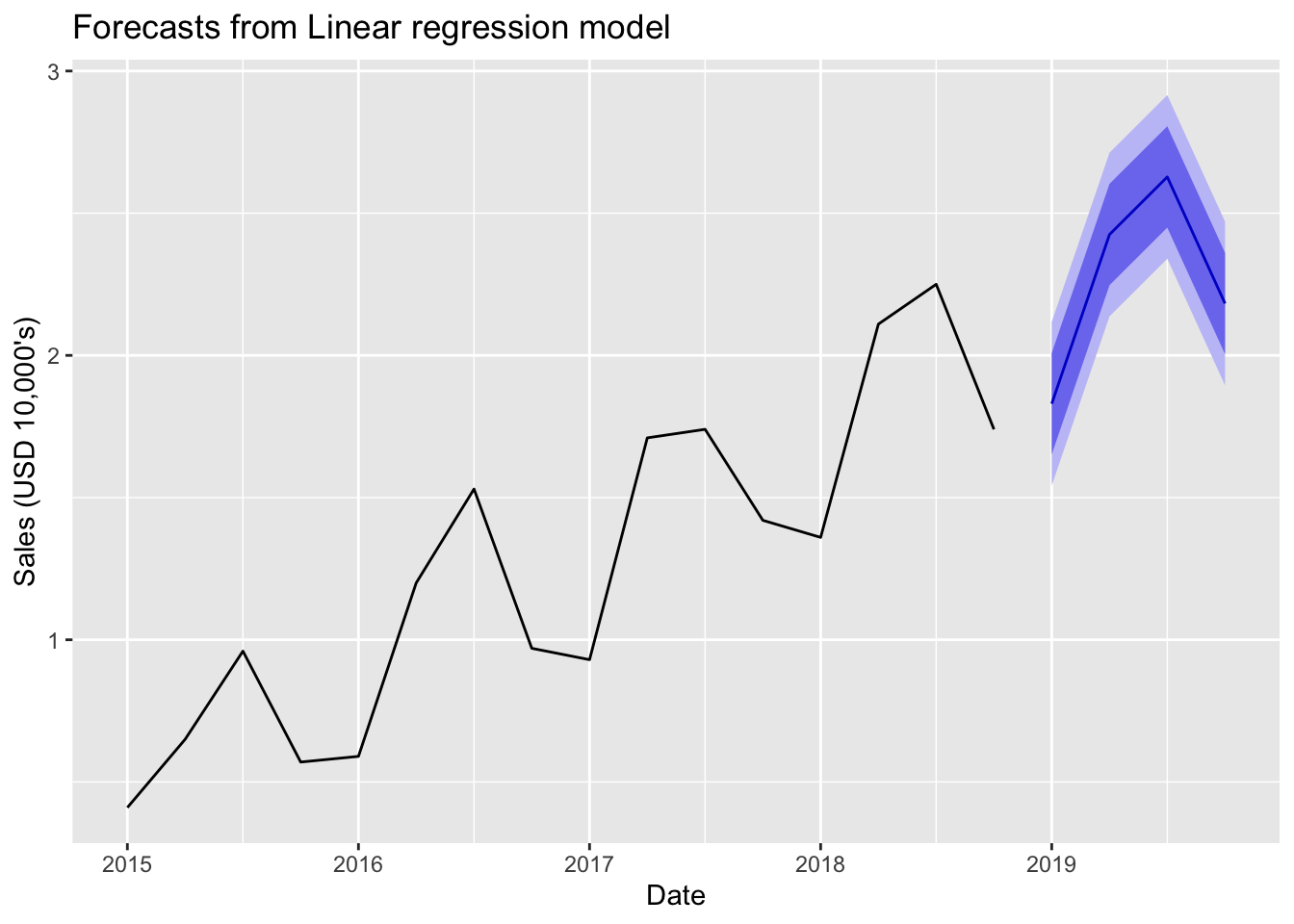
The parameter h specifies how many periods to forecast into the future. The data in this example are quarterly, so the value of 4 specifies one year of forecasts. The last data point was for Q4, 2018, so setting h to 4 specifies forecasts through 2019. Save the output into the R object f, and then list its contents by entering its name at the R console.
f <-forecast(fit, h=4)f
        Point Forecast    Lo 80    Hi 80   Lo 95   Hi 95
2019 Q1         1.8300 1.651793 2.008207 1.54232 2.11768
2019 Q2         2.4250 2.246793 2.603207 2.13732 2.71268
2019 Q3         2.6275 2.449293 2.805707 2.33982 2.91518
2019 Q4         2.1825 2.004293 2.360707 1.89482 2.47018
The function forecast() from the package of the same name does much work for us. The function automatically provides the forecasted values extrapolated from trend and seasonality, and generates the corresponding 80% and 95% prediction intervals. Every forecast should include a prediction interval to indicate the uncertainty inherent in all forecasts. Every. Single. Time.
2.2.3 Step 3: Visualize the Forecast
Virtually every time series analysis should begin with its visualization. Visualize before the forecasting model is estimated to understand what forecasting model to apply. Visualize after the forecast to display the forecasted values and associated error bands. Here use the autoplot() function from the popular R visualization package ggplot2, which was also initially downloaded with the fpp2 package, installed and then accessed with the corresponding call to library(fpp2). The parameters xlab and ylab specify the labels for the two axes. Use the parameter main to specify a custom title if desired.
The visualization includes the data, the forecasted data values of Sales, and the two prediction intervals: 80% and 95%. The 80% prediction interval for Sales is narrower than the corresponding 95% interval for each value of Date because it provides a lower probability that the actual data value, once it occurs, will fall within its bounds.
2.3 Decomposition
The previous section provides a time series forecast with the structural components of trend and seasonality. This section shows how to estimate the extent of these components.
Decomposition: Estimate the influence of each structural component, trend and seasonality, upon each data value.
Once the size and extent of each component, trend and seasonality, is known, the forecast projects into the future the combined extent of each component that occurred in the past.
2.3.1 Obtain the Components
2.3.1.1 Base R Function stl()
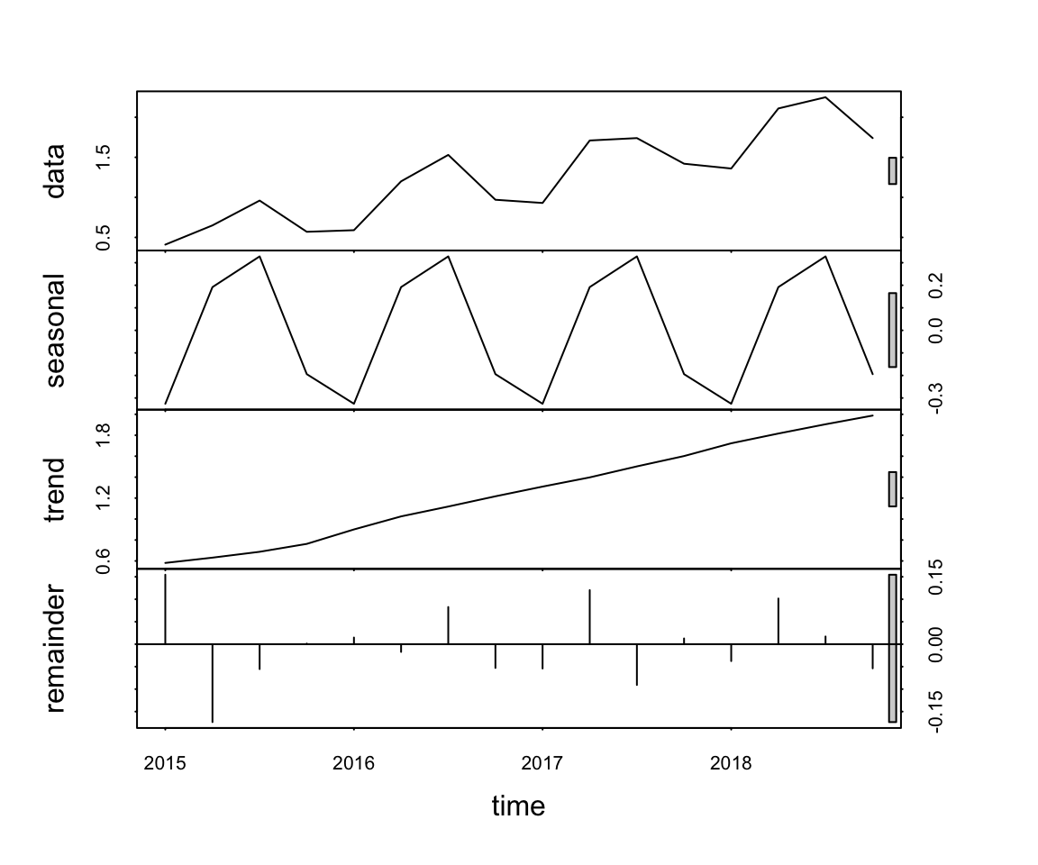
The example time series is evidently a linear trend with additive seasonality. The base R function stl() estimates the extent of these influences. This function analyzes the time series data to estimate the combined influences of the underlying trend and seasonality components that presumably contributed to each of the time series data values.
The function name stl() abbreviates as seasonal, trend, and error (estimated with a procedure called loess.) The primary input to stl() is the R time series object from the ts() function. Set the s.window parameter to "periodic" to allow for the search of seasonality. Store the output of stl(), here in the object decomp, for later reference, such as plotting. As with any R object, display its contents at the console by entering its name.
What is the extent of trend and seasonality on each data value? Interpret the decomposition remembering that Sales are expressed in units of $10,000.
2.3.1.2 Trend and Seasonality
The contribution for trend continually increases over the time series, indicating that sales are generally increasing over time. The trend in Sales, began Q1 2015 at $5,810 and, by Q4 2018, had risen to $19,880. Because Sales are reported in units of $10,000, in the decomposition these values are reported as 0.581 to 1.988.
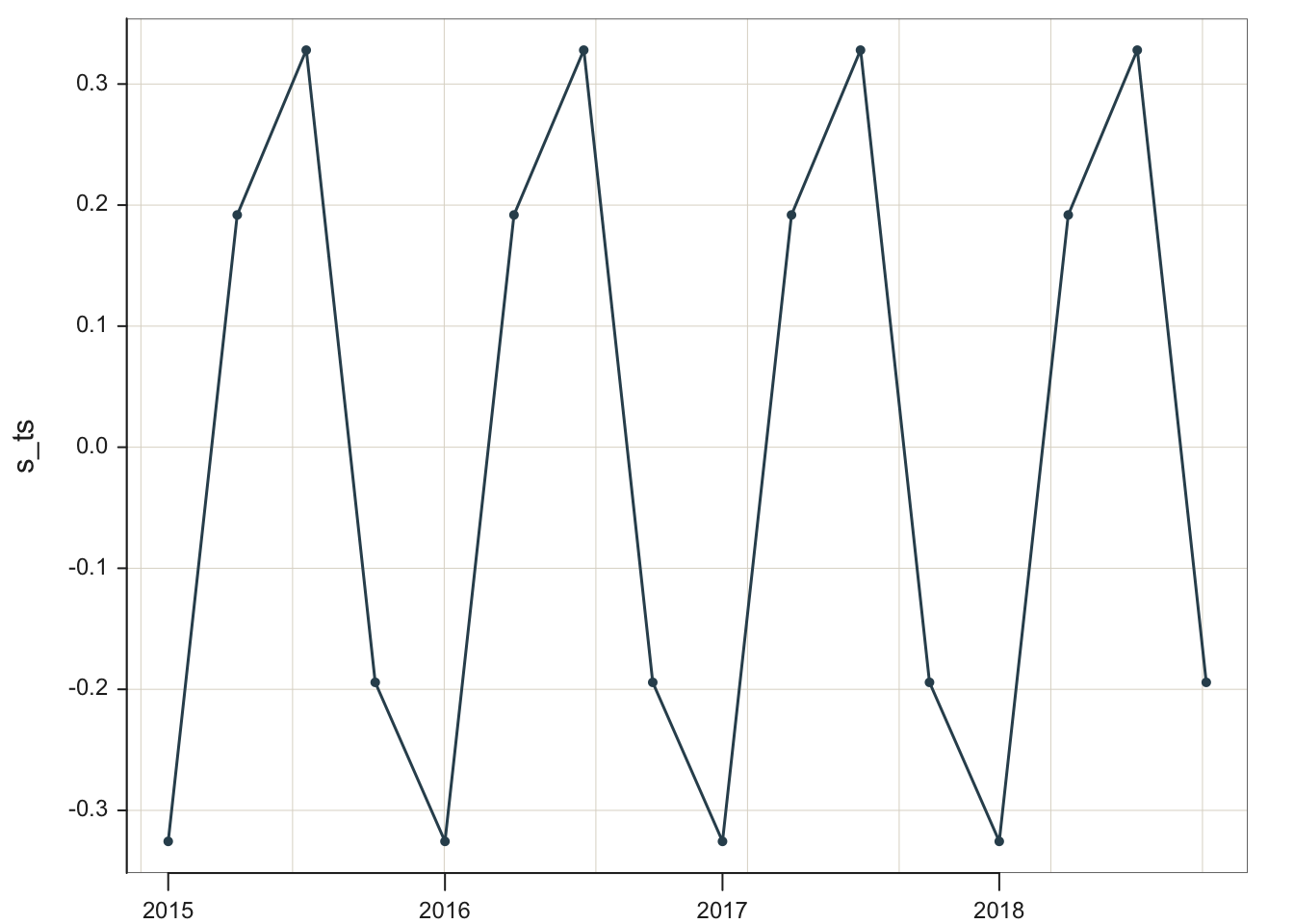
Regarding seasonality, how much do sales increase in the summer over the underlying trend? How substantial is the winter decline? Because the time series is additive, the seasonal effects are the same for each season throughout the time series. The stl() estimates the extent of this seasonality across the seasons for each year. By definition for an additive model, the effect for each season is the same across the years.
Season
Qtr
Effect
Winter
Q1
-0.326
Spring
Q2
0.192
Summer
Q3
0.328
Autumn
Q4
-0.194
These results are consistent with sales for a swimwear company. Winter is the worst month, with sales down about $3260 each Winter off the trend line. For Summer, with the highest level of sales, sales are up $3280 over the trend line.
Both trend and seasonality are essential components of this time series, and their corresponding effects are both needed for accurate forecasting of future values. The need for both effects is illustrated in the forecasted values in the previous sections, which include both the trend and seasonal effects. That said, in terms of their relative importance, trend dominates over seasonality. The range of variation for trend, 0.58 to 1.988, is considerably larger than the range of seasonal variation, -0.194 to 0.328, in units of $10,000.
The additive model formulates each data value as a sum of the underlying components plus random error not explained by the model. If the pattern, the underlying structure, is trend and seasonality, then express the data value \(y\) at Time t as the sum of this pattern plus random error: \[Y_t = T_t + S_t + e_t\] To illustrate, refer to the first line of data from decomp, that is, for the first quarter of 2015, which expresses the trend, seasonal, and error components:
2015 Q1: -0.3256159 0.5810253 0.154590654
The sum of the components is just the value of \(y\) at Time 1, \(Y_1\).
Because the data follow an additive pattern, add the positive or negative seasonal effect to the trend line for each time period. For a multiplicative model, express the seasonal effects as a percentage of the trend line. The more sales in general, the stronger the multiplicative effects.
As shown in a following section, these individual plots on the same visualization can be plotted separately to provide more detail.
2.3.1.3 Informally Evaluate Model Fit
Viewing the output of stl() shows both the quarterly seasonality and the linear trend. The trend is linear, increasing. By definition, the seasonality pattern repeats yearly, quarter-by-quarter.
The visualization of the decomposition provides the scale of each effect. From the visualization, the range of errors from a trend + seasonal model varies from about -0.15 to 0.15, a range of about 0.3. To understand the size of these errors, compare to the range spanned by data overall: from about 0.4 to 2.5 (in tens of thousands), for a range of about 2.9. The error range is much less than the range of the data, which supports the trend plus seasonal model. This model accounts for the variation of the data over time. Random error variation is always present to some extent, but its influence is relatively minor for these data.
However, what if the range of the errors, the irregularities from the trend plus seasonality model, comprise most of the range of the data? If so, then the data primarily represent random fluctuations mostly free from trend or seasonality components. Potentially misleading, the output from the analysis of such a time series may still show a seasonal component, but its range of variation will be small. Any trend or seasonality in that situation is minimal.
2.3.2 Visualize the Components
2.3.2.1 Composite Visualization
Plot the output of stl() with the standard base R function plot(), with a lowercase p, which separately plots the data, seasonality, trend, and the error (remainder) components as a single visualization.
plot(decomp)
The range of variation is shown for each component. For example, trend is shown to vary from just under 0.6 to above 1.8. From the numerical output we obtained the exact range, 0.58 to 1.99.
2.3.2.2 Separate Visualizations
Plot the components of the time series w separately to obtain more detail. These components are part of an object (a matrix) computed by stl() named time.series, created as part of the stl() output, here named decomp.
As with variables in a data frame, reference the sub-component in the decomp structure with the $ notation. As shown in the previous listing of decomp, the trend, isolated free from both seasonality and error, is stored in the second column of the computed time.series data object. The [,2] in the following R code refers to all the values of the second column of the time.series object created by stl(), embedded in the decomp object.
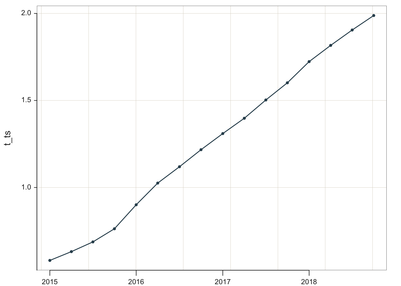
Store the pure trend component in the object t_ts.
Clearly, the underlying trend is almost entirely linear. A near straight line was obtained for the trend without any assumption of linearity in its computation.
Similarly, extract and plot the seasonality effects, the same for each year, regardless of the level of sales in these data. They are stored in the first column of the time.series object. Store the pure seasonal component in the object s_ts and then plot. As s_ts is a time series object, the lessR function Plot() works to plot.
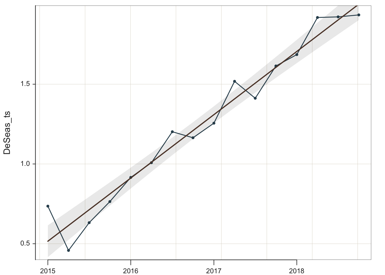
Classic regression analysis can also be used for models with not just linear trend but also seasonality. How is the regression model estimated from a time series with trend and seasonality? First, remove the seasonality, then estimate the trend with a regression model. Once the regression model (line) has been obtained, add back the seasonality, juxtaposed over the trend line. This is the process that the forecast function tslm() follows when estimating the model. The function forecast() then extends this process into the future.
Because this model is additive, deseasonalize the data by subtracting the corresponding seasonal effect. In this example, the seasonal effect for each data value has already been stored in s_ts. To illustrate, store the column of deseasonalized data in the created variable DeSeas_ts. Then plot the deseasonalized data plus the regression line, which is specified with parameter fit set to the value of lm for linear model.
Data with seasonality removed – deseasonalized data – are also found in many economic reports, such as the government unemployment level data. Not needed for this analysis per se, but could be useful to have the deseasonalized data extracted from the time series and entered into a standard data frame, which could then be exported and analyzed by any statistical system.
To extract the relevant information from the seasonal time series, use the Base R function as.vector() to covert the corresponding time series object to a standard vector (column of data in this case). Define new variables Sales_ds and Qtr in the d data frame. For the time series data, also use the base R function time(), which extracts the times from a ts object.
To create the new variables, simply specify the equation that defines each variable. Follow the R convention that to create and identify variables in a data frame, such as the d data frame, add the d$ in front of the variable name.
The variable names and the first six rows of data of the revised d data frame follow. As shown, the new variables, Sales_ds and Qtr, are now part of the d data frame.
To save the deseasonalized data, write the revised data frame d to an Excel file with the lessR function Write(). If using RStudio, specify the directory to which the file is written from the Session menu. Choose the Set Working Directory option. Either way, lessR indicates where the file is written. In this example, name the written file RevisedData, but call whatever you wish.
Write(d, "RevisedData", format="Excel")
>>> Note: data is now the first parameter, to is second
[with the writeData() function from Schauberger and Walker's openxlsx package]


The d data values written at the current working directory
        RevisedData.xlsx  in:   /Users/davidgerbing/Documents/BookNew/0TS
2.4 Summary
2.4.1 Forecasting Process
Following are the steps to create a forecast with error bands. Notationally, it is not necessary but good practice to identify the package from which each function is obtained. This practice is beneficial if there are functions from multiple packages. Valid R code lists the package name, two colons, ::, and the function name.
Read a data file that contains a column of time series data: lessR::Read()
Create the time series from the column of time series data: ts() from Base R
Plot the time series: lessR::Plot()
Estimate the corresponding model: forecast::tslm()
Generate the forecast with error bands: forecast::forecast()
Plot the data with the forecast and error bands: ggplot2::autoplot()
The entire process, as outlined here, requires functions from four different sources: base R, lessR, forecast, and ggplot2. Only the lessR and forecast packages need to be installed, however, beyond base R. The visualization package ggplot2 downloads with the forecast package.
2.4.2 Compare Forecasting Functions
Before the midterm we forecasted from a linear trend line from time series data with no seasonality with the lessR function Regression(). This week we forecasted from time series data with both trend and seasonality using functions from the forecast package. How do these functions compare?
Regression() provides a general, comprehensive regression analysis, applicable to time series as well as non-time series data, as we saw from HW #4 and HW #6. It also provides forecasts, but for time series data, limited to data without seasonality without modification. To use Regression() with seasonality, the time series would first need to be deseasonalized, the trend estimated, and then the seasonality added back in. The forecast function tslm() accomplishes this process automatically. Regression(), however, also provides additional analyses such as inferential evaluation of one or more slope coefficients in a multiple regression with multiple predictors, an outlier analysis, and more.
By comparison, the forecast functions are fine-tuned to provide forecasts from time series data. They straightforwardly adapt to seasonality. Plus, the resulting visualization of the forecasted values with the prediction intervals is easily obtained. However, the forecast functions are limited to time series data, so good to have access to both approaches.