❝ Life can only be understood backwards; but it must be lived forwards. ❞
2 Project the Past into the Future
Every business must plan for the future. Many management decisions depend upon estimating the value of one or more variables at some future time. What are the monthly sales projections for the next three months? How many employees will our company have at this time next year? What is the estimated interest rate two months from now? How large will the inventory be during the summer months? Some of these questions, such as the estimated interest rate, involve forecasting a single value. Inventory, however, might consist of thousands of different items, each requiring a specific forecast. Planning for the future in such a company involves thousands of forecasts.
To forecast the future values of a variable, we need to understand the past. We need to understand the pattern by which the values of the variable are generated over time.
The following material describes a core set of patterns with corresponding visualizations.
The best way to understand the structure of a process is usually to visualize outcomes of that process.
2.1 Processes
The process is the core unit for organizing business activities and the basis for forecasting.
Structured set of procedures that generate output over time to accomplish a specific business goal.
A functioning business is a set of interrelated business processes that ultimately lead to the delivery and servicing of the product or service. Managing a business is managing its processes, so evaluating on-going performance of the constituent business processes is a central task for managers. To assess process performance, consider variables that generate values over time such as:
Consider some examples of outcome variables for business processes.
- Supply Chain: Ship Time of raw materials following the submission of each purchase order
- Inventory: Daily inventory of a product
- Manufacturing: Length of a critical dimension of each machined part
- Marketing: Ongoing satisfaction measured with customer ratings
- Production: Amount of cereal by weight in each cereal box
- Order Fulfillment: Pick time, elapsed time from order placement until the order is boxed and ready for shipment
- Accounting: Time required to forward a completed invoice from the time the order is placed
- Sales: Satisfaction rating of customers after purchasing a new product
- Health Care: Elapsed time from an abnormal mammogram until the biopsy
The values for these variables vary over time. How can we predict the future values of these variables?
One way to predict a variable’s future value is to discover its pattern of variation over past time periods and extend that pattern into the future.
Ongoing business processes generate a stream of data over time. Understanding how the process performed in the past is the key to forecasting its future performance. If sales have been steadily increasing every month for the last two years, and this trend is expected to continue, then a forecast of future sales can project this trend into the next three months. Successful forecasting is the successful search for patterns from past performance.
2.2 Randomness vs Structure
Unfortunately, uncovering the underlying structure of previous time values is not always straightforward.
The analysis of the pattern of variation of a variable’s values over time must distinguish the underlining signal, the true pattern, from the random noise, the random sampling variation, that surrounds the pattern.
Noise obscures the true pattern, but it is structure and pattern that can be projected into the future. The construction of models by searching for pattern buried among noise and instability is not only central to forecasting, it is crucial to statistical thinking in general.
To illustrate, consider a process as simple as coin flipping. Flip a coin 10 times. How many Heads will you get? We predict five, but random variation ensures that the obtained value can vary anywhere from 0 to 10, with five just the most likely value. In actuality, flipping a fair coin 10 times will result in five heads less than 1/4 of each 10 flips. Usually, over 75% of each 10 coin flips, a value other than five Heads will be obtained.
The values of a variable at least partially vary according to random influences from one value to the next. Each data value is determined by an underlying stable component consistent with the underlying pattern, such as the fairness of a coin, and a random component that consists of many undetermined causes.
A data value results from the influence of the underlying pattern plus the error term, the sum of many undetermined influences.
Random variability is pervasive, and its impact on data analysis is profound. Even if the structure of the process is disentangled from the noise, the noise is always present. The exact next value cannot be known until that outcome occurs.
For example, moving beyond coin flips, the hospital staff does not know when the next patient will arrive in the emergency room until the patient arrives. Nor do they know how many patients will be admitted on any one evening. A hospital may see 17 people admitted to the emergency room on one Saturday evening, and 21 people another Saturday evening. You do not know the amount of overtime hours in your department that will occur next month until next month happens. And you only know how much the next tank of fuel will cost once you again fill up the tank.
The opposite of randomness is pattern, stability and structure, the basic tendencies that underlie the observed random variation. The same hospital that admitted 18 and then 21 patients to the emergency room on a Saturday evening, admitted on the corresponding Wednesday evenings, 8 and 6 people. All four admittance numbers – 17, 21, 8, 6 – are different, but the pattern is that more people were admitted on a Saturday evening than on a Wednesday evening. Any capable forecasting algorithm would leverage this knowledge of the differential pattern of arrivals.
2.3 The Future
A central task of data analytics is to reveal and then quantify the underlying tendencies and pattern. Sometimes the task of uncovering and quantifying structure is straightforward, and other times it involves is as much intuition and skill including the formal application of sophisticated analytic forecasting procedures. To delineate this stable pattern from the observed randomness, construct a set of relationships expressed as a model.
Mathematical expression that describes an underlying pattern extracted from the random variation exhibited by the data.
The outcomes of a process include a random component, but the model describes the underlying, stable pattern. The data consist of this stability with the added randomness that to some extent obscures the pattern. Projecting this pattern into the future includes the following steps.
Business success requires accurate forecasting. Management decisions apply to the future. Try running a business in which either the forecasted sales never materialize or the opposite situation in which actual sales outpace inventory.
- Describe: Visually assess the inherent variation in the data
- Infer: Build a model that expresses the knowledge of the underlying stable component that underlies this variation
- Forecast: From the model project this stable component into the future as the estimate of future reality
- Evaluate: Wait for some time to pass and then compare the forecast to what actually happened
The knowledge obtained from this analysis begins with a description of what is, an inference of the underlying structure that culminates in a forecasting model, followed by a forecast of what will likely be, and then refinement of the model to improve the accuracy of the forecasts. The primary problem of identifying patterns from the past is the presence of sampling error.
3 Visualize Patterns Over Time
The data and visualization of the values of a variable over time result from an on-going process. Visualize the data values of a variable to reveal the pattern of their variability over time in one of two fundamental ways: run chart and time series visualizations, discussed next.
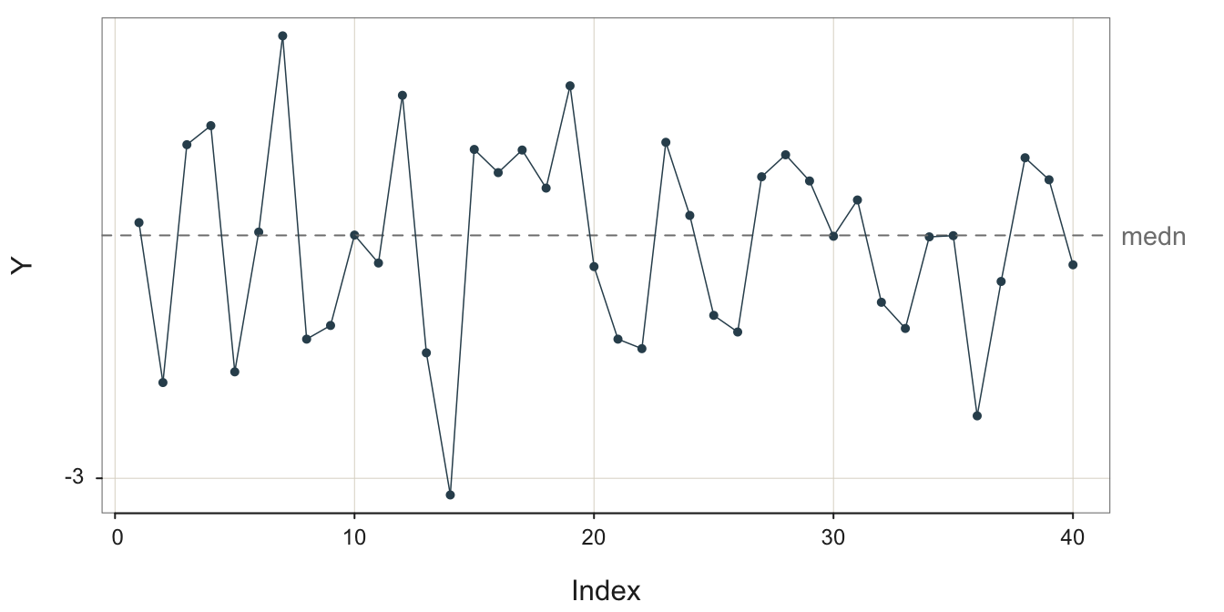
3.1 Run Chart
Consider the time dimension of an ongoing process. Effective management decisions about when to change the process, to understand its performance, to know when to leave it alone, to evaluate the effectiveness of a deliberate change, require knowledge of how the system behaves over time. Evaluation of a process first requires accurate measurements of one or more relevant outcome variables over time.
Plot of the values of a variable identified by their order of occurrence, with line segments connecting individual points.
Use the run chart to plot the performance of the process over time if the dates or times at which each point was recorded are not available or not necessary. However, order the data values sequentially according to the date or time they were acquired. The run chart lists the sequential position of each data value in the overall sequence and the horizontal axis.
The ordinal position of each value in the overall sequence of data values, numbered from 1 to the last data value.
A run chart is a specific type of line chart. Display the values collected over time on the vertical axis. On the horizontal axis, display the Index. A run chart may also contain a center line, such as the median of the data values to help compare the larger values to smaller values.
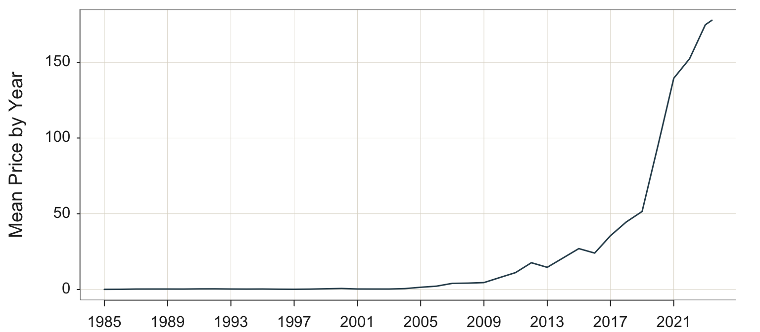
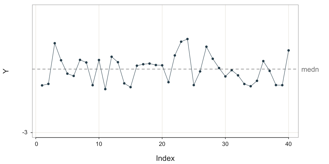
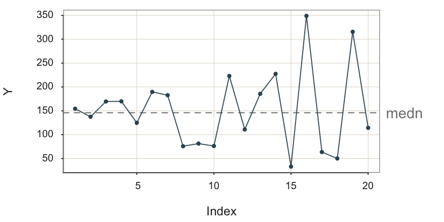
As an example of a run chart, consider pick time, the elapsed time from order placement until the order is packaged and ready for shipment. Pick time is central to the more general order fulfillment process, and requires management oversight to minimize times and to detect any bottlenecks should they occur. The variable is Hours, the average number of business hours required for pick time, assessed weekly, illustrated in Figure 3.1. The data are available on the web as a text data file at the following location.
https://web.pdx.edu/~gerbing/data/pick.csv
First, read the data, which contains the variable Hours, into the d data frame.
d <- Read("https://web.pdx.edu/~gerbing/data/pick.csv")
Obtain the run chart and associated statistics with the lessR function Plot() to display the values in sequence.
Plot(.Index, Hours)
Set the \(x\)-axis variable, the first variable listed, to .Index. That designation automatically generates the sequence of integers from 1 through the last data value. With that convention, a separate R programming statement to generate those values is not needed. The initial period, ., is part of the name so that the name is not confused with an actual variable name.
Plot() automatically connects adjacent points with a line segment. The center line, the median, is automatically added to a run chart if the values of the variable tend to oscillate about the center.
What does the manager seek to understand from a run chart? A primary task of process management is to assess process performance in the context of this random variation, to know:
- The central level of performance of the process, mean or median
- The amount of random variation about the central level inherent in the process
The next task is to actively manage process performance. We see from Figure Figure 3.1 a concerning trend for pick time deteriorating toward the end of data collection. The last three data values are above the median, and the maximum value of 6.70 is obtained as the last data value. Are these larger pick time values random variation, or do they signal a true deterioration in the process? More data would answer that question, data carefully scrutinized by management. Adjust the central level of performance up or down to the target level, as needed. Continue to minimize the random variation about the desired average level of performance.
3.2 Process Stability
Processes always exhibit variation but that variation can result from underlying stable population values of the mean and standard deviation.
Data values generated by the process result from the same overall level of random variation about the same mean.
The run chart of a stable process displays random variation about the mean at a constant level of random variability such that some data values are closer than others to the center line with no apparent patterning and no data values tend to be much further than all the values.
A stable process or constant-cause system produces variable output but with an underlying stability in the presence of random variation. The output changes, but the process itself is constant. W. Edwards Deming describes a stable process as follows.
W. Edwards Deming established that a process must first be evaluated for stability, which is required to verify the quality control of the process output. There is an entire literature dedicated to this proposition. Deming became revered worldwide for his contributions to quality control, especially in Japan as it rebuilt its industrial capabilities following World War II.
W. Edwards Deming, “Some Principles of the Shewhart Methods of Quality Control,”Mechanical Engineering, 66, 1944, 173-177.
There is no such thing as constancy in real life. There is, however, such a thing as a constant-cause system. The results produced by a constant-cause system vary, and in fact may vary over a wide band or a narrow band. They vary, but they exhibit an important feature called stability. … [T]he same percentage of varying results continues to fall between any given pair of limits hour and hour, day after day, so long as the constant-cause system continues to operate. It is the distribution of results that is constant or stable. When a … process behaves like a constant-cause system … it is said to be in statistical control.
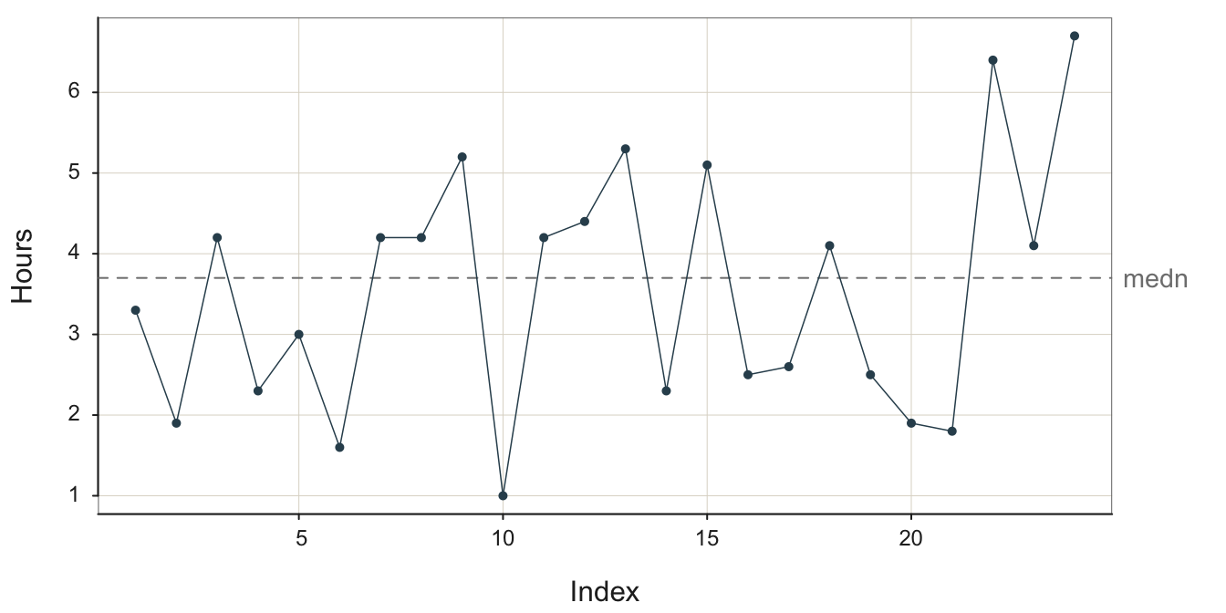
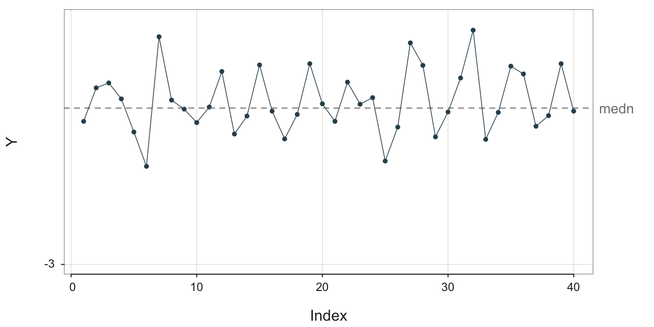
To illustrate this random, sampling error inherent in a sequence values generated over time, consider the following four stable processes shown in Figure 3.2, Figure 3.3, Figure 3.4, and Figure 3.5. To better compare the processes, their visualizations all share the same y-axis scale, from -3 to 3. In the following figure captions, \(m\) is the sample mean and \(s\) is the sample standard deviation. For illustrative purposes, each run chart of each of the four stable processes is illustrated with the median as the center line.
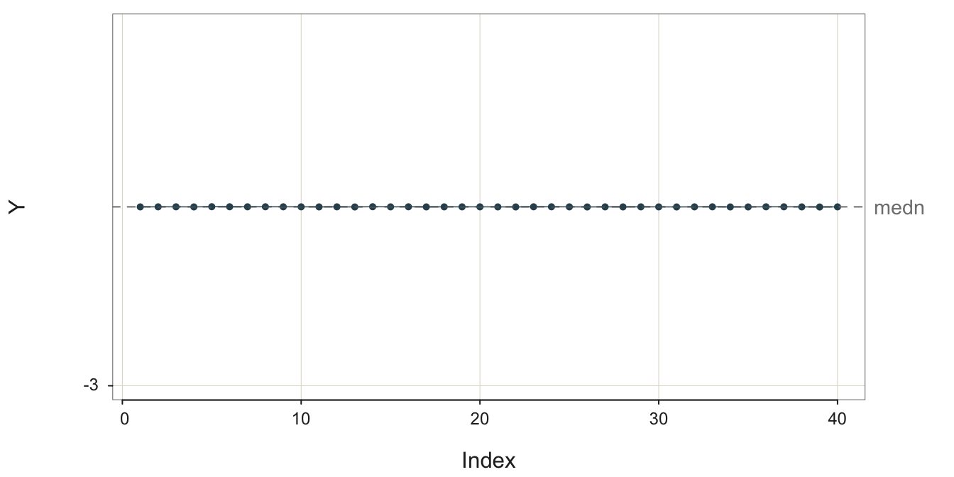
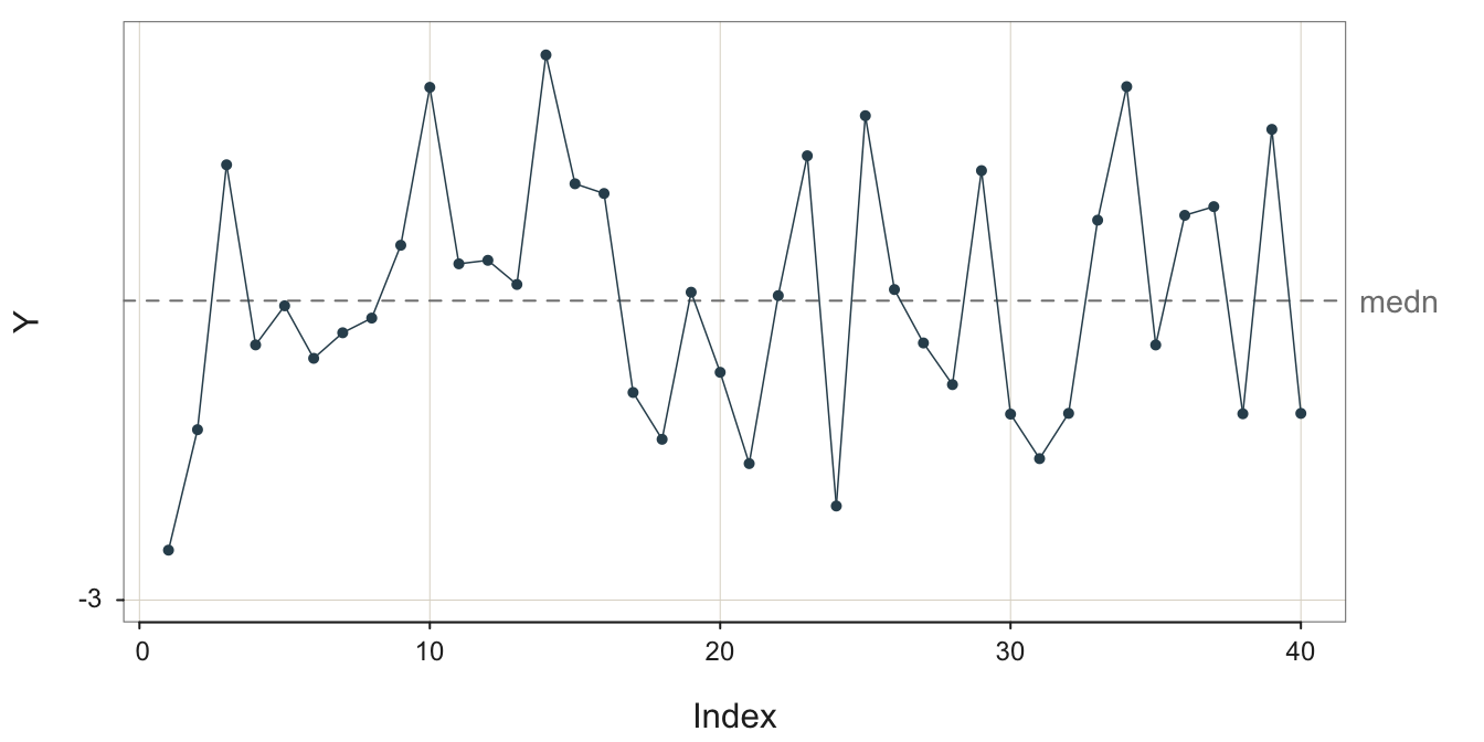
What differs across these four stable processes is their variability. All four processes are stable, but the variability of their output differs. The sample standard deviation of these four stable processes varies from 0.0010 to 1.3364.
The definition of a stable process is not a small variability of output but rather a constant level of variability about the same mean..
To create a forecast you first need to understand the structure of the underlying process. First, identify the pattern to be projected into the future. If you view Figure 3.5 with the large amount of random error, realize that the process is stable even if the outcomes are highly variable. Specifically, recognize that the fluctuations are not the regular fluctuations of seasonality but instead are irregular with no apparent pattern. With no seasonality and the same mean underlying all the data values, the forecast for the next value remains the mean of the previous values.1
1 Assumptions of a stable process are better evaluated from an enhanced version of a run chart called a control chart, essential for the analysis of quality control.
3.3 Non-Stable Processes
Some other patterns found in the data values for a variable collected over time are described next.
3.3.1 Outlier
Of particular interest in the analysis of any set data values, including the outcomes of a process, is an outlier.
A data value considerably different from all or most of the remaining data values in the sample.
An outlier indicates the presence of a special cause in Deming’s terminology, a temporary event, which resulted in a deviant data value. Figure 3.6 contains an outlier.
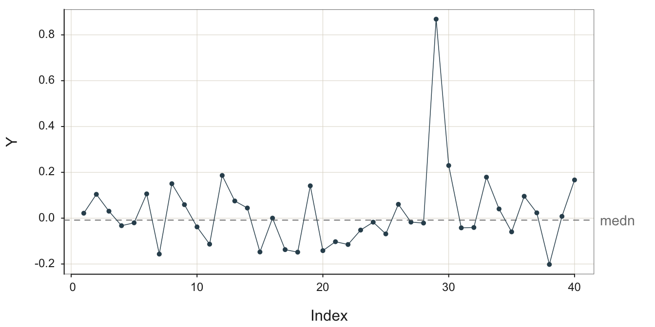
Given a process otherwise in control but with an outlier, the best forecast is not the average of all of the values. Suppose it is established that an outlier occurred due to a data value sampled from a process distinct from that which generated the remaining date values. Then, there is no meaning in analyzing all the data values as a single sample. Figure 3.6 likely shows the results from two separate processes.
Understand why the outlier occurred and ensure the conditions that generated the outlier do not occur for the forecasted values.
When observing an outlier, understand how and why the outlier occurred. This is almost always an essential understanding because it often leads to a change in the procedure, presumably for the better. The most trivial cause is a simple data entry error, not the type of data to base management decisions. Or, more fundamentally, is a particular shipment of metal in the manufacturing process defective? Or is the output from a specific machine defective?
3.3.2 Process Shift
3.3.2.1 Level Shift
Another pattern is a process in which some event occurs that shifts the level of the process up or down, essentially transforming one process into another. Figure 3.7 illustrates a stable process without error, the underlying structure free from random error, not the data, which then shifts to a different level.
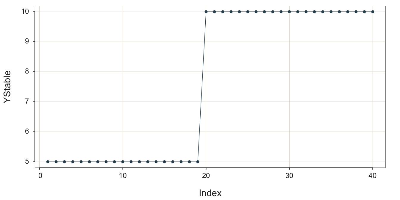
The following figure illustrates this process as observed in reality. Random error partially obscures the underlying stability followed by the upward shift of the process mean to define a new, stable process, shown in Figure 3.8.

Once a process has changed, such as a level shift, the data values that occurred before the change are no longer relevant for discerning the current underlying signal from which to generate a forecast.
Hopefully, there is enough data to discern the underlying structure after the level shift. Recognize that after the level shift there is a new process, but, of course, that new process may be desirable. The process output may be profitability or, applied to an industrial process, volume of output.
3.3.2.2 Variability Shift
The amount of variability inherent in the system can also change over time. Consider an industrial assembly in which the set up that manufacturer is a part is becoming more loose overtime, increasing the variability of the dimensions of the output. Figure 3.9 illustrates this pattern.
Each data point in Figure 3.9 is sampled from a different process. Each successive process generates output more variable than the previous process.
3.3.3 Trend
Another type of non-stability is trend, again, a desirable outcome if it is positive and the process describes profitability.
The long-term direction of movement of the data values over time, a general tendency to increase or decrease.
The example in Figure 3.10 is a positive, linear trend with considerable random error obscuring the underlying signal.
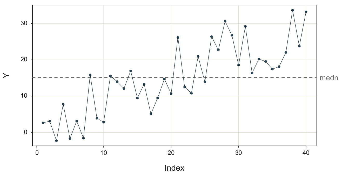
Without random error, a linear trend plots as a straight line, either with + slope or - slope.
Extend the trend “line” into the future.
The trend line can be an actual straight line, linear, or it can be curvilinear, such as exponential or logarithmic growth or exponential decay.
3.3.4 Seasonality
Another typical, non-stable pattern in data over time is seasonality.
Pattern of fluctuations that repeats at regular intervals with the same intensity, such as the four quarters of a year.
This first plot, in Figure 3.11, is of the underlying structure, the signal without the contamination of random error.
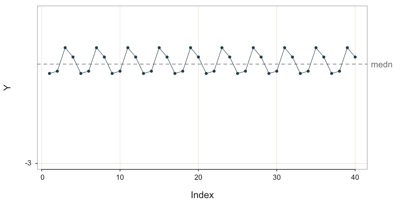
In the plot in Figure 3.12, some random error is added to the additive seasonality to mimic actual data.
The process illustrated in Figure 3.13 exhibits much random error that tends to obscure the underlying signal, the additive seasonality.
The forecast for a data value that reflects seasonality with no pattern of increase or decrease, such as in Figure 3.13, depends only on the season and the impact of a particular season on the deviation from the overall mean of the process.
Estimate and apply the seasonal effect for the season at which the forecasted data value occurs.
As always, the more random error the more difficult to estimate the seasonal effects. How these seasonal effects are estimated is discussed later.
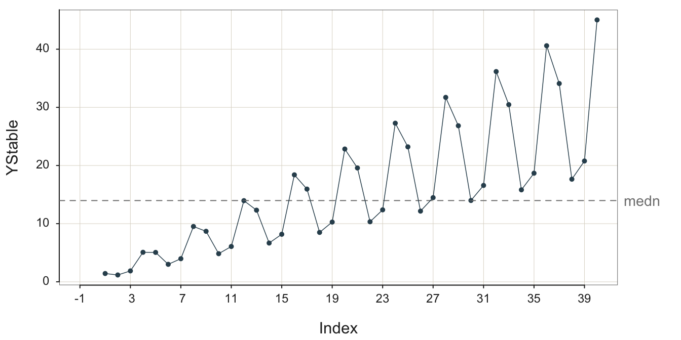
3.3.5 Trend with Multiplicative Seasonality
Consider a successful swimwear company that generally experiences more robust sales each year but suffers from relatively lower fall, especially winter sales. The highest quarter for sales is spring (probably most in late spring) as customers prepare for summer, closely followed by Summer sales. Sales continue to grow every year but generally comparatively less so for fall and winter.
The intensity of the regular seasonal swings up and down, which systematically increase or decrease in size forward across time.
Following is an example of the underlying structure of quarterly geometrical seasonality with an overall positive, linear trend. Because there is no random error for the sales variable YStable, the plot in Figure 3.14 is of the structure, not actual data, which is always confounded with random sampling error. To facilitate observing the pattern of seasonality, the first of the quarterly seasons, Winter, is displayed on a vertical grid line in Figure 3.14.
For example, consider Time 31, a Winter quarter. The sales are larger than for any season for the early years, sales are low within the context of that given year. Sales then increase much at Time 32 for Spring, remain high but diminish slightly for Time 33, Summer, and then diminish again for Time 34, the fourth quarter, Fall. Winter sales then rise slightly compared to the Fall, perhaps to take advantage of sale prices or planning for next summer.
Given data, structure plus sampling error, the underlying, stable pattern is obscured to some extent but remains apparent.
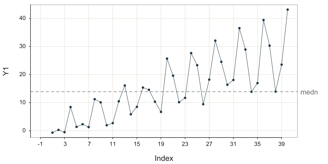
With even more random error shown in Figure 3.16, it is easy to miss the seasonal sales signal and falsely conclude that the up and down movements of the data over time is due only to random error, though the trend remains obvious.
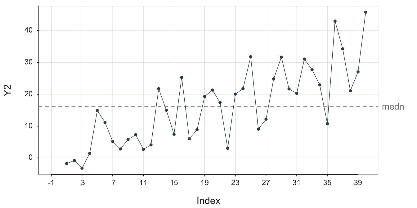
To help delineate the stable pattern, the signal, from the noise, Figure 3.17 highlights the groups of four seasonal data values from Figure 3.16. It explicitly numbers their seasonality for three groups.
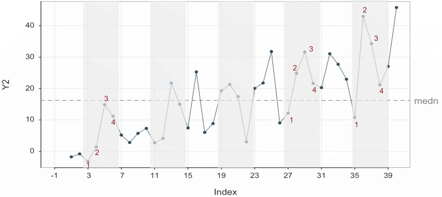
Project the trend “line” into the future and then add the seasonal effect for each corresponding forecasted value.
The process of forecasting is to discern the signal from the noise and then forecast from the signal. This is not always straightforward, but it is always more accessible with more data. Fortunately, analytic methods exist to disentangle the trend and seasonal components from each other and from random errors.
Here, the purpose is to visualize some of the various patterns in time-oriented data and to understand better how the random error always present in data obscures the underlying pattern. The goal is to not only rely upon analytic forecasting software but also to develop some visual intuition from examining these visualizations. The more the analyst can discern structure from a visualization, such as trend with geometric seasonality, often leads to more effective use and understanding of the results provided by the analytic software.
4 Visualize Patterns as Time Series
A time series orders the values of a variable by time, just as a run chart does. However, the time series also provides the corresponding dates or times, usually plotted on the \(x\)-axis.
Sequence of data values plotted against the corresponding dates and/or times at which the values were recorded, usually at regular intervals.
A standard forecasting technique is to forecast future values of a time series. Examples include any process that generates values over time such as ship times and inventory levels. When forecasting a future value from past values of a variable, discover the underlying structure from the past, disentangled from the random variation. Then, extrapolate the past structure into the future.
The analysis begins with a visualization of the time series. Before extracting structure analytically, view the patterns present over time. The more you understand the structure of the time series before proceeding with analytical forecasting methods, the better you can direct the forecasting methods to obtain the most accurate forecast.
4.1 Example Data
The data for the following examples is the stock price of Apple, IBM, and Intel from 1985 through mid-2024, obtained from finance.yahoo.com. The data were obtained from three separate downloads and then concatenated into a single file. The data are available on the web as an Excel file at the following location, or as part of the lessR download.
Make sure to enclose the file reference in quotes within the call to the lessR function Read().
#d <- Read("https://web.pdx.edu/~gerbing/data/StockPrice.xlsx")
or
d <- Read("StockPrice")
The output of Read() provides useful information regarding the data file read into the R date frame, here d. Always review this information to make sure that the data was read and formatted correctly. There are three variables in the data table: Month, Company, and Price. The file contains 1350 rows of data, with 450 unique dates reported on the first day of each month. There is no missing data.
The variable Month contains the dates to be plotted on the \(x\)-axis for the resulting time series visualization. The dates are repeated for each of the three companies.
Data analysis systems typically provide a variable type specifically for dates and times, which for R includes the data type Date, for which each value consists of the year, month, and day.
Viewing the output of Read() under the heading of Type reveals that Month was read as a Date variable. This correct classification is because Excel recognizes and classifies data values that are character strings such as “08/18/2024” as date values. This Excel date formatting then transfers over to R when the data are read with the lessR function Read().
If the data file were stored as a text file, R would not automatically translate the character string of dates into a variable of type Date. In a text file, all data values are character strings. R translates character strings that are numbers into a numerical variable type when reading the data into an R data frame. Not so with dates, which remain as character strings after reading into R. However, the relevant lessR functions also properly classify dates.
Traditionally, the variable with these date fields must be explicitly converted to variable of type Date with the as.Date() function. Storing the data as an Excel file avoids this extra step because Excel has already done the conversion. Since lessR Version 4.3.9, lessR implicitly performs this conversion to an R Date variable. Reference lessR date processing for more details.
Data Types
------------------------------------------------------------
character: Non-numeric data values
Date: Date with year, month and day
double: Numeric data values with decimal digits
------------------------------------------------------------

    Variable                  Missing  Unique
        Name     Type  Values  Values  Values   First and last values
------------------------------------------------------------------------------------------
 1     Month      Date   1419       0     473   1985-01-01 ... 2024-05-01
 2   Company character   1419       0       3   Apple  Apple ... Intel  Intel
 3     Price    double   1419       0    1400   0.100055  0.085392 ... 30.346739  30.555891
 4    Volume    double   1419       0    1419   6366416000 ... 229147100
------------------------------------------------------------------------------------------
The dates are stored within R according to the ISO 8601 international standard, which defines a four-digit year, a hyphen, a two-digit month, a hyphen, and then a two-digit day.
ISO is the acronym for the organization that sets global standards for goods and services: the International Standards Organization, www.iso.org.
Following are some sample rows of data. The first column of numbers are not data values but rather row names.
- The first four rows of data, which are the first four rows of Apple data.
- The first four rows of IBM data, beginning on Row 451.
- The first four rows of Intel data, beginning on Row 901.
       Month Company    Price     Volume
1 1985-01-01   Apple 0.100055 6366416000
2 1985-02-01   Apple 0.085392 4733388800
3 1985-03-01   Apple 0.076335 4615587200
4 1985-04-01   Apple 0.073316 2868028800
Month Company Price Volume
451 2022-07-01 Apple 160.9099 1447125400
452 2022-08-01 Apple 155.6720 1510239600
453 2022-09-01 Apple 137.0294 2084722800
454 2022-10-01 Apple 152.0411 1868139700 Month Company Price Volume
901 2020-08-01 IBM 98.22727 77439042
902 2020-09-01 IBM 98.18989 88369845
903 2020-10-01 IBM 90.11163 166434813
904 2020-11-01 IBM 99.68288 108438088With the data, we can proceed to the visualizations.
4.2 One Time Series
We can plot the time series for any one of the three companies in the data table. Because the data file contains stock prices for three different companies, we need to subset the data with the process known as filtering.
Extract a subset of the entire data table for the specified analysis.
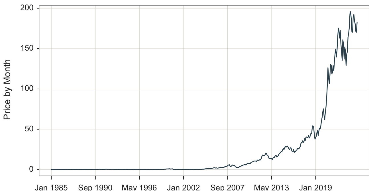
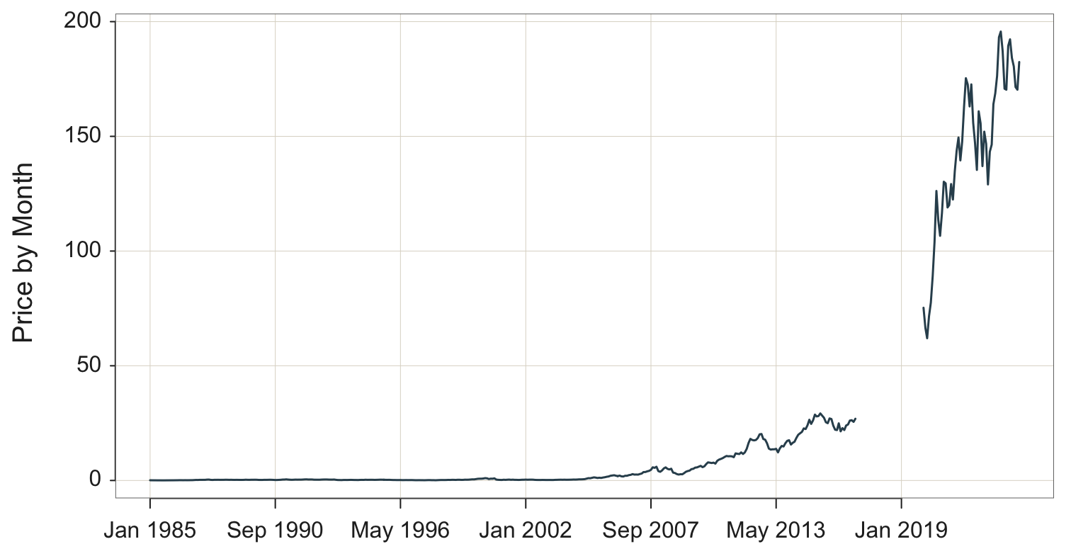
Every analysis system provides a way for filtering the data. Set up the time series visualization by plotting share Price vs. Month, filtering the data so that only the stock price for Apple is visualized, shown in Figure 4.1.
Plot two variables with the lessR Plot() function of the form Plot(x,y). When the \(x\)-variable is of type Date, here named Month, Plot() creates a time series visualization. The \(y\)-variable in this example is Price.
Plot(Month, Price, filter=(Company=="Apple"))
filter: Parameter to specify the logical condition for selecting rows of data for the analysis.
To visualize the data for only one company, we need to select just the rows of data for that company. Select specified rows from the data table for analysis according to a logical condition.
- The R double equal sign,
==means is equal to. - The == does not set to equality, it evaluates equality, resulting in a value that is either
TRUEorFALSE. - The expression (Company==“Apple”) evaluates to
TRUEonly for those rows of data for which the data value for the variable Company equals “Apple”.
size: Parameter to specify the size of the plotted points. By default, when plotting a time series, lessR, default size of the points is 0. Set at a positive number to visualize the plotted points, which are by default connected with line segments.
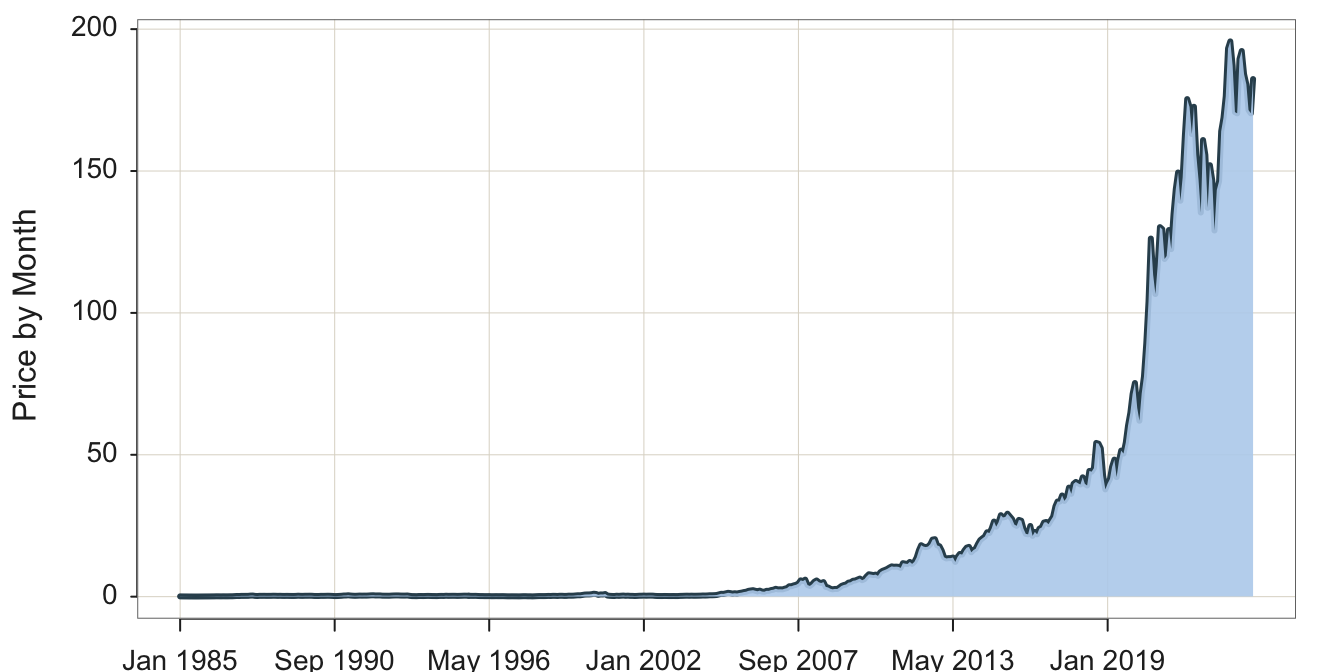
A desirable option is the ability to fill the area under the curve to highlight the form of the plotted time series, a visualization often referred to as an area chart. Figure 4.2 illustrates the area chart.
style(quiet=TRUE, lab_x_cex=.75, lab_y_cex=.75, axis_x_cex=.62, axis_y_cex=.62) Plot(Month, Price, filter=(Company=="Apple"),
area_fill="slategray2", lwd=3)
area_fill: Parameter to indicate to fill the area under the curve. Set the value to on to obtain the default fill color for the given color theme, or specify a specific color such as with a color name.
lwd: Parameter to specify the line width of the time series line segments. In the accompanying plot to increase the thickness of the plotted line, line width was set to 3 instead of the default value of 1.5 .
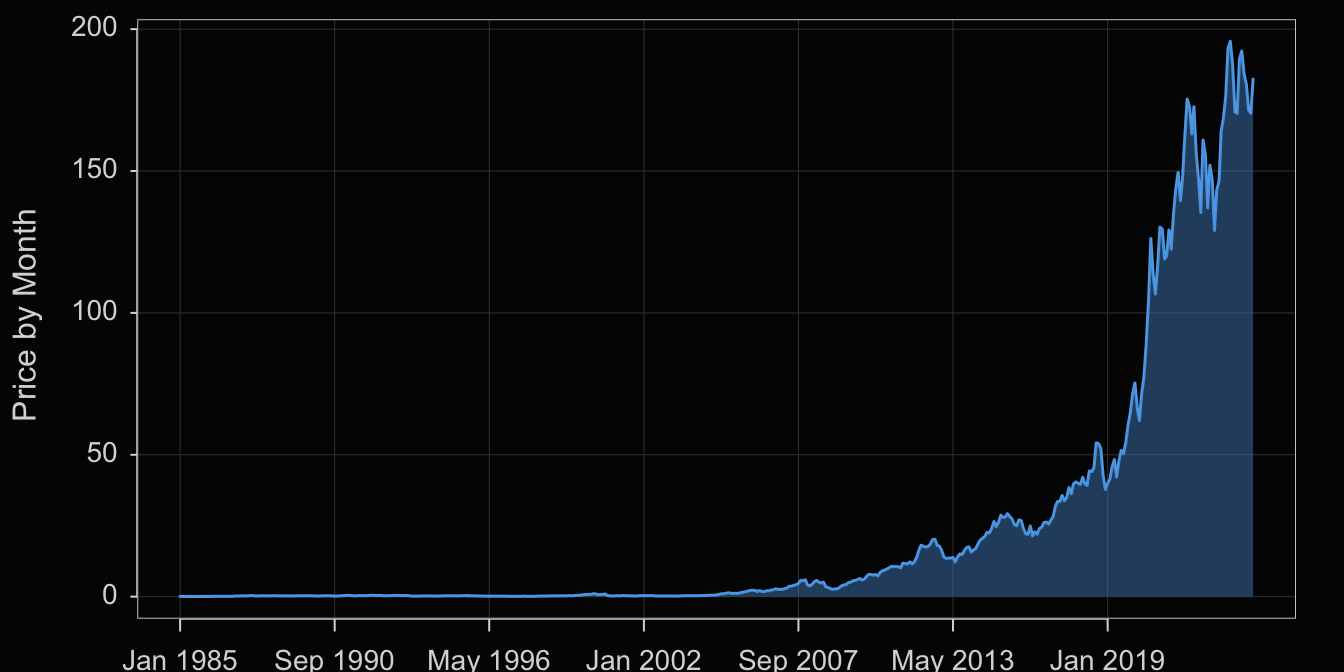
Visualization systems also offer many customization options such as for colors. We will not explore these customizations here in any detail, but offer the following example in Figure 4.3.
style(sub_theme="black")
Plot(Month, Price, filter=(Company=="Apple"),
color="steelblue2", area_fill="steelblue3", trans=.55)
style(): lessR function to set many style parameters. Here, set the background to black by setting the sub_theme parameter. Styles set with style() are persistent, that is, they remain set across the remaining visualizations until explicitly changed.
color: Parameter that sets the line color.
area_fill: Parameter that sets the color of the area under the curve.
transparency: Parameter to set the transparency level, which can be shortened to trans. The value is a proportion from 0, no transparency, to 1, complete transparency, that is, invisible.
4.3 Several Times Series
4.3.1 One Panel
The variable Company in this data table is a categorical variable with three values: Apple, IBM, and Intel. Visualization systems typically offer options to stratify time series plots by a categorical variable such as Company. One option plots all three times series plots the same panel.
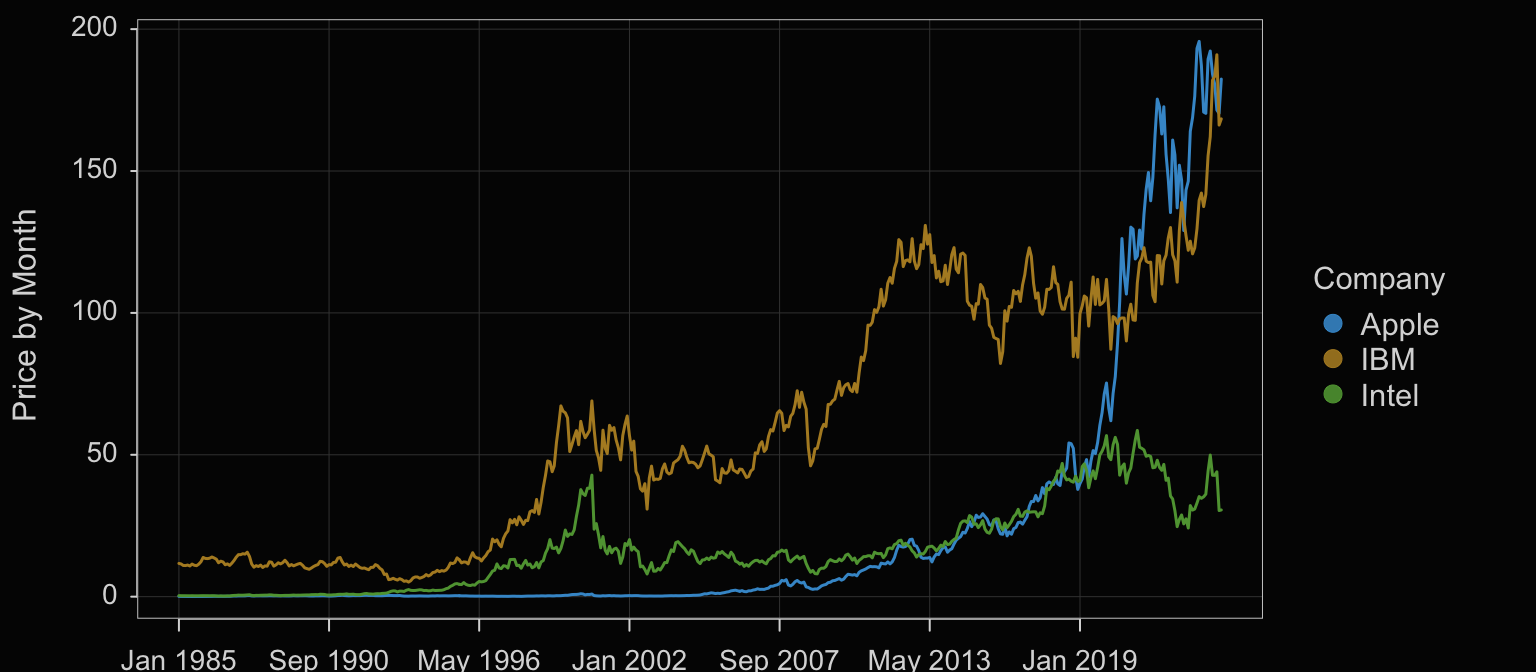
Plot(Month, Price, by=Company)
by: Parameter that specifies to plot a different visualization for each value of a specified categorical variable on the same panel as in Figure 4.4.
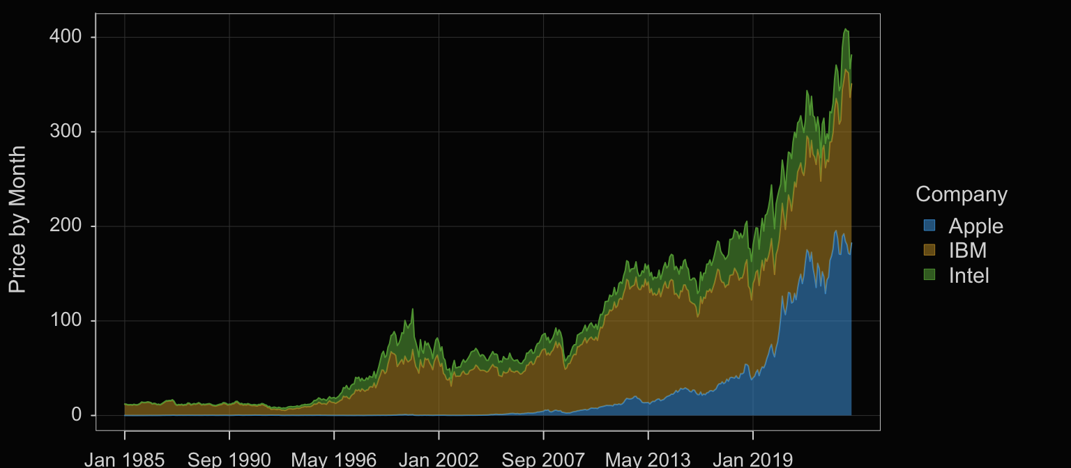
Another option when plotting multiple times series on the same panel offered by some visualization systems is to stack each time series on top of each other, what is often called a stacked area chart.
Plot(Month, Price, by=Company, stack=TRUE, trans=0.4)
Set the parameter stack to TRUE to stack the plots on top of each other. When stacked, the Price variable on the y-axis is the sum of the corresponding Price values for each Company. The y-value for Apple at each date is its actual value because it is listed first (alphabetically by default). The y-value for IBM is the corresponding value for Apple plus IBM’s value. And, for Intel, listed last, each point on the y-axis is the sum of all three prices.
4.3.2 Several Panels
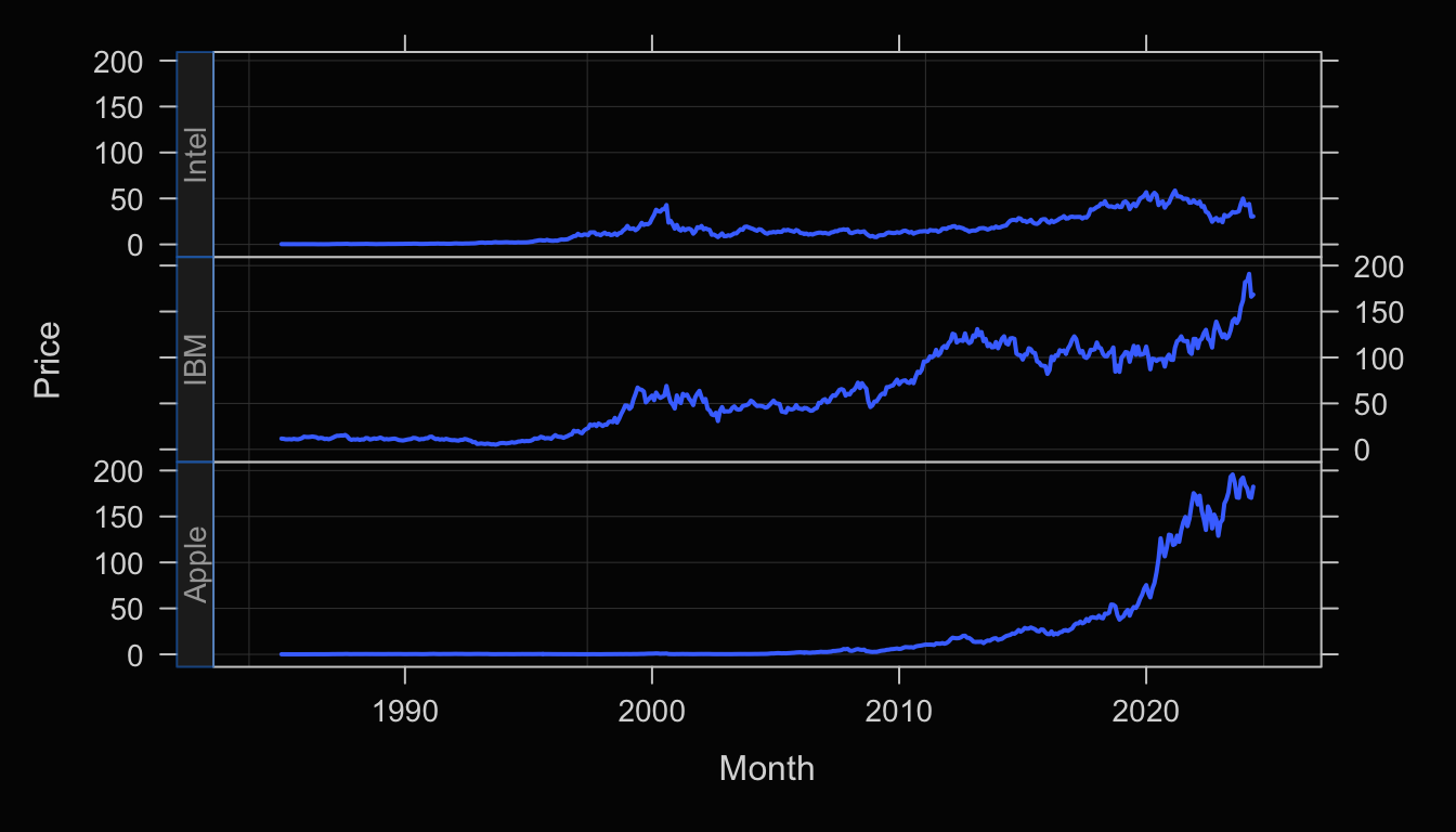
A Trellis plot, also called a facet plot, stratifies the visualization on the levels of a categorical variable by plotting each level separately on a different panel.
Plot(Month, Price, facet1=Company)
facet1: Parameter indicates to plot each time series on a separate panel according to the levels of the specified categorical variable.
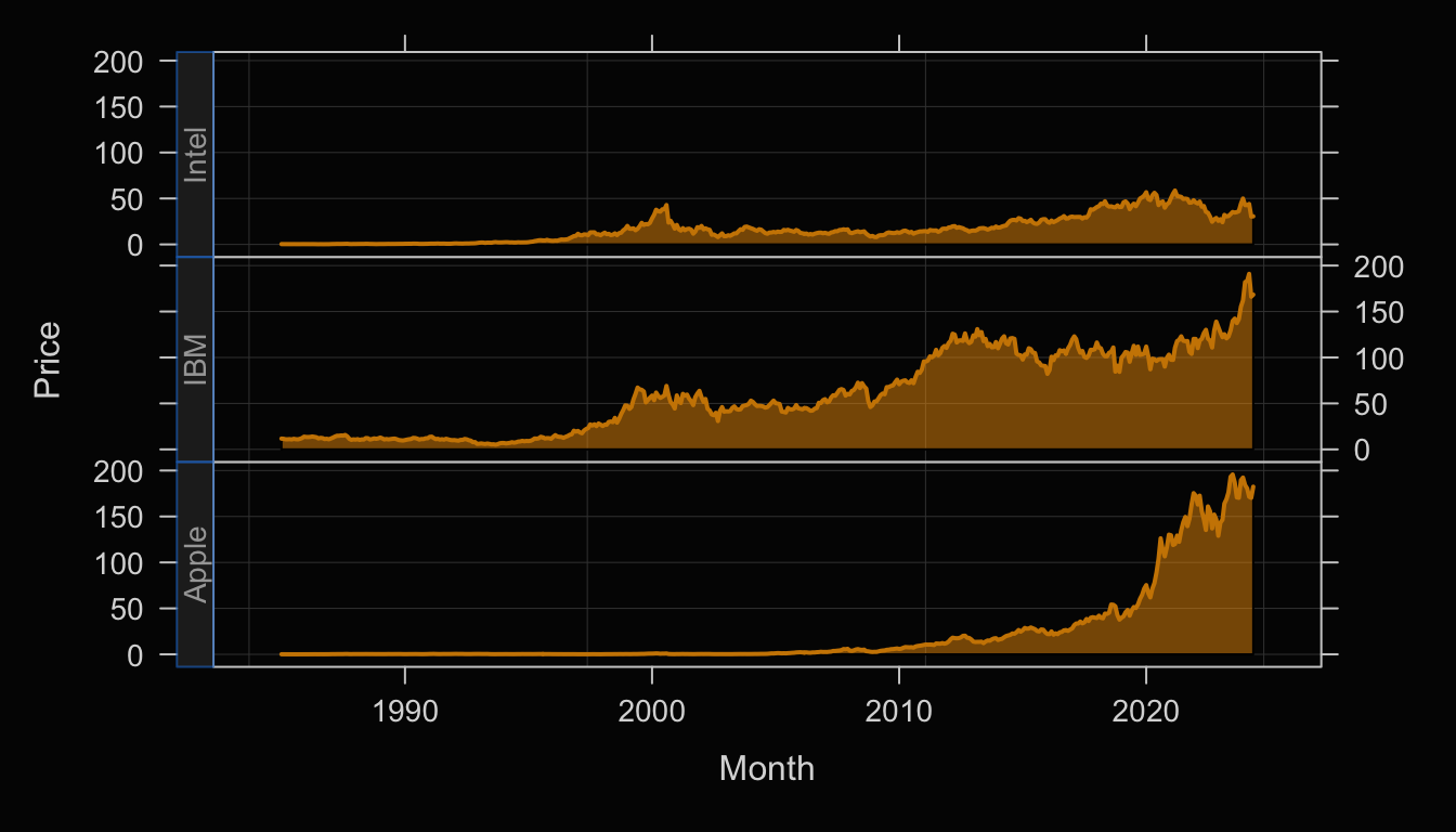
Enhance the Trellis plot with the transparent orange fill against the black background, shown in Figure 4.7.
Plot(Month, Price, facet1=Company,
color="orange3", area_fill="orange1", trans=.55)
4.4 Missing Data
To demonstrate, modify the data table for the Apple stock price by removing the stock price for three years of data, 2017 through 2019. If the date were initially available as an Excel file, then the corresponding cells for the missing values of Price would typically be left blank.
d[385:420, "Price"] <- NA
Rows 385 through 420 represent the data for years 2017 through 2019. The rows of data for those months are still present but the corresponding value of Price is set to the missing data code for R, NA, for not available.
The following brief excerpt from the modified data table shows the value of Price missing for the first four months of 2017. These missing values continue throughout 2019. The NA value is the R code for data that is not available. Each data analysis system has a code for missing data, such as R’s NA. Blank cells, such as in an Excel workbook, would be converted to the missing data code, such as NA, when the data are read into the corresponding analysis system.
         Month Company    Price     Volume
383 2016-11-01   Apple 25.54987 2886220000
384 2016-12-01   Apple 26.91259 2435086800
385 2017-01-01   Apple       NA 2252488000
386 2017-02-01   Apple       NA 2299874400
387 2017-03-01   Apple       NA 2246513600
388 2017-04-01   Apple       NA 1493216400
Figure 4.8 shows the resulting time series visualization. The corresponding time series visualization plots as before, see Figure 4.1, except now there are no plotted values for the rows of data that have Price missing.
The values of Price cannot plot when they are not available. Do note, however, that the data table contains entries even when the monthly Price is missing. For example, monthly data need to be reported as monthly data even if the data value for a corresponding month is not available.
4.5 Aggregate Over Time
Suppose your data are recorded as daily sales but you wish to analyze quarterly sales. Visualizing the data as they exist shows the time series of daily sales. To visualize the time series of sales by quarter, sum the sales for each day across each entire quarter.
Compute a statistic such as a sum or a mean over a range of data, which, for time series data, is over a time unit such as months or quarters.
Of course, you cannot aggregate at a level below the detail at which the data are specified. If you have monthly data as with the Apple stock price data, you cannot specify an aggregation level of weeks because the data are not available. Doing so would lead to a termination of the analysis with an explanatory message.
4.5.1 Aggregate by Sums
Consider three variables in the Superstore data table included with the Tableau data visualization system: Order.Date, Sales, and Profit.
#d <- Read("https://web.pdx.edu/~gerbing/data/Superstore.xlsx")
d <- Read("~/Documents/BookNew/data/Superstore/Superstore.xlsx")
d[1:10, .(Order.Date, Sales, Profit)]
   Order.Date    Sales   Profit
1  2021-01-03   16.448   5.5512
2  2021-01-04    3.540  -5.4870
3  2021-01-04   11.784   4.2717
4  2021-01-04  272.736 -64.7748
5  2021-01-05   19.536   4.8840
6  2021-01-06 2573.820 746.4078
7  2021-01-06    5.480   1.4796
8  2021-01-06   12.780   5.2398
9  2021-01-06  609.980 274.4910
10 2021-01-06   31.120   0.3112
The resulting d data frame is reasonably large, with 10,194 rows of data reporting 10,194 individual sales. As can be seen from the data values for these three variables for the first 10 rows of data, sales are reported daily with generally multiple sales per day. For example, on January 4, 2021, there were three sales for $3.54, $11.78, and $272.74. Their sum represents the total sales for that day.
Because the data are in Excel format, the variable Order.Date is already properly formatted as a date variable. However, there are multiple orders per day, so the time series plot of the original data is not what would be typically desired. At the least, the sales data needs to be collapsed, aggregated, to a daily basis, presumably by summing. For example, the sum of the three sales for January 4, 2021 is $288.06, the value plotted for that date. The result of the aggregation to daily sales provides the data needed to plot the daily time series, shown in Figure 4.9.
Plot(Order.Date, Sales, time_unit="days")
To aggregate with the lessR function Plot(), access the first and possibly the second of the following parameters.
time_unit: Specify a value that is longer than the natural time intervals in the data. Possible values are days, weeks, months, quarters, and years. For example, if each individual sale was recorded along with the date of the sale, then a value of days would aggregate the sales for each day resulting in a daily time series of sales.
time_agg: If the aggregation should be based on the mean, then specify the value of the parameter as "mean". The default value is "sum". For example, if a stock price for a company is recorded weekly and the time series should be visualized as monthly, then the average stock price for a month that generally be the preferred basis for the aggregation.
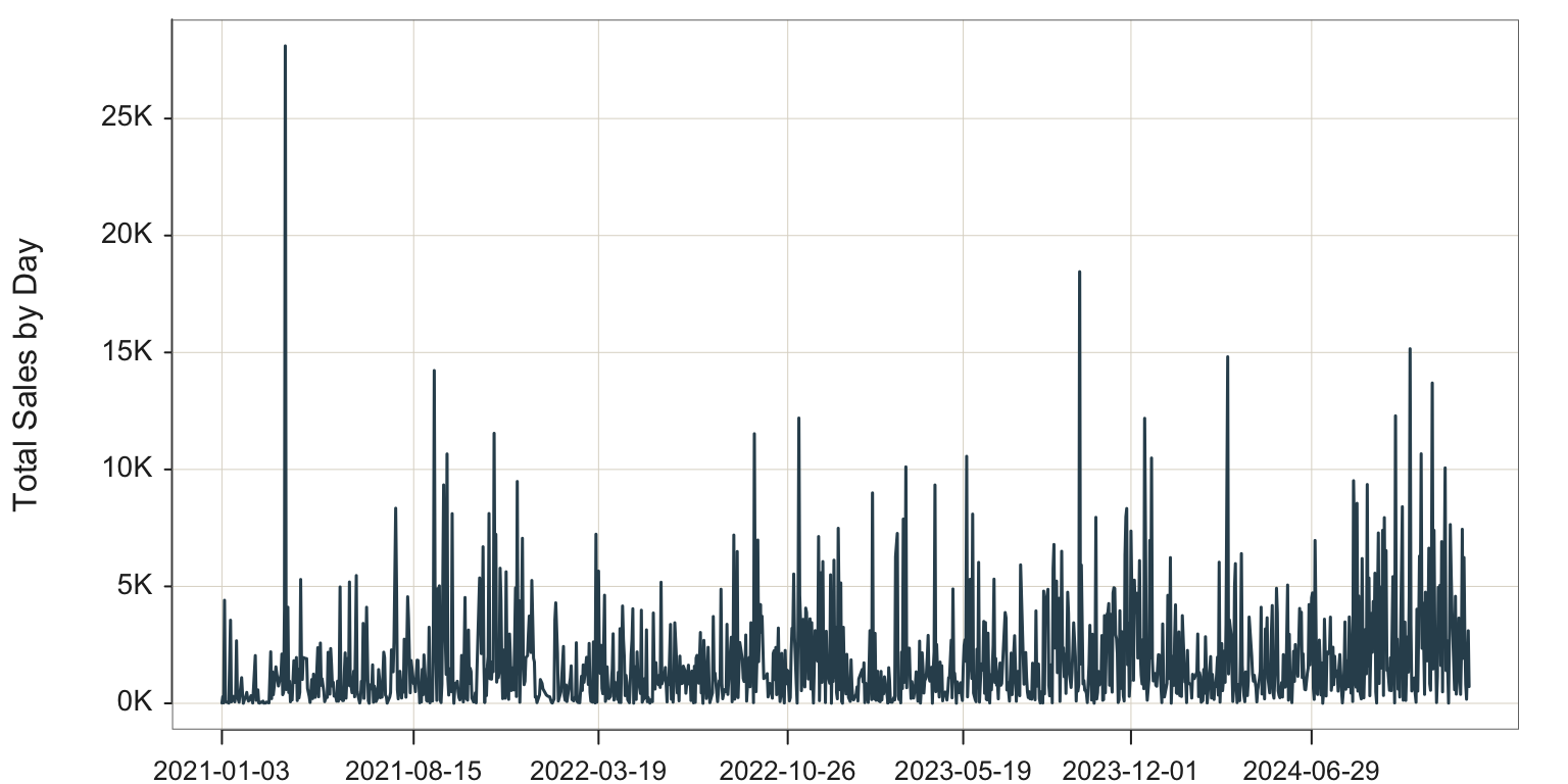
However, even after sales are aggregated by day, the data remain too detailed reporting a time series over three years on a daily basis. Sales at the extreme right of the time series in Figure 4.9 appear to be generally larger than sales at the extreme left of the visualization, but difficult to assess the change more precisely. Moreover, seasonality is also difficult to discern from the visualization of the daily time series. Instead, aggregate the data further by some larger time unit, such as quarters.
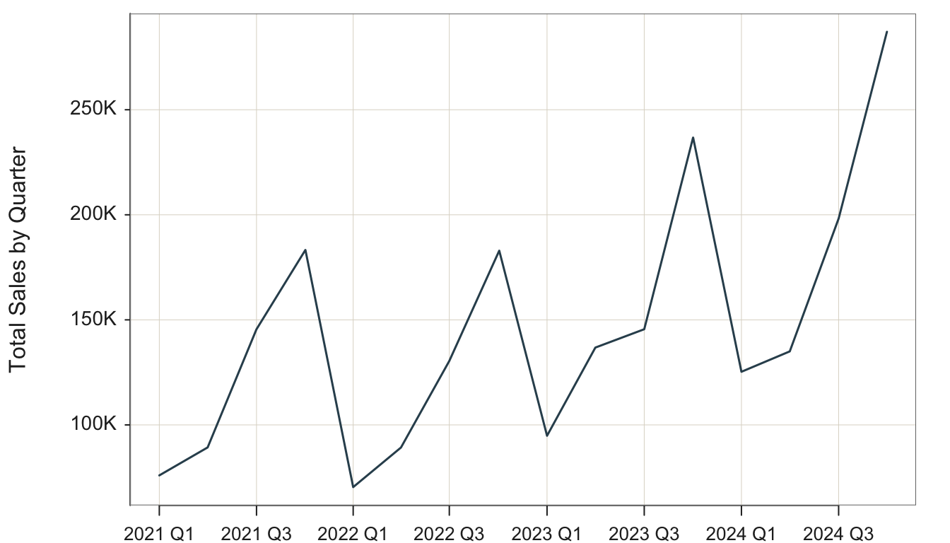
Plot(Order.Date, Sales, time_unit="quarters")
time_unit: Parameter to specify the time unit for the aggregation. Based on functions from the xts package, currently implemented valid values include "days", "weeks", "months", "quarters", and "years".
time_agg: Parameter that specifies the arithmetic operation of the aggregation. The default value is "sum", so no need to specify in this function call.
With aggregation by summing sales over consecutive quarters, the overall increasing trend of sales is evident, as is the consistent seasonal fluctuations with maximum sales at Q4 for each year, shown in Figure 4.10.
In the next example, aggregate by the largest available time unit, years.
Plot(Order.Date, Sales, time_unit="years")
Figure 4.11 shows the trend over the four years.
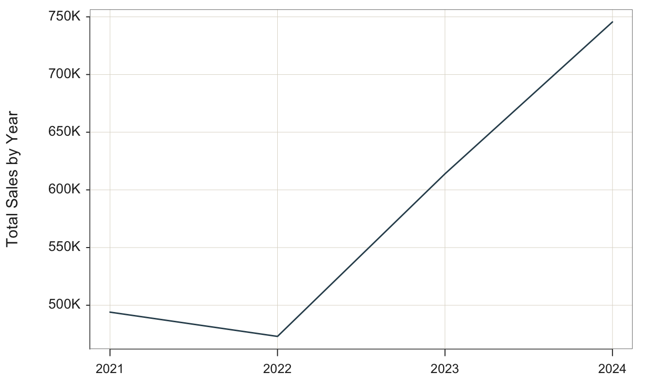
Aggregating by years obscures the seasonal variations with any year but clearly shows the overall trend across years. There was an initial downturn from 2022 to 2023, after which sells increased greatly.
We can compare Sales and Profit on the same visualization by stacking the plot of one time series on top of the other, shown in Figure 4.12.
Plot(Order.Date, c(Sales, Profit), time_unit="years", stack=TRUE)
Specify the second parameter, the \(y\)-variable, as a vector, here of two variables: Sales and Profit.
stack: Parameter that when set to TRUE, stacks the second variable in the visualization, Profit, on top of the first variable, Sales.
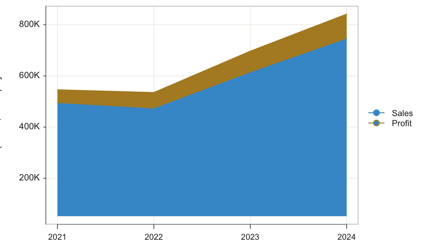
The visualization demonstrates that profitability increased with sales.
4.5.2 Aggregate by Means
Return to the StockPrice monthly data.
#d <- Read("https://web.pdx.edu/~gerbing/data/StockPrice.xlsx")\
d <- Read("StockPrice")head(d) Month Company Price Volume
1 1985-01-01 Apple 0.100055 6366416000
2 1985-02-01 Apple 0.085392 4733388800
3 1985-03-01 Apple 0.076335 4615587200
4 1985-04-01 Apple 0.073316 2868028800
5 1985-05-01 Apple 0.059947 4639129600
6 1985-06-01 Apple 0.062103 5811388800Previous examples visualized the data according to the unit in which the data is collected, monthly. Here, let’s aggregate to quarterly and yearly data. However, unlike the Tableau Superstore data, in this example, we wish to aggregate by mean instead of sum. In the Superstore data, each original data point, a recorded sales, is a part of the overall whole, such as a part of daily sales or monthly sales. To get the full daily sales or the full monthly sales we cumulate the sales over that period.
However, for stock price, each monthly stock price indicates a value for the given time unit. To aggregate, we want the average stock price over the given time period to represent the value of the stock during that time period. In this example, focus on Apple’s stock price as in Figure 4.13.
Plot(Month, Price, filter=(Company=="Apple"),
time_unit="quarters", time_agg="mean")
filter: Parameter to specify the logical condition for selecting rows of data for the analysis. Note that in versions of lessR prior to 4.3.3, this parameter was named rows.
time_agg: Parameter to specify the arithmetic operation for which to aggregate over time. The default value is "sum", so explicitly specify to aggregate by the "mean".
size: Parameter to specify the size of the plotted points. By default, when plotting a time series, lessR, default size of the points is 0. Set at a positive number to visualize the plotted points, which are by default connected with line segments.
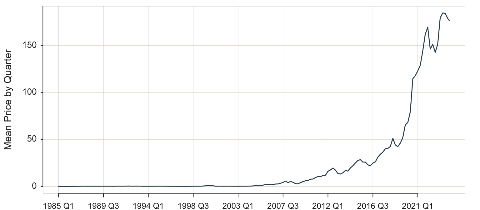
Or, aggregate yearly for a smoother curve focusing more on the overall trend, shown in Figure 4.14.
Plot(Month, Price, filter=(Company=="Apple"),
time_unit="years", time_agg="mean")