2 R Visualization Quick Start
Data analytic projects typically begin with the pursuit of answers to three fundamental questions. Seeking the answers to these questions motivates the three corresponding categories of visualizations introduced in this section. There are other types of visualizations, such as geographical maps and network structures, but these three essential classes of visualizations apply to a wide range of analytics projects.
Question: How are the data values for a variable patterned?
Answer: Distribution of the values of a variable
Visualization: categorical variable — Bar chart, dot plot, bubble plot
Visualization: continuous variable — Violin plot, boxplot, scatterplot, density plot, histogram, frequency polygon
Question: Are two or more variables related?
Answer: Joint distribution of the values of the variables
Visualization: categorical variables — Stacked bar chart, bubble plot, mosaic plot
Visualization: continuous variables — Scatterplot
Question: How do the values of one or more variables change over time?
Answer: Distribution of the values of the variables over time
Visualization: continuous variable — Run chart, time series chart
This chapter introduces R visualizations to answer each of these fundamental questions. More detail follows in subsequent chapters.
2.1 R Visualization Systems
As people throughout the world use R for data analytics, the functions from three different sets of R contributed packages have generated most of the resulting visualizations:
- base
R(R Core Team 2019)graphicspackage - Deepayan Sarkar’s (Sarkar 2008)
latticepackage - Hadley Wickham’s (Wickham 2016)
ggplot2package.
Your author’s (Gerbing 2014) lessR visualization functions provide a simplified interface to the first two packages, the base R graphics package and the lattice package.
2.1.1 Relative advantages of ggplot and lessR
2.1.2 Grayscale
2.2 Distribution of a Categorical Variable
bar chart: Associate a numerical value proportional to the height of a bar, for each value of a categorical variable. Associate a numerical value with each category, or level or value of a categorical variable to create one of the most prominent data visualizations. An example of a corresponding visualization, the bar chart, presents a bar of proportionate height according to the numerical value associated with the corresponding category. Find more detail for bar charts and related visualizations in the chapter for categorical variables. A numerical variable commonly plotted is the Count, the tabulation of how many data values occur at each level of the categorical variable.
2.2.1 Bar Charts of a Single Variable
Tabulate the values of each level of a categorical variable in this example. Consider the employee data set. This table of data contains variables such as Salary, an employee’s annual salary, and Dept, the department in which the employee works.
How many employees work in each department? To answer, first read the data values from an external file, here from a data frame included with lessR, the Employee data frame. Read the data into the R data frame called d. Then generate a bar chart.
Figure 2.1 shows the default versions of the lessR and ggplot2 bar charts.

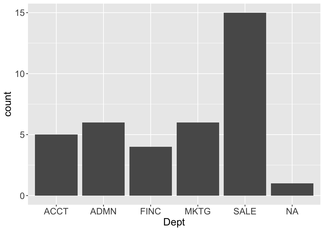
Figure 2.1: lessR and ggplot2 default one-variable bar charts.
Python
d = pd.read_excel('http://lessRstats.com/data/employee.xlsx')

Plotnine: ( ggplot(d, aes('Dept')) + geom_bar() )
Seaborn: sns.countplot(x='Dept', saturation=.5, data=d)
“Default” means that the visualization functions set the visual aesthetics such as the color of the bars, though all such aesthetics can be easily customized. Also, by default ggplot2 plots the number of NA values, that is, values Not Available, the missing data values, whereas lessR lists the number of missing values as part of the text output at the R console.
Table 2.1: Four equivalent lessR function calls to generate the same bar chart and analysis.
| Function Call | Explanation |
|---|---|
| BarChart(x=Dept, data=d) | Parameter and data table both explicitly specified |
| BarChart(Dept, data=d) | Unlabeled value in first position is the x-variable |
| BarChart(Dept) | Default lessR data table is d |
| bc(Dept) | Abbreviation for BarChart() is bc() |
2.2.2 Bar Charts of Multiple Variables
2.2.2.1 Multiple single bar charts
2.2.2.2 Stacked bar charts
stacked bar chart: Divide a single bar for a categorical variable into regions, one for each level.
For data sets with categorical variables that have different response scales, such as Dept and Gender from the Employee data set, each bar chart in a set appears on its own window by default. The BarChart() default changes, however, for a set of variables that share the same response scale, such as each of the 20 Mach IV (Christie and Geis 1970) items assessed with a 6-pt Likert scale. Then BarChart() plots a single visualization as a set of stacked bar charts, one bar for each variable, an individual item in this context.
Multiple bubble plots provide an alternate visualization of these responses.
The counts of the response categories for each item displays as a single bar. Instead of separate bars for the levels of the categorical variable, divide each single bar into regions that correspond to the response categories, as illustrated with the responses to the 20 Mach IV items in Figure 2.2.
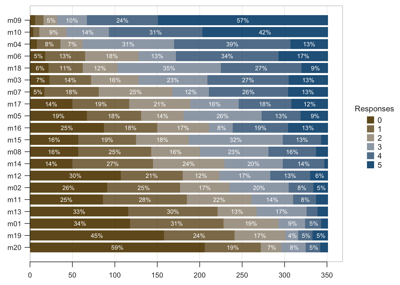
Figure 2.2: For each of the 20 Mach IV items, a stacked bar chart of 6-pt Likert scale responses sorted by mean level of agreement for 351 respondents.
BarChart() analyzes the responses to the categorical variables and then sets the parameter one_plot as TRUE or FALSE accordingly. Or, override the default as preferred. Even with different response scales, variables can be plotted on a single panel. Or, separate visualizations can be generated even for variables with the same response scale.
2.3 Distribution of a Continuous Variable
2.3.1 Default histogram
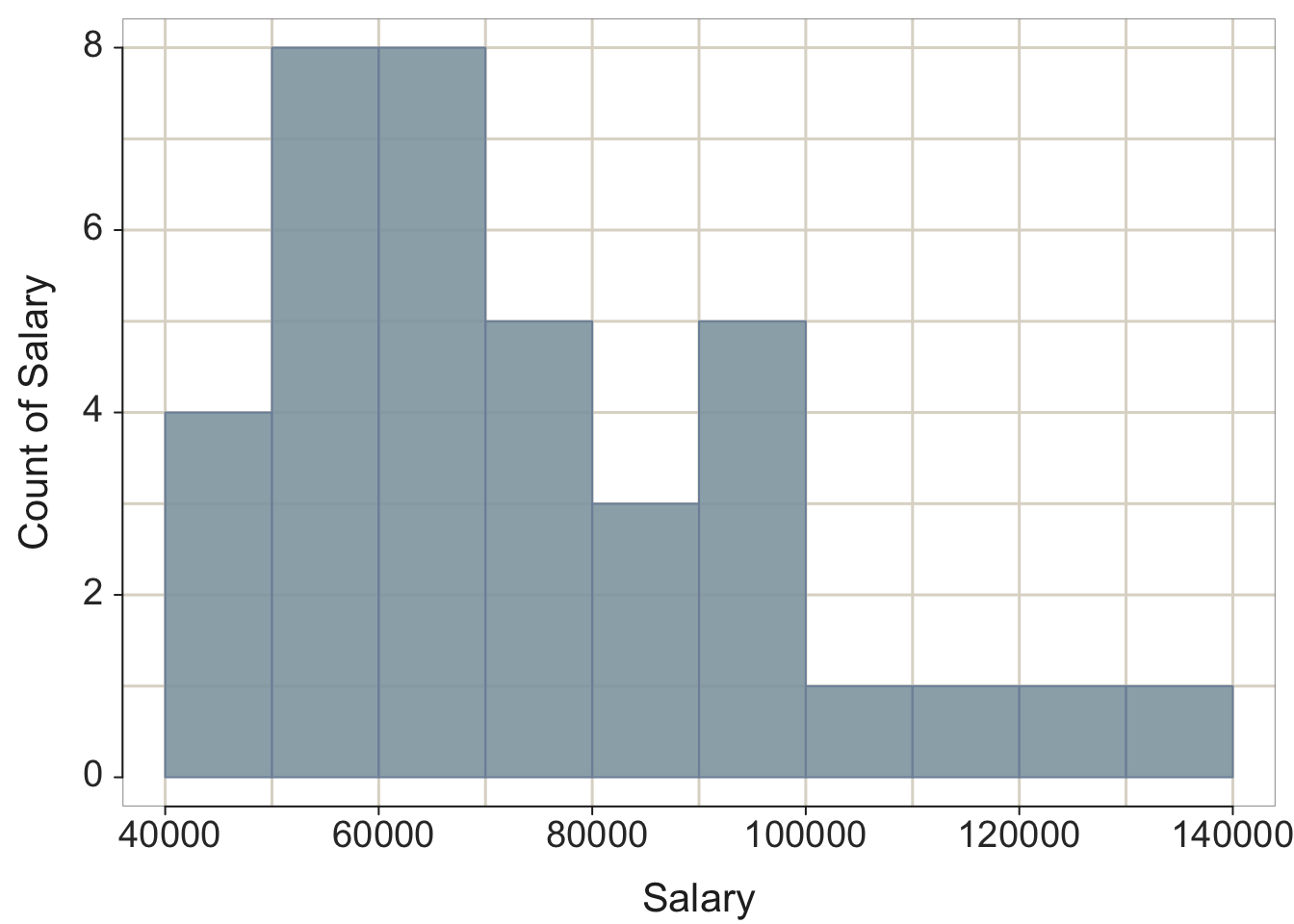
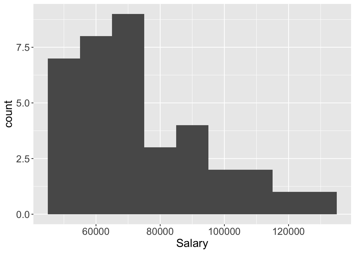
Figure 2.3: lessR default histogram, and ggplot2 histogram with set bin width.
2.3.2 Beyond the histogram
VBS Plot: Integrated violin, box and scatterplot for the display of the distribution of a continuous variable. Modern computer technology provides for more effective visualizations than the 19th-century histogram, such as with the VBS plot for the display of the distribution of a continuous variable (Gerbing 2019). The VBS plot integrates three different but complementary plots into a single visualization: a violin plot (Hintze and Nelson 1998), a box plot (Tukey 1977), and a 1-variable scatterplot, and then automatically tunes the completed visualization in terms of the sample size and other characteristics of the distribution. Find a more extensive discussion of all three subplots and of the VBS plot in Chapter 5 beyond the following introduction.
Figure 2.4 illustrates the lessR and ggplot2 VBS plots for a small data set of 37 annual salaries.
lessR::Plot(Salary)
ggplot2::ggplot(d, aes(x="", y=Salary)) +
  geom_violin(fill="gray90", bw=9500, alpha=.3) +
  geom_boxplot(fill="steelblue", width=0.20) +
  geom_jitter(shape=16, position=position_jitter(0.02)) +
  theme(axis.title.y=element_blank()) +
  coord_flip()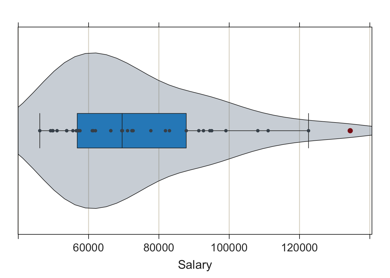
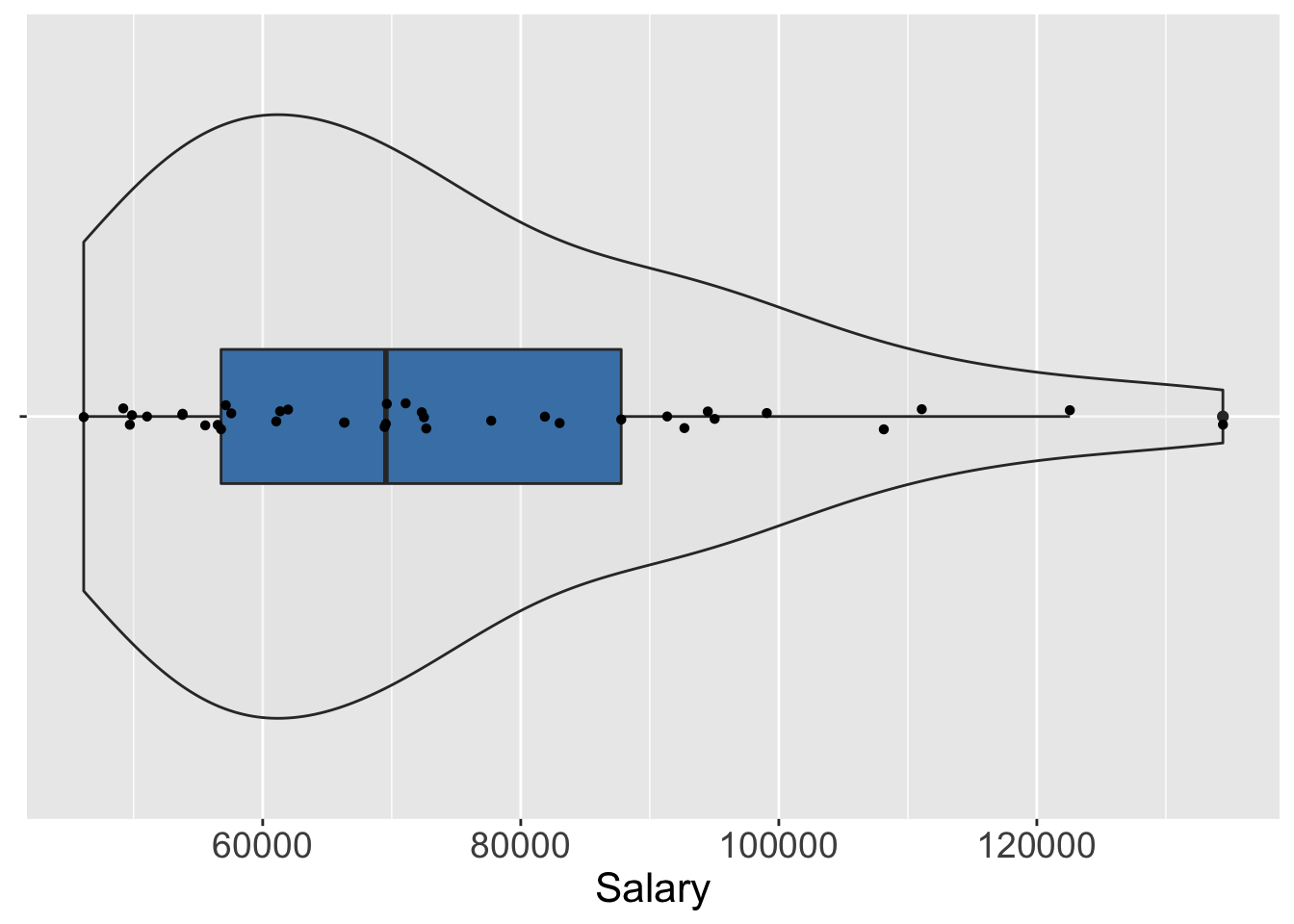
Figure 2.4: lessR default VBS plot and ggplot2 constructed VBS plot.
The VBS plot of Salary shows that for these 37 employees, the most frequently occurring salaries range from $40,000 to $60,000, with relatively few salaries over $100,000. The boxplot marks the highest value of Salary, over $120,000, as an outlier, a concept explored in detail in Chapter 5.
The VBS plot demonstrates a primary goal of lessR: Conceive of what is most useful, and then provide the relevant visualization with a simple function call given appropriate defaults. The lessR function Plot() generates the VBS plot given the values of a single continuous variable. Plot() by default adds each component of the plot – violin plot, box plot and scatterplot – as a separate layer, and automatically adjusts characteristics of the plot according to the sample size and distribution type. In contrast, to use ggplot2 to construct the VBS plot, explicitly add each of the three components as separate layers, each with its own geom and then run successive visualizations manually tuning the parameters such as bandwidth and point size to obtain the desired result.
To re-iterate a basic theme of much of this book: lessR provides the simplicity to obtain a pre-programmed result and ggplot2 provides the flexibility, at the cost of additional complexity, to create what can be conceptualized.
2.4 Relation Between Two Variables
scatterplots: For each observation, the values of n variables plotted as a point in an n-dimensional coordinate system. Represent data values as plotted points with the scatterplot, a 19th-century invention by Francis Galton (Friendly and Denis 2005). relationships: As the values of one variable increase, the values of the other variable tend to either systematically increase or decrease. The scatterplot relates two continuous variables by their joint data values, with an axis for each variable. Each point on a two-dimensional scatterplot represents the values of the two variables for a single observation. Plot the respective values for the variables as the coordinates of the two axes.
2.4.1 Basic Scatterplot
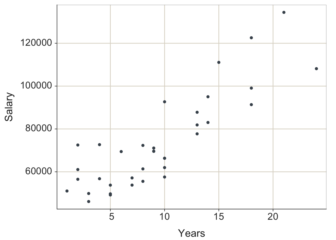
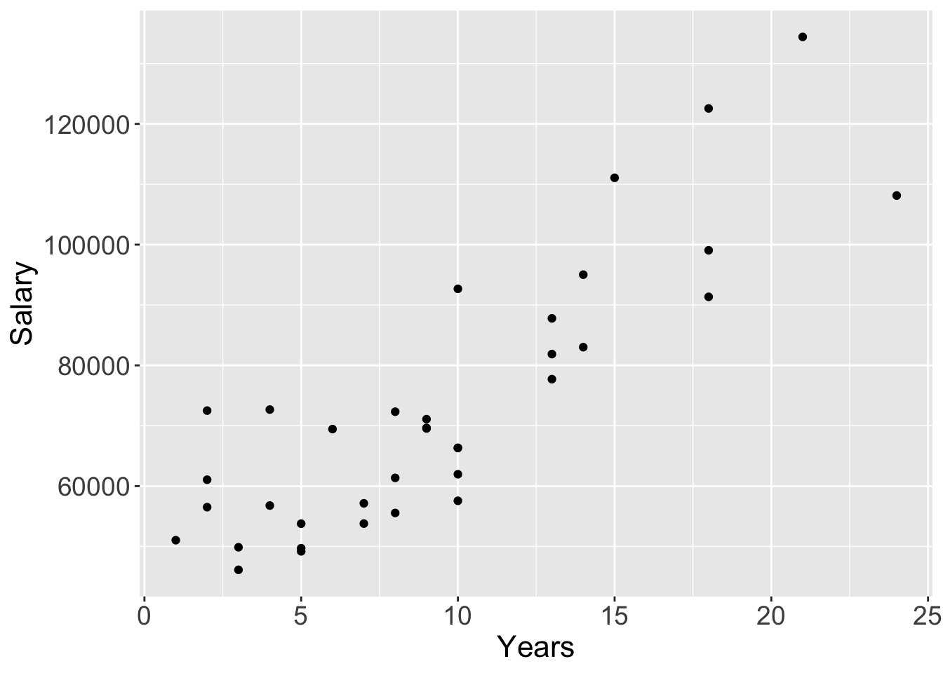
Figure 2.5: lessR and ggplot2 default scatterplots.
2.4.2 Enhanced Scatterplot
Enhance the scatterplot to further assist visualizing the relationship. The 95% confidence ellipse from the bivariate normal distribution helps to visualize the relationship between the variables. The best-fit least squares line plotted with the corresponding 95% confidence bands summarizes the (linear) relationship. The identification of potential outliers with a re-computation of the best-fit line without the outliers present calibrates their influence on the estimated relationship. Delineating the four quadrants of the plot further assists in visualizing the nature of the underlying relationship.
Figure 2.6 shows all of these features for the lessR visualization and all except the outlier analysis for ggplot2. The corresponding ggplot2 visualization does not identify the outliers, nor present the alternative best-fit line without the outliers. The flexibility and freedom to customize of ggplot2 means that it could also create the same visualization in Figure 2.6a.
Mahalanobis distance: Multivariate measure of distance.
However, to do so would require many more lines of code that would include the calculation of Mahalanobis distance of each point from the center to identify outliers, the deletion of the outliers from the data set, and then the re-calculation and display of the regression line for the data without the outliers.
lessR::Plot(Years, Salary, enhance=TRUE)
ggplot2::ggplot(d, aes(Years, Salary)) + geom_point() +
  geom_smooth(method=lm) +
  stat_ellipse(type="norm") +
  geom_vline(aes(xintercept=mean(Years, na.rm=TRUE)), color="gray70") +
  geom_hline(aes(yintercept=mean(Salary), na.rm=TRUE), color="gray70")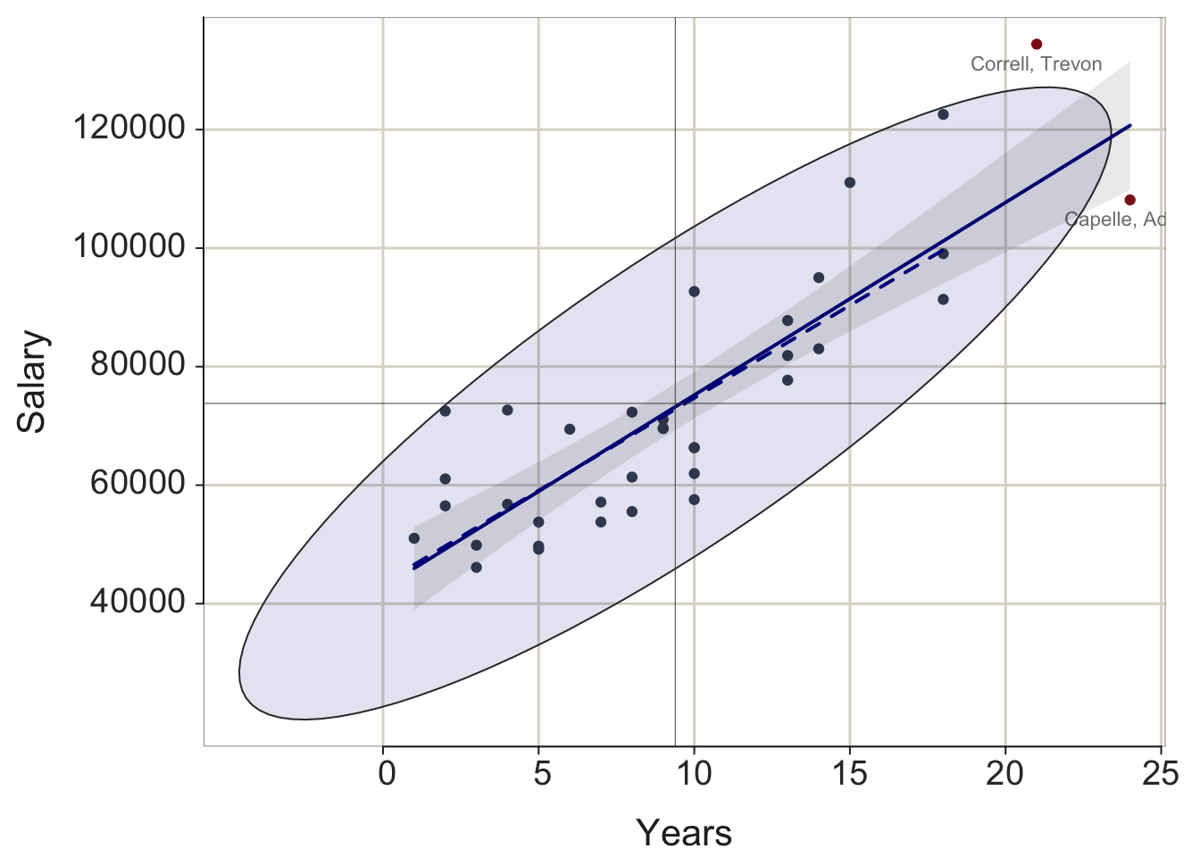
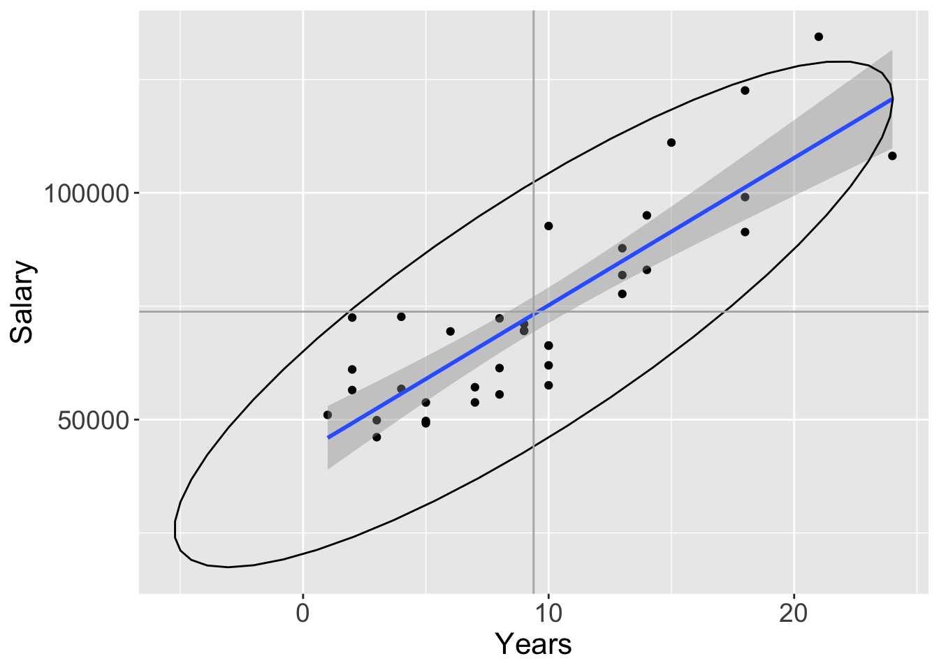
Figure 2.6: lessR and ggplot2 enhanced scatterplots.
Consistent with the lessR perspective, create the enhanced visualization by setting a single parameter, enhance to TRUE, with the additional layers automatically generated. Consistent with the flexibility of ggplot2, a distinct function call generates each component of the resulting visualization in Figure 2.6. If lessR has a parameter option for what is desired, then much simpler to use, but for the many possibilities not pre-programmed into lessR functions, ggplot2 provides the ultimate toolkit for generating customized visualizations.
For ggplot2, obtain the best-fit least-squares line and associated default 95% confidence interval with geom_smooth(). By default, the line is plotted in blue, so obtain grayscale by specifying a color such as “black”. Obtain the 95% confidence ellipse with stat_ellipse(). The type="norm" argument specifies the assumption of multivariate normality. Plot the vertical and horizontal lines with geom_vline() and geom_hline(). The respective xintercept and yintercept arguments indicate where to place the lines on the corresponding axes. In the computation of the respective means, the na.rm parameters instruct R to calculate the mean even in the presence of missing data. Otherwise, the computation fails if there are missing data values.
2.5 Distribution of Values over Time
2.5.1 Time Series
d$date <- as.Date(d$date, format= "%m/%d/%Y")
lessR::Plot(date, Price, by=Company)
ggplot2::ggplot(d, aes(date, Price, color=Company)) + geom_line()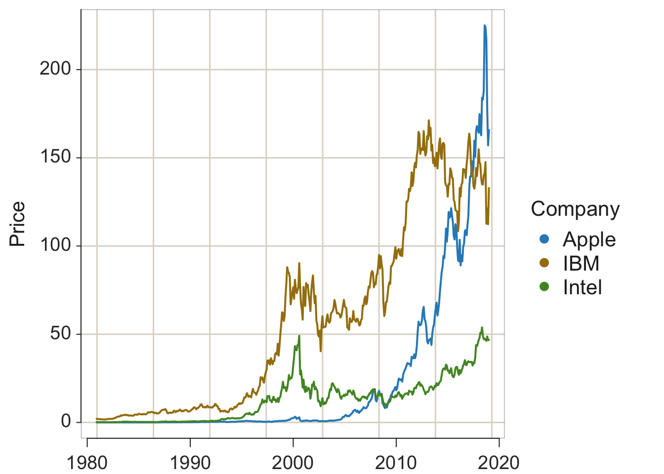

Figure 2.7: lessR and ggplot2 default time series plots.
2.5.2 Multiple Time Series
d$date <- as.Date(d$date, format= "%m/%d/%Y")
lessR::Plot(date, Price, by=Company)
ggplot2::ggplot(d, aes(date, Price, color=Company)) + geom_line()
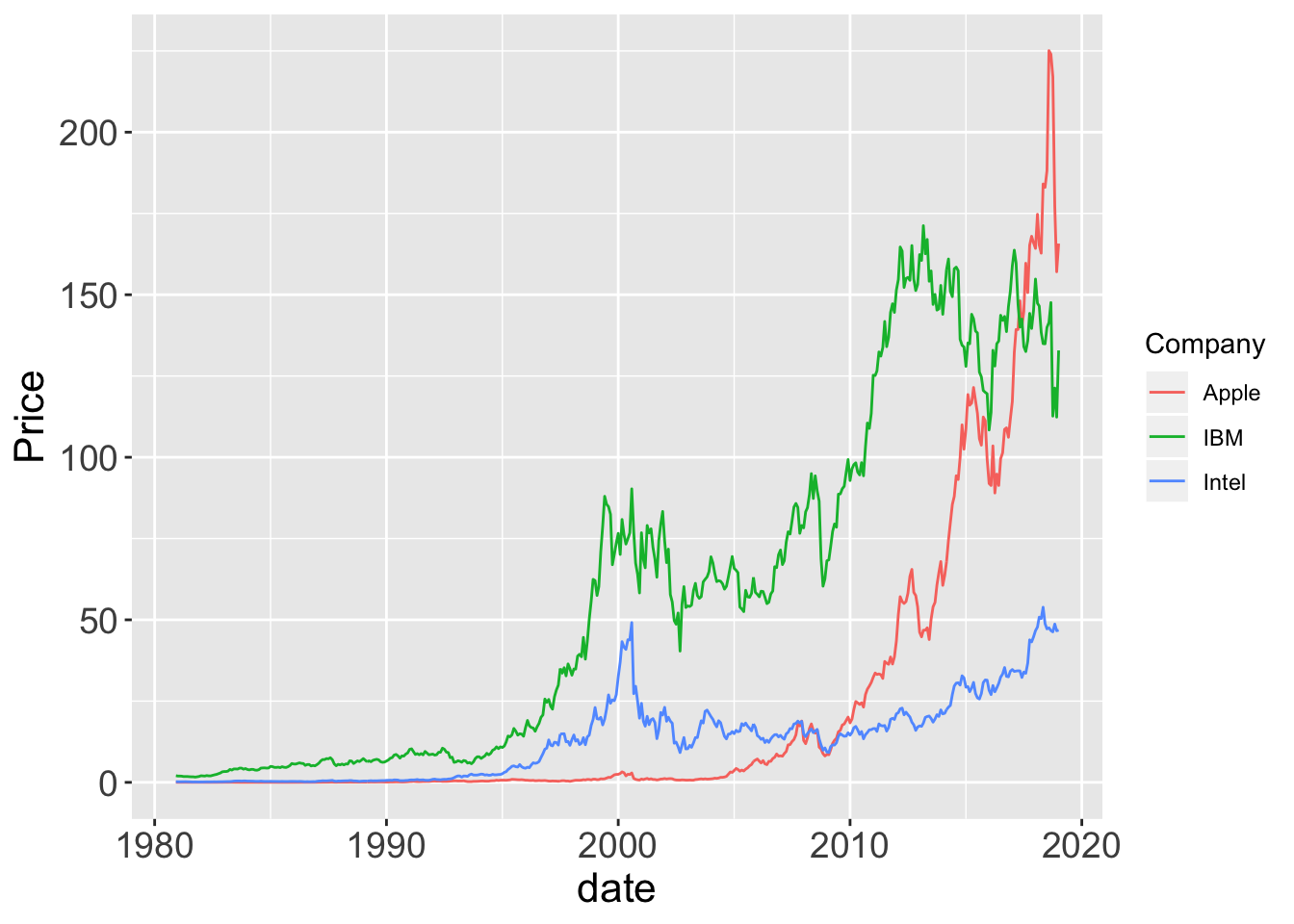
Figure 2.8: lessR and ggplot2 default time series plots.
d$date <- as.Date(d$date, format= "%m/%d/%Y")
lessR::Plot(date, Price, by1=Company)
ggplot2::ggplot(d, aes(date, Price)) + geom_line() +
               facet_grid(rows=vars(Company))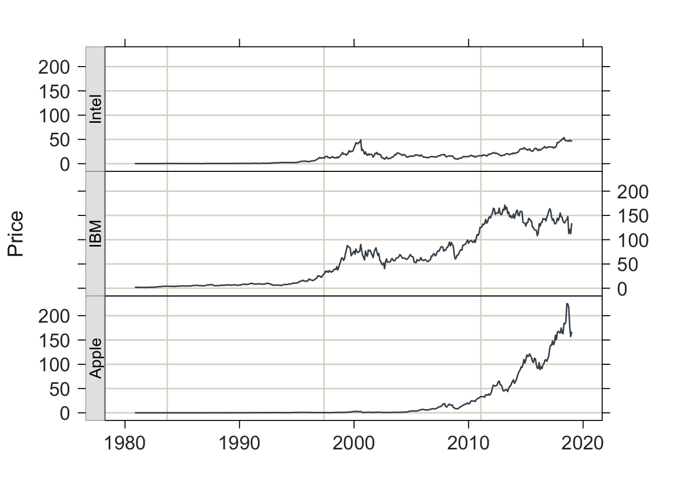
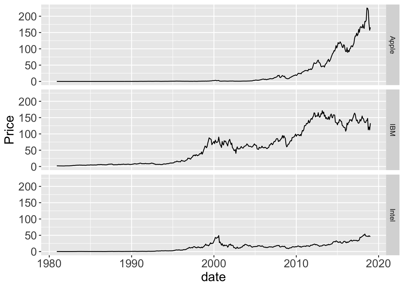
Figure 2.9: lessR and ggplot2 .
Page built: 2019-10-06