3 Visualize a Categorical Variable
3.1 Bars, Dots, and Bubbles
3.1.1 Horizontal Bar Chart of Counts
3.1.2 Cleveland Dot Plot of Counts
3.1.3 Bubble Plot of Counts
3.1.4 Display Proportions
3.2 Multiple Plots on a Single Panel
3.3 Provide Numerical Values
3.3.1 Bar Chart of Individual Data Values
3.3.2 Vertical Long Value Labels
3.3.3 Cleveland Dot Plot of Individual Data Values
3.3.4 Visualize Means across Categories
3.4 Communicate with Bar Fill Color
3.4.1 Bar Fill Color Bifurcated by Value of Mean Deviations
3.4.2 Bar Chart of an Ordinal Variable
3.4.3 Custom Color for Individual Bars
3.5 Create a Report from Saved Output
3.6 Part-Whole Visualizations
3.6.1 Doughnut and Pie Charts
# ggplot2
ggplot(na.omit(d), aes(x="", y=stat(count), fill=Dept)) +
  geom_bar() + coord_polar(theta="y") +
  theme_void()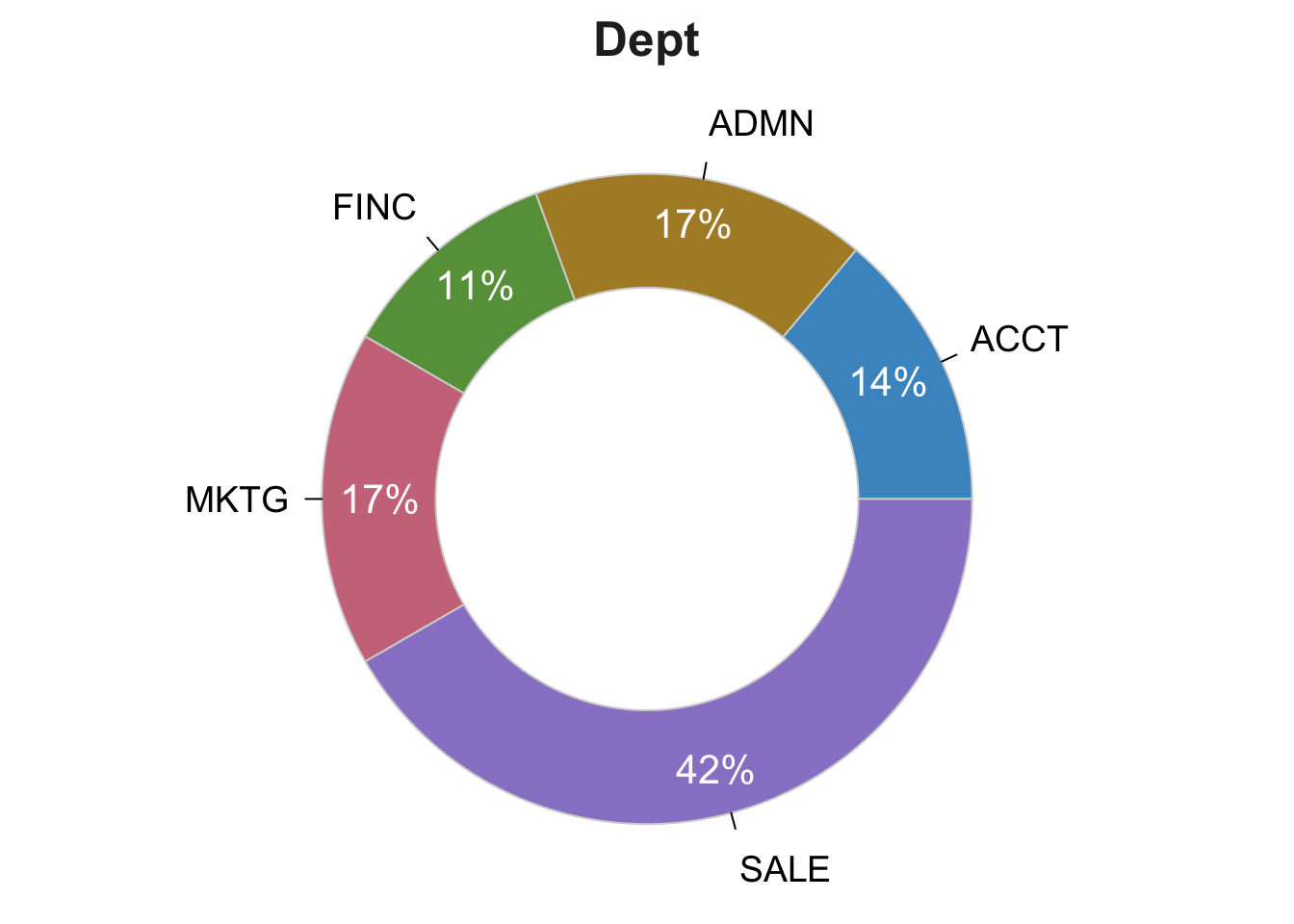
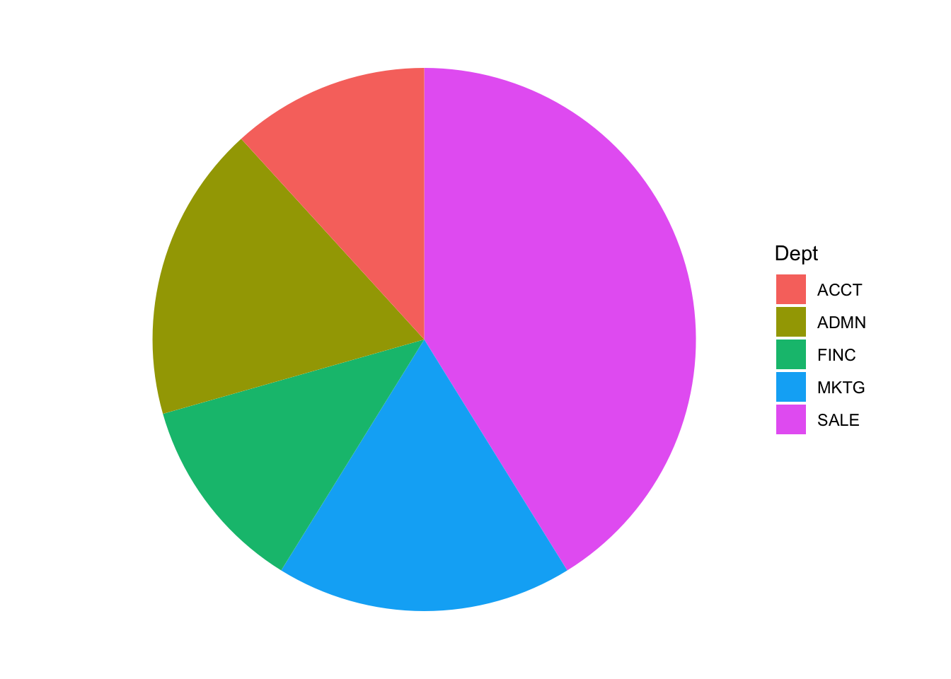
Figure 3.1: lessR and ggplot2 .
3.6.2 The Waffle Plot
3.6.3 The Treemap
3.7 Presentation Quality Base R Bar Chart
Page built: 2019-10-06