Data Analysis
Comparing
Means Across Categories
 Now
that you have created a new variable, you can use it in any kind of analysis,
along with your other variables. I might choose to see if "EQEFFORT,"
the sense that work is distributed evenly, is related to age or level in
school (by running a correlation analysis), but for this example I chose
to see if it is related to the way groups organize their work.
Now
that you have created a new variable, you can use it in any kind of analysis,
along with your other variables. I might choose to see if "EQEFFORT,"
the sense that work is distributed evenly, is related to age or level in
school (by running a correlation analysis), but for this example I chose
to see if it is related to the way groups organize their work.
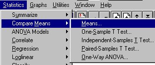
Click on "Statistics" (on the top menu bar), then "Compare
Means." (You could also click on "ANOVA Models," but "Compare
Means" is easier for a beginner to use.)
 Again
I have several choices. If I want to compare just two categories (Males
to Females, for example) I could click on "Independent Samples T Test."
Since my Independent Variable has three values, I can use either "One-Way
ANOVA" or "Means..." Again I choose "Means" for
this example because it is easier for a beginner to use.
Again
I have several choices. If I want to compare just two categories (Males
to Females, for example) I could click on "Independent Samples T Test."
Since my Independent Variable has three values, I can use either "One-Way
ANOVA" or "Means..." Again I choose "Means" for
this example because it is easier for a beginner to use.
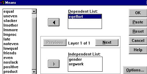
I click on ORGWORK, my Independent Variable, and add it to the "Independent
List" box.
Notice that I also add GENDER: "Compare Means" can
be used with a variable that takes only two values. I then click on my
newly created variable, "EQEFFORT," and add it to the Dependent
List. 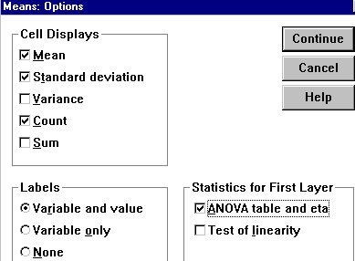 If
I wanted, I could add other ordinal or ratio-level values to the Dependent
List, but I want to keep it simple. I could just click on "OK,"
but I would like to generate some statistics, so I click on "Options..."
and a new window opens.
If
I wanted, I could add other ordinal or ratio-level values to the Dependent
List, but I want to keep it simple. I could just click on "OK,"
but I would like to generate some statistics, so I click on "Options..."
and a new window opens.
I make certain that the Cell Displays box is checked to display the
Mean, Standard deviation, and Count (number of subjects in each category).
I make certain the Variable and value labels are checked. And I check the
box for ANOVA table and eta - just for purposes of illustration. (Since
my sample is not a random sample and I do not have random assignment to
conditions, these statistics will not be very meaningful.)
Now click on "Continue," to return to the first window, and
"OK," to run the analysis.
The output from this analysis is shown in the table to the right and
below. The top part of the table gives the mean for each group, followed
by the standard deviation for each group, the Sum of Squares, and the number
of cases in each group. 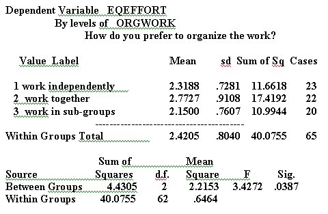 Sum
of Squares has to do with the Analysis of Variance (for a detailed explanation,
consult a good statistics textbook).
Sum
of Squares has to do with the Analysis of Variance (for a detailed explanation,
consult a good statistics textbook).
The bottom part of the table gives the output of the Analysis of Variance.
If this data set were based on a random sample, or on random assignment
to conditions, the results would be significant at p < .05. Given that
the data set is not based on a random sample, however, the statistical
significance level is not very informative.
I have edited the SPSS outpu to make it fit better in this screen.
Warning: The output from SPSS is still not very easy to
read. Do not just copy this into the text of a written report, or
onto an overhead transparency! You will need to do considerable work before
this table can be presented in a report. I will discuss presentation of
results in the next section, Presenting your results.
As noted in the foregoing, SPSS will prepare charts and tables. However,
I find the charts and tables prepared by Excel easier to use and format.
You can easily copy your results from the SPSS output windows into Excel
- or any other Windows based spreadsheet, where you can format them as
you like. Just block the material you want to copy and give the "copy"
command, either through "Edit" or by hitting "Control-C."
You can also copy into your word processing software - but you may have
to fix the tabs to get the table back into readable format.
Continue on to Cross Tabs Example
Return to:
Top of this page
SP399 Home Page
David Ritchie's Home Page
Communication Studies
Mainpage
 (PSU
Home Page)
(PSU
Home Page)
This page is maintained by David Ritchie, e-mail:
cgrd@odin.cc.pdx.edu
Last updated on July 29, 1999.