Data Display
This section will discuss how to display your results in a way that makes sense to your readers or audience.
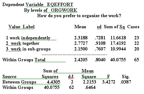
Take a look at the results of the analysis from the point of view of your audience. Notice how cluttered it seems, how difficult it is to pick out what is important and what is not. Does the reader really need to see the mean and sd carried to four decimal places? Question: Which digit in the mean is the most important? Which digit tells you how different the results are?
In general, you should round each number to the meaningful digit - subject to conventions of data display. For "Mean" and "sd," the meaningful digit appears to be the first decimal place. It is conventional to show sd to two decimal places - and sometimes a single digit looks incomplete - but I have chosen to show sd to only one decimal place in order to present a simple, clean table.
"Significance" is usually shown to two or three decimal places,
or transformed to "p < .05," "p < .01," or "p
< .001," whichever is accurate. If the data satisfy the assumptions
of the ANOVA model (which these do not), it suffices to show the ANOVA
statistics as follows: F(2,62) = 3.43, p < .05. 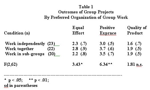
If your audience is likely to include people who are fairly sophisticated users of statistics, include the information about Sum of Squares and Mean Square; otherwise omit it.
Other space-saving conventions: The number of cases (n) is often shown in parentheses immediately after each value (category) label, and the sd is often shown in parentheses either immediately after the mean or in the line below the mean. This allows you to display the means for several dependent variables in a single table, as shown to the right.
Because I have shown three dependent variables, I display the F statistics
for each dependent variable in the same column, beneath the means, separated
by a double space to avoid confusion. 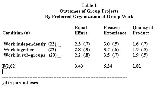
I show the significance levels by way of illustration - in an actual published report I would omit them because the sample does not justify their inclusion.
I have shortened the word, "Experience" to "Exprnce" to save space. However, now that I have eliminated so much extraneous detail from the table, I can probably spell it out without making the table look to cluttered.
The final table, as I might include it in a published report, is shown to the right and above.
I could also blow the table up to at least double this size in order to make an overhead transparency for an oral presentation. Either way, notice how easy it is to compare the value of each dependent variable across values of the independent variable, and to get the overall picture at a glance.
As you no doubt know, many people find it easier to understand data
in graphic form than in a table. 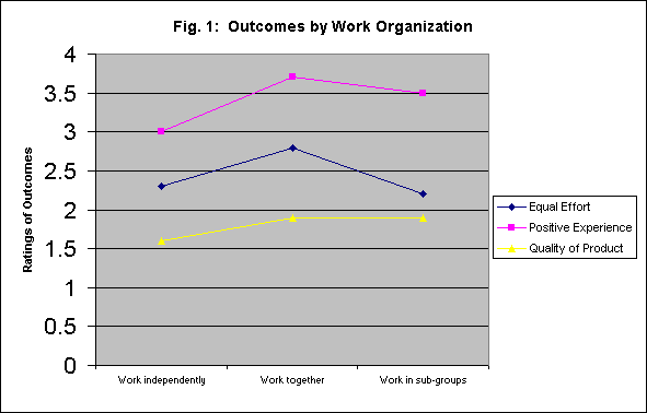
I often prefer to display data both in a table and in a chart or graph. To the left, and in the following, are several ways to display the information in the table. Which way you choose will depend in part on your own stylistic preferences, in part on your rhetorical purposes.
These charts were all produced in Excel, by copying the means from the SPSS analysis into an Excel worksheet. Each of the first four charts shows ratings of outcomes by how the work is organized.
The first chart, to the left and above, shows a line graph of ratings
of outcomes by how the work is organized. Each line represents ratings
for a different outcome: Perceived Equality of Effort, Positive Experience,
and Quality of Product. 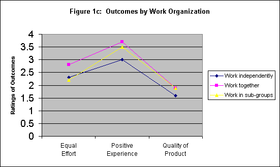
In the chart below and to the left, ratings are shown across outcomes. The lines represent how work is organized. Either chart permits comparisons in either direction, but each chart makes it slightly easier to make a different sort of comparison.
Again, which chart you choose is partly a function of stylistic preferences and partly a function of the sort of argument you plan to make.
Bar-charts can also be useful. 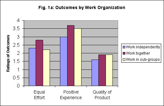 The
first bar chart to the right groups ratings by type of outcome and shows
method of organizing the work in bars of different colors.
The
first bar chart to the right groups ratings by type of outcome and shows
method of organizing the work in bars of different colors.
Note how this bar chart facilitates comparisons between different ways of organizing the work; it also shows at a glance the different patterns of differences for different types of outcome.
The fact that perceived quality of product does not differ much according to how the work is organized is highlighted in this chart.
It is also quite easy to display the same data, grouped the other way.
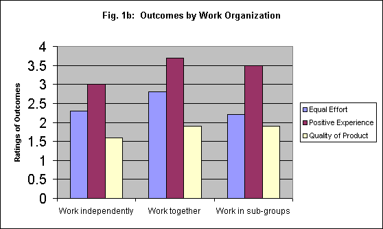 In
the next bar chart, below and to the left, ratings are grouped by how the
work is organized, with outcomes coded in different colored bars.
In
the next bar chart, below and to the left, ratings are grouped by how the
work is organized, with outcomes coded in different colored bars.
Note how this chart invites attention to the differences among ratings for the three outcome measures; comparisons within outcome measure by different ways of organizing the work are not so readily apparent.
If you think about the measure, you will realize that the three measures of outcomes are not necessarily comparable: I would use the first bar chart in preference to the second, because the first bar chart highlights a more meaningful comparison.
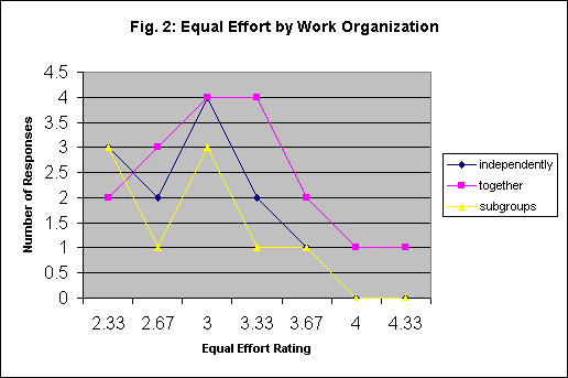 It
can also be useful to compare ratings for different ways of organizing
the work in terms of how many subjects gave each rating.
It
can also be useful to compare ratings for different ways of organizing
the work in terms of how many subjects gave each rating.
The line chart to the right shows the number of subjects who give each rating for equal effort (remember, the variable is an index formed by averaging three variables; that's why some of the ratings are decimals). Notice that no-one gave the response of 4 or 4.33 for working in subgroups.
This line chart comparison makes it easy to compare the distribution
of overall responses. It is a useful addition to the previous charts, because
it helps us see if the differences in means are caused by a few extreme
responses. 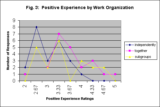
The next chart shows the number of people who gave each rating for Positive Experience.
Here, you will notice that no-one gave a rating of 2.67 for "Work together," and no-one gave a rating of 4.33 or higher for "Work Independently."
It appears that the differences for this variable are all in the extremes.
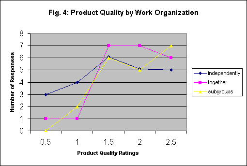
The final chart shows the distribution of responses for "Product Quality." Here, the greatest difference seems to be between "Working Independently" and "Working Together."
It is ordinarily not a good idea to show very many charts. Choose one or two - the decision of which format to use is largely a rhetorical and stylistic decision.
In brief, which format will best support the argument you are making? Which format will best help your audience to understand your points?
Basic principles for good graphics:
1. Keep it simple and direct. Show only the data that are needed.
2. Don't try to do too much with one chart.
3. Use a scale that will bring out the contrasts - and group your data in a way that facilitates making the comparisons you regard as most important.
4. Don't be afraid to leave "white space."
5. It's okay to put in a few decorative touches - color,
cartoon characters, etc. But keep them to a minimum, and make certain
they don't detract from the main point! Any drawings or such should
be thematically related to your argument; if you can't find anything that
is thematically relevant, leave it out.
Communication Studies
Mainpage
![]() (PSU
Home Page)
(PSU
Home Page)
This page is maintained by David Ritchie, e-mail:
cgrd@odin.cc.pdx.edu
Last updated on July 29, 1999.