web.pdx.edu/~rueterj/courses/esr473/assignments/pvsi_excel.html
P vs. E vs. depth
This is a step by step instruction sheet for creating a spreadsheet in Excel that will make P vs. I and P vs. Z curves. For an explanation of these curves and the equations please go the this page.
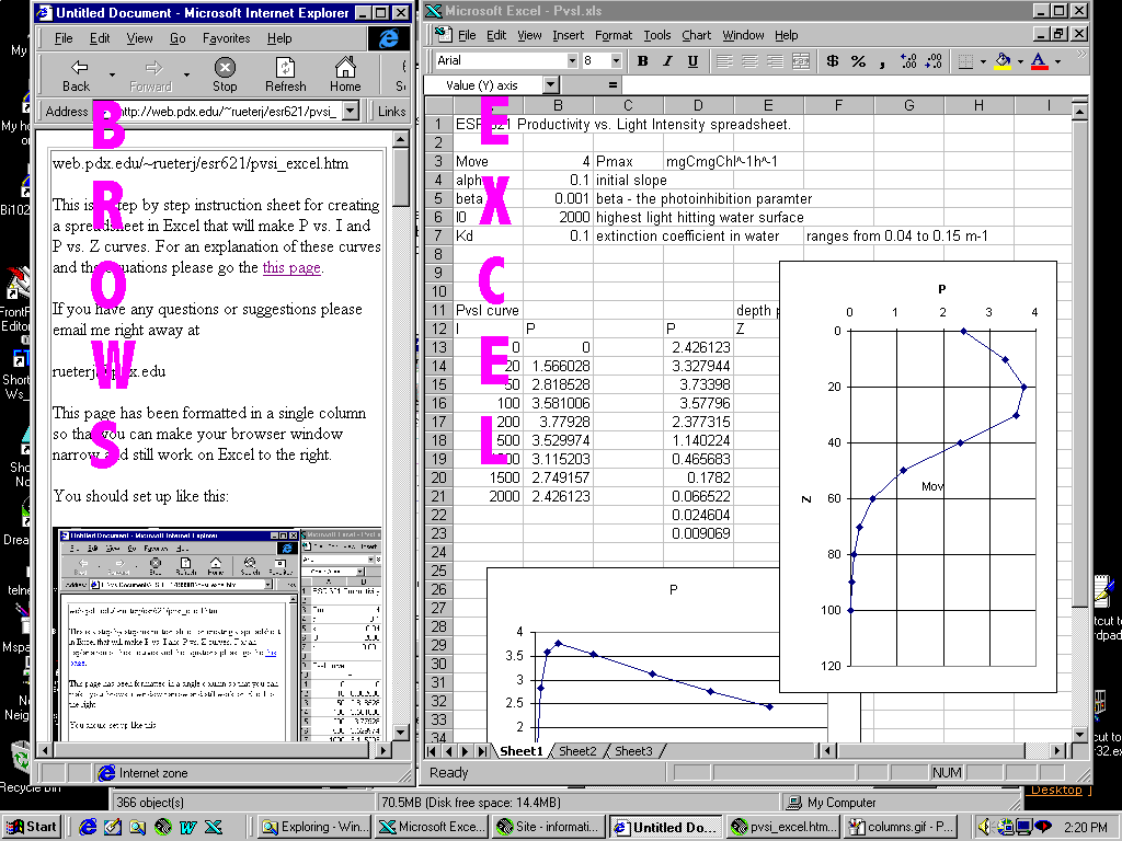
This page has been formatted in a single column so that you can make your browser window narrow and still work on Excel to the right.
You should set up like this:
Step 1: set up the named variables
In column A cells A1-A5 put in the following names of variables:
Pmax
alpha
beta
I0
Kd
Then go to the cell just to the right of each, select Inser/Name/Define from the menu bar.
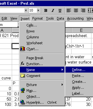
and after the dialog box comes up, just say OK. This means that this cell will be called Pmax.
Do the same for each of the five parameters.
Step 2: Putting in starting values.
We are going to put in some arbitrary starting values in Cells B1 through B5.
Pmax 4
alpha 0.1
beta 0.001
I0 2000
Kd 0.04
Step 3: Making a column of light values
Move down the spreadsheet to cell A8. Put "I" in this cell (without the quotes). Below that put in a range of light values from 0 to 2000 (such as 0,20,50,100, 200,500, 1000, 1500, & 2000).
Next, highlight this column of light values and name them I (Insert/Name/Define).
Step 4: Putting in the P vs. I equation.
Label the cell B8 "P".
Type the following string into B9
=Pmax*(1-EXP(-alpha*I/Pmax))*EXP(-beta*I/Pmax)
after you hit return it should give you the value of 0.
Highlight cell B9 and copy this cell (Edit/Copy)
Highlight cells B10 through B17 (next to your light values) and Paste the equation into all of the cells (Edit/Paste). You should come up with a set of numbers. If you get a #name cells, it means that you didn't properly define the names of some of the variables of of I.
Step 5: Making a chart.
Highlight the entire region from A8 through B17. Insert a chart (Insert/Chart).
From this point you will follow the wizard but you need to select the XY (Scatter) and click on the version that puts dots and lines.
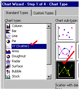
When you follow the wizard steps you should eventually get a graph that looks like this.
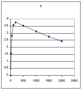
PART B: Making a P vs. Z graph.
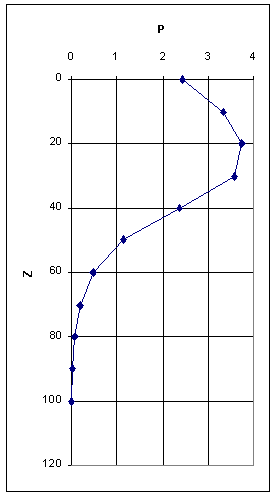
The point of this is to make a graph that looks like this:
Step 6: setting up the Z, Id and P table
Move over from your previous table and lable three columns P, Z, and Id. You will be changing the name of the light variable from I to Id (I at depth). You are doing them in this order to be able to make a plot as above.
Fill in Z with depth increments of from 0 to 100 m.
Select this column of depths and name it Z.
Step 7: equation for Id
Go to the top cell of the Id column (right under the label) and type in this equation
=I0*EXP(-Z*Kd)
This should return with the value of I0.
Drag from the cell you just entered down to the bottom of the list of depths, release and then hit Ctrl D or Edit/Fill/Down to fill in the rest of the cells. The values should show an exponential decrease.
Step 8: equation for P
Go to the top cell of the P column and type in the following formula
=Pmax*(1-EXP(-alpha*Id/Pmax))*EXP(-beta*Id/Pmax)
It is just like the one you used previously, except I is replaced by Id.
Final step: Graph P vs. Z
Select the columns P and Z by dragging.
Insert a chart.
Select X-Y (scatter plot) and finish through the chart wizard.
After you get the chart up on the page, double click on the Y axis (which should be depth). You will get a dialog box to format the axis, choose the "scale" tab at the top and then check the box that allows you to show the values in reverse order.
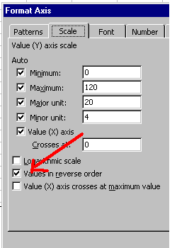
this should reverse the Y axis so that 0 meters are at the top and 100 meters is at the bottom.
Assignment:
Use this spreadsheet to compare the effects of Pmax, alpha, beta, I0 and Kd to make a figure that looks like the depth profile above.
Make sure you understand what each of the named parameters represents (I0, Pmax, alpha, beta, Kd) and how changing each will change the shape of the profile.