
I would argue that typography is the single most important thing in any piece of graphic design. Just consider, for example, how designers describe what graphic design is to people who haven't got a clue. Usually I'll say that it's "logos and pretty much anything involving typography." They'll respond by saying, "You mean like fonts and stuff?" "...Yeah, like fonts."
While I am not an expert on choosing the right typefaces or setting type, I have at least learned enough to give some okay advice:
1.
If your type sucks, your whole project sucks.
2.
The more time you spend looking at typefaces, the better trained your eye will be to notice little subtleties between typefaces—and it’s these subtleties that make all the difference. Two typefaces that seem the same are not alike.
3.
Accept the fact that you might have to shell out some money for typefaces every now and then. Note: it's worth it. Free typefaces can be dangerous, so proceed to use them with extreme caution and good judgement. Free typefaces often don’t come with the proper glyphs that you need, and this can become problematic, especially if you’re setting a lot of text. You've been warned.
4.
Know the difference between kerning, tracking, and leading. Between en dashes and em dashes and when to use them. Between oldstyle figures and lining figures. Use your glyphs palette.
5.
Be picky about your typesetting. It’s ALL about those tiny, tiny details that make type well-set. It should have taken you some time to get right. It doesn’t matter how few words there are!
6.
Fix those rags. Do it now.
7.
Don’t start looking for typefaces when you haven’t yet figured out what it is you’re looking for. You’ve got to help yourself by narrowing your selection right off the bat, otherwise you’ll be lost. This is when you should go back to your mood boards and devise a plan for what kind of typefaces you’ll be looking for based on the look and feel you’re trying to achieve with your piece.
8.
Be extra careful to choose typefaces that aren’t cliché. How to know what cliché looks like?
Let’s take “vintage movie type” for example. Whatever you first envision in your brain—that’s the cliché. Here’s an example of an invitation suite I designed in my Sophomore year:
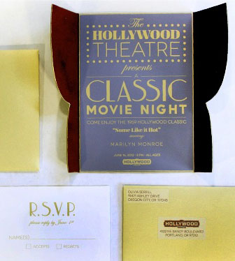
LEFT
Okay, to be fair—this isn't the worst thing you've ever seen in your life... But the feedback I got was pretty accurate and relevant for future projects.
I was later told that my typefaces in this piece felt expected and predictable. They were right because all I did was find something that matched what I had first envisioned in my mind (the cliché). I wish instead that I had taken the time to find an updated, more nuanced typeface perhaps inspired by “vintage movie type"—without being so blatant about it. You can also evoke a certain mood and style in your piece with just ONE typeface. Not every single typeface in my invitation needed to scream “vintage movie type.”
9.
Don’t stick to one resource for finding typefaces. Additionally, don’t stick to one resource for being inspired by typography. Dig around.
10.
Useful tip: when searching through typefaces online, take screenshots of typefaces you haven’t purchased yet to compare them inside your document before you buy.
11.
Don't choose typefaces for the sake of being trendy. Please. Everything should be done for a reason.
12.
Start poking around in different type foundries. Some of them give away free trials of their typefaces. Here’s a link to a website that lists all the type foundries in the world. You're welcome.