
Let’s talk about the “big idea” aka: the concept. That thing your teacher keeps talking about—but that you yourself still can’t define using words other than “vintage,” “modern,” or “kind of whimsical-looking with maybe some hand-drawn elements.” (Which by the way, are not concepts.) You may be thinking, What even is a concept and how do I find it? I chose my topic and I have an idea of what I want it to look like…isn’t that enough?
To put time into thinking of a concept seems unnecessary, laborious, and intimidating—if you don’t understand what purpose a strong concept serves. But thankfully, sooner or later you’ll learn that the concept is everything.
The concept is the framework that informs the visuals, but is not quite the visuals itself. It’s the “why” behind the visual style and language you intend to employ. It’s the brains behind your project. It’s the thesis statement, backbone, narrative, story, or problem. The concept is a whole idea, which in and of itself doesn’t have a style assigned to it per se, but that which helps you (as a creative, smart and intuitive designer) determine based on what seems appropriate. This, at least, is my textbook definition of a concept when it comes to graphic design. Here's some more definitions I got off the internet.1
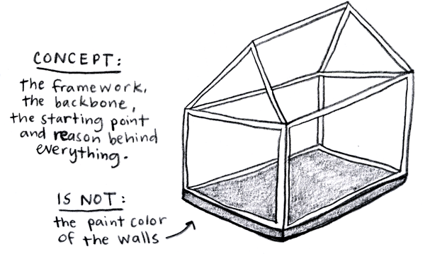
Don’t make the mistake of underestimating the importance of the concept, no matter the size and scope of the project. If you don’t define it at the beginning, your project may start to suffer from it later on down the road, and you’ll find yourself overwhelmed and stuck inside a project that seems to spin out of control in no particular direction. Christian Helms describes this quite nicely:
An intern who once worked for me started every design project in a state of creative paralysis, brought on by the seemingly infinite visual possibilities at his disposal. He went around in circles for days, the carousel of possibility never stopping. I did my best to explain to him that he didn’t have a direction yet because he hadn’t framed the problem, that he didn’t have any idea what he wanted to communicate.
Here’s a story of a lesson I learned in one of my design classes my junior year:
The class was ‘Information Design’ and we were designing a piece that thoroughly investigated one object of our choosing—be it a taco, the human eye, or in my case, the $100 bill.

My concept, as I stated it, was simply “Old versus new.” I compared an old hundred dollar bill from 100 years ago, to the newly re-designed hundred dollar bill, which, conveniently for me, came out that year. I compared every aspect of the bills, and at the bottom, included an in-depth look at the new $100 bill, with detailed notes about each feature.
I thought my professor already understood my concept since it seemed like he asked me about it every. single. day. So I couldn’t believe it when I got up to present my final piece in front of the class, whilst holding a giant piece of roll paper that kept flopping up at the bottom, that he asked again, what my concept was. In a slightly annoyed tone I simply replied, “Old versus new.”
It may have been a decent start to a concept, but even on the last day, I still had trouble articulating it, because I hadn’t given any meat to it. How did any of my aesthetic decisions reflect the concept? What about my illustrations? In fact, why did I even choose to illustrate it, as opposed to another visual treatment? What about the typefaces—why did I choose those in particular?
All these questions relate back to the concept, and I think that’s what my teacher was getting at. I guess that wasn’t a very good example of how to construct a decent concept, but hopefully you can see how I thought I had had it, but really kinda didn’t. Perhaps a better example is how I came up with the concept for this very project. It goes something like this:
Take it From Me is a “living room conversation” on what it’s like to be a design student. This is a self-help guide from an older (and maybe wiser) student who’s “been there, done that”—and who’s acquired some slight bumps and bruises from figuring it out along the way. Drawing from personal experience, this “know before you go” resource is written from a candid and honest perspective—bumps, bruises and all.
From there, I can pick out several keywords to build upon:
“Living room”
lighthearted, disarming, puts you at ease, down to earth, comfortable, not trying to seem “holier than thou,” funny, not single-sided, open, relaxed, uncensored
“Bumps and bruises”
pain, stress, growth, learning experience, rough, jagged, not spotless, imperfect, crude, ugly, live and learn, trial and error, mistakes
“Honest”
tell it like it is, straight to the point, plain and simple, basic, cut-throat, stark, transparent, real, human, relatable, not trying to perform or impress, not convoluted, complex or technical
And finally from there, you can start to think about the visual styles and treatments that would best express those moods and attitudes. For example, the overall design aesthetic for this piece is clean, straightforward and minimal—to emphasize the writing itself, which is immediate and self-aware. The secondary handwritten type expresses a mood that feels desperate, raw and even angsty. Then there's the imagery: a mix of internet memes, .gifs, and my own "invisible desk" scans, to add humor in a relatable context.
So frame your question, your problem...whatever. Write it down in a nice and tidy “thesis statement” so you can refer to it all throughout the process. Pair it down to it’s simplest, most basic idea. From there, your concept will help you develop a cohesive piece where all the visuals rightly and appropriately make sense—and you’ll be equipped with all the reasons why they do.
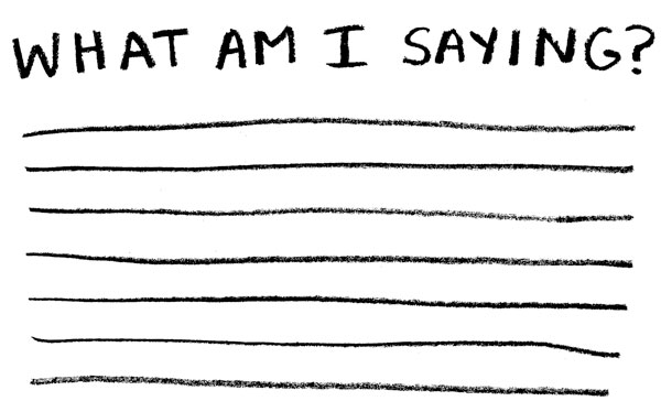
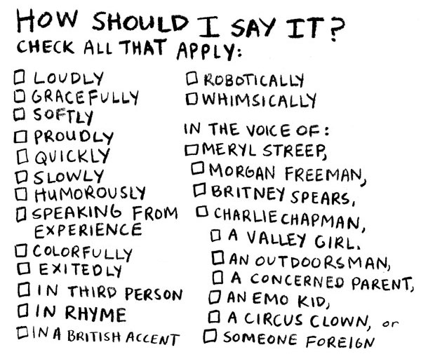
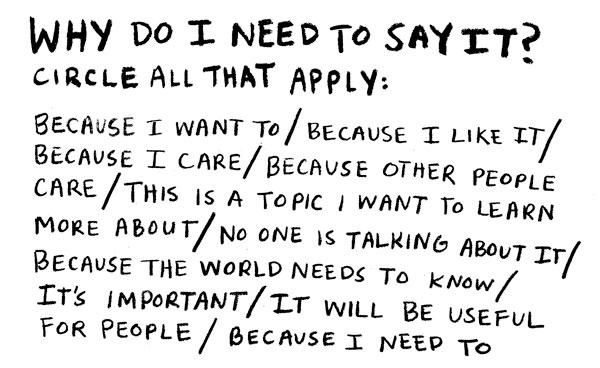
Because no matter what, your piece is going to communicate something. And it’s your concept that defines what it is that’s being communicated, how it's said, and why you need to say it.
Con•cept (noun):
1.
something conceived in the mind; a thought, or notion.
2.
an abstract or generic idea generalized from particular instances.
3.
a plan or intention; a conception.