Lecture 14
Correlation
Association is one of the fundamental tools of
scientists. Francis Bacon, for instance, discovered that heat is a form of
motion by compiling lists of items that were hot and cold. Ivan Pavlov, who was
originally studying the digestive system, discovered an important rule of
learning, classical conditioning, by observing that dogs salivated when he rang
their dinner bell. In both instances, an association was noted between two
variables. As one variable increases, so does the other.
The statistical index of the degree to which
two variables are associated is the correlation
coefficient. Developed by Karl Pearson, it is sometimes called the
"Pearson correlation coefficient". The correlation coefficient
summarizes the relationship between two variables.
Let's take an example. Did you ever wonder
whether the person that took the longest on the test did very well or very
poorly? It might be that the students who take the longest on the exam are the
most careful, and they score the highest. This would be an example of a
positive correlation, because high values
of one variable (e.g., time spent on the test) are associated with high values on the other variable (e.g.,
better performance on the test). Or it might be the other way around:
longer time on the test is associated with poorer scores. The latter is an
example of a negative correlation, because high
values on one variable are associated with low
values on another variable. A person who scores highly usually finishes
quickly.
To examine whether there is a positive or
negative association between grades on an exam and time spent on an exam, one
has to look to see if individuals who did well on the exam also spent longer on
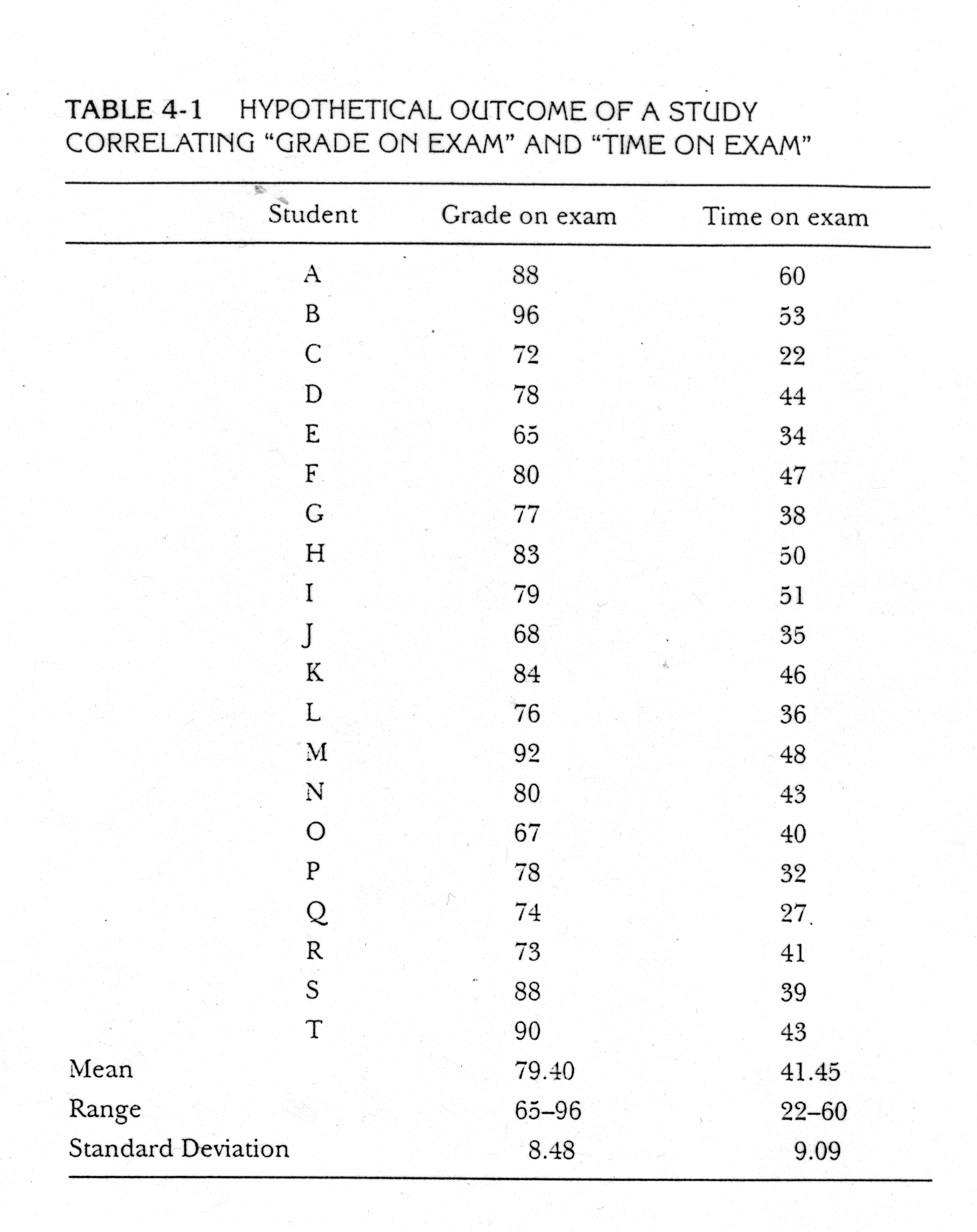
it. Here are some hypothetical grades on an exam and the amount of time each
student spent on the exam.
One way to find out if there is a
positive or negative relationship is to examine the list and see if the highest
grades are associated with the shortest or longest time spent on the exam. But
it is difficult to easily see if there is a relationship between the variables
this way. A better method is to create a bivariate scatter plot (bivariate
meaning two variables). If we plot the scores from the table above with the
time on the x-axis and the grades on the y-axis, we would get something that
looks like this:
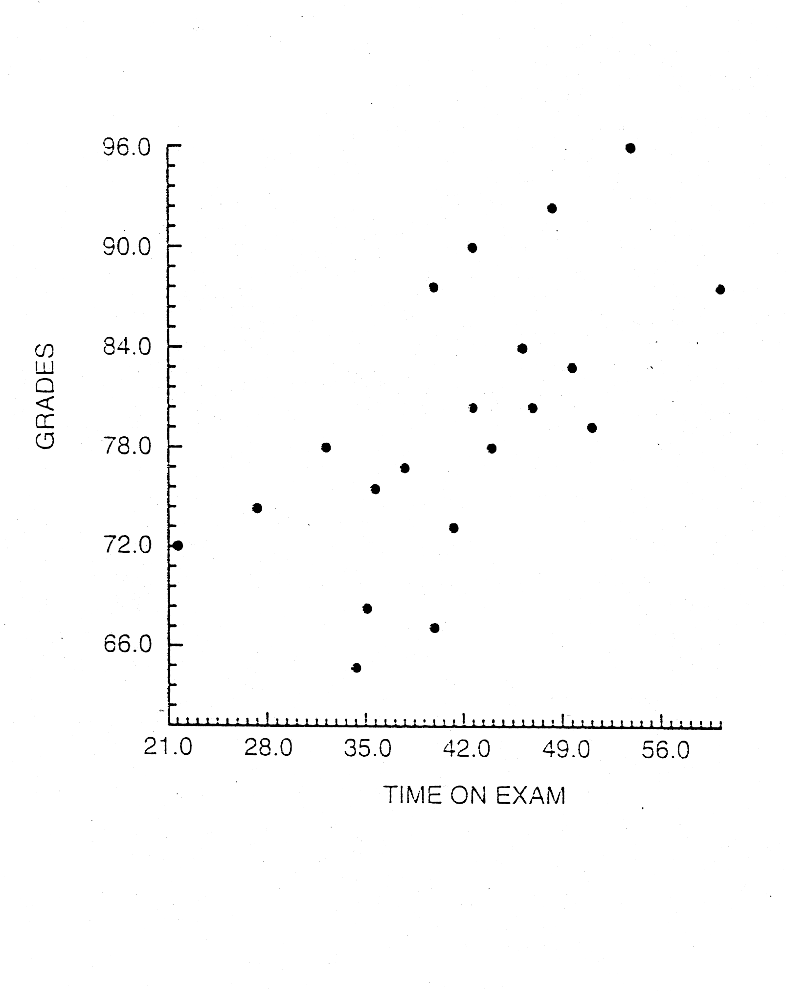
Each point represents one student with a
certain score for time on the exam, x, and grade, y. The scatter plot reveals
that, in general, longer times on the exam tend to be associated with higher
grades. Notice that there is a kind of stream of points moving from the bottom
left hand corner of the graph to the upper right hand corner. That indicates a
positive association or correlation between the two variables.
About r
As always, we have a letter that stands for out statistic. In the case of
correlation, it is r. The Pearson r can be positive or negative, ranging
from -1.0 to 1.0. A correlation of 1.0 indicates a perfect positive association
between the two variables. If the correlation is 1.0, the longer the amount of
time spent on the exam, the higher the grade will be--without any exceptions.
An r value of -1.0 indicates a perfect negative correlation--without an
exception, the longer one spends on the exam, the poorer the grade. If r=0,
there is absolutely no relationship between the two variables. When r=0, on
average, longer time spent on the exam does not result in any higher or lower
grade. Most often r is somewhere in between -1.0 and +1.0.
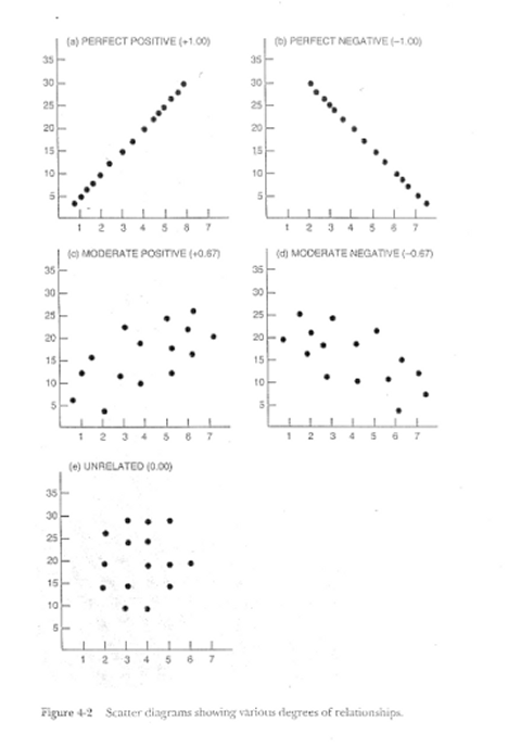
Take a minute to look at some examples of
scatter plots with different correlations, by clicking here.
In these graphs, the r values are in
parentheses. Notice that for the perfect correlation, there is a perfect line
of points. They do not deviate from that line. For moderate values of r, the
points have some scatter, but there still tends to be an association between
the x and the y variables. When there is no association between the variables,
the scattering is so great that there is no discernable pattern.
Correlations can be said to vary in
magnitude and direction. Magnitude refers to the strength of association--higher
r values represent stronger relationship between the two variables. Direction
refers to whether the relationship is positive or negative, and hence the value
of r is positive or negative.
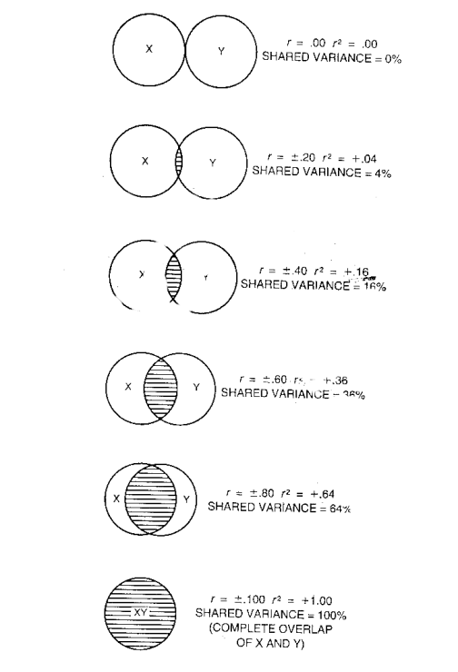
About r2
One can think of a correlation as measure the degree of overlap, or how much
two variables tend to vary together. Go back to the scatter plot printed above,
and put your hand over the y-axis (vertical one!!). How much the points vary
from left to right is how much variation there is in the time variable. Now,
put your hand over the x-axis. Look at how much the points vary from top to
bottom. That amount of scatter represents the variation in grades. Now, looking
at the bivariate plot as whole, you can see how the points tend to scatter or
vary together. Their "shared variance" is the amount that the
variations of the two variables tend to overlap.
The percentage
of shared variance is represented by the square of the correlation
coefficient, r2. Another way to visualize this is with a Venn
diagram that represents the amount of shared variance, or overlap of variation,
of two variables. Click here
to see some examples. Because r-square is interpreted as the percentage of
shared variance, it is best to compare two r2s rather than
two rs. For instance, a correlation of .8 seems to be twice as large as
a correlation of .4. But the larger coefficient actually indicates there is 4
times as much shared variance. .64 vs. .16. Occasionally, shared variance is
called the variance accounted for in
one variable by another variable. An r-square of .64 suggests that x accounts
for 64% of the variance in y.
Example
Let's look quickly at an example using the grade and time study above. (My
apologies for switching the x and y in this example).
|
ID |
Grade on Exam (x) |
x2 |
Time on |
y2 |
xy |
|
1 |
88 |
7744 |
60 |
3600 |
5280 |
|
2 |
96 |
9216 |
53 |
2809 |
5088 |
|
3 |
72 |
5184 |
22 |
484 |
1584 |
|
4 |
78 |
6084 |
44 |
1936 |
3432 |
|
5 |
65 |
4225 |
34 |
1156 |
2210 |
|
6 |
80 |
6400 |
47 |
2209 |
3760 |
|
7 |
77 |
5929 |
38 |
1444 |
2926 |
|
8 |
83 |
6889 |
50 |
2500 |
4150 |
|
9 |
79 |
6241 |
51 |
2601 |
4029 |
|
10 |
68 |
4624 |
35 |
1225 |
2380 |
|
11 |
84 |
7056 |
46 |
2116 |
3864 |
|
12 |
76 |
5776 |
36 |
1296 |
2736 |
|
13 |
92 |
8464 |
48 |
2304 |
4416 |
|
14 |
80 |
6400 |
43 |
1849 |
3440 |
|
15 |
67 |
4489 |
40 |
1600 |
2680 |
|
16 |
78 |
6084 |
32 |
1024 |
2496 |
|
17 |
74 |
5476 |
27 |
729 |
1998 |
|
18 |
73 |
5329 |
41 |
1681 |
2993 |
|
19 |
88 |
7744 |
39 |
1521 |
3432 |
|
20 |
90 |
8100 |
43 |
1849 |
3870 |
|
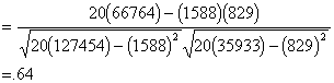
S |
1588 |
127454 |
829 |
35933 |
66764 |
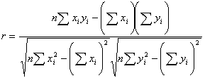
The formula for correlation is really just a
computational one. It does not make much sense as is, but will give us a
correlation coefficient more quickly.
To test r for significance, we test the null
hypothesis that, in the population, the correlation is zero. To do that we
compute a t statistic.
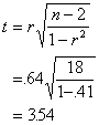
The d.f. for the test is n - 2 =18, and we
use the usual t table. The critical value is 2.101 at alpha=.05, so the
correlation is significantly greater than zero. In other words, there is a
statistically significant linear relationship between the grades and time spent
on the exam. If we were to measure exams grades and time spent on test in the
population, we expect that the correlation between the two would be greater
than 0.
Standardized Relationship
The Pearson r can be thought of as a
standardized measure of the association between two variables. That is, a
correlation between two variables equal to .64 is the same strength of
relationship as the correlation of .64 for two entirely different variables.
The metric by which we gauge associations is a standard metric.
Also, it turns out that correlation can be
thought of as a relationship between two variables that have first been
standardized or converted to z scores.

Correlation Represents a
Linear Relationship
Correlation involves a linear
relationship. "Linear" refers to the fact that, when we graph our two
variables, and there is a correlation, we get a line of points. In an algebraic
sense, linear refers to the fact that we can add, subtract, multiply, or divide
one of the variables by a number to get an approximation of the other variable.
(If you don't get this last explanation, don' t worry, we'll revisit it later).
Correlation tells you how much two variables
are linearly related, not necessarily
how much they are related in general. It is true that the most common measure of
association is correlation, and, hence, whether or not there is a relationship
is usually determined by whether or not there is a correlation. However, there
are exceptions. A curvilinear relationship is one example. In some cases, two
variables may have a strong, or even perfect, relationship, yet the
relationship is not at all linear. In these cases, the correlation coefficient
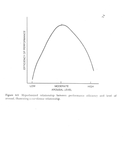
might be zero. Take for example, a well know psychological relationship between
arousal and performance. This is referred to as the Yerkes-Dobson law. If
someone has very low arousal (e.g. half-asleep), performance on a test will be
very poor. If one is moderately aroused, the performance on the test will be
high because of stronger motivation. If that arousal becomes too high, as it is
with extreme test anxiety, performance on an exam will be very poor. So,
overall, there is not a linear relationship between arousal and performance,
because there is no general tendency to do better as arousal increases.
Here is a graph of the Yerkes-Dobson curve,
in which the correlation between arousal and performance is zero, but there is
a strong curvilinear relationship.
The best way to make sure that your
correlation coefficient is not misleading about the relationship between the
two variables is to look at a bivariate plot.
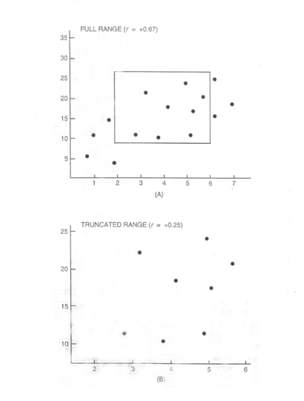
Restricted range
Correlations can be deceiving if the full information about each of the
variables is not available. A correlation between two variables is smaller if
the range of one or both variables is truncated. This is called the restricted range phenomenon. The range
of one or both of the variables is restricted or truncated. Because the full
variation of one of the variables is not available, there is not enough
information to see the two variables covary together.
These graphs illustrate restricted range.
So, sometimes a small or zero correlation
may obtained, because of restricted range rather than because there is not
really a true relationship between the two variables.