#d <- Read("http://web.pdx.edu/~gerbing/data/DeptCount.xlsx")
d <- Read("data/DeptCount.xlsx")d Dept n
1 ACCT 5
2 ADMN 6
3 FINC 4
4 MKTG 6
5 SALE 15
This document is the R implementation of the more general, conceptual discussion regarding categorical data visualizations.
For the following descriptions of the various categorical data visualizations in R, the section on the bar chart is by far the largest section. One reason for this size is that the bar chart is the essential visualization of this family. Another reason is that it is described first, so general descriptions of aspects of using these functions are explained in the bar chart section but also apply to the other visualizations.
The following discussions show how to create the bar chart from various sources, beginning with the summary table that results from a prior data aggregation, what Excel calls a pivot operation that results in a pivot table.
From lessR version 4.4.1.
For employment in various company departments, suppose the summary table of the counts is already available, but not the raw data, the original table of data values for each individual. Maybe you located a management report that listed the number of employees in each department and wish to create the corresponding bar chart from that table. Enter the summary table directly into a worksheet app, such as Excel.
Read the summary table into R for analysis, as in the following example. Then display its contents by entering its name into the R console.
#d <- Read("http://web.pdx.edu/~gerbing/data/DeptCount.xlsx")
d <- Read("data/DeptCount.xlsx")d Dept n
1 ACCT 5
2 ADMN 6
3 FINC 4
4 MKTG 6
5 SALE 15
The summary table is available online, but that read statement is commented out with a # in the first column. When writing this document, as the document gets continually regenerated, reading from the web takes longer, and I have to be connected to the web. So, instead, I read the data from a local file on my computer.
This summary or pivot table contains the two variables relevant to the analysis: categorical variable Dept and numerical variable n. There is only one row for each unique value (category) of Dept. To create the bar chart from the summary table, specify these two variables: categorical variable, \(x\), and numerical variable, \(y\), which maps to each bar’s height.
The following general form of the call to BarChart() analyzes data from a summary table, which requires both variables.
Of course, in actual data analysis, replace the generic \(x\) and \(y\) with the relevant variable names. Both variables are in the d data frame. There is no need to specify data=d for data in the d data frame because the name d is assumed unless otherwise specified.
When the data are a summary table, BarChart() analyzes the values of the \(y\) variable directly instead of computing its values. Because a categorical variable and a numerical variable are read in this example, with no further instructions on how to aggregate the numerical variable (with the stat parameter), BarChart() assumes the data are in summary table form.
BarChart(Dept, n)The BarChart() function provides a default color theme, and also labels each bar with the associated percentage of values for the corresponding category.
One possibility creates the bar chart from the original data table of individual responses. Data analysis ultimately begins with the data values obtained for each unit in the analysis, such as each person or each company. To plot a bar chart, first read the data table from a computer file into the R data frame named d. BarChart() computes the frequency distribution, the association of counts and categories, which serves as the summary or pivot table to construct the bar chart of counts.
Enter the function call to create a bar chart directly into the R console. The instruction in Figure 3 creates the bar chart of the count of each category for a categorical variable named \(x\), and also displays the table of counts (frequencies).
With the BarChart() function, the name of the categorical variable is the first value passed to the function, and in this example, the only value passed to the function. If the data frame is named d, you do not need to specify the data parameter.
When only the name of one categorical variable name is passed to BarChart(), the visualization is of the variable’s distribution, with the height of the bar for each category representing the corresponding count of the number of occurrences.
To illustrate, return to the Employee data. First, read the data into R as the d data frame. Given the data, BarChart(Dept) tabulates and displays the number of employees in each department, according to the variable named Dept. The values of Dept are in the default data frame (table) named d. The result is the bar chart in Figure 4 for the distribution of the values of the categorical variable Dept.
Video: Bar Chart of Counts [3:08]
BarChart(Dept)The result is the identical bar chart shown in Figure 4 created from data in summary table form. When computing the bar chart from the original data, BarChart() implicitly calculates the summary table of departments and counts.
Obtain the same analysis by explicitly including the data parameter to identify the name of the data frame, here the default value d.
BarChart(Dept, data=d)
When doing R analyses, you can have as many data frames as computer memory allows and name your data frames any valid name. However, d is the default name for lessR data analysis functions.
The BarChart() function provides the tabular form of the computed frequency distribution, a pivot table, as part of its text output to the R console, as shown in the above output. The counts appear in the row labeled Frequencies, with the levels shown in the previous row.
ACCT ADMN FINC MKTG SALE Total
Frequencies: 5 6 4 6 15 36
Proportions: 0.139 0.167 0.111 0.167 0.417 1.000
From the frequency distribution that pairs a number with each category or level of the variable of interest. In this example, the frequency distribution reveals that there are five accountants (ACCT), six administrators (ADMN), four financial analysts (FINC), six marketers (MKTG), and 15 people working in sales (SALE). From this information, a bar chart function defines the bars and their associated heights.
An example of the third method of invoking BarChart() is the bar chart of the mean salary for each department computed from the original data. To obtain this bar chart, specify the categorical variable, \(x\), the numerical variable, \(y\), and then specify the statistic to compute with the parameter stat. The available values of stat: "sum", "mean", "sd", "dev" for mean deviations, "min", "median", and "max".
BarChart(Dept, Salary, stat="mean")As with reading a summary table as the data from which to compute the bar chart, here we specify both an x categorical variable and a y numerical variable. However, in this situation, we are reading the data from the original data table of measurements. We need the stat parameter to specify the transformation of the numerical variable y in the data aggregation.
The statistical output of this BarChart() analysis includes the summary statistics aggregated across all of the levels of the x categorical variable as well as the specific values plotted.
Salary
- by levels of -
Dept
n miss mean sd min mdn max
ACCT 5 0 61792.776 12774.606 46124.970 69547.600 72502.500
ADMN 6 0 81277.117 27585.151 53788.260 71058.595 122563.380
FINC 4 0 69010.675 17852.498 57139.900 61937.625 95027.550
MKTG 6 0 70257.128 19869.812 51036.850 61658.990 99062.660
SALE 15 0 78830.065 23476.839 49188.960 77714.850 134419.230
Plotted Values
--------------
ACCT ADMN FINC MKTG SALE
61792.776 81277.117 69010.675 70257.128 78830.065
Unlike most visualization systems, lessR visualization functions also provide statistical analysis as well.
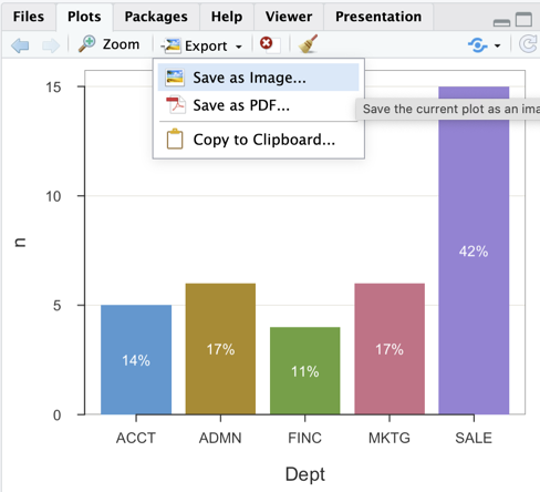
RStudio provides a simple and effective process for exporting visualizations, which appear in the lower right window pane under the Plots tab. After creating a visualization, click the Export button and then save it as an image file in .png format, a .pdf file, or copy directly to the clipboard for pasting into any relevant application, such as MS Word.
Figure 6 illustrates these choices.
A data analysis function in any data analysis system is defined with a set of parameters to customize the visualization. For example, the lessR function BarChart() and other data visualization functions have the parameter fill that sets the color that fills the bars. By default, BarChart() displays each bar in a different color, but the bars can also be set to the same color or other colors depending on the colors passed to the fill parameter. To change the color of all the bars to a blue shade as in Figure 7, set the fill parameter to "steelblue", one of many R defined color names.1
1 Create a pdf file that shows all R color names and colors with the lessR function showColors().
The full function call to obtain the blue bars appears below. Again, set the parameter quiet to TRUE to suppress the statistical output.
BarChart(Dept, fill="steelblue")As is true of Excel and other analysis systems, such as R, the general format for setting a parameter value within the call to a function follows in Figure 8. The three dots, ..., in the figure indicate other stuff that is part of the function call, such as a variable name.
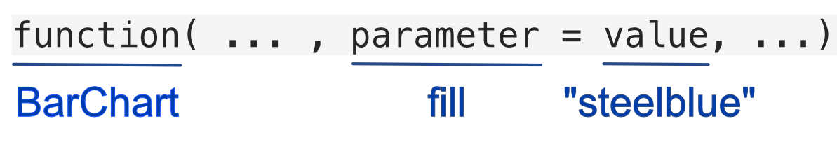
In the BarChart() example above, fill names the parameter. The value of "steelblue" is the specific value set for that parameter. Explicitly setting that parameter value overrides the default value of fill for BarChart(), which provides a different color for each bar.
All input into a function is input into the function’s parameters. Each parameter has a name. For example, the parameter name of the first categorical variable entered into a BarChart() function call is x. The name of the parameter that specifies the data frame is data. Parameter values can be numeric or a character string, such as a word or a letter. As is true of all computer analysis systems, such as Excel and R, if a parameter value is a character string, enclose its value in quotes, double or single quotes. For example, "steelblue". Specify numbers without quotes.
In the definition of a function, if the parameter values are entered into the same order as they are presented in the definition, then the parameter values do not need to be named.
For example, because the BarChart() first parameter is \(x\) in the definition of the function, then if the value for that parameter is listed first in the function call, that value does not have to be named with a x= preceding the value.
BarChart(Dept) is the same function call as BarChart(x=Dept)
Parameters control many aspects of how a function processes data, far more than just color. You can rely upon the default parameter values or add more paired parameter names and values as there are parameters to specify.
GUI systems, such as Tableau, may be considered easier to learn and use in part because the available parameters are listed on the computer display and accessed by clicking on their respective buttons. This accessibility leads to the misperception that when using a system with written instructions there is much information to memorize, requiring the dedicated neuroticism of a super-geek. In reality, it is easy to access the list of available parameters with R functions as well, and, the meaning of the parameters is also explained.
How do you view all the available parameters for an R function? All functions in the R ecosystem have a corresponding help manual, which lists and describes the function’s parameters. To display a help manual, enter the name of the function preceded by a question mark into the R console, such as the following.
?BarChart
Toward the beginning of the help file, find a list of all the parameters, their default values, and an explanation of each under the heading of Usage. Figure 9 shows an excerpt from that part of the BarChart() manual that lists the function’s arguments, its parameters, just the first of 61 available BarChart() parameters. Further, unlike most manuals of R functions, the lessR manuals group and label the parameters according to their role in data visualization.
BarChart() function.
Figure 9 displays the first eight BarChart() parameters: categorical variable x, numerical variable y, second categorical variable by, and data frame data. The value of NULL means that the parameter value is not required but can be specified when the function is called. If no value is specified in the definition, then the parameter value is required in the function call. Here, all parameters are assigned values even if NULL, so it is possible to call the function without any parameter values. In that situation, a bar chart is generated for each categorical variable in the entire data set.
Setting the data parameter to d means that d is the default value, which can be overridden, but if not specified defaults to d for the name of the input data frame. The available values of the stat parameter are also displayed. The first listed value, "mean" is the default value. If the y variable is not specified, then stat_x indicates to define y as either the "count" or the "proportion", with the later the default value.
Figure 10 shows the next section of the manual, under the heading Arguments, that defines the meaning of each parameter. These values are again shown for the first eight of the 61 parameters.
lessR function BarChart().
All of the 61 parameters are available for BarChart() because they are presumably useful. Here, you can now explore the manual as you wish. For example, the horiz parameter, set to TRUE, displays the bars horizontally. The sort parameter sorts the bars in descending or ascending order according to the corresponding parameter value, "-" for descending, and "+" for ascending. The rotate_x parameter rotates the value labels on the x-axis which is useful when they are too large to display in their default horizontal position. Use that parameter in conjunction with the offset parameter to move the labels closer or further away from the axis depending on the amount of specified rotation.
To use R for data analysis requires at least three separate R functions. Run R either on your computer or in the cloud.
lessR functions from your R library library(lessR)d <- Read("") to browse for the data filed <- Read("path name" or "web address") to specify the location of the data fileBarChart(x, y) for a summary table of usually aggregated dataBarChart(x) for calculating the counts of the levels from the original dataBarChart(x, y, stat="mean") for calculating the mean of y for each level of x from the original data, other statistics are availableBeyond lessR, find many, many analysis functions in Base R as originally downloaded. Find even more functions in contributed packages, such as lessR.
Another way to construct the corresponding bar chart references the lessR interactive analysis, called by entering interact("BarChart") into the R console. The interactive analysis presents a GUI interface, similar to Tableau and Power BI, in which you click on various buttons to create a bar chart and explore different forms of the bar chart simply by clicking with your mouse to specify different parameter values. The interactive analysis also presents an option for saving the written instructions that generate the final bar chart into a text file that can be modified and run separately.
Interactively explore some of the most important parameter values and their effect on the resulting visualization with the lessR function interact(). To use, provide the name of the visualization contained in quotes, such as interact("BarChart"). The process of creating an interactive bar chart is explained in the following figures as well as in the following video.
Video: Create a bar chart interactively [before 4:04 does interactive bar charts on your computer, after 4:04 does bar charts with a cloud account.]
Figure 11 shows the first window that appears after entering the call to interact("BarChart") at the R console. Select an Excel or text file formatted data file. Then, select if the data are on the your local computer system or online. If local, browse for the data, otherwise you are prompted to enter a web address, a URL.
After selecting the data file, Figure 12 shows that by default the first 10 rows of data are displayed, with available alternatives the last 10 rows, a random selection of 10 rows, or all of the data.
Click on the BarChart tab and select from the list of categorical variables, shown in Figure 13. The output immediately appears.
Add a numerical variable y by clicking on the y variable button, which then displays the list of available statistical transformations. Different coloring options for the Bars can also be selected as well as for the displayed Values on the bars. Different options, parameter values, can be repeatedly set and explored. Save the visualization to a pdf file with the Save button.
Each change to a parameter value lists the corresponding function call to BarChart() that creates the bar chart at the R console, plus the code for creating the bar chart can be saved from the Save button. Moreover, the code to create the bar chart can be saved that creates the bar chart, beginning with the call to library(lessR), as shown in the following video.
Video: Examine the code created for BarChart() from an interactive session. [3:26]
At the current time, there is no provision for pre-processing the levels of a categorical variable, such as presenting the correct order, attaching labels to the levels present in the data, or allowing for data values that did not occur.
Not elegant, but the solution to the problem of not being able to specify the order of the levels of the categorical variable interactively can be overcome by generating the code for the plot visualization/ Run that code in the R console after specifying the correct transformation to a factor variable with the factor() function. The call to BarChart() remains the same, only the ordering of the levels as specified by the factor() function.
If you save the interactive plot working in the cloud, RStudio will save the plot in your cloud home directory (folder). Navigate to this directory by clicking on the Cloud icon in the Files tab in the bottom-right window pane, then click in the corresponding folder that contains the created pdf file, as shown in the second half of the video linked above.
An alternative to the bar chart is the pie chart. Data visualized as a bar chart for a single variable can also be represented with a pie chart, though not generally as optimal. It would appear that the difficulty of detecting the relative size of the visual aesthetic of an angle is mitigated to some extent with the ring or doughnut version of the pie chart, the default lessR version.
As with the bar chart, obtain the pie chart of the frequencies of a categorical variable, generically named \(x\). Of course, replace the generic name with the actual variable name for any one analysis.
I am not aware of research that found that judgement of the size of a pie slice increases with a ring chart over a traditional pie chart. But it “does appear” to be so. Also, ring charts seem to be more popular now in business analysis but again that is just an impression.
As with the bar chart, in lessR create the pie chart interactively by entering interact("PieChart") into the R console. Figure 15 displays the pie chart as a doughnut or ring chart.
Video: Pie Chart of Counts [1:23]
Here, create the ring chart for counting the occurrences for the levels of the categorical variable Dept.
PieChart(Dept)The doughnut or ring chart is a reasonable, though necessarily preferred, alternative to the standard pie chart. The lessR function PieChart() can also create an “old-fashioned” pie chart. Set the hole size in the doughnut or ring chart with the parameter hole, which specifies the proportion of the pie occupied by the hole.
style(quiet=TRUE)PieChart(Dept, hole=0)The default hole size is 0.65. Set hole to 0 to close the hole.
PieChart(), however, is not as robust as BarChart().
When applied to the original data of individual measurements, the function currently only applies to counts of the levels of the specified categorical variable.
However, previously aggregated data other than counts can also be analyzed. Although PieChart() only aggregates counts, a summary table can also be specified as the input data, in which case the numerical variable, y, can be any numerical value. As with BarChart(), when analyzing a summary table of two variables, specify in the function call to PieChart() both the x and y variables. To view the actual values of y on the pie slices instead of percentages, specify for the parameter named values the value of "input".
In the lessR visualization system, the Plot() function plot points, just as the BarChart function plots bars. The dots in a dot plot are plotted points, so generate this plot with Plot(). To create, specify two parameters. First, specify x, the categorical variable of interest. Second, as with BarChart(), specify a y variable to aggregate over levels of x and the stat parameter to specify the statistic by which to aggregate. Or if there is no y variable specified, then specify the stat_x parameter with the values of count or proportion.
The following function call specifies the counts of x, here Dept, when applied to the original data of individual responses. The first variable listed, the x parameter, must be a categorical variable. If the categorical variable has integer data values, then to obtain the bubble plot it firt must have converted to a factor.
Plot(Dept, stat_x="count")The output is written with the categorical variable on the vertical axis because there can be many categories down to the individuals in the original data table. However, maybe I should revise this function so that the x variable is plotted on the horizontal axis for consistency with other visualizations.
Or, do the mean of y for each level of x, here the mean of Salary for each department.
Plot(Dept, Salary, stat="mean")Currently, if reading the summary table of aggregated data as the data for the dot plot, there is no default to connect the dots to the axis, to make the “lollipop”.
To add those line segments, set the parameter segments_x to TRUE.
d <- Read("http://web.pdx.edu/~gerbing/data/DeptCount.xlsx")Plot(Dept, n, segments_x=TRUE)Here, the categorical variable x is more properly listed on the horizontal axis.
The bubble plot utilizes only the x-axis and relies upon the visual aesthetic of the area of a circle for which to communicate the extent of the corresponding numerical variable.
Plot(Dept)
ACCT ADMN FINC MKTG SALE Sum Mean
Dept 5 6 4 6 15 36 3.556
Computation of the mean based on coding response categories from 1 to 5
As shown in the text output from the Plot() function, two useful parameters for controlling the bubble sizes are radius and power. The former sets the size of the largest bubble and the ladder sets the relative bubble sizes. In the next example, increase the radius of the largest bubble from the given default value of 0.22 to 0.30.
Plot(Dept, radius=.30)
ACCT ADMN FINC MKTG SALE Sum Mean
Dept 5 6 4 6 15 36 3.556
Computation of the mean based on coding response categories from 1 to 5
Obtain the waffle and treemap charts from functions located in separate R packages named accordingly, not incorporated in lessR or the initial R download. First, these packages must be downloaded to your computer or cloud account. To do so, use the install.packages() function. Or, call that function from the RStudio Tools menu, selecting the Install Packages... option, shown in Figure 17.
Then, enter the names of the packages to install, separated by commas, as shown in Figure 18.
As with any contributed R package, to access the functions in the package that has been downloaded to your R library, invoke the library() function.
library(waffle)Loading required package: ggplot2
library(treemap)The functions that generate the visualizations have the same name as their respective packages.
The waffle() and treemap() functions only process the already obtained summary or pivot table as the data necessarily obtained from a previous data aggregation.
The lessR bar chart function, BarChart(), processes both the original, raw data of individual measurements and then does the data aggregation for you, or it directly processes data input as the summary table computed from a prior data aggregation. However, we can only use the summary table from which to create a waffle chart or treemap in R. In this example, read the summary table from an Excel file into the d data frame.
#d <- Read("http://web.pdx.edu/~gerbing/data/DeptCount.xlsx", quiet=TRUE)
d <- Read("data/DeptCount.xlsx", quiet=TRUE)The lessR function pivot() does data aggregation, creating the pivot table as output. For example, a <- pivot(d, table, Dept) to store the pivot table in data frame a, to distinguish it from the original data frame d. But that result leaves a third column, the proportions, which must be deleted, with a <- a[,-3]. These two statements bring us into programming. But we all know Excel, so that is how I presented this example.
Always verify your data before you do an analysis. Here, with a summary table, the data table is so small we can list it all of it.
d Dept n
1 ACCT 5
2 ADMN 6
3 FINC 4
4 MKTG 6
5 SALE 15
Of course, to read a summary table from Excel, you need a summary table in Excel. Where did you get it from? As we discussed in the concept reading upon which this reading depends, the summary table can come from anywhere, including pure nonsense. However, if you wish to plot the frequencies, the counts of occurrence for each level of the categorical variable, you can obtain those from a bar chart analysis. Construct a summary table exactly as presented in the following example and also in several examples throughout the concept reading. In these examples, we read the data in summary table form into the d data frame, so that is the data structure that will be input into the waffle() and treemap() functions.
The waffle plot, or square pie chart, replaces the bars of a bar chart or the slices of a pie with squares (of a waffle): One square for each integer value of the corresponding number in your summary table. For larger numerical values associated with a category, display more squares. If you have too many squares to plot, see the warning below.
Create the waffle plot with the waffle() function. The squares for each level are displayed with a different color. The waffle chart in Figure 19 shows the default colors. The optional flip parameter set to TRUE indicates to place the chart horizontally. A waffle chart is a waffle chart whether vertical or horizontal, so the choice is yours.
waffle(d, flip=TRUE)And there is the “waffle”. There are 15 people in sales, so there are 15 waffle squares for the corresponding category, SALE. And so forth.
However, the total number of waffle squares is fairly small in this example. What happens if you have data from a larger company and there are 4549 people in sales? And 3960 people in marketing, etc.? We do not want a waffle plot with a total of around 10000 squares as that would be way too large.
For numbers that you are plotting you may need to limit the number of elements to plot.
The little waffle squares do not automatically scale, so if there are too many squares, transform the values of the numerical variable in your summary table by division to reduce the number of squares. Depending on the number of categories, you likely do not want more than a maximum of 50 or so for the largest category. For example, if the largest category is 4549, then to scale all the category numbers, divide them by 100, resulting, for example, to yield 45.4 for the largest value. Then, instead of 4549 squares you will have 45 squares for that one level. To scale down even more, divide by 15 or 20 to rescale. There is no correct answer as to the rescaling, as many possibilities work as long as you apply the same rescaling to all of the numbers in the summary table, analgous to converting data values of length from inches to centimeters.
Finally, the waffle() function has what I think is a bug, which did not appear in the previous example.
Sometimes the function adds another set of squares of another color when necessary to fill out the rectangle that results from placement of all the squares.
The legend for these extra squares is blank. There is some control in removing these extra squares with the rows parameter that specifies the number of rows in the output waffle chart. Often, the number of rows can be adjusted so that no extra squares are filled in.
The treemap in Figure 20 illustrates the number of employees in the five company departments. The largest rectangle represents the department with the most employees, sales, with 15 employees. The smallest rectangle represents the department with the fewest employees, finance with four employees. To call the function, specify the data frame, then the categorical variable followed by the numerical variable.
treemap(d, "Dept", "n")