suppressPackageStartupMessages(library(`lessR`))
style(suggest=FALSE, quiet=TRUE)
We use the employee data set for examples throughout this section.
d <- Read("Employee")Describe Colors
Colors are organized according to Sir Isaac Newton’s 1666 creation of the color wheel. The lessR function getColors() generates the version of the color wheel in Figure 1 for mixing light, such as for computer screens. Generate 360 different colors based on the parameter n to approximate the smooth transition between adjacent colors. Set the border parameter to "transparent" to disable the border between colors.
From lessR version 4.4.1.
getColors(n=360, border="transparent", labels=FALSE, shape="wheel")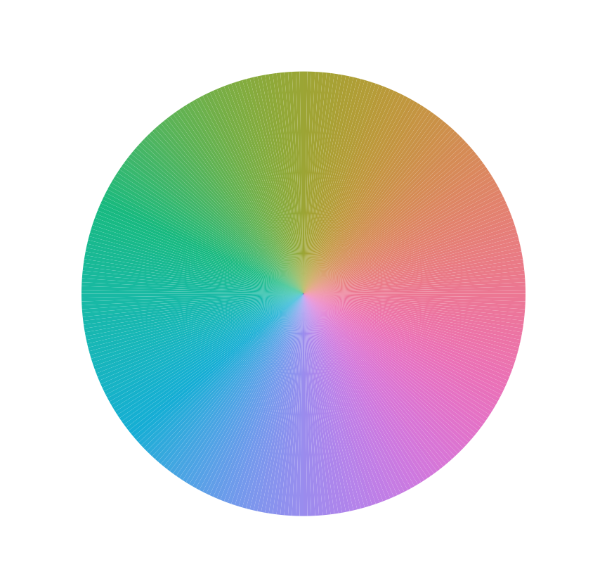
Color Parameters
Colors are defined by their position on the color wheel. To personalize the colors in our data visualizations, we assign chosen colors from this color wheel to specific objects. What are the plotted objects that we wish to colorize? Figures such as circles, bars, triangles, and a state on a map of the United States are polygons.
A closed geometric figure with straight sides.
We visualize a polygon’s color according to its interior and exterior. As such, we need matching parameter names for their references. Unfortunately, we encounter a complication.
There is no standardized vocabulary for assigning colors across data visualization systems such as those in R, Python, and Tableau.
R and Python each have multiple visualization systems accessible within those languages, and even systems within the same language share no general agreement regarding the vocabulary of color.
The commercial standard drawing app, Adobe Illustrator, uses the parameter fill to assign the interior color of a polygon. The standard R programming data visualization app from the RStudio people, ggplot2, also uses the fill parameter, as does lessR to maintain compatibility.
[ggplot2, lessR] Describes the color of the inside of a polygon.
One use of the parameter color describes an object’s color when viewed from the outside. This how is the ggplot2 system uses the parameter color, as does lessR. The parameter color refers to the color a line segment, either by itself or as an edge of a polygon.
[ggplot2, lessR] Describes the perception of color viewed from the exterior of a polygon, or a line, its appearance from the outside.
Tableau, however, uses the parameter color to describe the interior color of a polygon and specifies the color of the exterior with the parameter border.
Color Names
R identifies its 657 color names with the colors() function. Some of the more intriguing color names include “chocolate”, thistle, “lavenderblush”, and “peachpuff”. The color names also include the shades of gray, which vary from black, “gray00”, to white, “gray100”. However, the listed color names do not show the corresponding colors.
To compensate for this shortcoming, the lessR function showColors() generates a pdf file that contains all the color names and a sample of each color with its corresponding red, green, and blue composition. Figure 2 displays a small excerpt from the PDF file from showColors().

showColors().
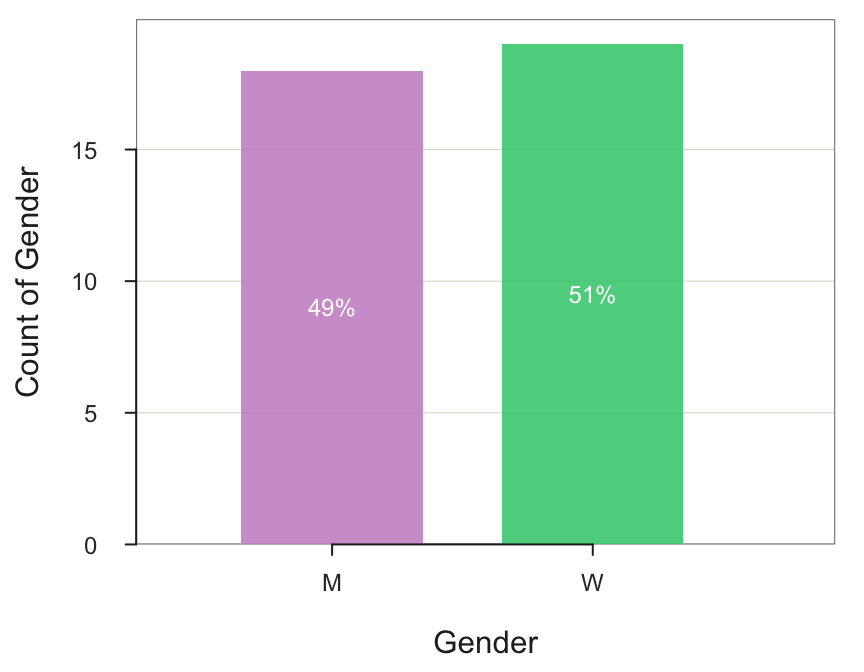
Figure 3 shows two customized bar charts. Figure 3(a) shows that specifying one color name for fill yields a bar chart with all the bars of that same color. By default, the bars have no borders other than the end of the fill color. The bars in Figure 3(a) have added black borders. Figure 3(b) shows that to separately color each bar, specify a vector of colors for the fill parameter, one for each bar, with the vector function c().
BarChart(Gender, fill="slategray3", color="black")
BarChart(Gender, fill=c("plum3", "seagreen3"))

Figure 4 shows customizing the color of each bar in a bar chart to highlight a specific bar. In this example, highlight the bar with the highest average salary, the administration department.
BarChart(Dept, Salary, stat="mean",
         fill=c("gray66", "rosybrown3", "gray66", "gray66", "gray66"))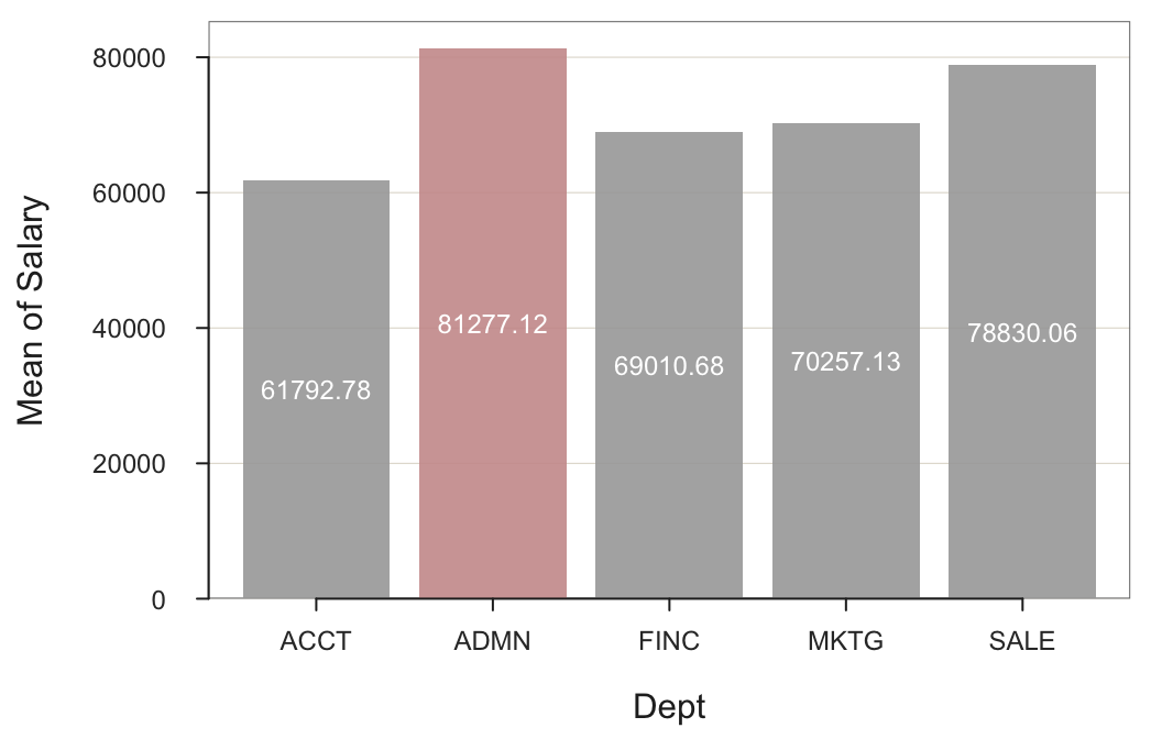
Use the Base R repetition function rep() to replace the last three “gray66” instances for the fill parameter with rep("gray66",3).
The same fill and color parameters apply to histograms and scatterplots. For histograms, fill also applies to the bars. For scatterplots, fill applies to the interior of the plotted points and color to their borders.
Figure 5 highlights the data values for the administration department in the scatterplot for years employed by the company with salary. Because of the relatively small number of plotted points, the point size was enlarged from the default value of 1.0 to the value of 1.3.
Plot(Years, Salary, by=Dept, size=1.3,
                    fill=c("gray66", "red3", "gray66", "gray66", "gray66"))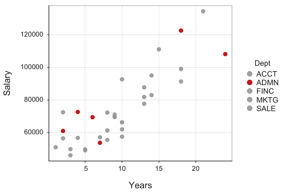
This scatterplot straightforwardly demonstrates that two of the highest paid and most senior officials in the company work in administration but the remaining four employees in that department are newer employees with much lower salaries.
Color names are straightforward, but we need more control over the specific colors chosen for a visualization.
RGB Color Space
A color space enables the description of far more colors than does a limited set of color names.
Describe a color in terms of its coordinates across a set of color dimensions.
One essential color space, one set of dimensions, is the RGB color space, the language of electronic screens such as TVs and computer monitors.
The R package colorspace provides many functions for exploring a variety of color spaces and converting color coordinates between them.
The RGB color space describes a color in terms of the combination of primary colors, its red, green, and blue components.
Each of the many thousands of tiny dots on a TV or computer monitor, the pixels, are colored according to their specific red, green, and blue constituent colors in various combinations. Together, a screen full of pixels can generate all the colors on the color wheel in Figure 1.
The Base R rgb() function specifies colors in the RGB color space with parameters red, green, and blue. By default, the three or four values of the rgb() function are proportions, which vary from 0 to 1. For example, rgb(0,0,0) is equivalent to the named color “black”, rgb(1,1,1) is equivalent to the named color “white”, and rgb(1,0,0) is equivalent to the named color “red”.
An optional fourth parameter, alpha, specifies the degree of transparency. The default alpha value of 1 results in a fully opaque color, that is, no transparency.
Most applications for color manipulation in the RGB color space typically specify colors with values that range from 0 to 255 to align more closely to how color information is stored in digital memory. To accommodate this larger, more common range of numbers, add the parameter and value maxColorValue=255 to the rgb() function call.
Figure 6 repeats the bar charts from Figure 3, but here specify the colors according to the RGB color space. For Figure 6(a), the bar chart colors from rgb() are scaled with the maxColorValue parameter set to 255. For Figure 6(b), the bar chart colors use the native rgb() parameter values, proportions from 0 to 1.
BarChart(Gender, fill=rgb(159, 182, 205, maxColorValue=255),
                 color=rgb(0,0,0))
BarChart(Gender, fill=c(rgb(.804,.588,.804), rgb(.263,.804,.502)))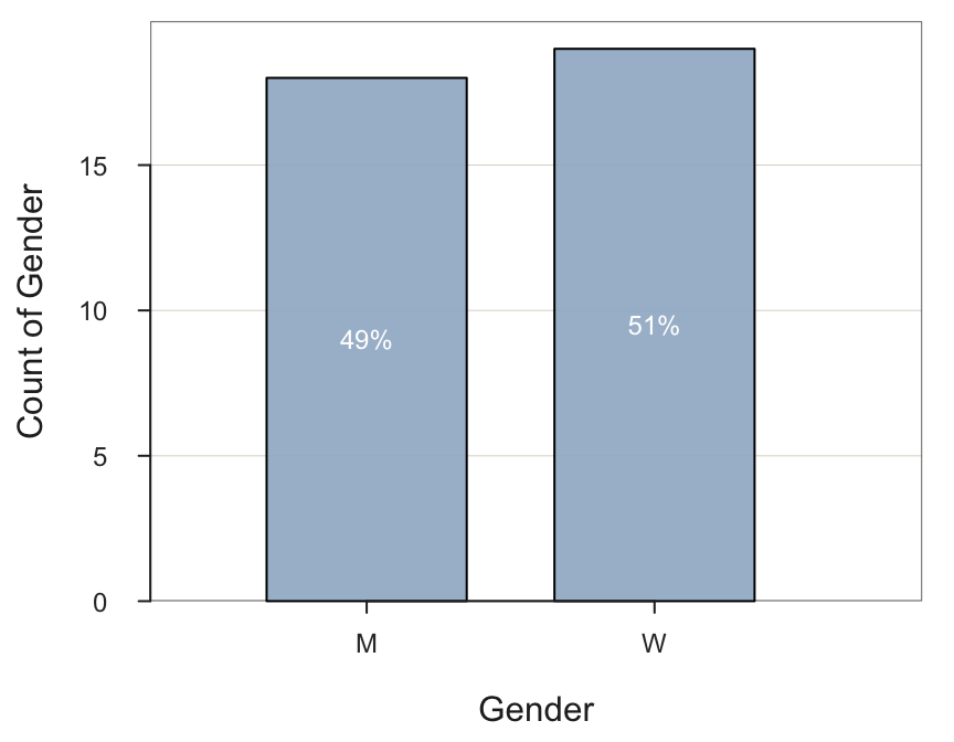
A second way to represent RGB colors closely follows the structure of computer memory. Internally, computers store and process information with binary digits, 0 and 1, which represent off and on states for an electronic switch, the transistor. Describing long strings of zeros and ones to map colors from computer memory to a computer monitor is tedious and takes much space. Computer memory is more efficiently described by hexadecimal or HEX notation.
Digits that vary from 0 through 9 then A through F to span 16 digits`, but where our usual Base 10 number 15 is represented with an F for the hexadecimal Base 16.
As illustrated in Figure 7, hexadecimal notation is much more compact than binary notation. Express our usual number 15 with a single hexadecimal digit F in place of the four binary digits 1111.

Because RGB colors map to pixels on a computer screen, HEX notation provides an alternate description of RGB colors. Find these color descriptions in web applications, R, Tableau, and other visualization systems. The first two digits of a color’s hexadecimal representation indicate the amount of red, the second two digits indicate green, and the last two digits indicate blue.
For example, specify pure blue with no red and green components using the R rgb() function, which evaluates to a hexadecimal number.
rgb(0,0,1)[1] "#0000FF"In this example, the red and green components of the rgb() function call are both 0 with blue at the maximum value of 1. This translates into the hexadecimal equivalent of 00 for red, 00 for green, and the largest hexadecimal value expressed as FF for blue, equal to our Base 10 value of 255. That is why most graphics design and visualization systems specify RGB colors from 0 to 255, which is the hexadecimal range from 00 to FF.
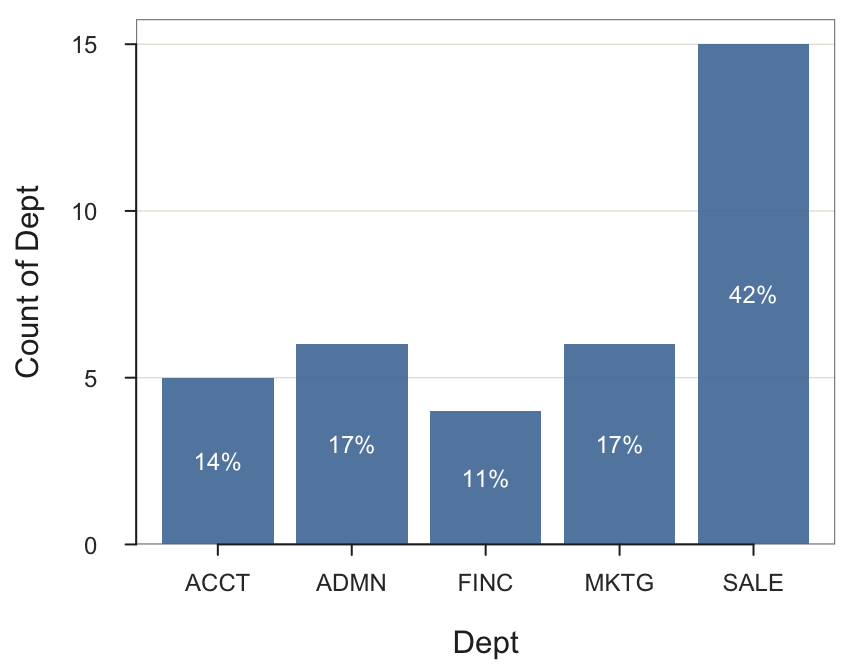
The next example illustrates HEX notation for the fill parameter as part of a call to the BarChart() function. If only one color is specified for the fill parameter in lessR data visualizations, such as the bar chart, then all of the corresponding plotted objects, such as bars, are plotted in that specified color. Figure 8 shows the default blue color obtained within Tableau from its Color parameter setting (mark) and then plots the bars in Tableau`s default blue color.
BarChart(Dept, fill="#4E79A7")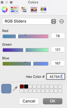
The RGB color space follows from the physical characteristics of how a computer screen displays color. But computer screens are not people. Unfortunately, engineering specifications of physical hardware do not directly translate into uniform human perception of colors. For example, there is no straightforward way to systematically vary colors and maintain the same levels of brightness with RGB colors. How we perceive color and how computer monitors display color are two distinct processes, which suggests the need for another color space.
HCL Color Space
The generally preferred specification of colors for data visualization is the HCL color space1, defined by three values that express colors as we perceive color, according to:
1 More technically, the polar coordinates of the CIE-LUV color space
- Hue - the color name as positioned on a rainbow
- Chroma - intensity of color from gray to saturated
- Luminance - brightness
The primary advantage of the HCL color space is that different regions of a visualization plotted in different hues, but the same levels of chroma and luminance can maintain the same level of intensity. Steps of equal size across chroma and luminance correspond to approximately equal perceptual changes in color. When all plotted objects, such as bars, have the same chroma and luminance, there is no unintentional emphasis on the brighter, more intense bars. Encouraging the person viewing the visualization to focus equally on all aspects presents the results in a neutral and unbiased manner.
Lighter, brighter areas of a visualization appears to “irradiate” into an adjoining darker area.
Changing the red, green, or blue component each in an equal number of steps and then displaying the result on a computer screen, unfortunately, does not uniformly change the intensity of the perceived color. Some of the transformed colors will be brighter than the others. The problem is that brighter, more intense colors tend to exaggerate the perceived size of an area relative to more subdued colors. More intense, brighter regions bias the interpretation as brighter colors visually are more apparent, larger, than darker regions.
The visualizations in Figure 9 leverage two pre-existing color sequences available from the lessR getColors() function, rainbow from Base R and rainbow_hcl from the colorspace package. Figure 9(a) illustrates the irradiation illusion. The red bar is more vivid than the light green bar. Figure 9(b) demonstrates the visual consistency of HCL colors that vary the hue while maintaining approximately the same chroma and luminance. These HCL colors minimize the irradiation illusion and unintentional focus on part of the visualization to the detriment of the rest.
getColors("rainbow")
getColors("rainbow_hcl")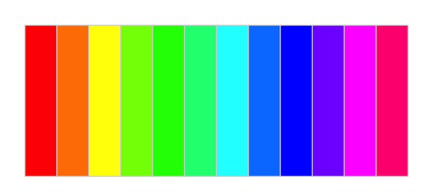
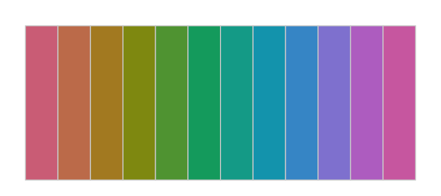
See the manual by entering ?getColorsinto the R console to identify other available pre-defined sequences, such as also heat_hcl and terrain_hcl plus others, some of which are discussed later.
For a continuous variable, avoiding the irradiation illusion contributes to the goal of perceptual uniformity when mapping data values to colors.
Plotted colors change appropriate to the amount of change in the corresponding data values.
The colors in a perceptually uniform palette, such as displayed by HCL colors, appropriately change corresponding to the changes in the magnitude of the data values. For example, the palette is not uniform if a small change in data values leads to a large change in the displayed colors. A perceptual non-uniform mapping of data to colors yields a distorted perception of the corresponding changes in the underlying data values.
For categorical variables, visualizations such as bars in a bar chart, slices in a pie chart, or points in a scatterplot that represent different levels generally should present all the colors with the same level of chroma and luminance. Some areas of color should not be brighter than others. Different colors should distinguish different areas that correspond to different categories but not bias the visual attention of some areas relative to others.
Within R, express HCL colors with the Base R function, hcl(), more conveniently accessed with the lessR color function getColors(). The parameter names for the three hcl() coordinates are h, c and l. Chroma and luminance dimensions scale from 0 to 100. Increasing c closer to 100 yields highly saturated, more vivid colors. Regardless of the value of h, a value of 0 for c results in gray scale, from dark colors of gray for values of l close to 0 and lighter colors of gray as the value of l approaches 100.
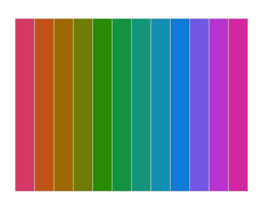
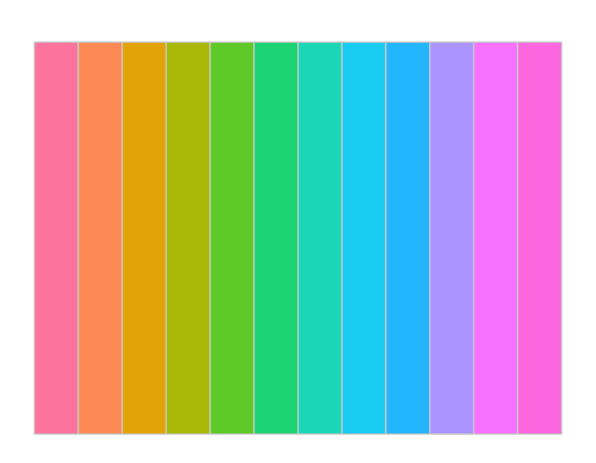
Figure 10 shows three examples of perceptual uniformity achieved with the lessR function getColors() applied to two pre-defined sets of colors. All three examples keep color saturation high, with chroma at 95, but vary luminance from 35 to 75. Obtain vibrant, rich hues from a high value of chroma and a low value of luminance, 35, as in Figure 10 (a). Obtain light, airy pastels from a high value of chroma coupled with a high value of luminance, 75, as in Figure 10 (c).
getColors("rainbow_hcl", c=95, l=35)
getColors("rainbow_hcl", c=95, l=55)
getColors("rainbow_hcl", c=95, l=75)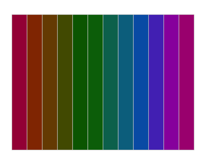
Most visualizations, especially composites of visualizations such as dashboards, should generally avoid overly bright, intense, harsh colors. Generally, use somewhat muted colors or add some transparency to the displayed colors.
As shown in the next section, Figure 14 and Figure 13, you can access these color sequences directly via the fill parameter.
Unfortunately, there is a problem displaying HCL colors: Translating human perceptual colors to the screens of color monitors is not straightforward.
Not all of the colors in the HCL color space of human perception translate into the RGB color space of computer monitors.
To display all HCL colors requires approximation of some of the colors translated to the RGB color space of color monitors. Only moderate values of chroma and luminance render all hues as precise HCL colors.
If using R to obtain HCL colors, set the parameter fixup to FALSE to show only precise HCL colors among the generated colors. Colors that fall outside of the RGB color space of computer monitors are displays as NA, that is, missing. By default, fixup is set to TRUE.
Color Palettes
Visualizations apply combinations of related colors, including shades of gray for grayscale.
A set of related colors, usually to provide consistent design such as data visualizations.
All visualization systems feature built-in color palettes. Users are also free to define any palette they choose, either generated by specialized functions or manually entered.
Three basic types of color palettes appear in visualizations offered by any visualization system: qualitative, sequential, and divergent.
Discussions of these three types of palettes follow. As we pursue generating palettes, realize that the resulting palettes are applicable to any data visualization system that permits customization of colors.
A standard color name, such as the hexadecimal representation of an RGB Color for a computer screen, is applicable to any data visualization system that displays colors on the computer screen.
To store colors generated by getColors(), store the result in a vector. This example, the vector of stored colors is named clr. The parameter output is set to false because there is no need here to actually view the palette.
clr <- getColors(output=FALSE)clr [1] "#4398D0" "#B28B2A" "#5FA140" "#D57388" "#9A84D6" "#00A898" "#C97E5B"
[8] "#909711" "#00A3BA" "#D26FAF" "#00A76F" "#BD76CB"Apply this getColors() palette defined by hexadecimal color specifications to any visualization system that allows custom colors displayed on a computer screen.
Qualitative Palettes
Nominal data are unordered data values of a categorical variable. Examples include State of Residence and Gender. To plot resulting data values such as the count of the occurrence of each data value, one option displays all levels, such as bars on a bar chart, with the same color. To apply a color palette, however, the appropriate scale for the display of the levels of nominal data is a qualitative palette.
Color palette of mixed hues applied to nominal data.
Preferably, different values of hues across the different bars, pie slices, or points should generally have the same chroma and luminance.
HCL Palettes
The lessR function getColors() generates the colors for a wide variety of color palettes and displays the resulting colors. The parameter list for getColors() begins with pal, for palette. In addition to the available predefined palettes as shown in Figure 10, it is straightforward to generate your own palettes.
The getColors() default value for pal is "hues", which generates the specified number of hues around the HCL color wheel, the default qualitative palette for the lessR visualizations. The number of colors for the generated palette is n, with a default value of 12. The function getColors() generates by default a rectangle, or specify a value of "wheel" for the parameter shape. The resulting palette is divided into intervals of hues in the order they are invoked in subsequent visualizations. Adjacent values were chosen to maximize hue separation. The value of the hue is h, presented in the plot. The text output also provides the hexadecimal and RGB information for each color.
Figure 11 indicates the getColors() text and visualization output for all default parameter values.
getColors()
      h    hex      r    g    b
-------------------------------
 1   240 #4398D0   67  152  208
 2    60 #B28B2A  178  139   42
 3   120 #5FA140   95  161   64
 4     0 #D57388  213  115  136
 5   275 #9A84D6  154  132  214
 6   180 #00A898    0  168  152
 7    30 #C97E5B  201  126   91
 8    90 #909711  144  151   17
 9   210 #00A3BA    0  163  186
10   330 #D26FAF  210  111  175
11   150 #00A76F    0  167  111
12 300 #BD76CB 189 118 203 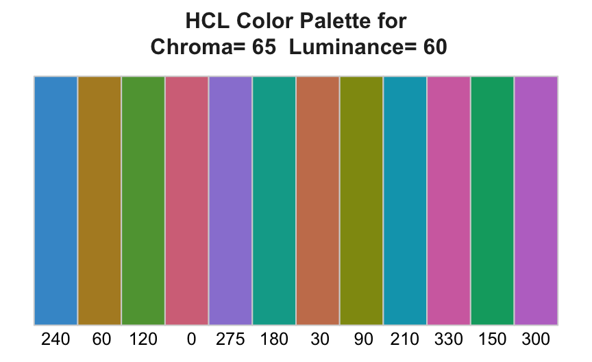
The ordering of the hues was chosen to maximize differences between adjacent hues, arbitrarily beginning with blue (240), brown (60), green (120), red (0), and purple (275) for the first five hues.
This default "hues" qualitative palette is implicitly generated by getColors() for each bar chart that assumes the default value of the fill parameter. Also, a slight transparency is added to further soften the displayed bars of the bar chart, shown in Figure 12.
BarChart(Dept) or BarChart(Dept, fill=getColors())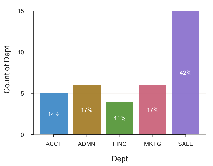
Explicitly override the default by providing any qualitative palette for fill, including having getColors() generate an alternative with different chroma and luminance values. Figure 13 shows deeper, bolder colors than provided by the default by lowering luminance to l=30.
BarChart(Dept, fill=getColors(c=95, l=30))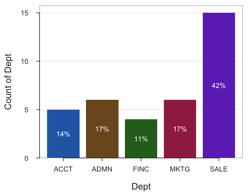
Or minimize the color differences between the bars by dropping chroma to c=25, as shown in Figure 14, almost desaturating the colors.
BarChart(Dept, fill=getColors(c=25, l=35))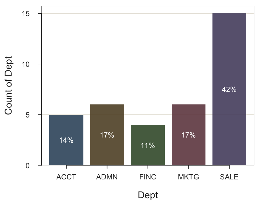
Manual Palettes
Complete Customization
One possibility creates a palette color-by-color. Enter multiple colors, applying getColors() to experiment with different color combinations to choose the palette. One inspiration for creating your custom palette is working with complementary colors or other related color patterns.
For given color, the color on the opposite side of the color wheel.
Complementary colors paired together often form pleasing combinations for graphic design and data visualization. Many free online sources are available from which to choose these complementary and other related colors, here from canva.com, illustrated in Figure 15.
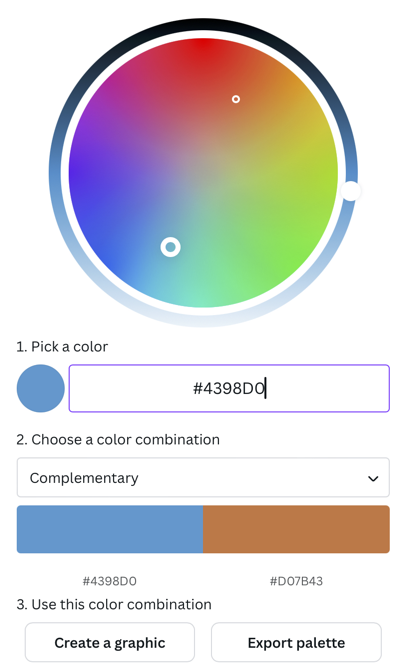
Specify the palette of multiple colors as a single unit with the vector function c() when calling getColors(). Usually, each color would be specified with the same notation. However, to demonstrate, this example uses multiple ways to specify colors. Store the resulting five colors in a vector, here named clr, as shown in the function call that created Figure 16.
clr <- getColors(c("#63B99F", rgb(.35,.53,.71), hcl(40,60,70),
                   "palevioletred2", "gray60"))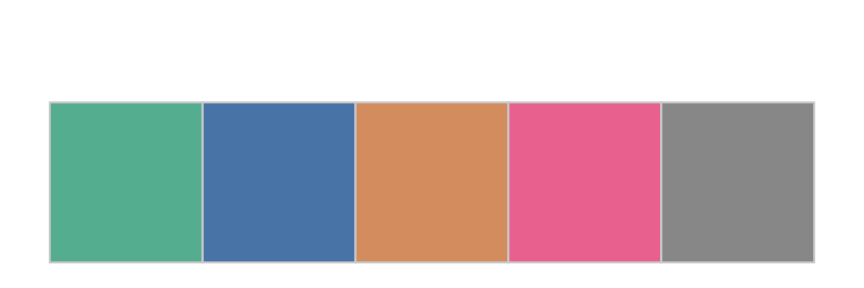
Figure 17 shows the bar cart constructed from this manually constructed palette, directly references the clr vector.
BarChart(Dept, fill=clr)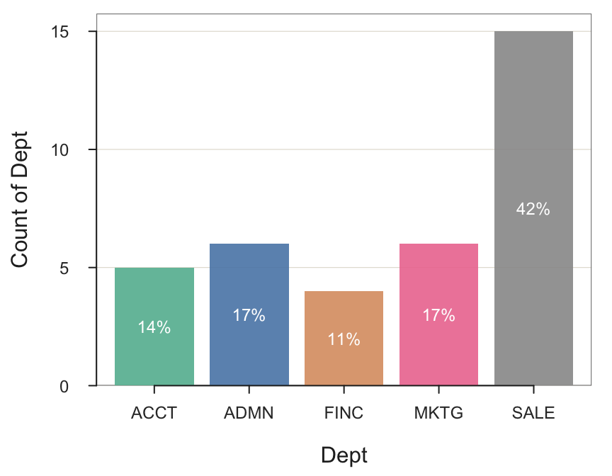
From an Image
Another possibility creates a palette from an image. For example, there could be official corporate logos or photographs from which a palette could be extracted from one of many online free services and then incorporated into subsequent data visualizations. Find the image picker illustrated in Figure 18 at coolors.co. Drag the circles on the picture around to obtain different colors. Drag a color to a different spot on the palette to rearrange the colors.
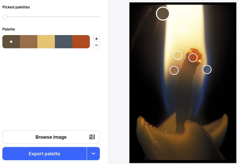
In this example, click on Export palette and choose Code, from which the following five colors were copied and the bar chart created as shown in Figure 19.
BarChart(Dept, fill=c("#69503A","#A86E47","#F2C66F","#4A5967","#CA4A18"))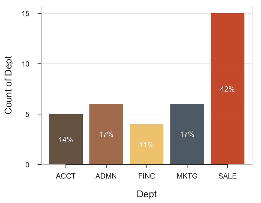
In general, follow the principle that the colors of a qualitative palette should share the same levels of chroma and brightness. Other possibilities, such as Figure 19, can also be considered to achieve specific effects, including the palette discussed next.
CVD Palettes
Many people are susceptible to various forms of a color vision deficiency (CVD). The eye contains receptor cells for the primary colors: red, green, and blue. The most common form of CVD does not distinguish red from green, which results from either missing red or the green color receptor cells in the eye. Accordingly, the two colors are often confused, so it can be problematic to include both colors in the same palette. Less frequently, the blue color receptor cells can also be missing, resulting in difficulty distinguishing between blue and yellow colors.
About 8% of men and 0.5% of women experience some degree of CVD, though the inability to visualize any color is rare.
A qualitative scale of some popularity to address these forms of color vision deficiency are the eight colors of the Okabe-Ito palette (Okabe and Ito 2008), shown in Figure 20. This palette is directly accessible via lessR.
getColors("Okabe-Ito", n=8)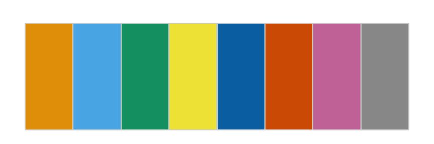
An illustrative bar chart that applies the first five colors of this palette appears in Figure 21.
BarChart(Dept, fill="Okabe-Ito")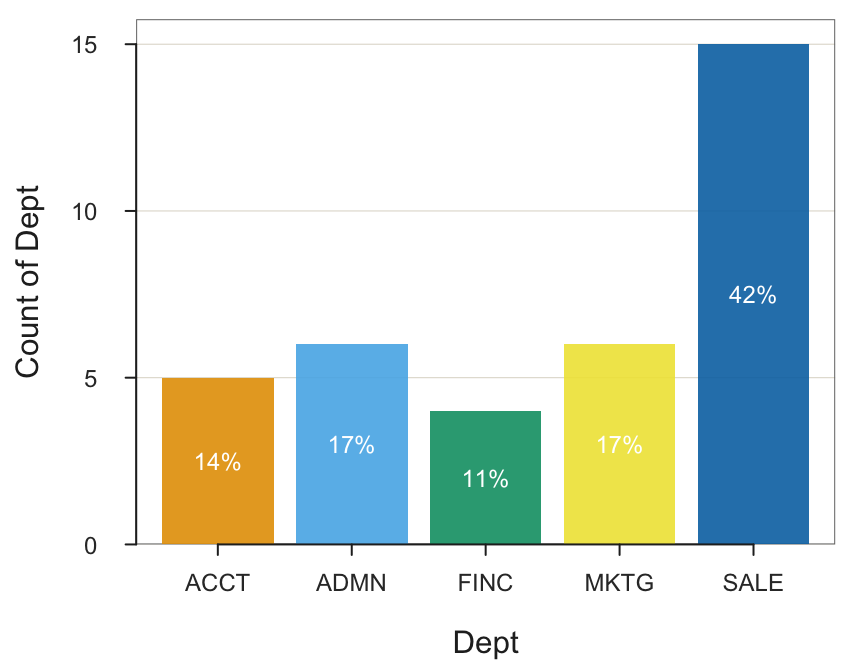
The R package colorBlindness provides a variety of CVD palettes. It also provides functions that emulate how different palettes are perceived with different types of CVD.
Sequential Palettes
Definition
A sequential palette applies to a variable with ordered values, an ordinal categorical variable or a continuous variable.
Systematically vary chroma or luminance at the same hue to generate a palette of colors.
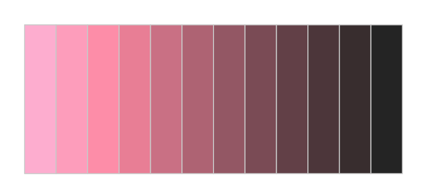
Examples of creating a sequential palette appear in Figure 22 by keeping hue constant at h=0 for red and varying either chroma or luminance .
getColors(h=0, l=60, c=c(0,100))
getColors(h=0, c=80, l=c(90,20))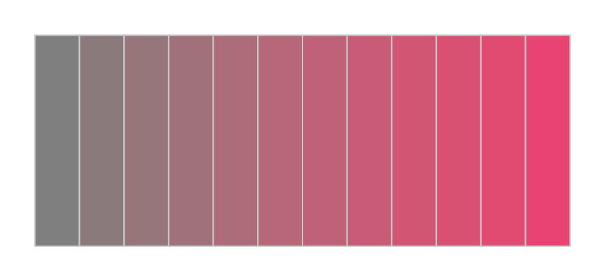
Pre-defined Palettes
Express the hues of the HCL color space in terms of degrees from 0 to 360 (and multiples thereof) . Set the hue with the longest wavelengths of light, red, to zero degrees. Green and blue, the other primary hues, display in 120-degree increments (120 and 240 degrees, respectively). Figure 23 depicts the hues around the color wheel in 30-degree increments. Color names are also provided; some are global, but all are recognized by the lessR color management system.
The following call to getColors() generates the color wheel in Figure 23, without the color names. The default values for chroma and luminance are c=65 and l=60.
getColors(n=12, shape="wheel")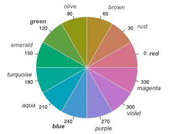
For convenience, getColors() provides a pre-defined sequential ranges for each corresponding hue name. The names of the pre-defined ranges are the hue names from the color wheel in Figure 23 expressed as the plural of the color name, that is, with an added “s”. For example, the hue at 240 degrees, “blue”, defines a corresponding sequential range named "blues". Also included is a grayscale sequential palette defined by "grays".
The getColors() function generates sequential palettes for the specified value of n and adjusts the extent of the range of luminance according to the number of intervals generated, so the fewer intervals, the less the range. Custom values of the start and end points of luminance can also be specified with the l parameter.
Substitute "rusts" or "emeralds" or "purples" or any other plural version of the HCL color wheel names from Figure 23 to access a corresponding pre-defined sequential color scale, plus "grays". Figure 24 shows three examples of these sequential scales.
getColors("rusts")
getColors("aquas")
getColors("grays")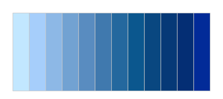
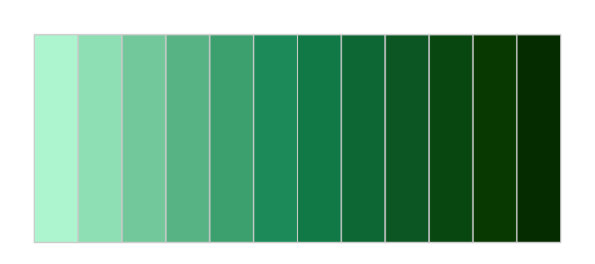
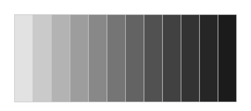
lessR pre-defined sequential palettes.
The pre-defined palettes such as "blues" pre-select the hue as well as the chroma and luminance. Include custom values for c and l in the call to getColors() to override the provided default values. The default level of chroma for each pre-defined palette varies from 35 to 75. The default range of luminance depends on the number of intervals generated.
Consider the variable for job satisfaction in the employee data set, JobSat, which has three levels: Low, Med, and High. As with any categorical variable, the first step in its analysis is to formally declare it as a categorical variable, which in R is according to the factor() function. Here, set the optional parameter ordered to TRUE, defining JobSat as an ordinal level categorical variable.
d$JobSat <- factor(d$JobSat, level=c("low", "med", "high"),
                             ordered=TRUE)
Figure 25 shows the resulting bar graph. Because JobSat is ordinal, lessRautomatically applies a sequential pallet to color the bars.
BarChart(JobSat)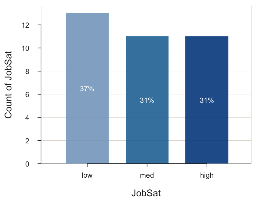
Of course, use the fill parameter to indicate a sequential palette with other hues than the default blue (for the existing color theme, explained later).
CVD Viridis Palette
The most commonly applied sequential palette for color vision deficiency (CVD) is named viridis (Rudis, Ross, and Garnier 2018). The viridis palette is free of red hues, directly addressing the problem of red-green perceived color deficiency.
The viridis palette was developed according to the following principles.
Perceptual uniformity, so that similar data values similar have similar-appearing colors, and data with discrepant values have more different-appearing colors, consistently across the range of values
Span as wide a color palette as possible to accentuate differences in adjacent colors, with outliers readily detected with dark blue
Robust to color vision deficiency, so that the above properties hold true for people with unable to perceive the full color spectrum
The lessR function getColors() can directly display the viridis palette. The default value for n, the number of intervals, is 12. A large value such as n=100 approximates continuity, resulting in Figure 26.
getColors("viridis", n=100, border="transparent")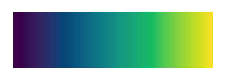
The viridis palette spans a wide color gamut, from dark blue to bright yellow. One implication is that extreme data values, large or small, shown as either dark blue or bright yellow, are differentiated from the other data values. Regarding perceptual uniformity, no large color steps intrude across adjacent color values. Instead, dark blue smoothly transitions from to blue to blue-green to green to yellow.
As a sequential palette, the viridis palette is best applied to a variable with ordered levels of magnitude, ordinal variables, and especially numerical variables with data values from a continuum. An application is the default palette for producing choropleth maps with the mapview() function, which is the viridis palette. An example is the Gini distribution map shown in Figure 27.
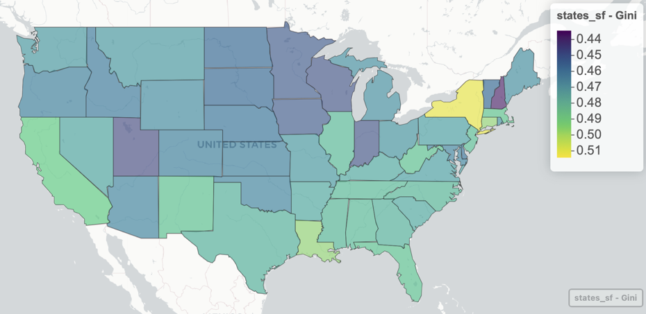
As indicated, viridis excels at detecting extreme values. In Figure 27, the state with the largest Gini coefficient, New York, is clearly distinguished from the remaining states with its yellow color.
Divergent Palettes
Another form of a color palette diverges from two colors toward the neutral middle.
Each side of the palette is anchored by a different color, each fading to a central neutral color toward the middle.
For lessR, the most straightforward method to define a divergent scale follows from the pre-defined sequential palettes such as “reds” and “blues” based on the HCL color names from Figure 23. The first parameter, pal, names the hue to be generated. If the scale is to be divergent, it names the left side of the scale. The second parameter, end_pal, indicates divergent. If present, it names the hue of the right side. An example of a divergent palette appears in Figure 28.
getColors("reds", "blues", n=100, border="transparent")
To apply to a data visualization, we return to a different data set, the results of an attitude survey with 20 items labeled from m01 one to m20. The Survey response to each item was on a six-point scale from strongly disagree to strongly agree. The data table is included with `lessR`, called *Mach4*.
d <- Read("Mach4")The data are recorded numerically, each response from 0, strongly disagree, to 5, strongly agree. Label the numerical responses with the corresponding category name using the lessR factors() function, which can assign the factor levels and labels simultaneously to multiple variables, here in the d data frame.
LikertCats <- c("Strongly Disagree", "Disagree", "Slightly Disagree",
                "Slightly Agree", "Agree", "Strongly Agree")
d <- factors(m01:m20, levels=0:5, labels=LikertCats, ordered=TRUE)
Set the fill parameter with a call to getColors() to define a divergent scale. With the specification in Figure 29, a red color indicates a Disagree, and a blue color indicates an Agree. Given six possible response categories, there is no one value precisely in the middle, so there is no precisely gray bar.
BarChart(m05, fill=getColors("reds", "blues"))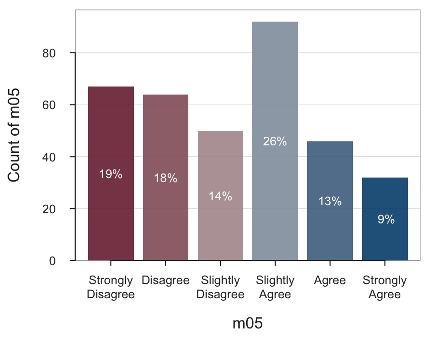
We can view the responses to all 20 items on the default divergent scale by simply listing all 20 items as the data values to create the bar chart shown in Figure 30.
BarChart(m01:m20)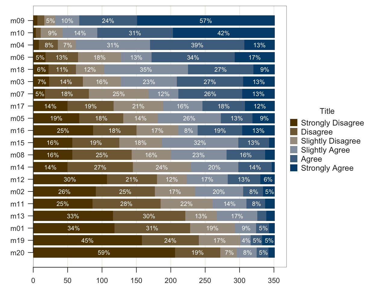
As an option, remove the labels displayed within each bar segment, shown in Figure 31. Also, change from the default divergent scale Brown-Blue to Green-Violet.
BarChart(m01:m20, fill=getColors("greens", "violets"), labels="off")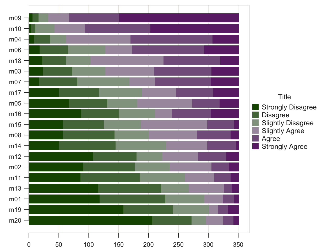
With listing multiple one-column bar charts, BarChart() by default sorts the items by their mean response. The average score for m09 is the highest of all 20 items. The average score for m20 is the lowest.
Other Customizations
Themes
The values for each visual aesthetic, color or style option, can be pre-set as a group to define a theme, a presumably harmonious blend of visual aesthetics. lessR offers a variety of pre-defined themes, including their default themes.
The default lessR theme, “colors”, displays a relatively colorful palette. The lessR themes present different color combinations called themes.
Pre-defined values for all visual aesthetics that apply to all visualizations when activated.
Change or tweak a lessR theme with the style() function. The theme argument is the first argument in the parameter list for the function, so the first unnamed argument to style() specifies the theme. The lessR theme names correspond to the predominant theme color. Beyond the default of “colors”, lessR themes include “lightbronze”, “dodgerblue”, “darkred”, “gold”, “darkgreen”, “blue”, “red”, “rose”, “slatered”, “green”, “purple”, “sienna”, “brown”, “orange”, “white”, “light”, and “gray” for grayscale, set with style("gray").
For additional flexibility, lessR also provides the sub_theme parameter. The sub_theme “black” sets a black background for any of the primary themes, as shown in Figure 32.
style("slatered", sub_theme="black", quiet=TRUE)
BarChart(Dept)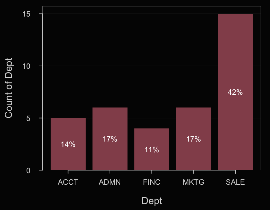
Once the style has been set, it remains active until changed. So, the histogram in Figure 33 continues the same style settings set for Figure 32.
Histogram(Salary)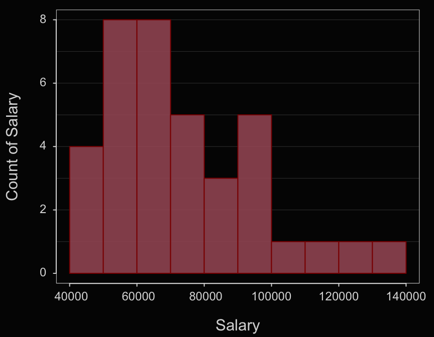
Now reset the style to the default for subsequent visualizations.
style()If a theme is only to be applied to a single visualization, invoke the theme parameter to specify a theme different from the current theme.
Individual Characteristics
Many characteristics of a data visualization do not depend directly on the data values. Want green axis labels, extra large? A purple background? Want to customize almost any aspect of your visualization? View the available lessR color and style options with a call to style(), setting the show parameter to TRUE.
style(show=TRUE)
Available Themes
----------------
colors lightbronze dodgerblue darkred gray gold darkgreen
blue red rose slatered green purple sienna brown orange
white light


Available Sub-themes
--------------------
default black wsj

THEME
theme ........ Theme color ....... colors
sub_theme .... Sub-theme style ... default

BACKGROUND
window_fill .. Window fill color ......... white
panel_fill ... Panel fill color .......... white
panel_color .. Panel border color .......  gray45
panel_lwd .... Panel border line width ..  1.0
panel_lty .... Panel border line type ...  solid

DATA OBJECTS
bar_fill ......... Bar fill color ............ 67 152 208 255
trans_bar_fill ... Bar fill transparency ..... 0.00
bar_color ........ Bar border color .......... 132 150 175 255
labels ........... Form of bar or pie labels . %
labels_color ..... Color of bar or pie labels . white
labels_size ..... Size of labels on bars, pie  NULL
labels_digits .... Decimal digits on bars, pie  NULL
labels_position .... Position of labels ...... .. in

pt_fill .......... Point fill color .......... 50 78 92 255
trans_pt_fill .... Point fill transparency ..  0.00
pt_color ......... Point border color .......  50 78 92 255
out_fill ......... Outlier point fill .......  firebrick4
out_color ........ Outlier point color ......  firebrick4
out2_fill ........ Extreme outlier point fill  firebrick2
out2_color ....... Extreme outlier point color firebrick2
violin_fill ...... Violin fill color ......... 116 133 151 90
violin_color ..... Violin border color ....... gray15
box_fill ......... Boxplot fill color ........ 65 155 210 255
box_color ........ Boxplot border color ...... gray15
fit_color ........ Fit line_color ...........  92 64 50 255
se_fill .......... Stnd error fill color ....  26 26 26 25
ellipse_fill ..... Ellipse fill color .......  146 128 111 40
ellipse_color .... Ellipse border color .....  gray20
ellipse_lwd ...... Ellipse border width .....  1.00
bubble_text_color  Bubble text color ......... 247 242 230 255
segment_color .... Line segment color ........ gray40
heat ............. Heat map color ............ gray30

AXES
axis_color ..... Color of axes .............. gray15
axis_x_color ... Color of x-axis ............ NULL
axis_y_color ... Color of y-axis ............ NULL
axis_lwd ....... Axis line width ............ 1.0
axis_x_lwd ..... Axis line width ............ NULL
axis_y_lwd ..... Axis line width ............ NULL
axis_lty ....... Line type of axes .......... solid
axis_x_lty ..... Line type of x-axis ........ NULL
axis_y_lty ..... Line type of y-axis ........ NULL
axis_cex ....... x and y axis text size ........... 0.75
axis_x_cex ..... x-axis text size ................. NULL
axis_y_cex ..... y-axis text size ................. NULL
axis_text_color  x and y axis values text color ... gray20
axis_x_text_color  x-axis values text color ....... NULL
axis_y_text_color  y-axis values text color ....... NULL
rotate_x ....... Rotation of x axis text .......... 0.00
rotate_y ....... Rotation of y axis text .......... 0.00
offset ......... Offset of values text from axis .. 0.50

LABELS
lab_color ...... Color of axis labels ............. gray15
lab_x_color .... Color of x-axis label ............ NULL
lab_y_color .... Color of y-axis label ............ NULL
lab_cex ........ Size of axis labels .............. 0.98
lab_x_cex ...... Size of x-axis labels ............ NULL
lab_y_cex ...... Size of y-axis labels ............ NULL
main_color ..... Color of plot label .............. gray15
main_cex ....... Size of plot title ............... 1.00

GRID LINES
grid_color .... Grid color ...................... 222 217 205 255
grid_x_color .. Grid color, vertical ............ NULL
grid_y_color .. Grid color, horizontal .......... NULL
grid_lwd ...... Grid line width ................. 0.5
grid_x_lwd .... Grid line width, vertical ....... NULL
grid_y_lwd .... Grid line width, horizontal ..... NULL
grid_lty ...... Grid line type .................. solid
grid_x_lty .... Grid line type, vertical ........ NULL
grid_y_lty .... Grid line type, horizontal ...... NULL

TRELLIS STRIP
strip_fill ...... Trellis strip fill color ..... 127 127 127 55
strip_color ..... Trellis strip border color ... gray40
strip_text_color  Trellis strip text color ..... gray15

ANNOTATION
add_fill  .. Fill color of annotated figures .. 217 217 217 32
add_trans .. Fill transparency ................ 0
add_color .. Color of annotated lines ......... gray30
add_cex  ... Size of annotated text ........... 0.75
add_lwd  ... Line width of annotated lines .... 0.5
add_lty  ... Line type of annotated lines ..... solid

NON-GRAPHICAL
quiet ..... Suppress console output for many functions .. TRUE
brief ..... Reduce console output for many functions .... FALSE
suggest ... Suggestions for enhanced input .............. TRUE
note ...... Notes for enhanced input .................... TRUE
width ..... Column width ................................ 120
n_cat ..... Largest number of unique, equally spaced
            integer values of a variable for which the
            variable will be analyzed as categorical .... 1
To illustrate, specify a new background color for the plot area of a panel, the rectangle defined by the x and y coordinate axes with the panel_fill parameter. According to the listed parameter values, set the color of the labels for each axis to “royalblue1” with the lab_color parameter. The result is Figure 34.
style(panel_fill="slategray1", lab_color="royalblue1")
Plot(Years, Salary)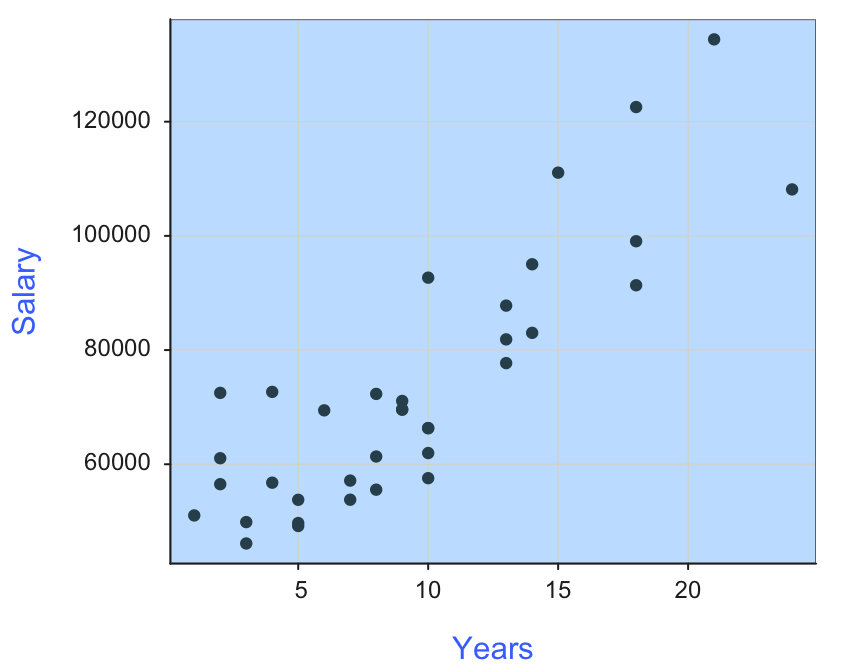
The most straightforward function call to re-initialize the style settings is style(), which resets all parameters to the default theme, the equivalent of style("colors").
Drawing Editor
Another possibility for editing that offers the most flexibility is to leave the data visualization app entirely and complete editing in a standalone drawing editor, a vector graphics editor. Since the 1990’s, the expensive and commercial standard for vector graphics is Adobe Illustrator, rented on a monthly basis, $38 per month until the next price increase. Much more affordable is Affinity Designer $70 for Windows and MacIntosh, and $18.49 for iPad, for a one-time purchase. Inkscape offers the ultimate in affordability, providing an open-source, free, and capable alternative with more than 20 years of development and an extensive developer and support community. Other alternatives are available as well.
The Affinity company has recently been purchased by Canva, which operates an extensive, partially free, website for data visualization and graphics design.
The key to using these drawing editors is to save the data visualization as a vector graphics file, such as a PDF. Within the drawing application, each individual object of a PDF file is selectable and then editable.
To demonstrate, consider the lessR bar chart saved as a PDF file from RStudio with the following menu sequence:
Plots –> Export -> Save as PDF...
The bar chart was opened in Affinity Designer, as shown in Figure 35.
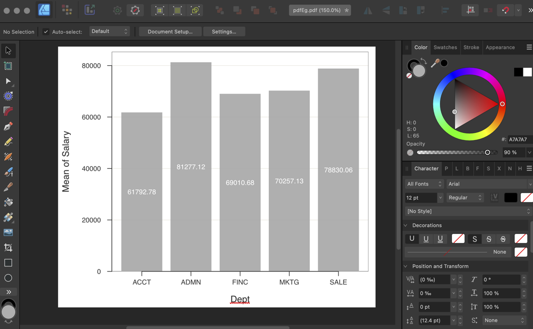
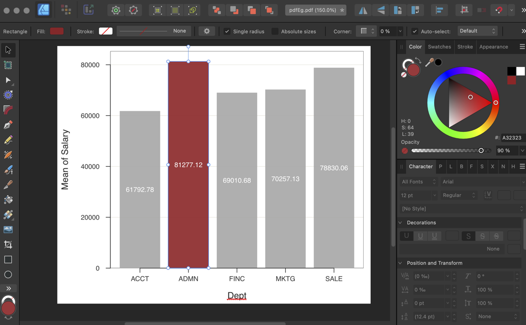
Double-click on the desired bar to select it. Once selected, move to the color picker at the top right and choose the color for the bar’s interior, as shown in Figure 36.
All objects are selectable. Figure 37 shows the selection of the axis labels. After the selection, move to the color picker and choose a blue color.
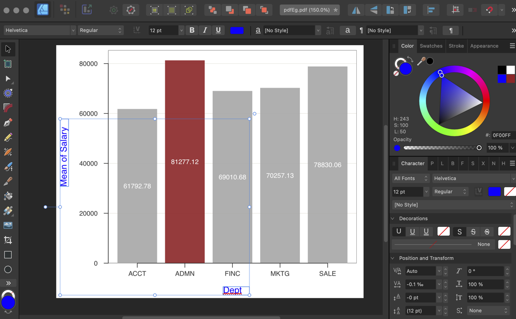
Editing a visualization in a drawing application offers a wider range of options than available in any data visualization application. The updated visualization can be saved in a variety of formats and used in presentation software ranging from MS Word and PowerPoint to RStudio’s Quarto.