Lecture 17
Simple
Regression
Prediction
When I discussed correlation, I noted that a perfect correlation between two
variables produces a line when plotted in a bivariate scatterplot.
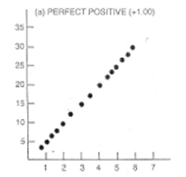
In this figure, every increase of
the value of X is associated with an increase in Y without any exceptions. If
we wanted to predict values of Y based on a certain value of X, we would have
no problem in doing so with this figure. A value of 2 for X should be
associated with a value of 10 on the Y variable, as indicated by this graph.
Many times in scientific studies, we are interested in predicting values of Y based
on X. For example, we may be interested in the blood cholesterol level of
patients based on their daily intake of fat. We would be predicting values of
cholesterol based on how much fat is in the diet. In the above picture, X is a
perfect predictor of Y. We know exactly what the value of Y will be for a given
value of X, because they all fall on a perfect line.
Error of
Prediction--the "Unexplained Variance"
Usually, prediction won't be so perfect. Most often, not all the points will
fall perfectly on the line. There will be some error in the prediction. For
each value of X, we know the approximate value of Y but not the exact value.

In the above figure, blood
cholesterol and fat intake are related, but we are not able to predict
cholesterol levels perfectly based on the fat intake. The points in the graph
that fall off of the line are not perfectly predicted. We can look at how much
each point falls off the line by drawing a little line straight from the point
to the line as shown below (sorry, my little lines are not perfectly aligned
with the points).
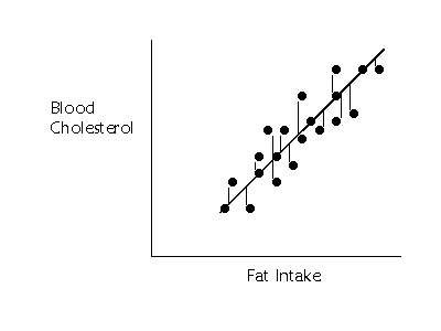
If we wanted to summarize how much
error in prediction we had overall, we could sum up the distances (or deviations)
represented by all those little lines. The middle line is called the regression
line. Summing up the deviations of the points gives us an overall idea of
how much error in prediction there is. Unfortunately, this method does not work
very well. If we choose a line that goes exactly through the middle of the
points, about half of the points that fall off of the line should be below the
line and about half should be above. Some of the deviations will be negative
and some will be positive, and, thus the sum of all of them will equal 0.
Remember that when we added all the deviations of the scores from the mean, we
also got 0? So, we pick a similar solution to the problem here. If we want to
summarize the overall error in prediction, we sum up all the squared deviations
from the regression line.
To calculate the deviations from the
line we need a little notation. In regression analyses, we label the points ![]() . We try to
predict the scores on the Y variable, given certain values of the X variable.
So, we are primarily concerned with the
. We try to
predict the scores on the Y variable, given certain values of the X variable.
So, we are primarily concerned with the ![]() scores. The (imaginary) scores that fall
exactly on the regression line are called the predicted scores, and there is a
predicted score for each value of X. The predicted scores are represented by
scores. The (imaginary) scores that fall
exactly on the regression line are called the predicted scores, and there is a
predicted score for each value of X. The predicted scores are represented by ![]() (sometimes
referred to as "y-hat", because of the little hat; or as
"y-predict"). So the sum of the squared deviations from the predicted
scores is represented by
(sometimes
referred to as "y-hat", because of the little hat; or as
"y-predict"). So the sum of the squared deviations from the predicted
scores is represented by

in which each y scores is subtracted
from the predicted score (or the line) and then squared. Then all the squared
deviations are summed up. Notice that this is a type of variation. It is the unexplained
variation in the prediction of y when x is used to predict the y scores.
Some books refer to this as the "sum of squares residual" because it
is a measure of the residual variation (like a "residue" left over).
Whatever we decide to call it, sum of the squared deviations from the
regression line (or the predicted points) is a summary of the error of
prediction.
The Regression Line
and Ordinary Least Squares Criterion
Conversely, if we want to draw a line that is perfectly through the middle of
the points, we would choose a line that had the squared deviations from the
line. Actually, we would use the smallest squared deviations. This criterion
for best line is called the "Least Squares" criterion or Ordinary
Least Squares (OLS).
We use the least squares criterion
to pick the regression line. The regression line is sometimes called the
"line of best fit" because it is the line that fits best when drawn
through the points. It is a line that minimizes the distance of the actual
scores from the predicted scores.
Sum of Squares
Regression--the Explained Variance
When we studied correlation, we
saw that a linear relationship between two variables could be seen as a stream
of points when plotted. When the correlation between x and y equals zero (no
tendency for y to be large (or small) when x is large), there is just a group
of random points. The graphs below show an example of each.
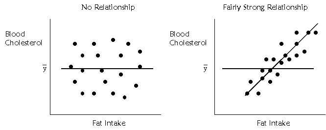
On the left, there is no
relationship between fat intake and cholesterol. On the right, there is a
relationship. The regression line is flat when there is no ability to predict
whatsoever. The regression line is sloped at an angle when there is a
relationship.
The extent to which the regression
line is sloped, however, represents the degree to which we are able to predict
the y scores with the x scores. When I discussed the mean, I said the mean
offered a way to summarize a group of scores. The scores are most likely to be
close to the mean, because it is the middle. Therefore, if you wanted to guess
at any one of the scores, the best guess would be the mean. When there is no
relationship between x and y, the values of x are of no help in predicting the
y scores, so we might as well use the mean of y, or ![]() to predict y scores. In the left
hand side of the above figure, there is a flat line drawn at the mean. The best
way to predict the y scores is with the mean of y. To the extent that there is
a relationship between x and y, there will be some slope in the line of
prediction. So, the degree to which the regression line is sloped compared to
the mean, represents the amount we can predict y scores.
to predict y scores. In the left
hand side of the above figure, there is a flat line drawn at the mean. The best
way to predict the y scores is with the mean of y. To the extent that there is
a relationship between x and y, there will be some slope in the line of
prediction. So, the degree to which the regression line is sloped compared to
the mean, represents the amount we can predict y scores.
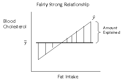
The extent to which the regression
line is sloped represents the amount we can predict y scores based on x scores,
and the extent to which the regression line is beneficial in predicting y
scores over and above the mean of the y scores. To represent this, we could
look at how much the predicted points (which fall on the regression line)
deviate from the mean. This deviation is represented by the little vertical
lines I've drawn in the above figure. If we want to quantify this distance, we
could use a similar method as before. The squared deviations of the predicted
scores from the mean score, or

represent the amount of variance
explained in the y scores by the x scores.
Total Variation
We may also want to know about the total variation in the y scores. That is
pretty easy to represent, because we have done the same thing elsewhere. The
total variation is measured simply by the sum of the squared deviations of the
y scores from the mean.

It turns out that the explained sum
of squares and the unexplained sum of squares add up to equal the total sum of
squares. The variation of the scores is either explained by x or not.
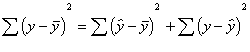
Total
sum of squares = explained sum of squares + unexplained sum of squares.
The Regression
Equation
The regression equation is simply a mathematical equation for a line. It is the
equation that describes the regression line. In algebra, we represent the
equation for a line with something like this:
![]()
a is the intercept, or the point at
which the line travels through the y-axis (sometimes called the y-intercept),
and b is the slope of the line. One can think of the y-intercept as the value
of y when x is equal to 0. With a grid, we could find the slope of the line by
counting how many points we have to go up to meet the line again after we have
gone over one point to the right (remember "rise over run"). So the
slope is a ratio of the increase in y with every point increase in x. With
regression analysis, we need to find out what the equation of the line is for
the best fitting line. What is the slope and intercept for the regression line?
If the slope is zero, there is no relationship between x and y. If the slope is
larger than 0 (or smaller, if the relationship is negative), there is a
relationship.
To figure out the equation for the
regression line, we first want figure out the slope, b. Here is the formula for
that:
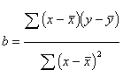
Pretty simple, we've done similar
formulas before. Notice that on the top of the formula, we compute the
deviations of the x's from the mean of x and the deviation of the y's from the
mean and multiple them. We do not square them. This top part of the equation
can be called the covariance of x and y. The slope then represents the
amount that x and y covary together relative to the overall variation of x. And
sometimes the equation for b is written as:
![]()
the intercept, a, can then be
obtained using b:
![]()
where ![]() and
and ![]() are the means of x and y
respectively. In regression analysis, we are attempting to predict y based on x
scores, so we represent the regression equation with a
are the means of x and y
respectively. In regression analysis, we are attempting to predict y based on x
scores, so we represent the regression equation with a ![]() symbol to indicate a predicted
score:
symbol to indicate a predicted
score:
![]()
I used the example of exam scores
and time on examine in the correlation lecture
to compute the regression equation. I'm not going to go through the steps here,
because you should be getting the hang of this stuff. You might want to check
my work as an exercise. If we solve the above equations for b and a, we would
then wind up with an equation that looked like this:
![]()
meaning that the y-intercept was a
value of -13.24 on the y axis, and the slope of the line is .69. The slope
represents the amount of increase in y scores with one unit change in x scores.
As we increase the time on the exam by 1 minute (x), we expect scores on the
exam (y) to increase by .69. The y-intercept is not always meaningful. For
instance, here, it means that when there are 0 minutes spent on the exam, the
score on the test is about -13.