 For ratio or ordinal variables, you also want to know if the variables
are badly skewed - most of the responses piled up at one end of the scale.
For ratio or ordinal variables, you also want to know if the variables
are badly skewed - most of the responses piled up at one end of the scale.
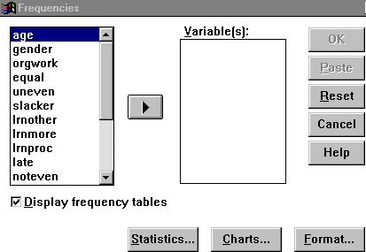
Your first step is to run frequencies on each of the variables you are going to use. Click on "Statistics," then on "Summarize," then on "Frequencies." Notice the other options you have. We will discuss the Compare Means and Correlate options later. You need a background in statistics to go any further. We will also discuss Crosstabs later - in effect, Crosstabs allows you to compare two or more nominal variables, for example to see whether gender might be related to preferred seating area.
You specifically want to know if any of the variables are in fact constants
- if everyone marked one value, the variable is, of course, worthless.
For ratio or ordinal variables, you also want to know if the variables
are badly skewed - most of the responses piled up at one end of the scale.
For nominal variables, you want to know if there are any response categories with very few responses: If there are, it may make sense to combine two or more categories. (You really can't do much with a category that has only two or three responses). I will discuss how to recode your variables into new variables, in which two or more categories are combined, a little later.
When you click on the Frequencies button, the screen at the right will open up. You can choose the variables you want to analyze by clicking on them one by one, or by highlighting an entire block. When you click on the arrow, everything you have highlighted will move into the "Variables" box. Notice that, when a variable is in the "Variables" box, the arrow turns around: you can use it to move variables either into our out of the box, on at a time or in contiguous groups.
If you want a chart, click on "Charts." It is often helpful to have a bar chart or histogram to help grasp the distribution of your data. However, I personally prefer the graphics function in Excel - it is easy to copy the output from your analysis into Excel or another spreadsheet software, and create your charts there.
If you have nominal data, you won't want to run any statistics, except
possibly "Mode," but if you have ordinal or ratio data, you will
want to run at least the median, and (for ratio-level data) the mean and
standard deviation. For a variable like age, that may have twenty or more
response categories, you may want to turn off the frequency table and rely
only on the Statistics. 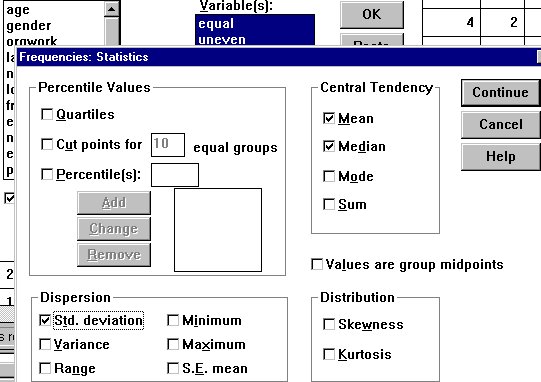 You can turn off frequencies by clicking over the check-mark next to "Display
frequency tables."
You can turn off frequencies by clicking over the check-mark next to "Display
frequency tables."
When you click on the Statistics button, the window on the right will open up. I have chosen Mean, Median, and Std deviation (Standard Deviation). I didn't click on range, minimum or maximum because for my data that will be obvious.
For a variable like age, you probably won't want to show a complete table, so you will want to check "Range," and/or "Minimum" and "Maximum." The other choices won't be meaningful to you until you have taken a couple of statistics courses.
The output from the frequencies command is shown in the box below and
to the right. Notice that the variable name is shown in all caps, the variable
label is shown exactly as I entered it. 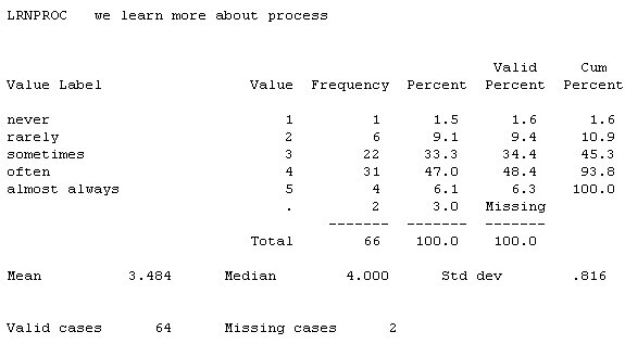 Each value is shown, with its value label. "Value" is how the
subjects actually responded. The column after "Value," "Frequency,"
is the actual number of subjects who gave each response. Notice that one
"Value" is a period. If any subject does not respond the a particular
question, the computer assigns a missing value and prints it as a period.
Each value is shown, with its value label. "Value" is how the
subjects actually responded. The column after "Value," "Frequency,"
is the actual number of subjects who gave each response. Notice that one
"Value" is a period. If any subject does not respond the a particular
question, the computer assigns a missing value and prints it as a period.
Next to Frequency is the percent of the total sample giving each response. Valid Percent is the percent of the total sample who actually responded the question. Cumulative percent is the percent of the total sample who gave this response or any of the previous responses.
The statistics are at the bottom of the table: Mean, Median, and Standard Deviation. At the very bottom is a summary of the total number of valid cases and the number of cases who gave no response ("Missing cases"). For this particular question, you will notice that most of the subjects gave a response in the middle; that is not at all unusual.
When we are trying to measure a concept that is complex or subject to
different interpretations, it is a good idea to ask several questions that
get at the same thing. (UNEVEN) and "At least one person does little
or nothing" (SLACKER). 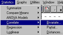
Thus, for example, I asked three questions all getting at the concept of the degree to which the workload is evenly shared within the group: "Everyone does a more or less equal part" (EQUAL), "The work does not get evenly distributed"
If these three variables do indeed measure the same underlying concept, they should be highly inter-correlated. So, before I decide whether I can combine them into a single index to measure the underlying concept, I need to see how strongly they correlate with each other.
continue on to Correlation Analysis example
Communication Studies
Mainpage
![]() (PSU
Home Page)
(PSU
Home Page)
This page is maintained by David Ritchie, e-mail:
cgrd@odin.cc.pdx.edu
Last updated on July 29, 1999.