This was one of the first experiments of front end development. This project was made interactive on a desktop format due to the the specific coding technique.
Research Organization
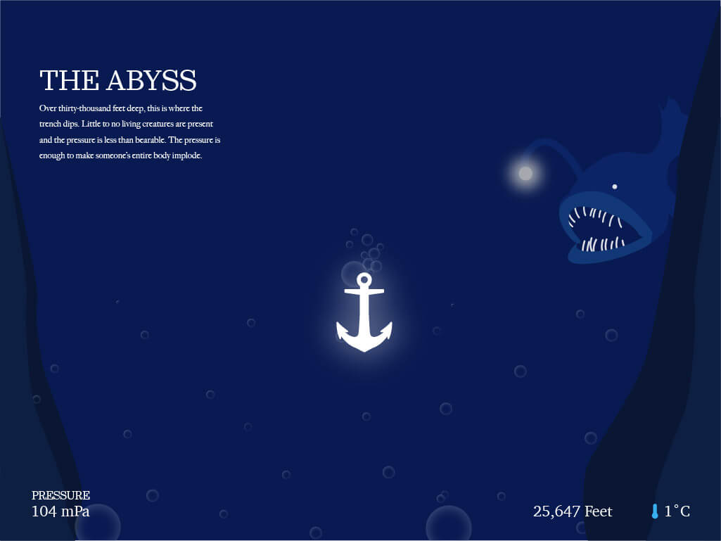
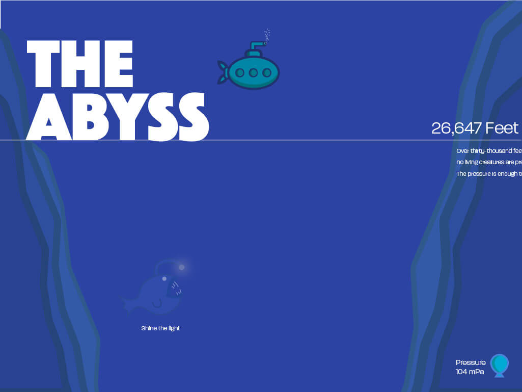
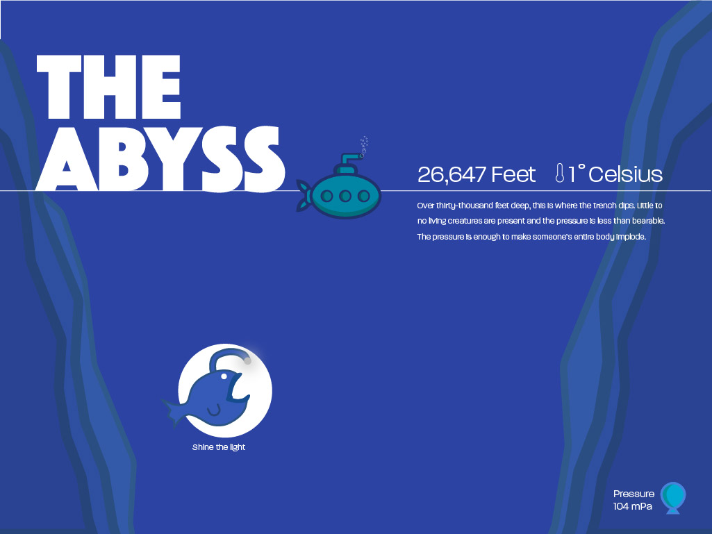
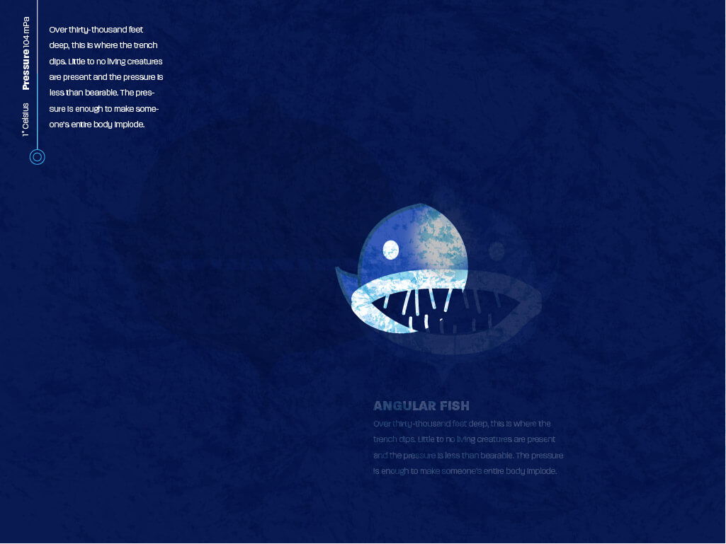
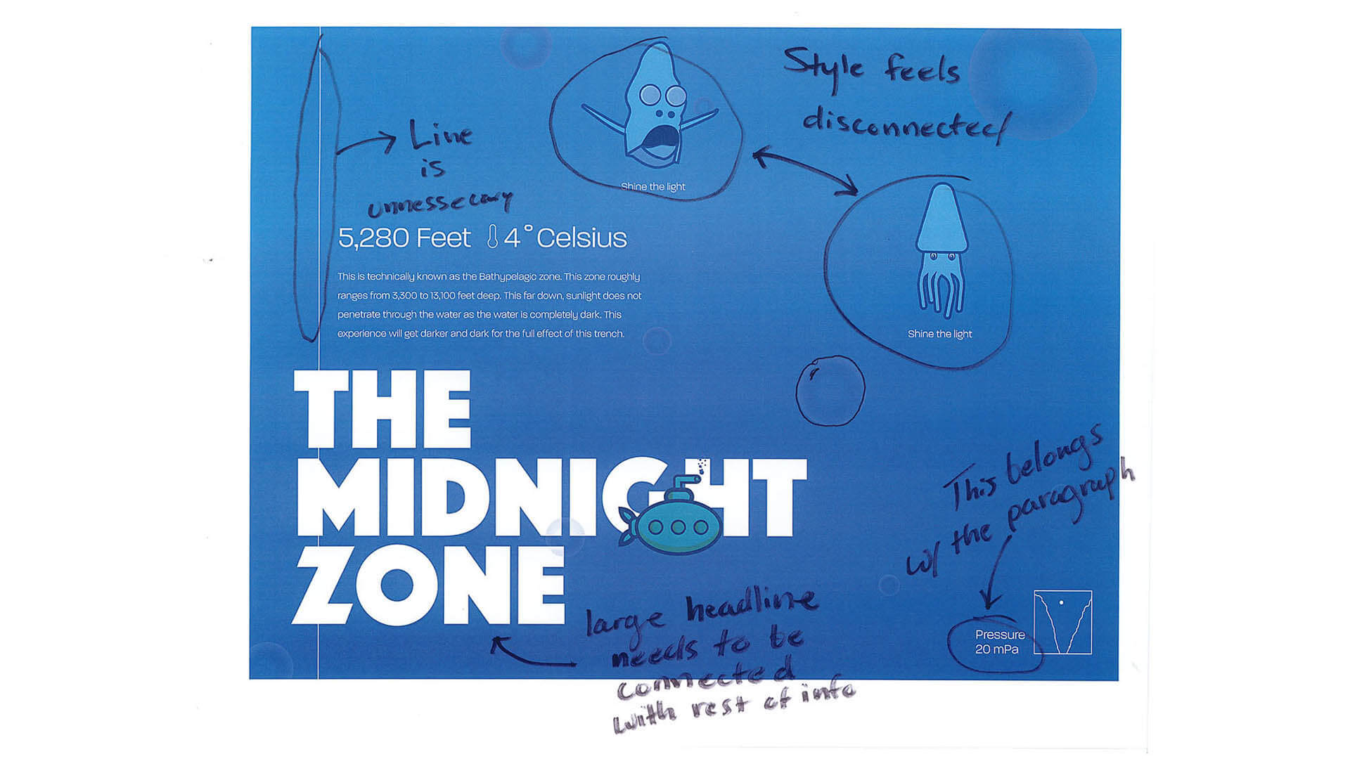
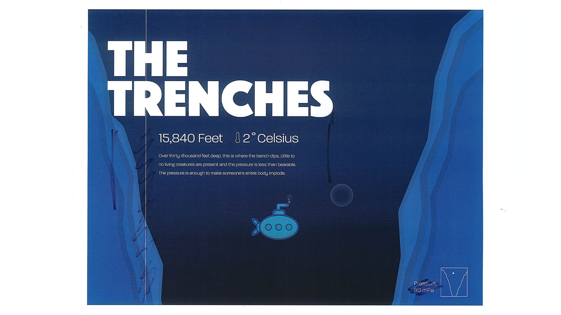
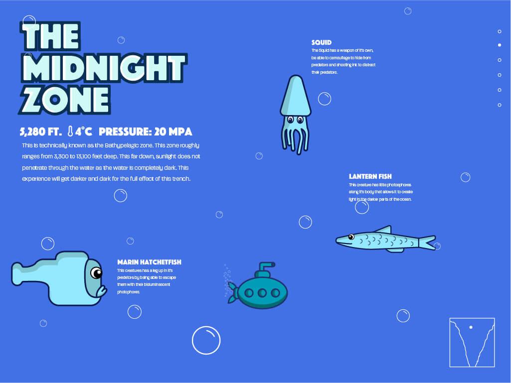
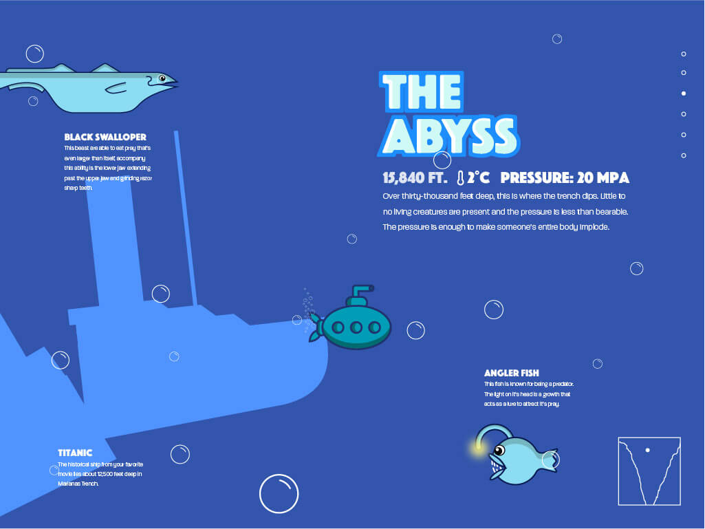
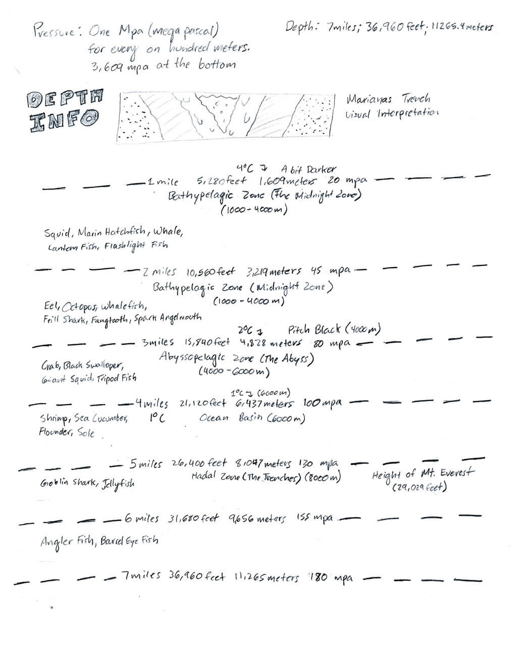
Each zone of Marianas Trench contains specific temparatures, pressures, and characteristics. It was crucial to visually organize the information before the design phase. Each set of dotted lines represent each zone.
Translating Information to UI
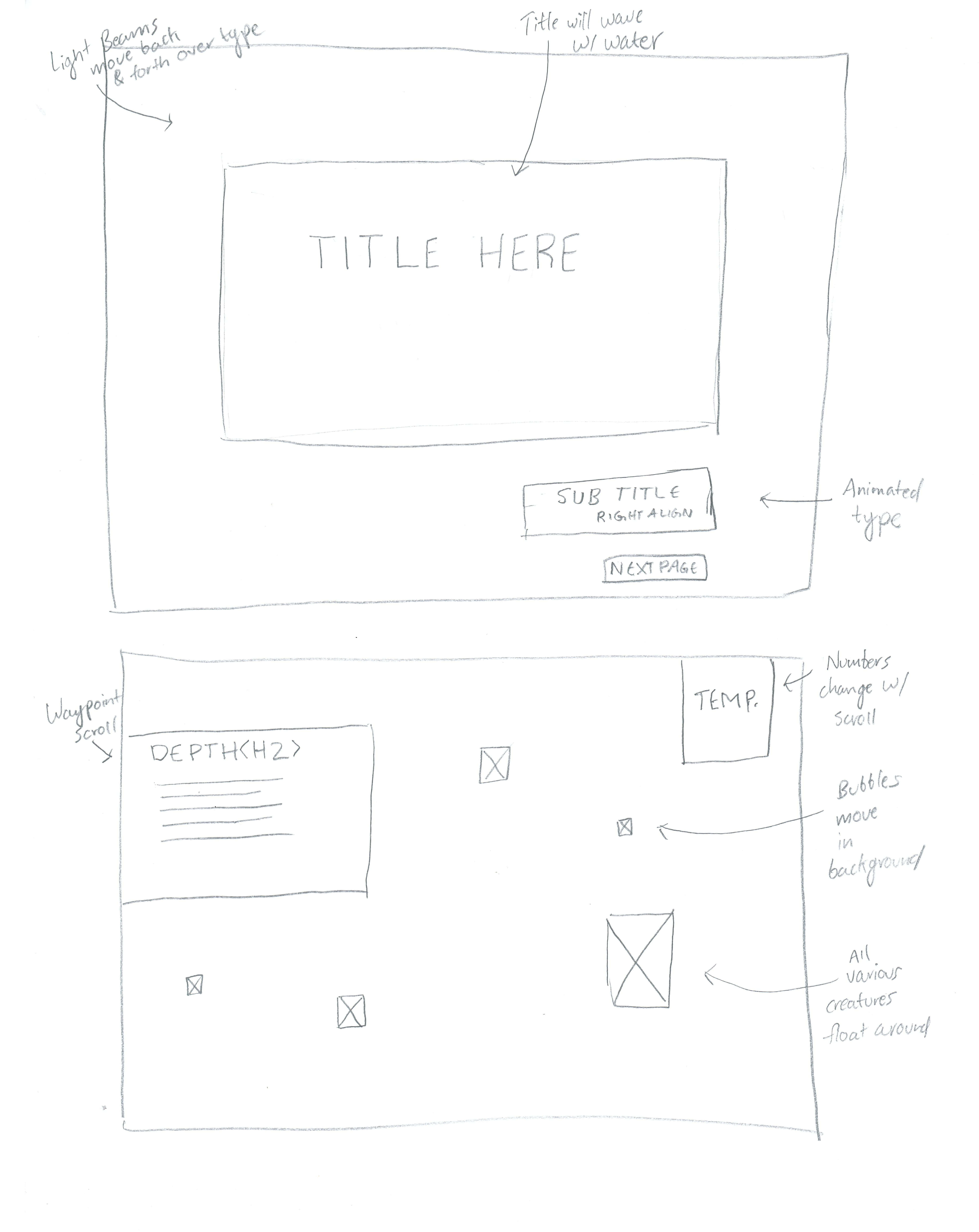
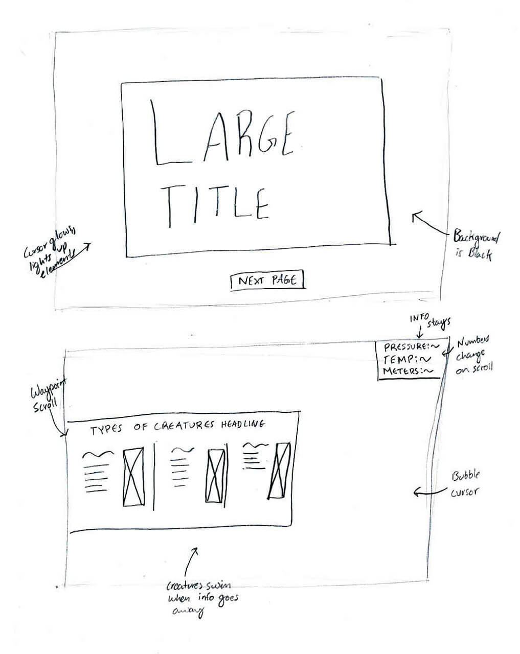
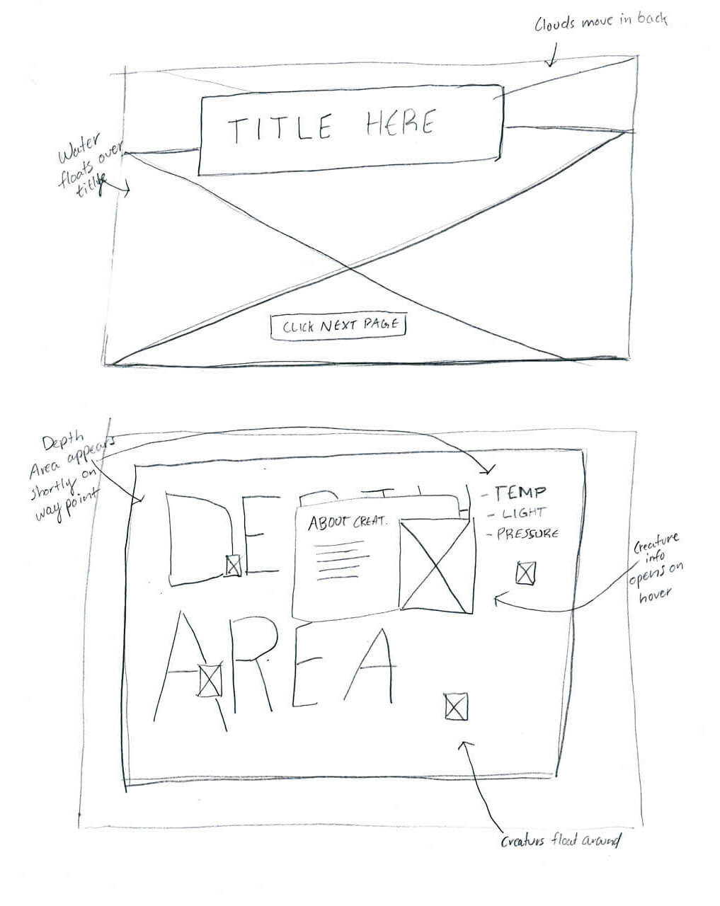
These wireframes represent a rough outline of how the information in each zone of the trench can be organized from page to page. In this stage, it was important to ask: Should each section be split into seperate pages? Should the entire website be one long page? What are some of the interactions that can tell this story in an immersive way? What's the hierarchy structure like?
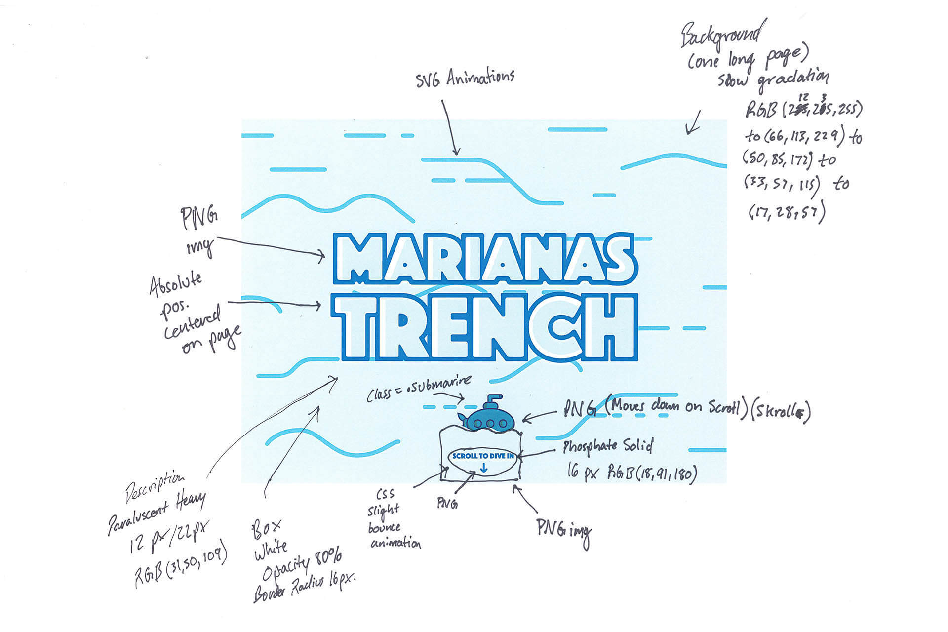
Visually Naming the Content
Once a general idea was captured as to how the project's structure would exist, it was time to turn all of the elements from frames to forms in order to further visually understand what may or may not work.
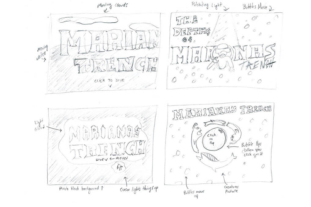
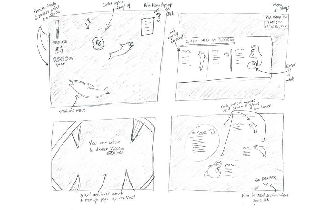
Digital Test
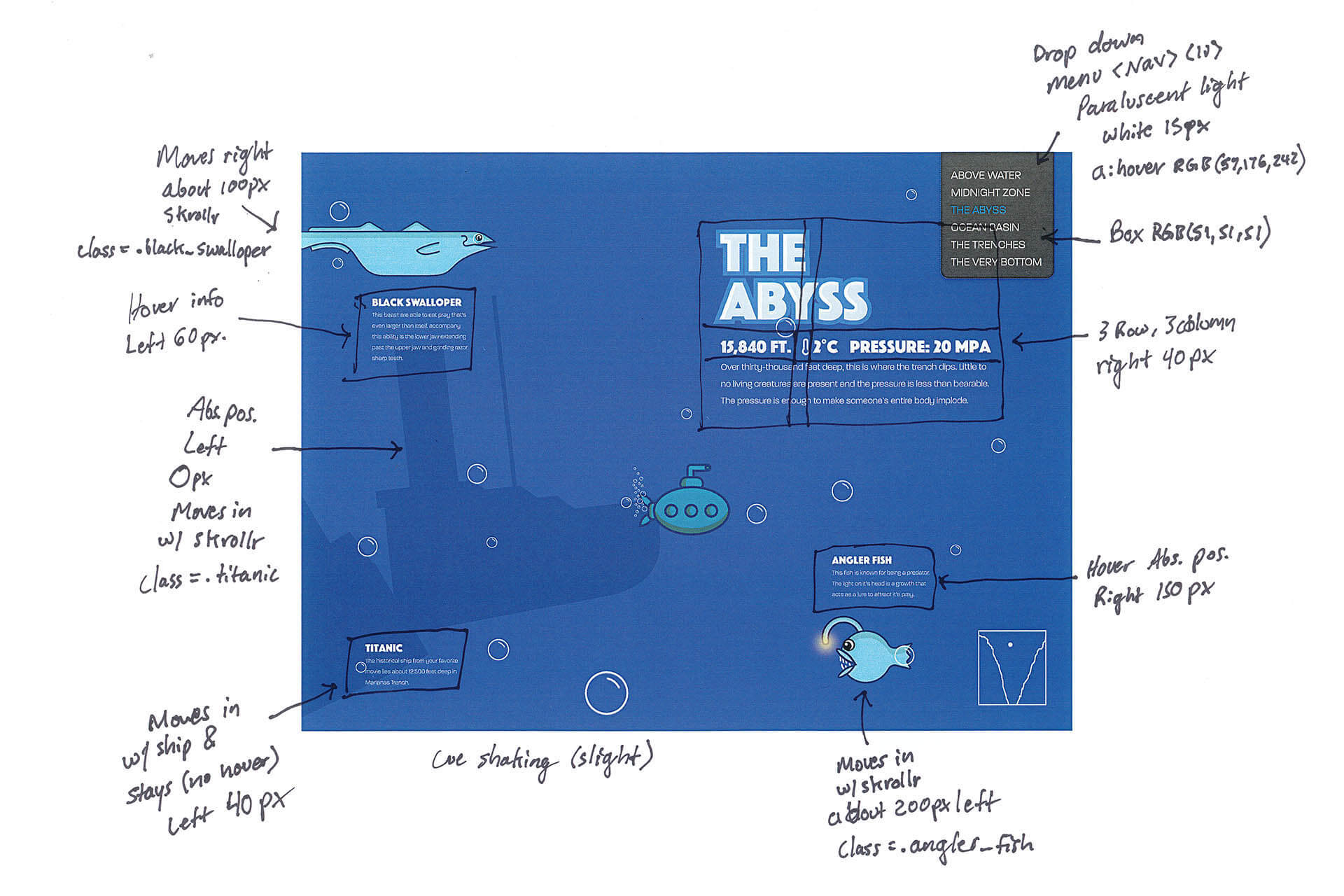
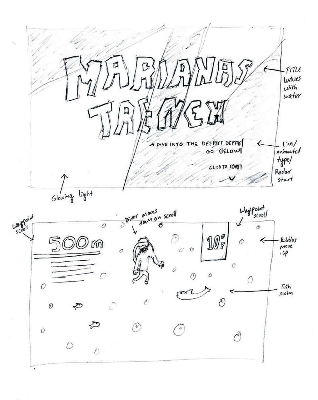
Once the structure was ruled, a digital rendition of the top three concepts was created. Each concept contains a seperate art direction, and each concept contains a before and after state of interactions. These concepts were tested on the home page and the first zone of the trench.
Concept One
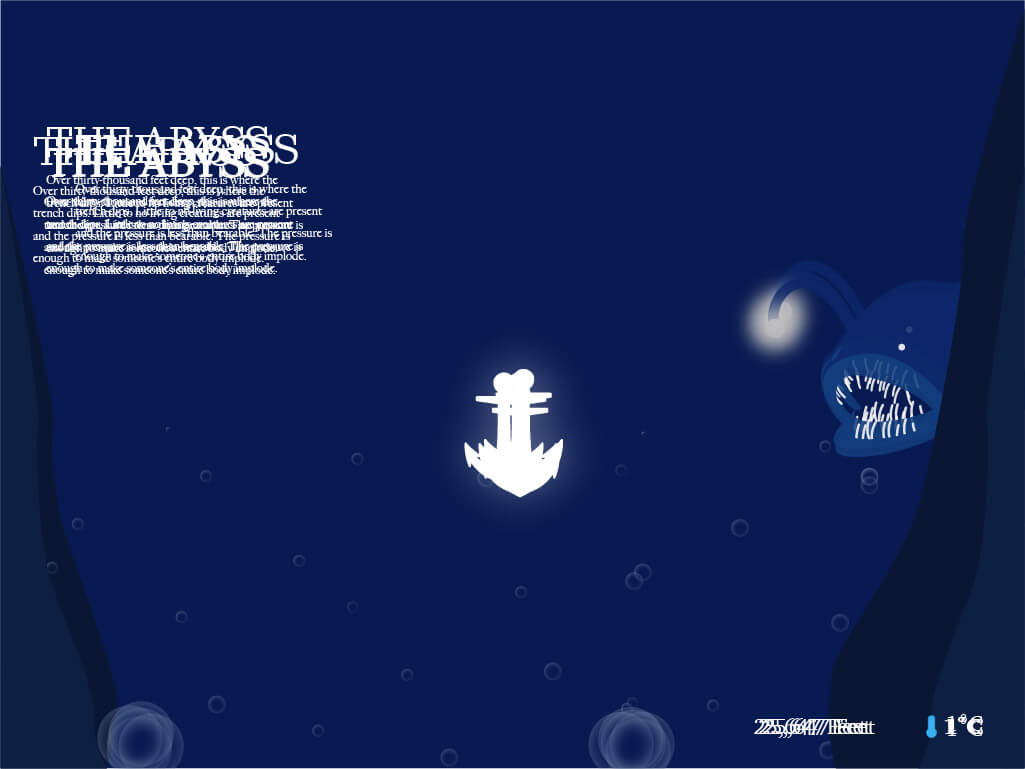
The user takes form of an anchor diving into the trench and weighing to the bottom while taking in information about the trench along the way. Once the user hits each zone, elements shake vigourisly due to the rise of pressure as creatures peek from behind objects.
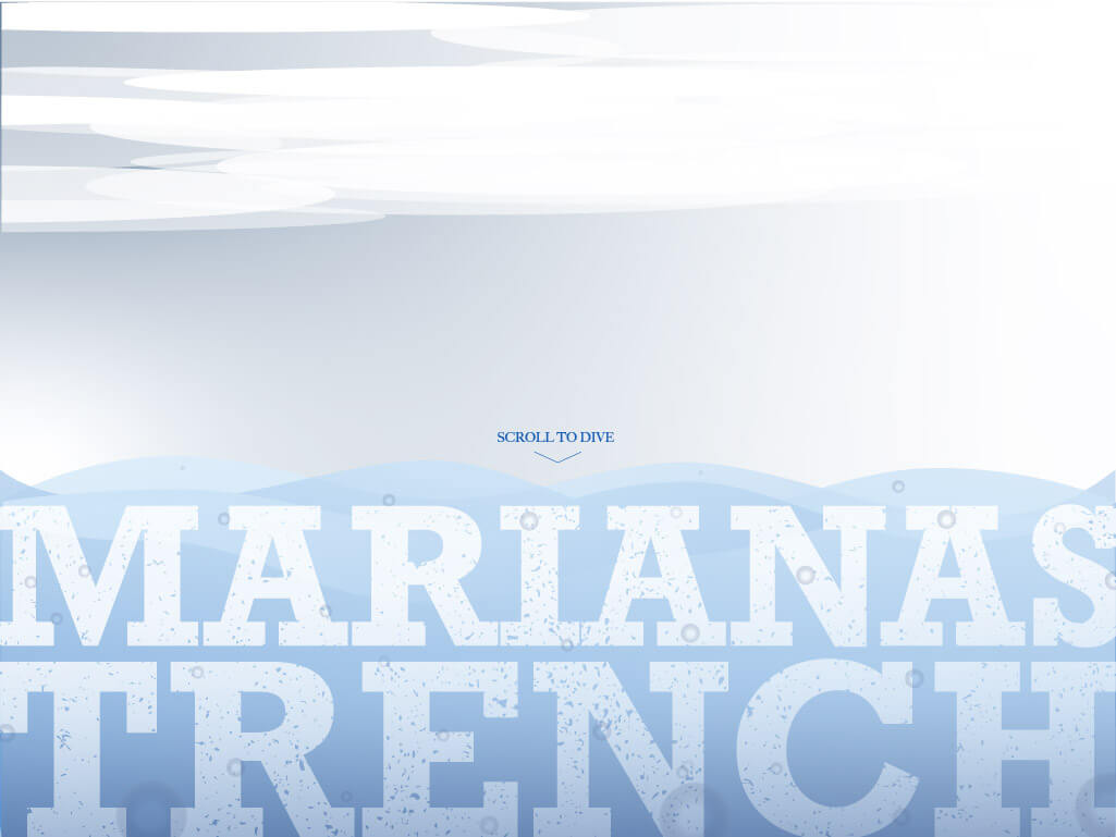
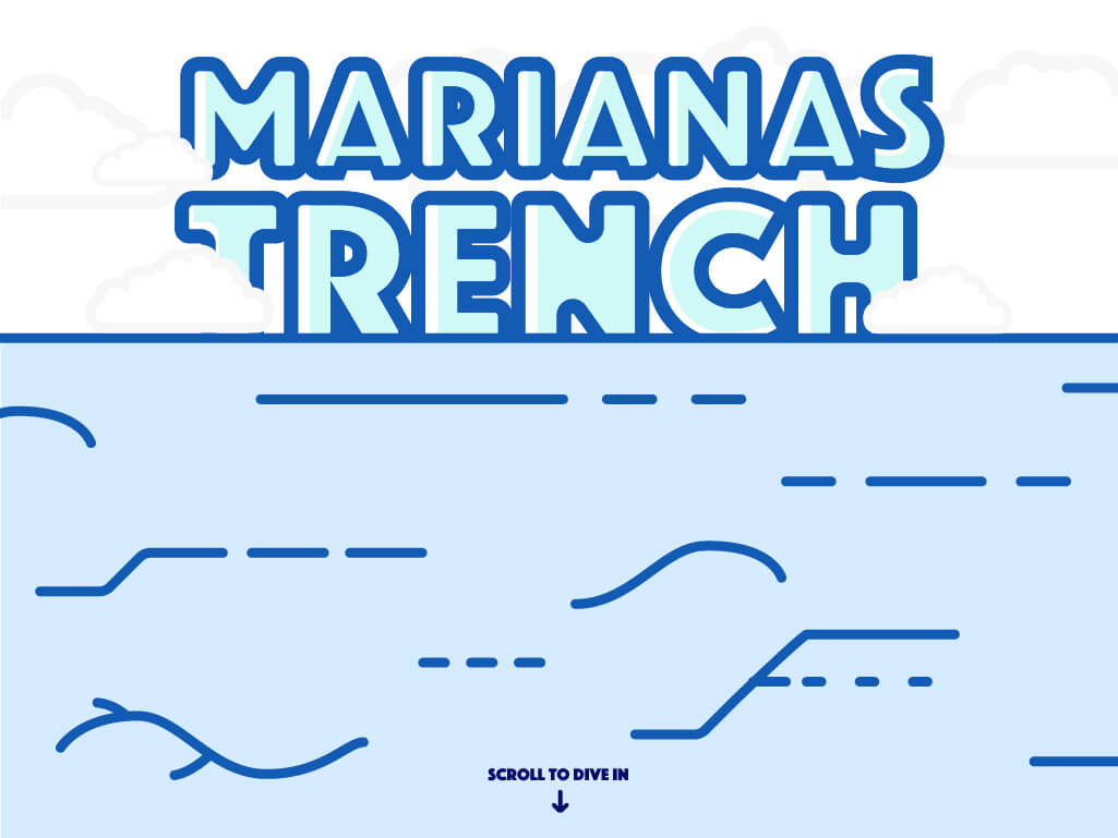
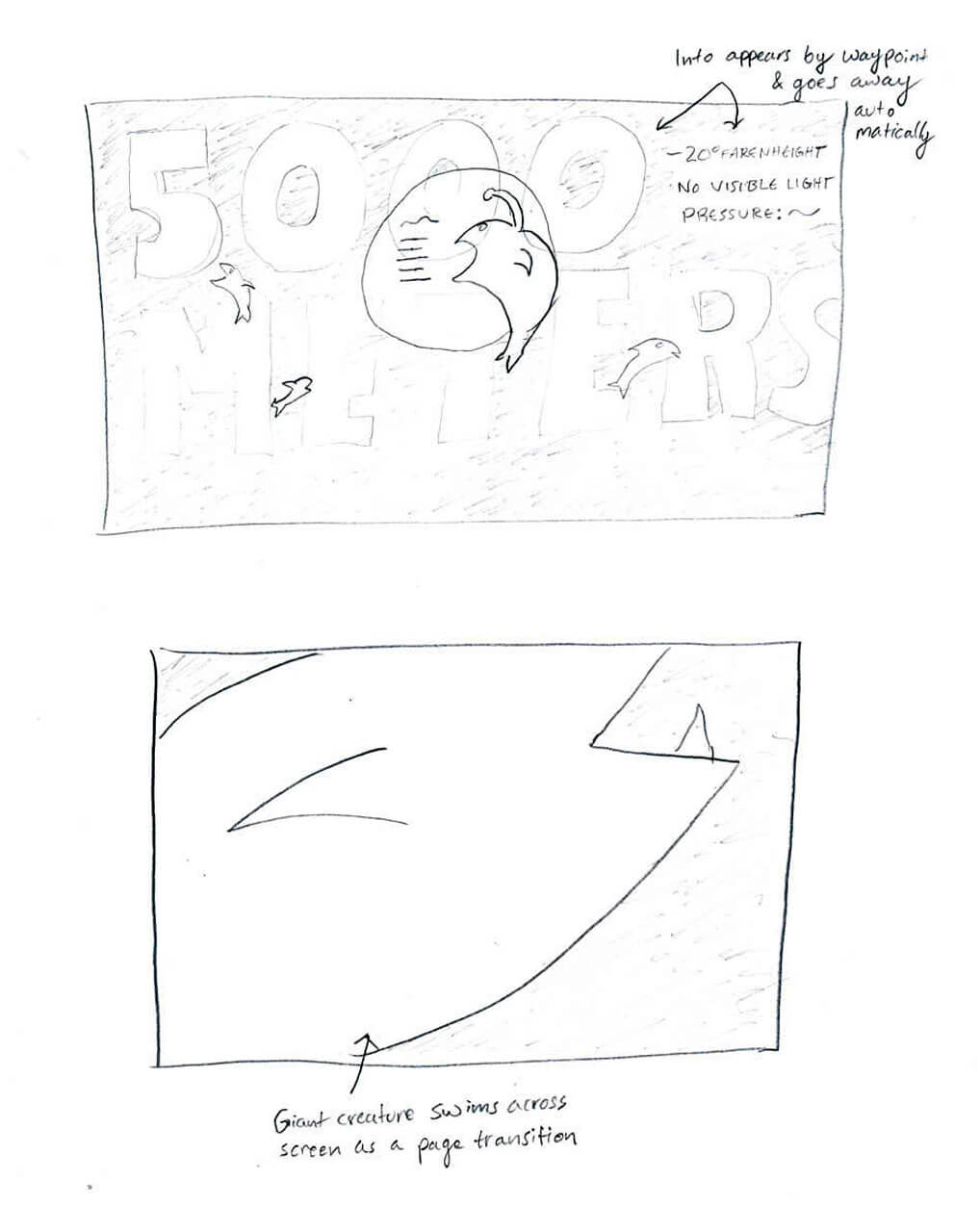
Landing page without interactions
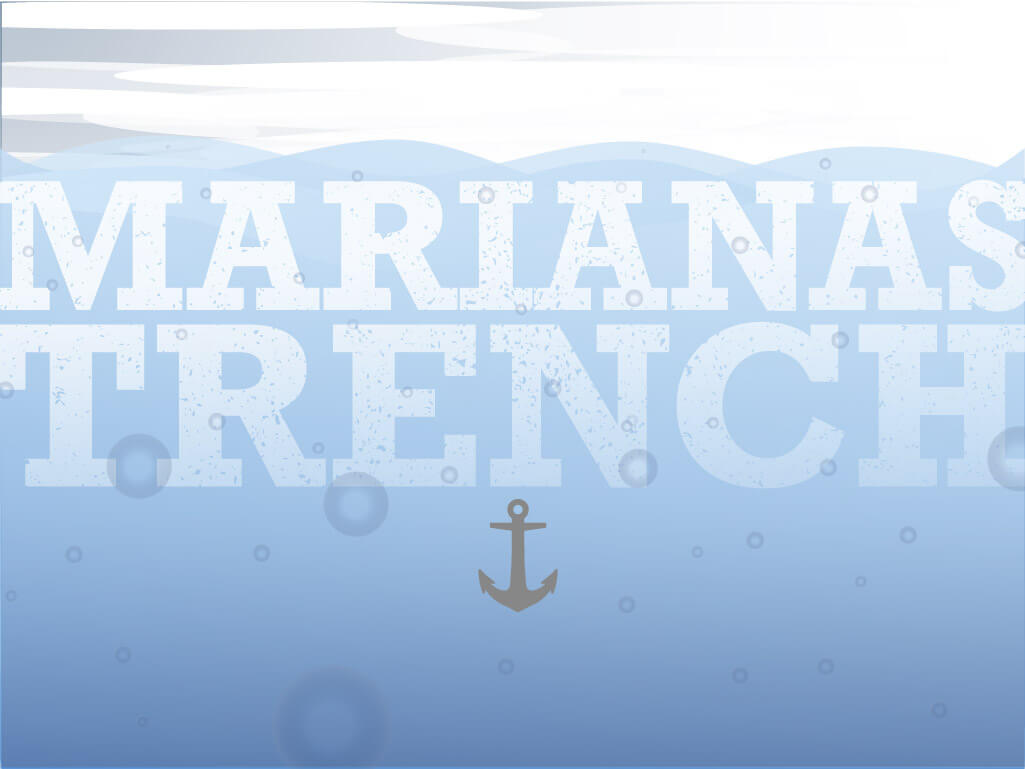
Anchor drops as user scrolls down