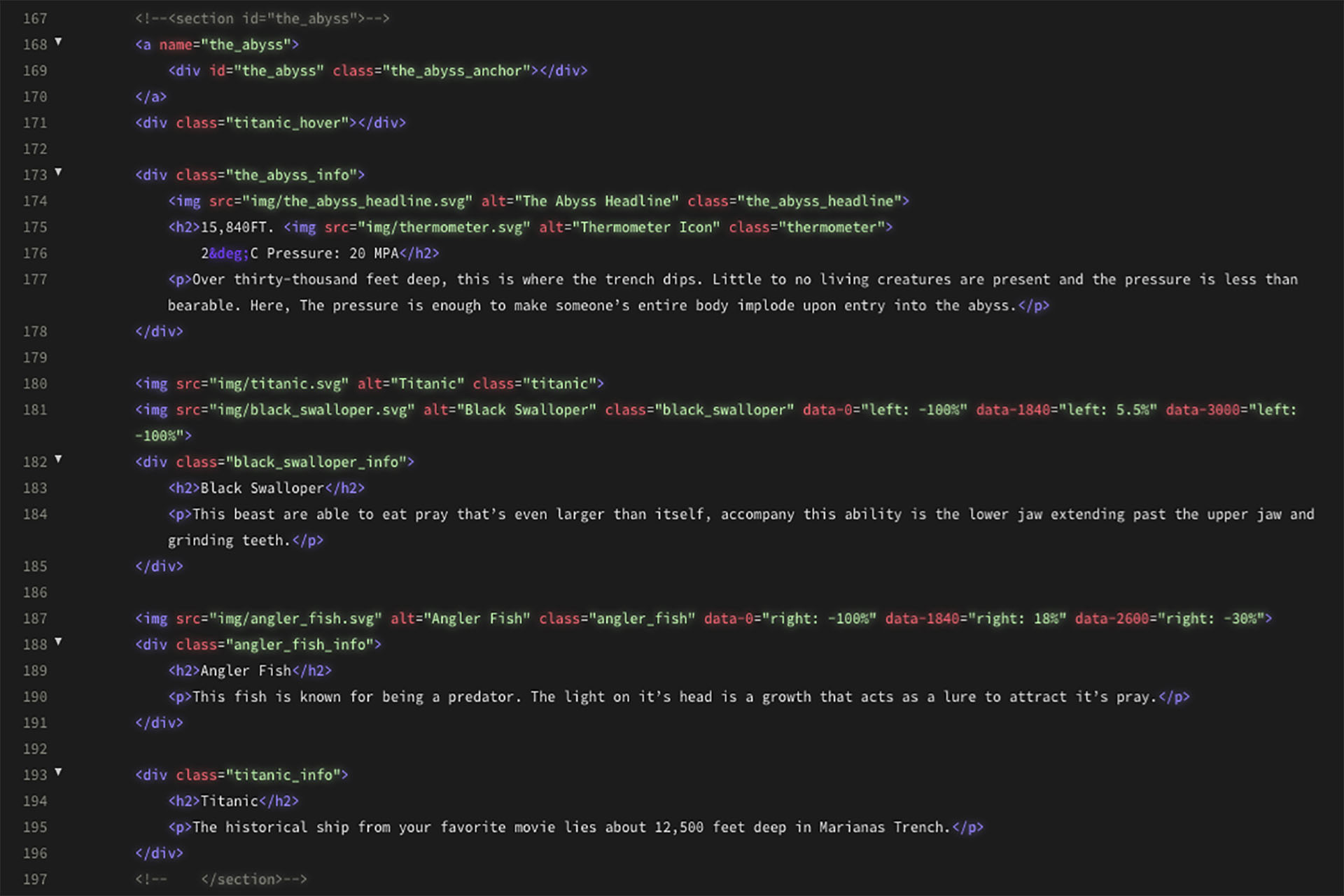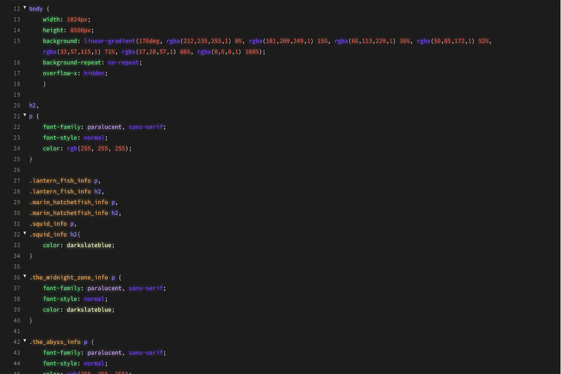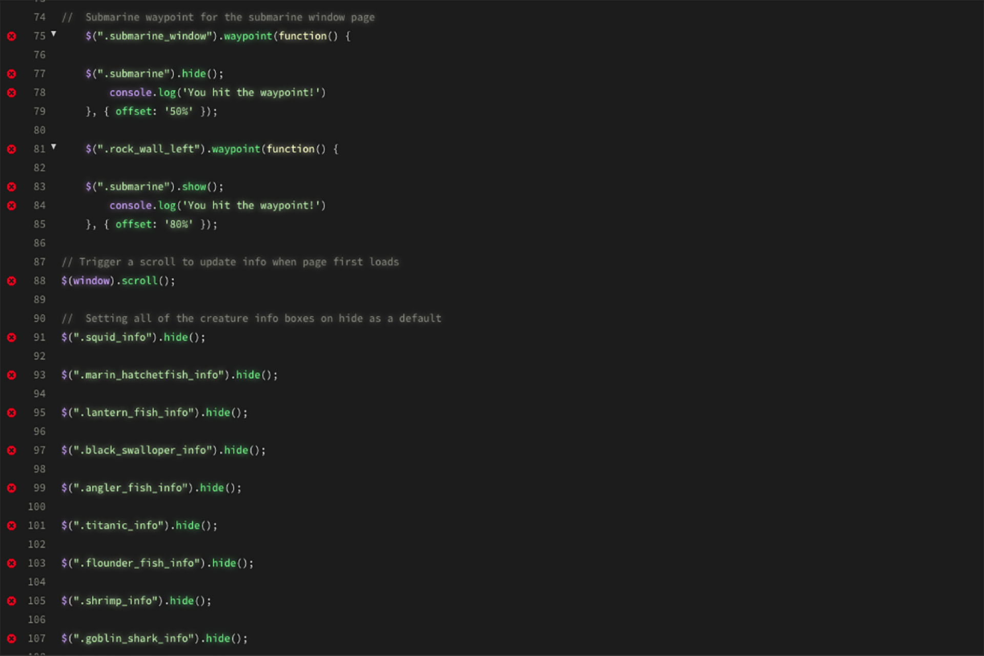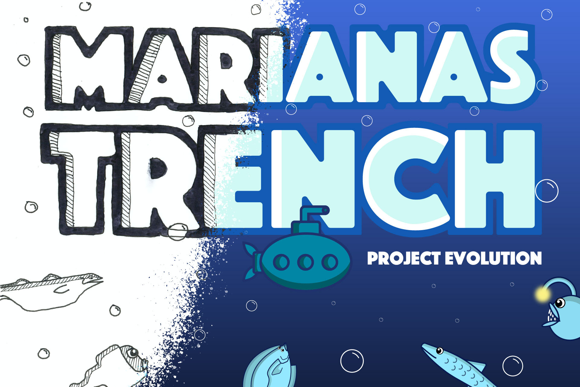

This was one of the first experiments of front end coding. This project was made interactive on a desktop format due to the the specific coding technique.
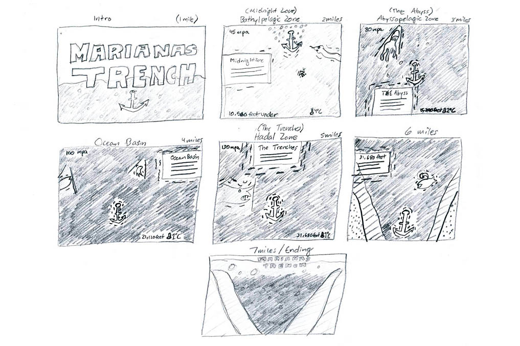
Each zone of Marianas Trench contains specific temparatures, pressures, and characteristics. It was crucial to visually organize the information before the design phase. Each set of dotted lines represent each zone.

These wireframes represent a rough outline of how the information in each zone of the trench can be organized from page to page. In this stage, it was important to ask: Should each section be split into seperate pages? Should the entire website be one long page? What are some of the interactions that can tell this story in an immersive way? What's the hierarchy structure like?
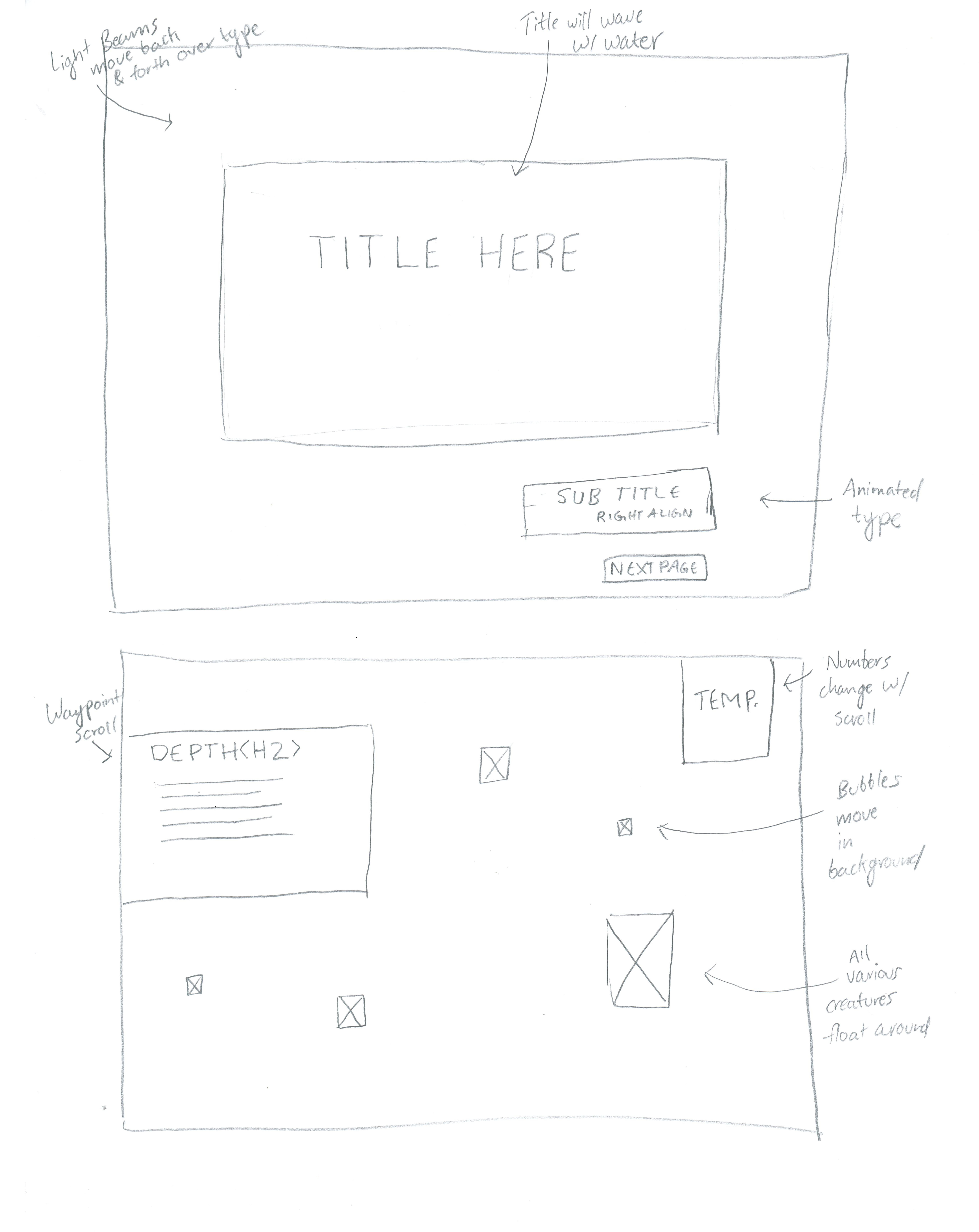
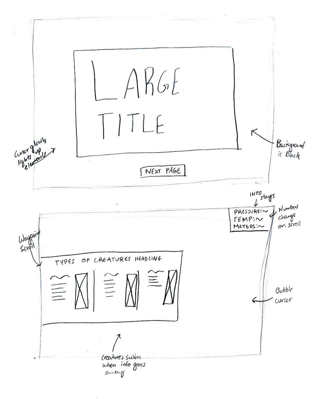
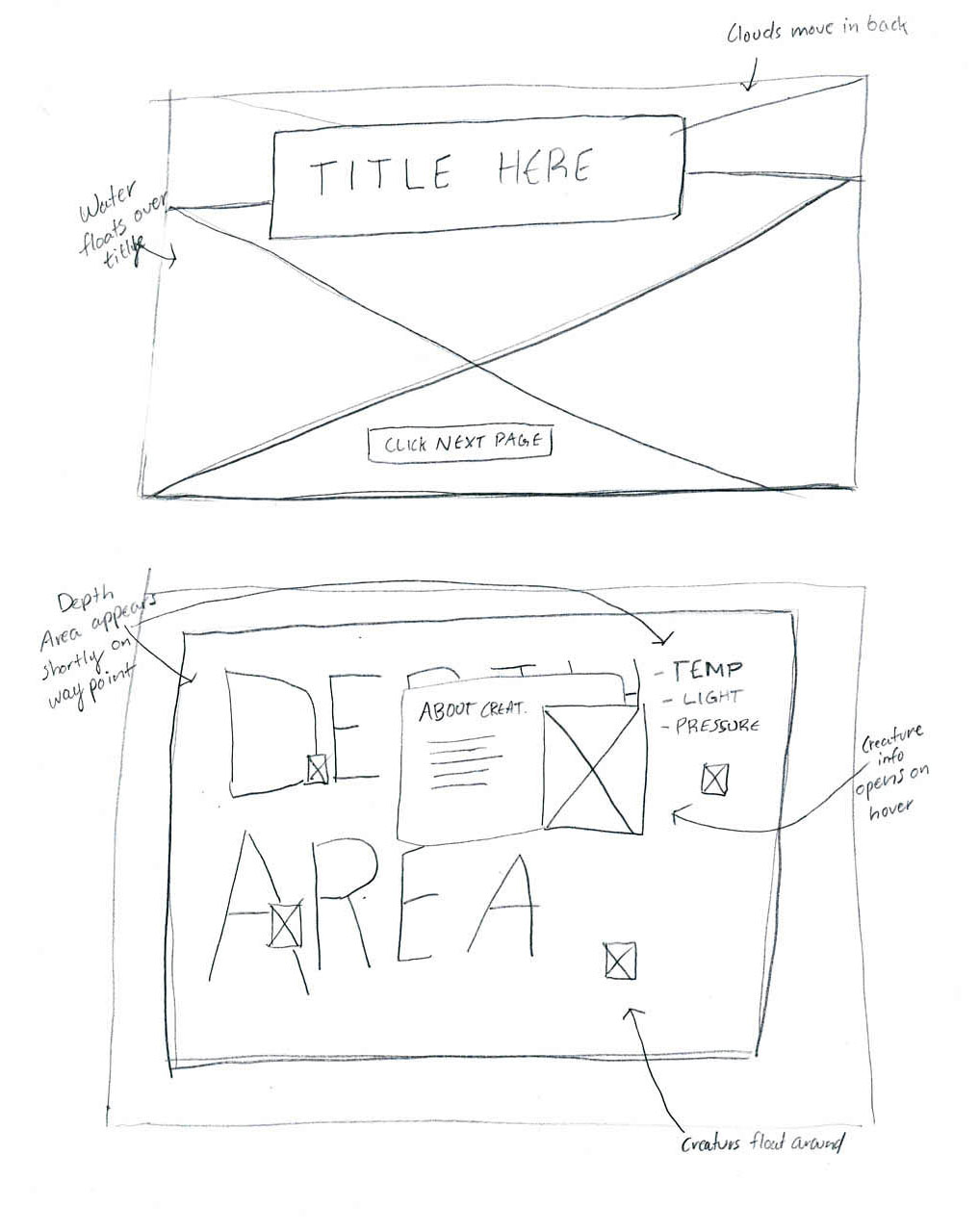
Once a general idea was captured as to how the project's structure would exist, it was time to turn all of the elements from frames to forms in order to further visually understand what may or may not work.
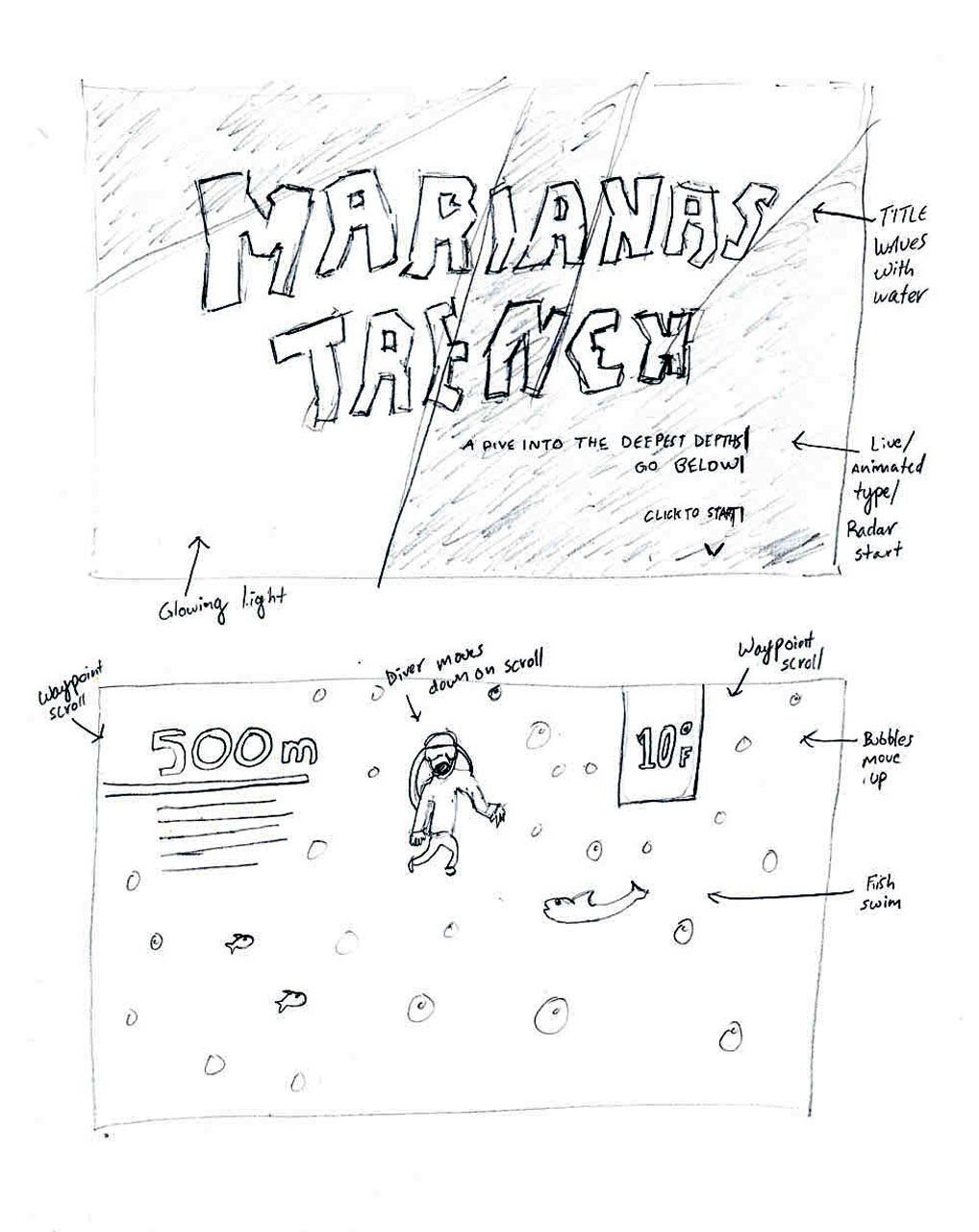
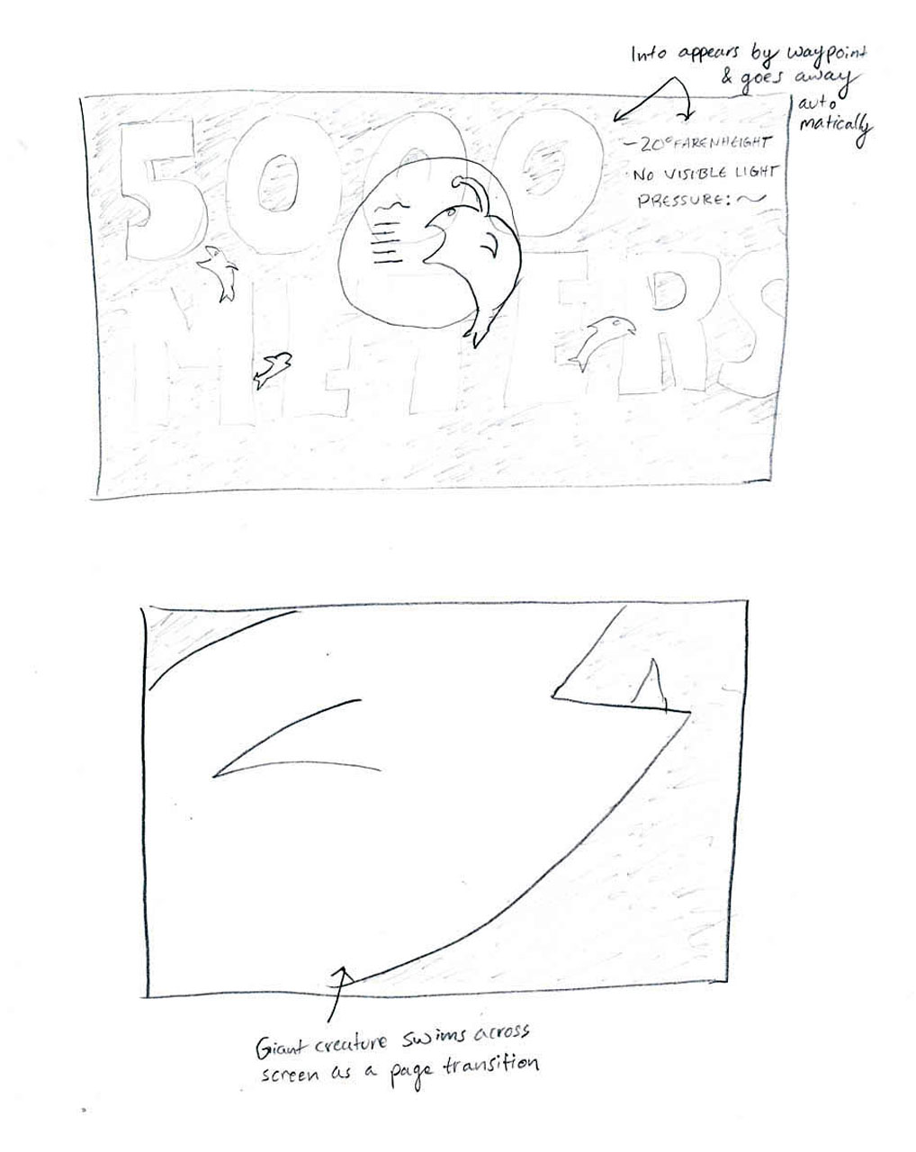
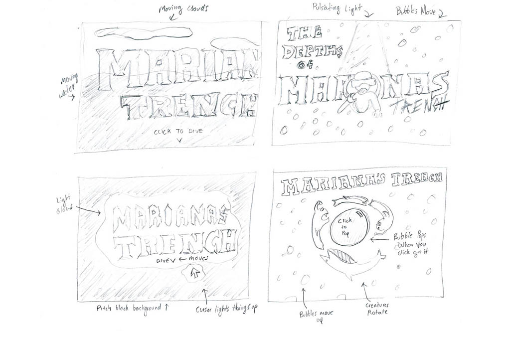
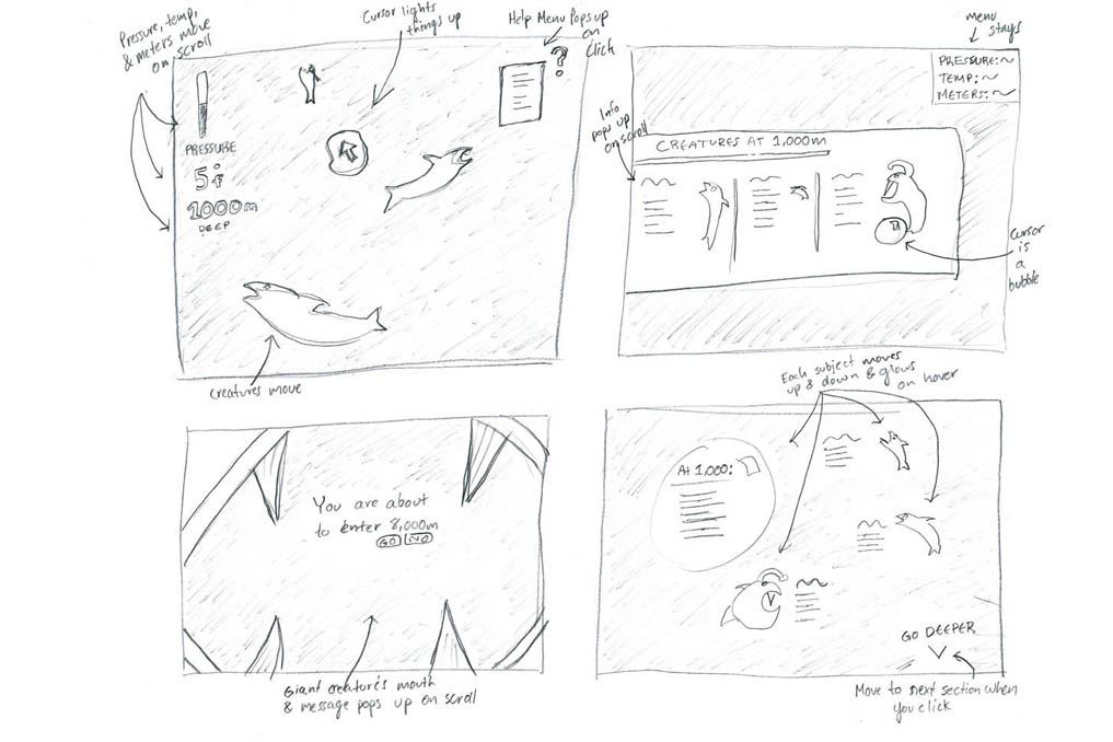
After specifically sketching out each element's form and typographic treatments it was time to fully get a sense of how a chosen structure would translate onto every section of the website.
Once the structure was ruled, a digital rendition of the top three concepts was created. Each concept contains a seperate art direction, and each concept contains a before and after state of interactions. These concepts were tested on the home page and the first zone of the trench.
The user would take form of an anchor that would dive into the trench, ultimately sinking to the bottom and taking in all of the information about the trench along the way. Once the user would hit each zone, the elements would shake vigourisly in order to experience the rise of pressure as the user dives deeper while the creatures peek from behind objects.
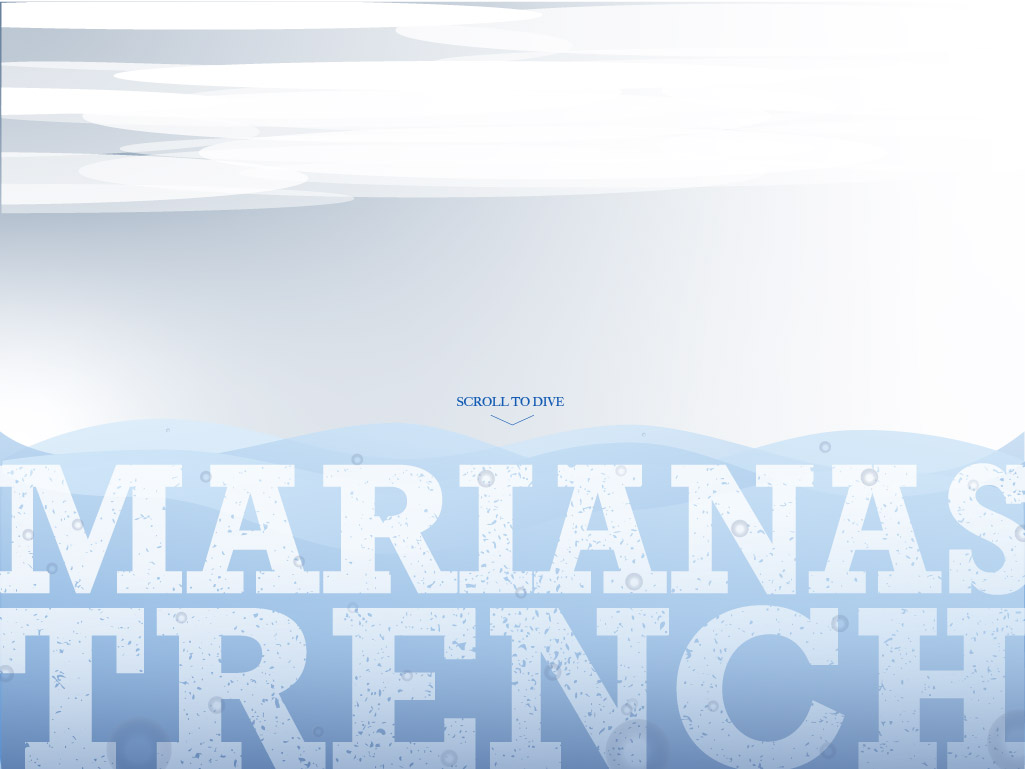
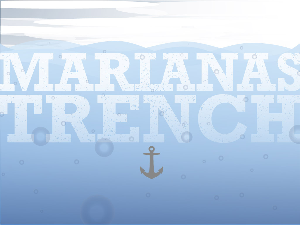
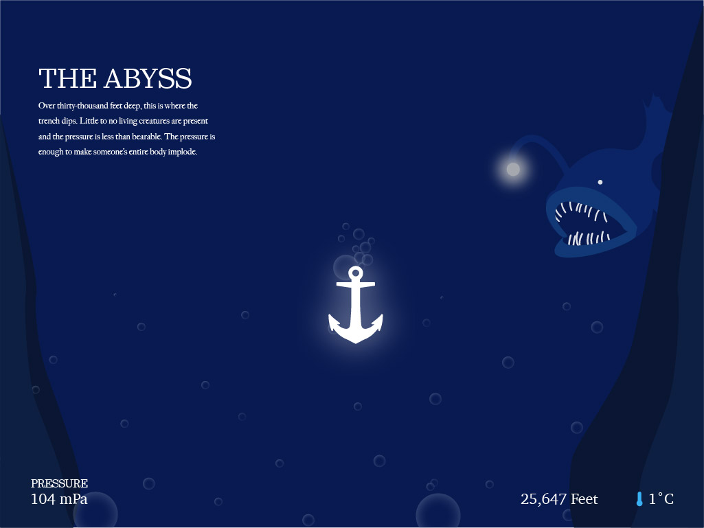
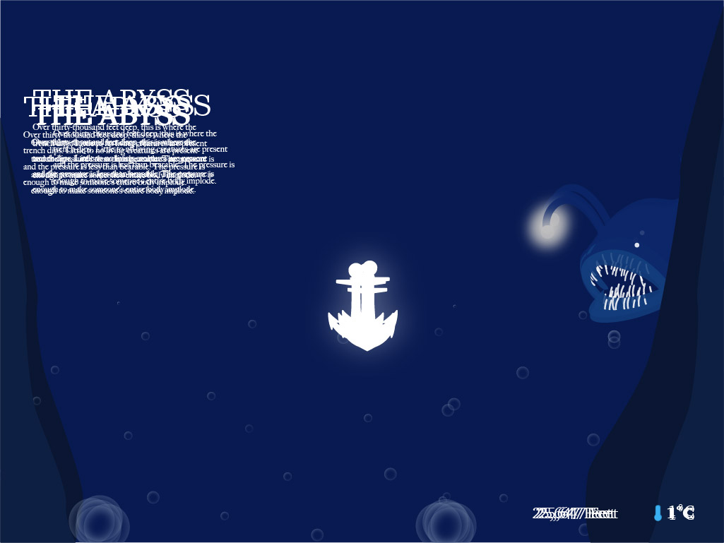
The submarine would be the user's vehicle to the bottom of the trench. The thin white lines show the user that they've crossed into another zone while tying up the typographic structure. When a creature enters the viewport, a light would shine on them as a visual cue to let the user know that the creatures are interactive elements that can be hovered over. A balloon that lies on the bottom right of the viewport would gradually get larger as if it was about to pop from zone to zone to give the user the sense of the pressure getting more intense.
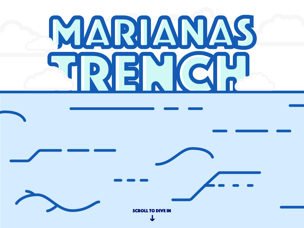
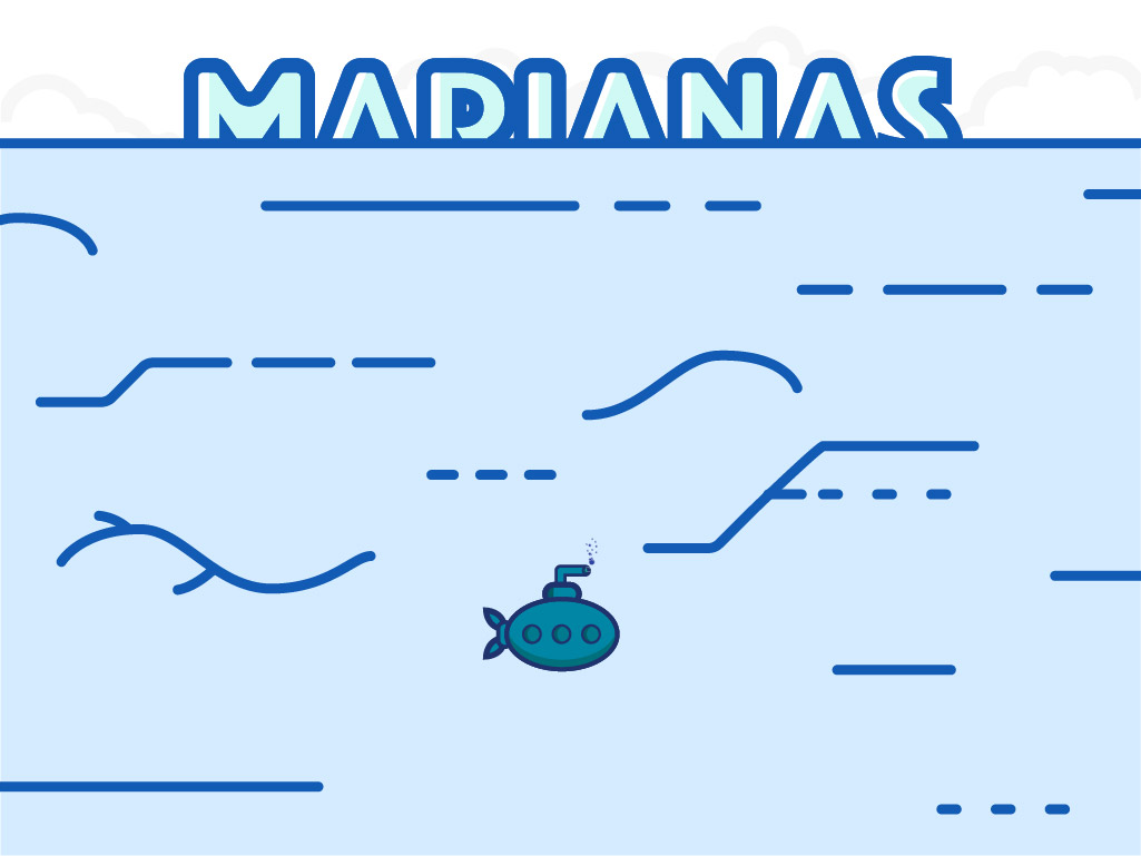
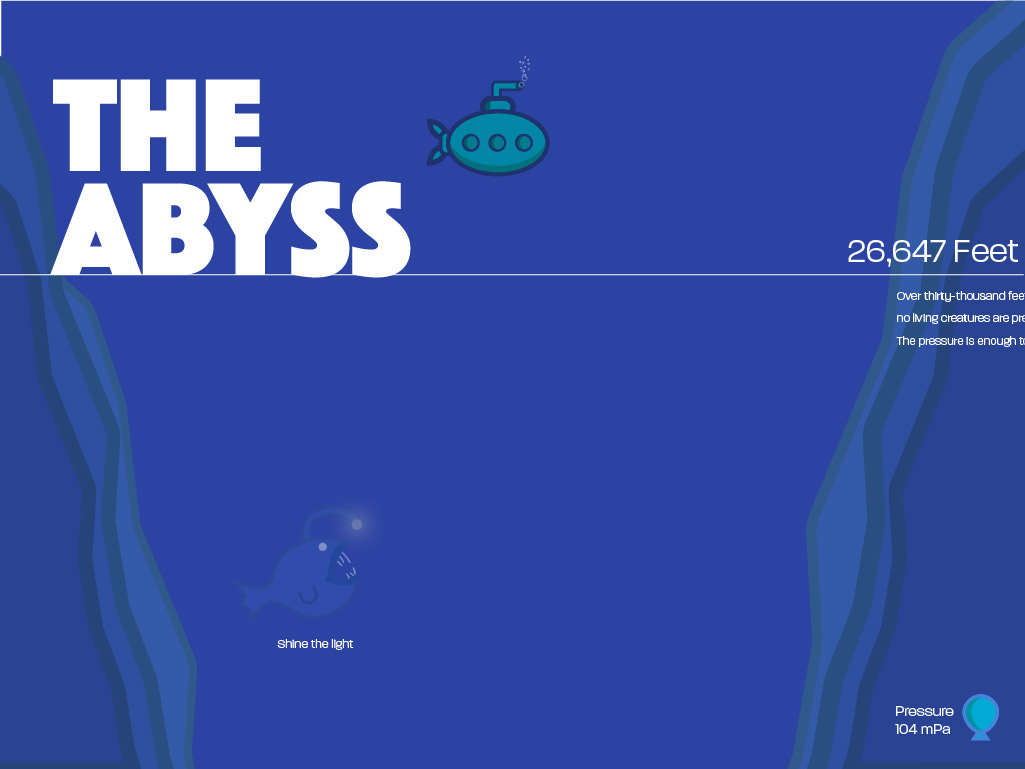
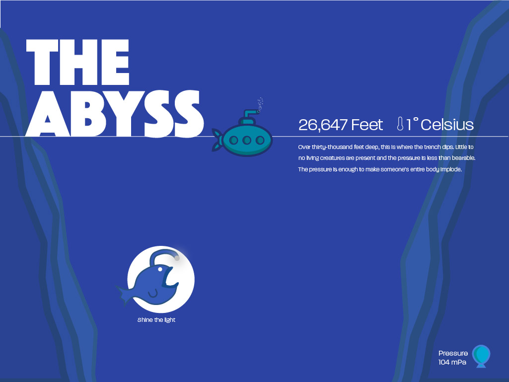
The concept would bring out the mysterious aspect of Marianas Trench through a trippy and dark horror-like experience. The user would begin diving straight into the title as the typography would ripple on top of the ocean's surface. Upon entering each zone, a large title would appear while swirling in order to make each zone feel eerie. Each of the zone's information would rest on the top left hand side of the viewport, making room for the larger interactive elements. When the user would come across a creature, the creature would surprise the viewer with a light shining on them to indicate the gradual darkness of Marianas Trench.
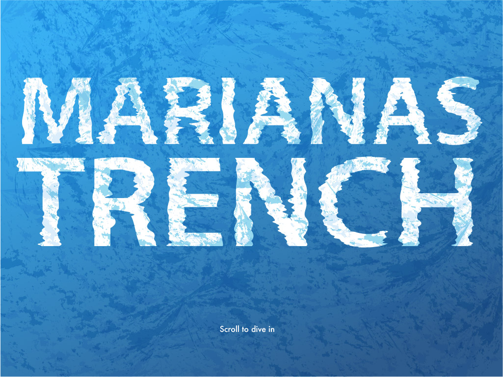
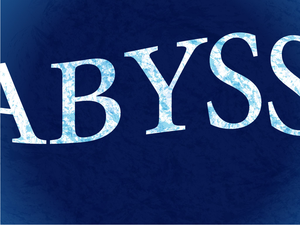
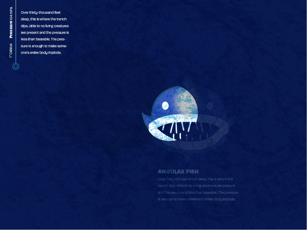
Concept two was ultimately chosen to move forward with as it made the most sense visually. The entire trench was mapped out in a flat profile structure, allowing the viewer to easily follow along with the overall narrative of diving deeper into trench and the iconic game-like rendering of the creatures would allow an audience of all ages to be included. Issues that arose with the other concepts included the perspective that didn't fulfill this narrative as well as concept two did due to the visual abstraction. The horror-like rendering of the creatures left out the very young portion of the audience as well as it could potentially scare kids. The next step included fully building every page from the chosen direction.
The entire project was visually built out from the chosen direction. Changes in the revision from this full iteration included removing the thin white line from each section (as each zone's title was enough of an indicator that the user was entering another area), making the submarine dive in behind the scroll indicator on the home page to give the user a notion of submerging into the ocean's surface, rendering the bubbles to be more readable, changing the rendering of the creatures to fit together stylistically (as some still felt too horror-like), and adding a navigation diagram inspired by radars from ship's on the bottom right corner of the viewport in order to show the user where they are within the trench at all times.
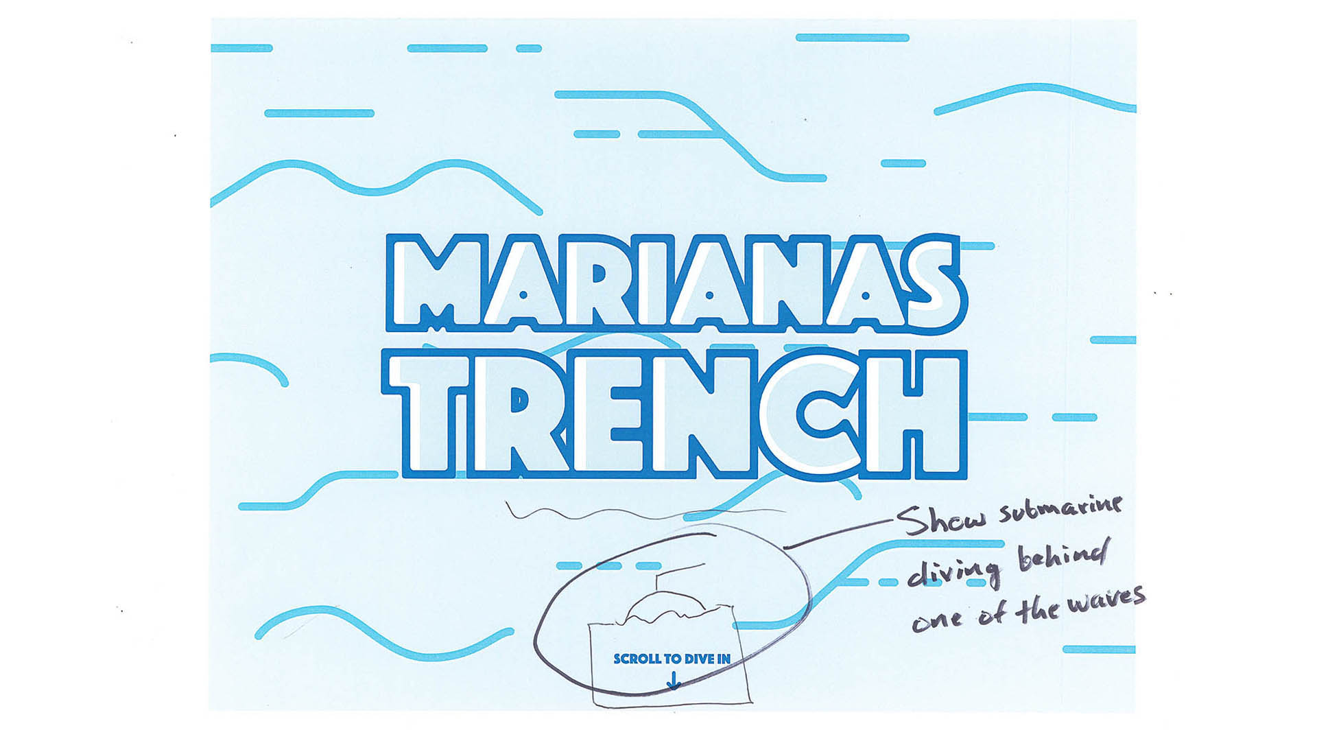
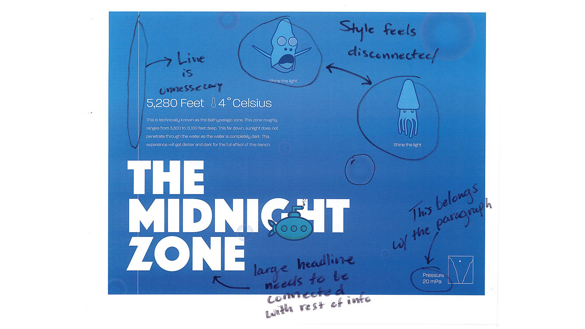
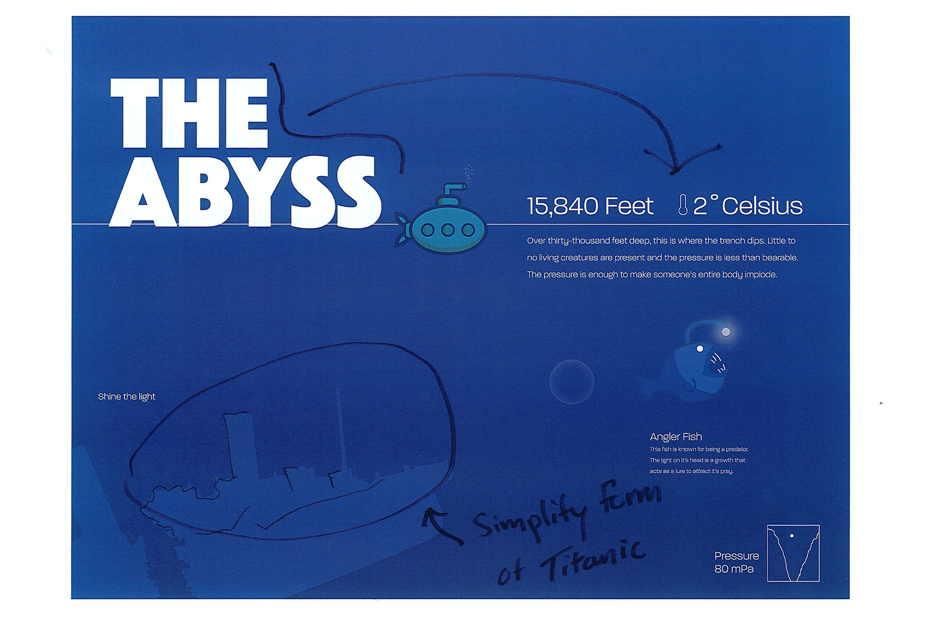
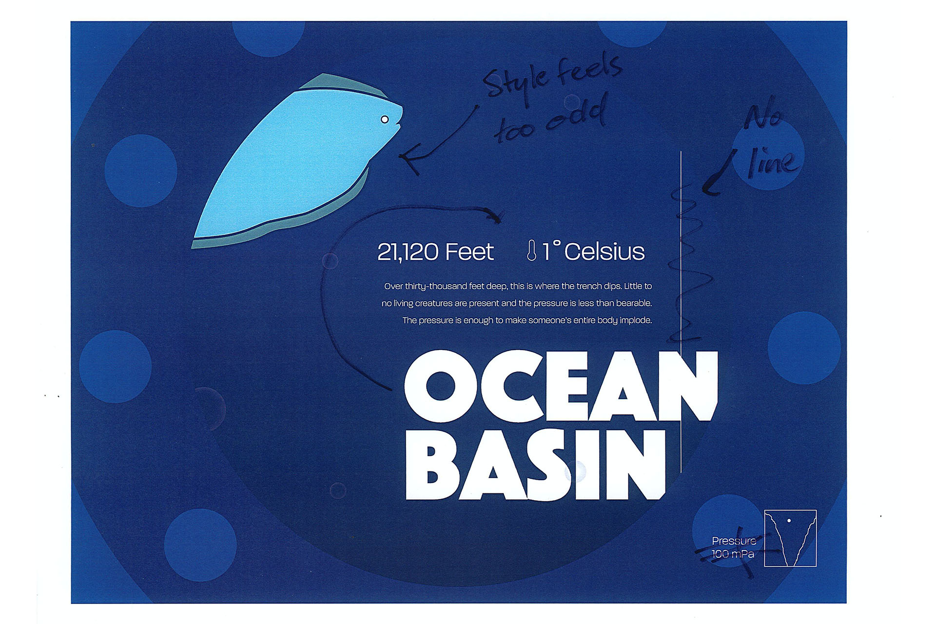

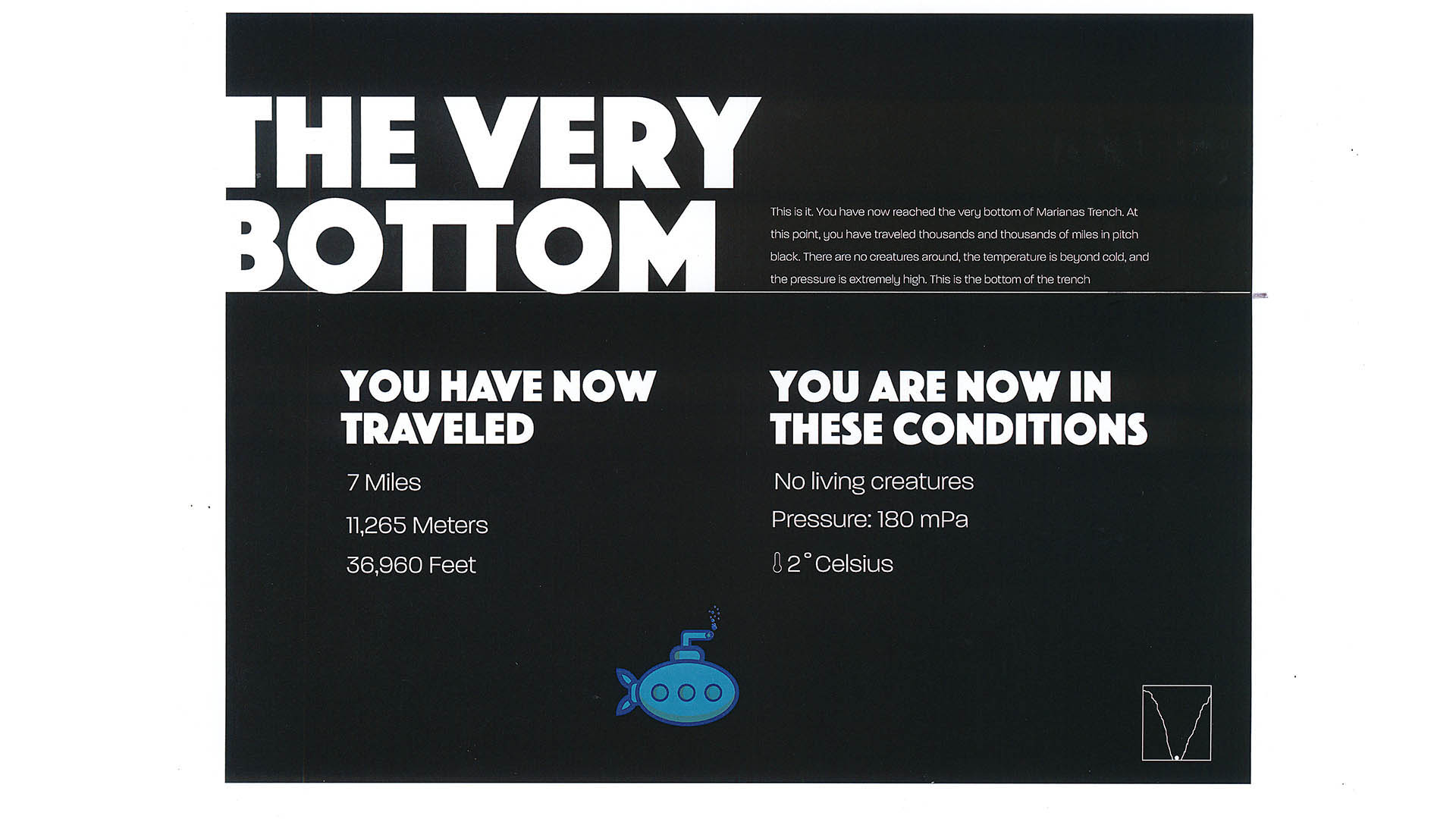
Once all of the revisions were made, it was time to make a full comp to use a visual reference while building the website and to turn each element into a useable asset.
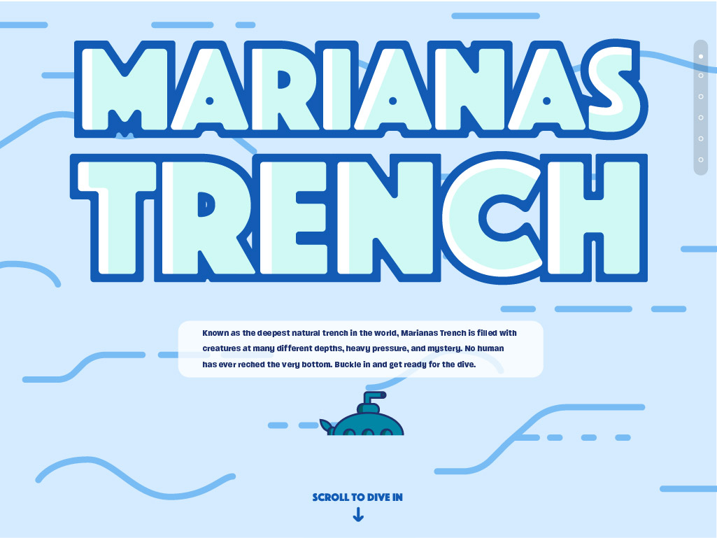
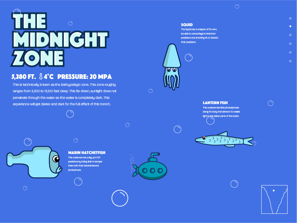
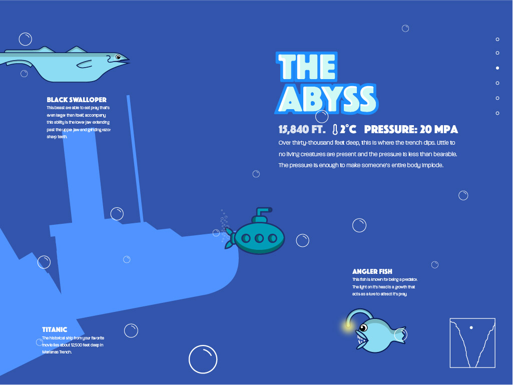
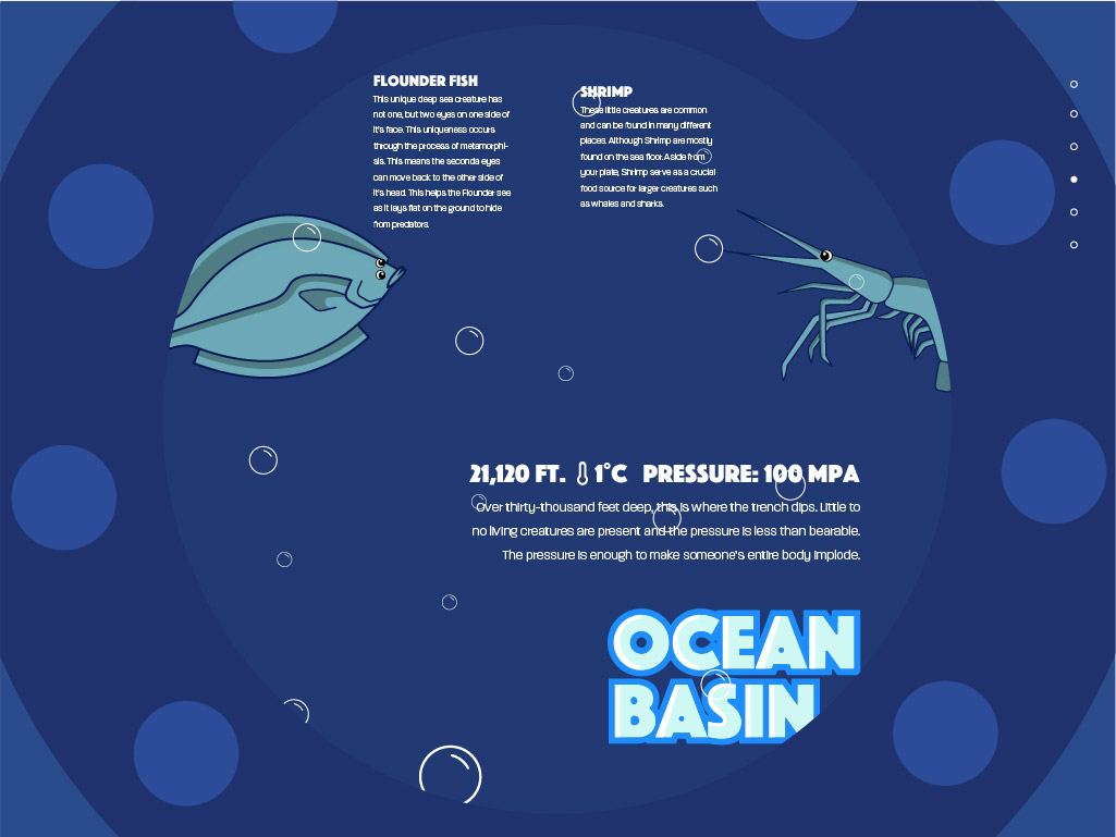
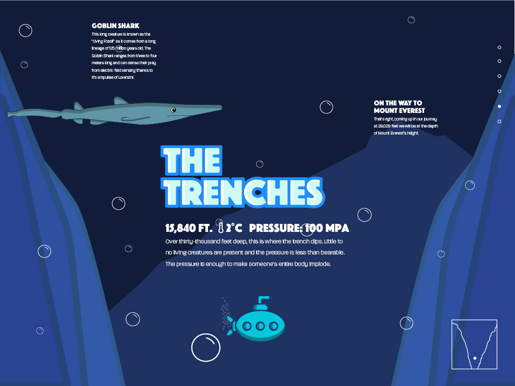
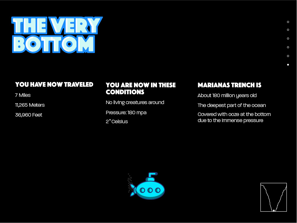
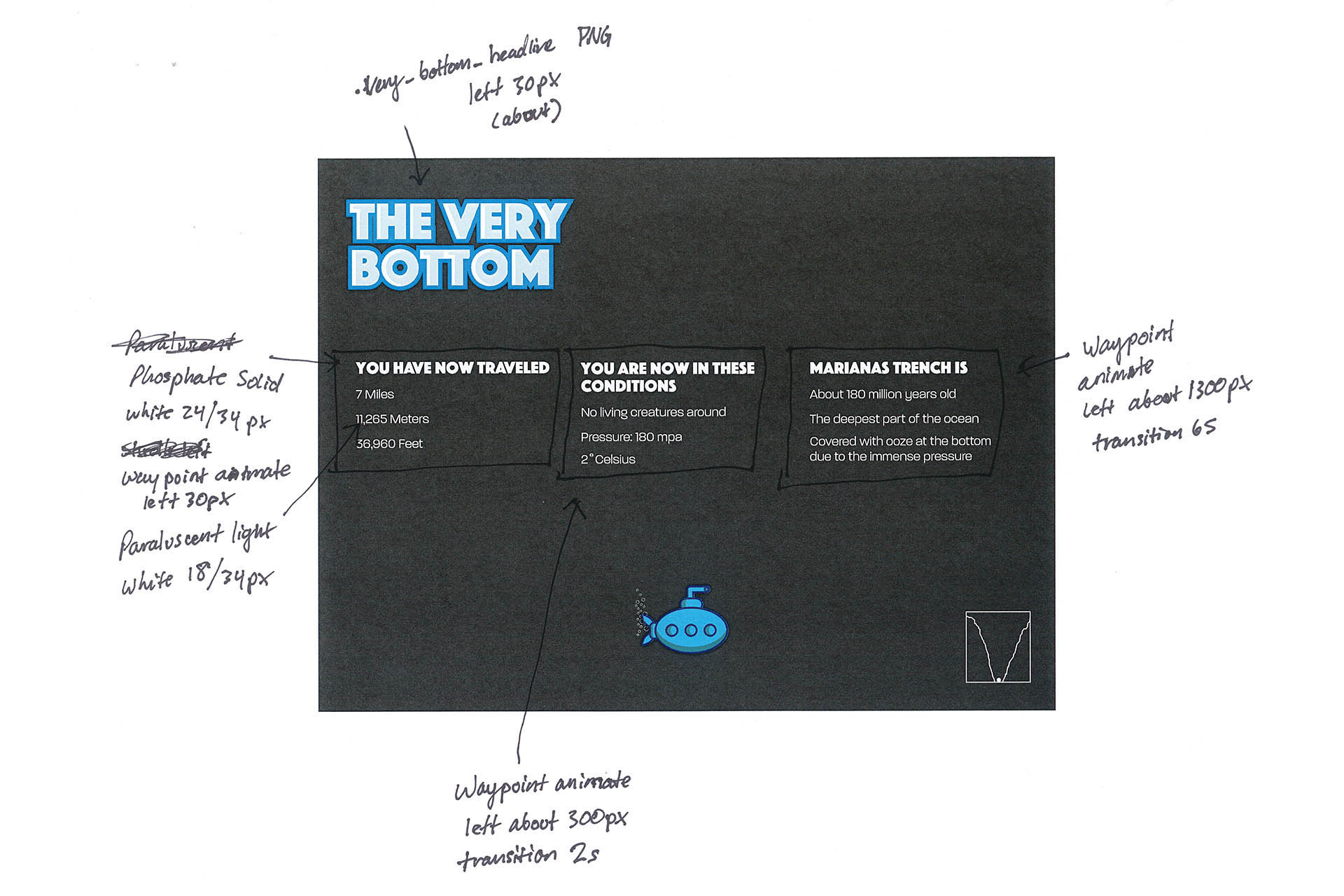
In order to get a solid start at translating all of the elements into viable pieces of code, it was crucial to map out how code could be implemented. This meant writing out all of the color values, writing out the details and grids of the typographic structure, and writing out the spacing and placement of all of the elements. Some of the spacing annotations came from a rough guess in order to have a sense of direction while coding.
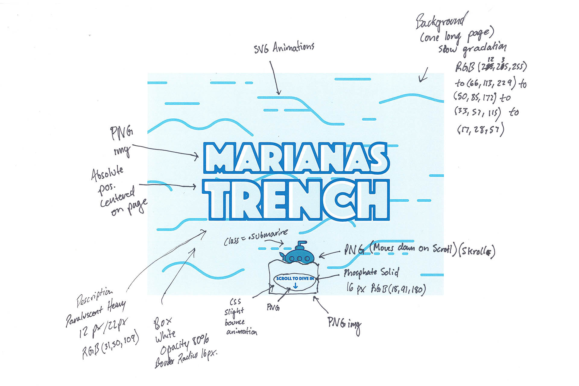
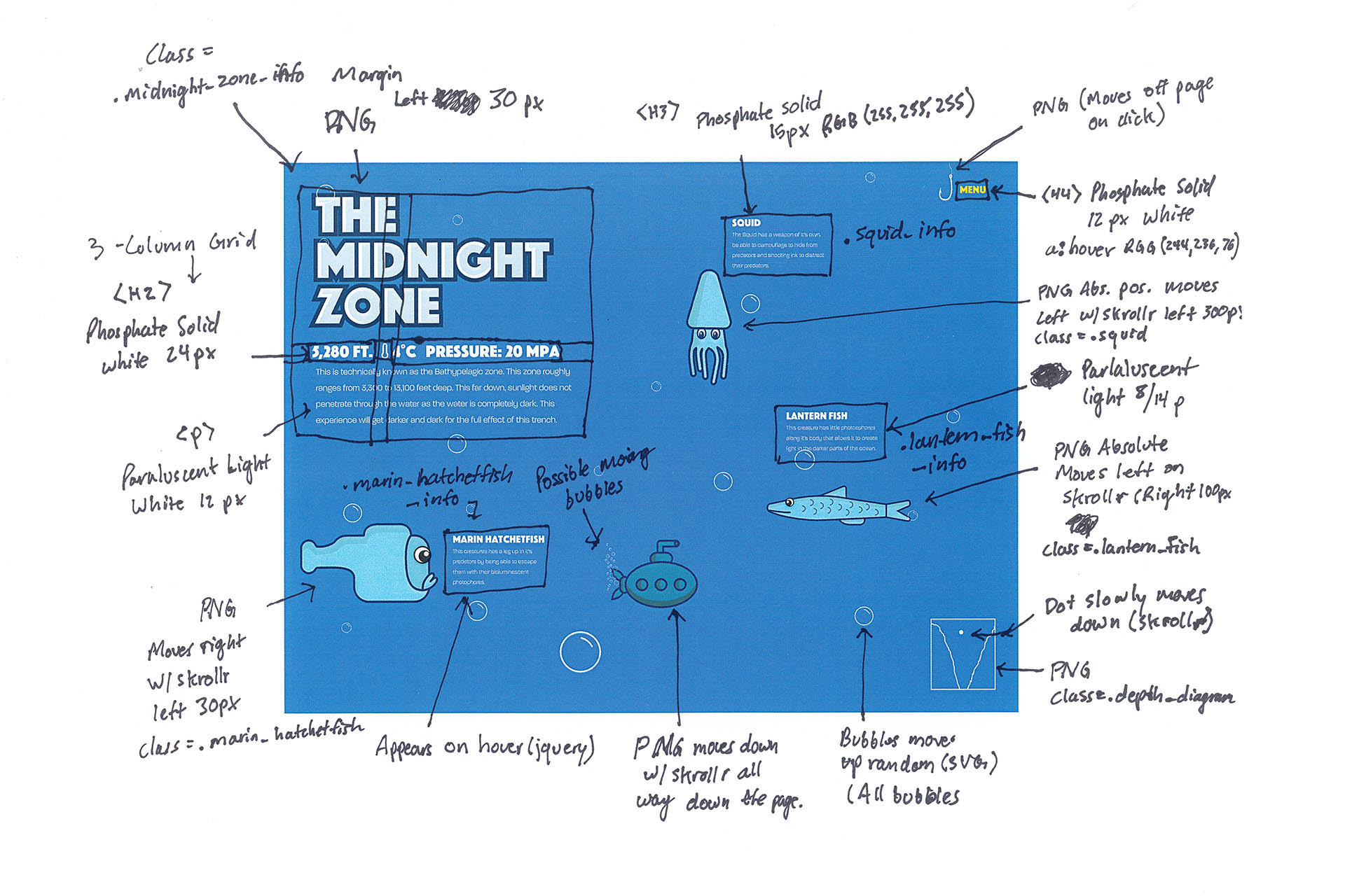
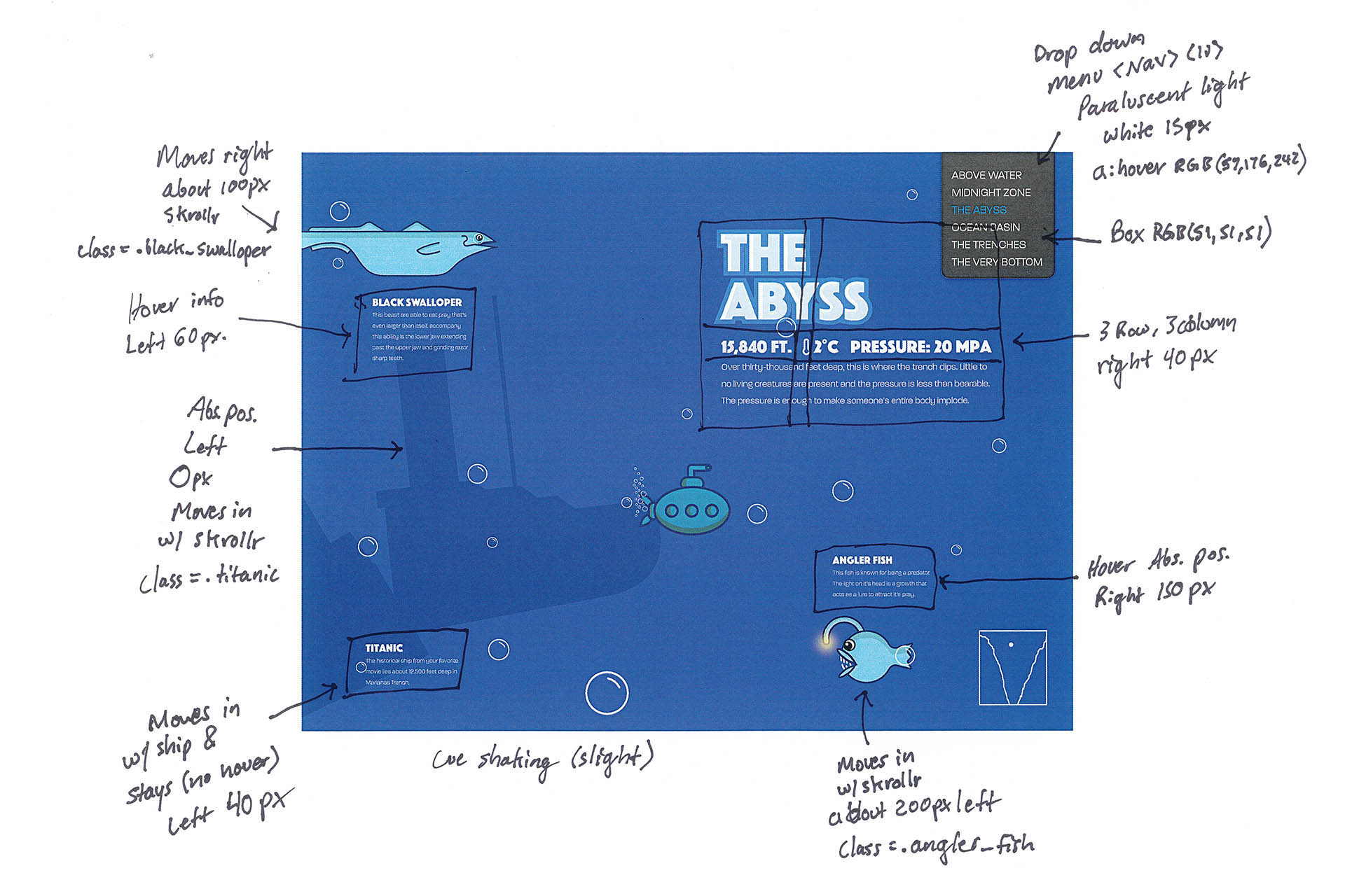
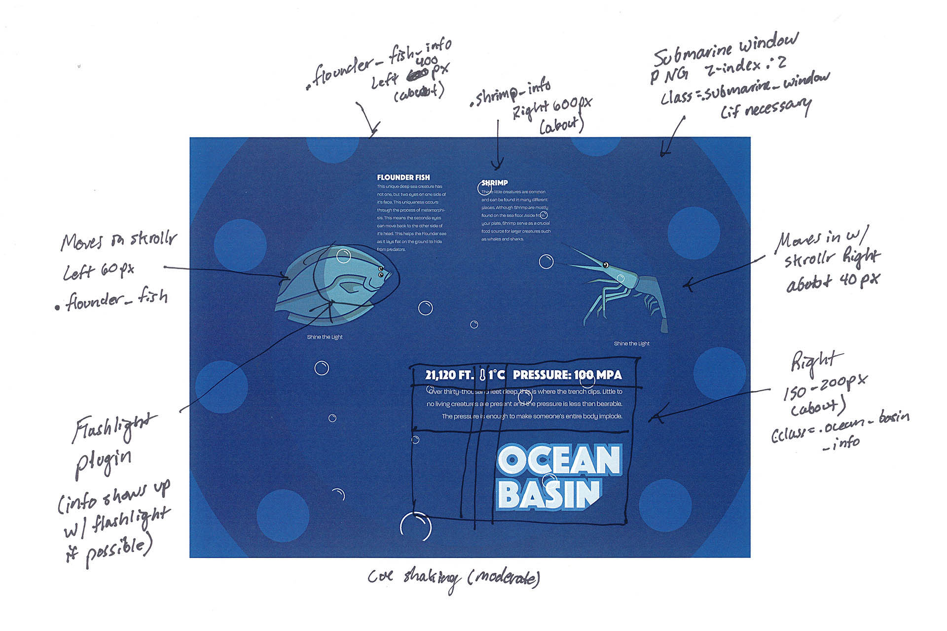
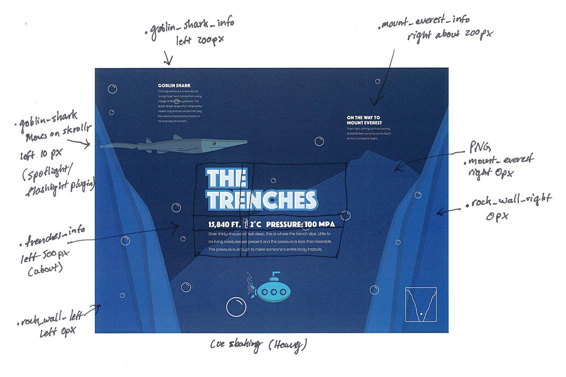
Between the final comp and code write-up stage, the navigation switched to a labeled form for clarity. The idea was to have the user click on a hook at the top right of the viewport and a dropdown navigation box would appear. This changed in the coding phase as the dropdown navigation menu made the website too busy and it took attention away from the rest of the interactions.
The flashlight idea was dropped as well as it felt unnecessary since the user was already able to see and hover over the creatures. In the coding process, the concept was geared back to the original final comp.
The radar diagram was facing an issue that made it difficult for the user to get a clear idea of where they were in the trench. Over all the radar wasn't needed due to the other visual cues (the gradual darker background, the form of the trenches, and the direction of the submarine's movement).
