library(lessR)Short-Answer Problems
These concepts can appear on the short-answer part of the tests. As part of this homework, answer the following questions, usually just several sentences that include the definition.
What is a data table and how are the data values organized?
A data table stores the data values for variables across different observations, such as people, companies, etc. The values in a column are for a specific variable and the values in a row are for a specific observation. The first row usually contains the variable names.What is the distinction between the name of a data table and the name of a variable? How are a data table and variables related?
The data values for variables read from a file are contained within a table of data values. Each column of the data table consists of the data values of a specific variable. The name of the entire table of data is the data table name. The name of variable is for a specific column within that data table.What is a csv file? What are its properties, its primary advantage, and its primary disadvantage?
A csv file is a standard text file, that is, it consists of just text characters, enterable from a keyboard: Letters of the alphabet, digits, punctuation and a few control codes such as line return. It is a specific type of text file in which adjacent values on the same line are separated by commas. Because the contents of the file are standard text, one advantage is that data stored in this format can be read by virtually any application that reads data.What is the distinction between categorical and continuous variables? Provide an example variable of each along with some sample values.
Categorical variables have a relatively small number of unique, non-numerical values that correspond to groups. The values can be non-numeric character strings or integers that do not have numeric properties such as addition. An example of a categorical variable is the operating system of your computer: Windows, Mac, or Linux/Unix, or coding Gender as 1, 2, and 3 for Male, Female, and Other. Continuous variables are numeric with a potentially very large set of values. An example is monthly mortgage payment, values that can range from a few hundred dollars to thousands of dollars, assessed to the nearest cent.Why do bar charts but not histograms have gaps between the bars?
Bar charts visualize the values of categorical variables. The gaps between the bars on a bar chart reflect discrete categories instead of non-numeric lack of continuity. Histograms are for continuous variables. The bars on a histogram are joined to indicate the underlying numerical continuity.What is a function? Why is the concept so central for data anlaysis?
A function is a procedure that performs a specific analysis. For data analysis, a function inputs the data, does the computations, and then presents the output, some combination of text and visualization. Both Excel and R, and every other data analysis system, accomplish a data analysis with functions. It is how data analysis is done.What is a parameter in a function call? Provide an example.
Each parameter for a function (Excel, R, etc.) provides a value that controls some aspect of the analysis, such as, for a bar chart, the color of the bars, the color of the axis labels, and many others. Most parameters have default values, such as data=d, so do not need to be explicitly stated unless a different value is needed. e.g., BarChart(Dept, data=mydata) to create a bar chart for the variable Dept from the mydata data frame.What is reproducibility in data analysis and how do we attain it?
A list of R function calls to perform an analysis, the lines of code, document exactly how to conduct the analysis. If these instructions are saved in a file for later use, the analysis can be repeated, that is, reproduced. The instructions for analyses done by one person become accessible to all applicable members of your organization at any subsequent point in time, including yourself, instead of mouse clicks, such as with Excel, that disappear into digital dust.Identify and describe two properties of histogram bins that lead to arbitrariness in the histogram display.
The shape of a histogram depends on both the width of the bins, the bin width, as well as the starting point for the first bin. Change any one of these values and the shape of the histogram likely changes, typically notably so for small data sets.What is the histogram artifact of under-smoothing and how does it relate to sample size? Describe a histogram that is under-smoothed? How can the problem be fixed?
Under-smoothing occurs when the bin width is too narrow for the given sample size. The result is a histogram that has lots of jaggedness with too many ups and downs that reflect sampling error more than the actual shape of the distribution. Fix the problem by increasing bin width.What is the histogram artifact of over-smoothing and how does it relate to sample size? Describe a histogram that is over-smoothed? How can the problem be fixed?
Over-smoothing occurs when the bin width is too wide for the given sample size. The result is a histogram that does not display as much detail as is available. Too much information is discarded. Fix the problem by decreasing bin width.
Analysis Problems
1. Follow the Posted Example
Example 1.1: Install lessR [just copy the function call and some lines of the output].
install.packages("lessR")[first several lines of output of the install.packages() function]
Example 1.2: Access the lessR functions.
Example 2.2: Read data from a file into an R data frame named d.
d <- Read("http://web.pdx.edu/~gerbing/data/employee.xlsx")[with the read.xlsx() function from Schauberger and Walker's openxlsx package]
Data Types
------------------------------------------------------------
character: Non-numeric data values
integer: Numeric data values, integers only
double: Numeric data values with decimal digits
------------------------------------------------------------
Variable Missing Unique
Name Type Values Values Values First and last values
------------------------------------------------------------------------------------------
1 Name character 37 0 37 Ritchie, Darnell ... Cassinelli, Anastis
2 Years integer 36 1 16 7 NA 15 ... 1 2 10
3 Gender character 37 0 2 M M M ... W W M
4 Dept character 36 1 5 ADMN SALE SALE ... MKTG SALE FINC
5 Salary double 37 0 37 53788.26 94494.58 ... 56508.32 57562.36
6 JobSat character 35 2 3 med low low ... high low high
7 Plan integer 37 0 3 1 1 3 ... 2 2 1
8 Pre integer 37 0 27 82 62 96 ... 83 59 80
9 Post integer 37 0 22 92 74 97 ... 90 71 87
------------------------------------------------------------------------------------------
For the column Name, each row of data is unique. Are these values
a unique ID for each row? To define as a row name, re-read the data file
with the following setting added to your Read() statement: row_names=1Example 2.3: Display the full d data frame with variable names.
d Name Years Gender Dept Salary JobSat Plan Pre Post
1 Ritchie, Darnell 7 M ADMN 53788.26 med 1 82 92
2 Wu, James NA M SALE 94494.58 low 1 62 74
3 Hoang, Binh 15 M SALE 111074.86 low 3 96 97
4 Jones, Alissa 5 W <NA> 53772.58 <NA> 1 65 62
5 Downs, Deborah 7 W FINC 57139.90 high 2 90 86
6 Afshari, Anbar 6 W ADMN 69441.93 high 2 100 100
7 Knox, Michael 18 M MKTG 99062.66 med 3 81 84
8 Campagna, Justin 8 M SALE 72321.36 low 1 76 84
9 Kimball, Claire 8 W MKTG 61356.69 high 2 93 92
10 Cooper, Lindsay 4 W MKTG 56772.95 high 1 78 91
11 Saechao, Suzanne 8 W SALE 55545.25 med 1 98 100
12 Pham, Scott 13 M SALE 81871.05 high 2 90 94
13 Tian, Fang 9 W ACCT 71084.02 med 2 60 61
14 Bellingar, Samantha 10 W SALE 66337.83 med 1 67 72
15 Sheppard, Cory 14 M FINC 95027.55 low 3 66 73
16 Kralik, Laura 10 W SALE 92681.19 med 2 74 71
17 Skrotzki, Sara 18 W MKTG 91352.33 med 2 63 61
18 Correll, Trevon 21 M SALE 134419.23 low 1 97 94
19 James, Leslie 18 W ADMN 122563.38 low 3 70 70
20 Osterman, Pascal 5 M ACCT 49704.79 high 3 69 70
21 Adib, Hassan 14 M SALE 83014.43 med 2 71 69
22 Gvakharia, Kimberly 3 W SALE 49868.68 med 2 83 79
23 Stanley, Grayson 9 M SALE 69624.87 low 1 74 73
24 Link, Thomas 10 M FINC 66312.89 low 1 83 83
25 Portlock, Ryan 13 M SALE 77714.85 low 1 72 73
26 Langston, Matthew 5 M SALE 49188.96 low 3 94 93
27 Stanley, Emma 3 W ACCT 46124.97 high 2 86 84
28 Singh, Niral 2 W ADMN 61055.44 high 2 59 59
29 Anderson, David 9 M ACCT 69547.60 low 1 94 91
30 Fulton, Scott 13 M SALE 87785.51 low 1 72 73
31 Korhalkar, Jessica 2 W ACCT 72502.50 <NA> 2 74 87
32 LaRoe, Maria 10 W MKTG 61961.29 high 2 80 86
33 Billing, Susan 4 W ADMN 72675.26 med 2 91 90
34 Capelle, Adam 24 M ADMN 108138.43 med 2 83 81
35 Hamide, Bita 1 W MKTG 51036.85 high 2 83 90
36 Anastasiou, Crystal 2 W SALE 56508.32 low 2 59 71
37 Cassinelli, Anastis 10 M FINC 57562.36 high 1 80 87Example 2.4: Display the first six lines of the data frame with variable names.
head(d) Name Years Gender Dept Salary JobSat Plan Pre Post
1 Ritchie, Darnell 7 M ADMN 53788.26 med 1 82 92
2 Wu, James NA M SALE 94494.58 low 1 62 74
3 Hoang, Binh 15 M SALE 111074.86 low 3 96 97
4 Jones, Alissa 5 W <NA> 53772.58 <NA> 1 65 62
5 Downs, Deborah 7 W FINC 57139.90 high 2 90 86
6 Afshari, Anbar 6 W ADMN 69441.93 high 2 100 100Example 2.5: Create a bar chart from the original (raw data) for variable Dept.
BarChart(Dept)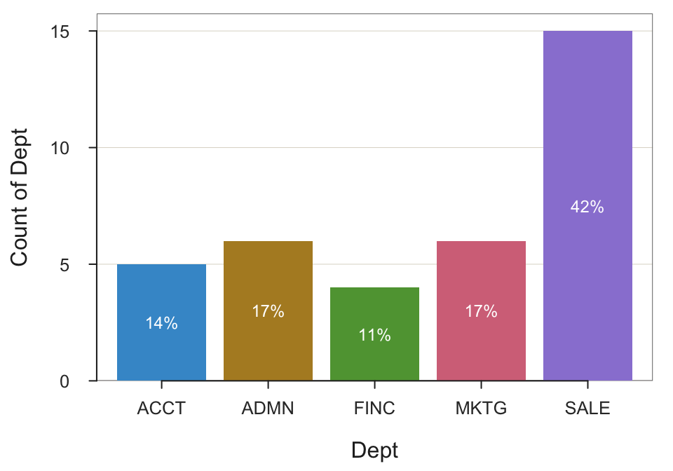
--- Dept ---

Missing Values: 1

                ACCT   ADMN   FINC   MKTG   SALE    Total
Frequencies:       5      6      4      6     15       36
Proportions:   0.139  0.167  0.111  0.167  0.417    1.000

Chi-squared test of null hypothesis of equal probabilities
  Chisq = 10.944, df = 4, p-value = 0.027
Example 2.6: Create a bar chart from a summary (pivot) table for variable Dept.
What I showed in the R handout is reading the already created pivot (summary) table from the web, and then create the bar chart.
Here also show this small pivot table to help differentiate it from the original, raw data for 37 employees.
d <- Read("http://web.pdx.edu/~gerbing/data/DeptCount.xlsx")[with the read.xlsx() function from Schauberger and Walker's openxlsx package]
Data Types
------------------------------------------------------------
character: Non-numeric data values
integer: Numeric data values, integers only
------------------------------------------------------------
Variable Missing Unique
Name Type Values Values Values First and last values
------------------------------------------------------------------------------------------
1 Dept character 5 0 5 ACCT ADMN FINC ... FINC MKTG SALE
2 Freq integer 5 0 4 5 6 4 ... 4 6 15
------------------------------------------------------------------------------------------
For the column Dept, each row of data is unique. Are these values
a unique ID for each row? To define as a row name, re-read the data file
with the following setting added to your Read() statement: row_names=1d Dept Freq
1 ACCT 5
2 ADMN 6
3 FINC 4
4 MKTG 6
5 SALE 15BarChart(Dept, Freq)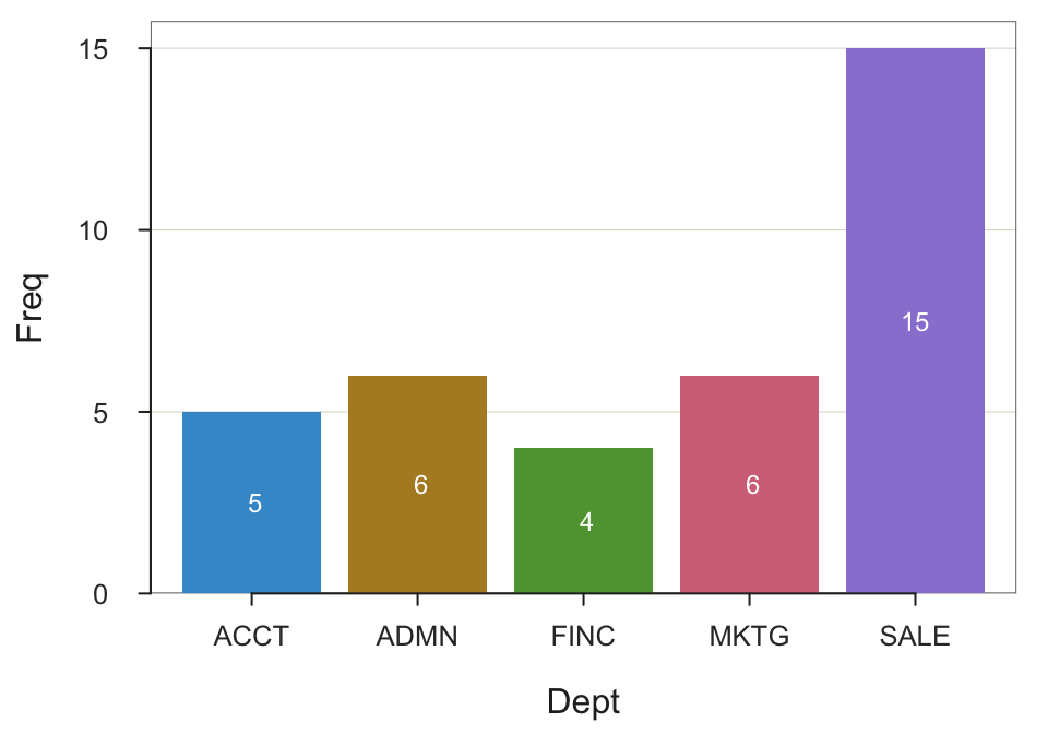
--- Dept ---

Missing Values: 0

                ACCT   ADMN   FINC   MKTG   SALE    Total
Frequencies:       5      6      4      6     15       36
Proportions:   0.139  0.167  0.111  0.167  0.417    1.000

Chi-squared test of null hypothesis of equal probabilities
  Chisq = 10.944, df = 4, p-value = 0.027
Example 2.7: Create a pie chart from measurements for variable Dept.
Need to re-read the original data first.
d <- Read("http://web.pdx.edu/~gerbing/data/employee.xlsx")[with the read.xlsx() function from Schauberger and Walker's openxlsx package]
Data Types
------------------------------------------------------------
character: Non-numeric data values
integer: Numeric data values, integers only
double: Numeric data values with decimal digits
------------------------------------------------------------
Variable Missing Unique
Name Type Values Values Values First and last values
------------------------------------------------------------------------------------------
1 Name character 37 0 37 Ritchie, Darnell ... Cassinelli, Anastis
2 Years integer 36 1 16 7 NA 15 ... 1 2 10
3 Gender character 37 0 2 M M M ... W W M
4 Dept character 36 1 5 ADMN SALE SALE ... MKTG SALE FINC
5 Salary double 37 0 37 53788.26 94494.58 ... 56508.32 57562.36
6 JobSat character 35 2 3 med low low ... high low high
7 Plan integer 37 0 3 1 1 3 ... 2 2 1
8 Pre integer 37 0 27 82 62 96 ... 83 59 80
9 Post integer 37 0 22 92 74 97 ... 90 71 87
------------------------------------------------------------------------------------------
For the column Name, each row of data is unique. Are these values
a unique ID for each row? To define as a row name, re-read the data file
with the following setting added to your Read() statement: row_names=1PieChart(Dept)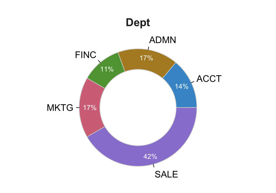
--- Dept ---

                ACCT   ADMN   FINC   MKTG   SALE    Total
Frequencies:       5      6      4      6     15       36
Proportions:   0.139  0.167  0.111  0.167  0.417    1.000

Chi-squared test of null hypothesis of equal probabilities
  Chisq = 10.944, df = 4, p-value = 0.027
Example 2.8: Create a pie chart from measurements for variable Dept with no hole.
PieChart(Dept, hole=0)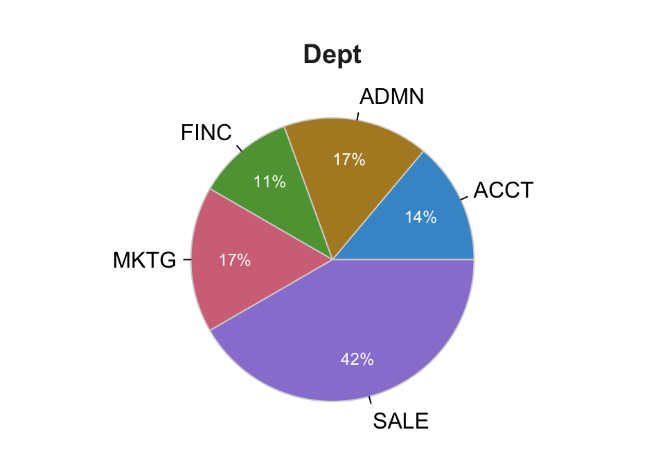
--- Dept ---

                ACCT   ADMN   FINC   MKTG   SALE    Total
Frequencies:       5      6      4      6     15       36
Proportions:   0.139  0.167  0.111  0.167  0.417    1.000

Chi-squared test of null hypothesis of equal probabilities
  Chisq = 10.944, df = 4, p-value = 0.027
Example 2.9: Create a histogram of variable Salary.
Histogram(Salary)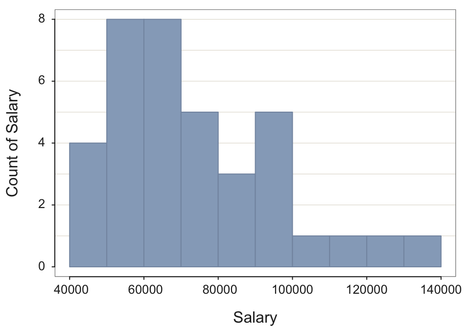
--- Salary ---

     n   miss         mean           sd          min          mdn          max
     37      0    73795.557    21799.533    46124.970    69547.600   134419.230


--- Outliers ---     from the box plot: 1

Small      Large
-----      -----
            134419.2


Bin Width: 10000
Number of Bins: 10

             Bin  Midpnt  Count    Prop  Cumul.c  Cumul.p
---------------------------------------------------------
  40000 >  50000   45000      4    0.11        4     0.11
  50000 >  60000   55000      8    0.22       12     0.32
  60000 >  70000   65000      8    0.22       20     0.54
  70000 >  80000   75000      5    0.14       25     0.68
  80000 >  90000   85000      3    0.08       28     0.76
  90000 > 100000   95000      5    0.14       33     0.89
 100000 > 110000  105000      1    0.03       34     0.92
 110000 > 120000  115000      1    0.03       35     0.95
 120000 > 130000  125000      1    0.03       36     0.97
 130000 > 140000  135000      1    0.03       37     1.00
Example 2.10: Create a histogram of variable Salary with a bin width of 13000.
Histogram(Salary, bin_width=13000)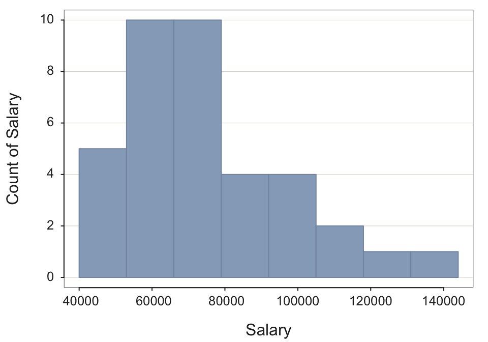
--- Salary ---

     n   miss         mean           sd          min          mdn          max
     37      0    73795.557    21799.533    46124.970    69547.600   134419.230


--- Outliers ---     from the box plot: 1

Small      Large
-----      -----
            134419.2


Bin Width: 13000
Number of Bins: 8

             Bin  Midpnt  Count    Prop  Cumul.c  Cumul.p
---------------------------------------------------------
  40000 >  53000   46500      5    0.14        5     0.14
  53000 >  66000   59500     10    0.27       15     0.41
  66000 >  79000   72500     10    0.27       25     0.68
  79000 >  92000   85500      4    0.11       29     0.78
  92000 > 105000   98500      4    0.11       33     0.89
 105000 > 118000  111500      2    0.05       35     0.95
 118000 > 131000  124500      1    0.03       36     0.97
 131000 > 144000  137500      1    0.03       37     1.00
Example 2.11: Create a bar chart for variable Dept with bars of the same color by setting the parameter fill. Choose any color.
BarChart(Dept, fill="darkred")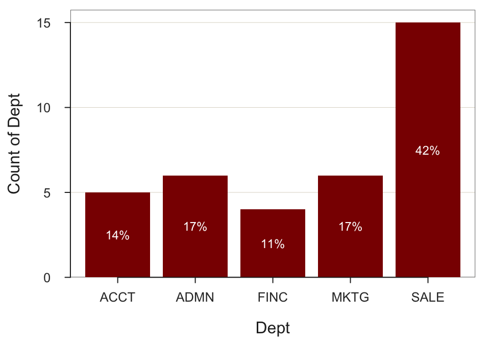
--- Dept ---

Missing Values: 1

                ACCT   ADMN   FINC   MKTG   SALE    Total
Frequencies:       5      6      4      6     15       36
Proportions:   0.139  0.167  0.111  0.167  0.417    1.000

Chi-squared test of null hypothesis of equal probabilities
  Chisq = 10.944, df = 4, p-value = 0.027
2. Data Entry
Consider the data in the following table, randomly selected from a data file of the measurements of thousands of motorcyclists.
a. List each of the variable names. Classify each as continuous or categorical.
Gender: Categorical, M and F
Height: Continuous
Weight: Continuous
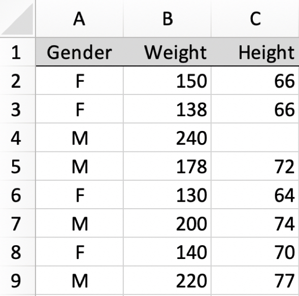
b. Manually enter each data value from the table into a worksheet (such as Excel). Copy and paste the data table from your R output into your homework document.
[Result is the same table above.]
c. Every data table, in R or Excel, has a name. Excel stores a data table in a worksheet. List the name of the data table, then list the names of the variables defined in that data table.
By default, Excel names the first worksheet of an Excel file Sheet1. Though not necessary, for clarity, this default name could be changed to indicate actual name of the data table, such as HtWt or d. The variable names are Gender, Height, and Weight.
- Verify that the data values for the variables in the data table are stored within the analysis system in the intended format. That is, from the output of
Read()describe how the variable types defined by R correspond to your description of categorical and continuous variables.
Copy to your homework document the listing from the lessR Read() function you used to read the data that displays the variable names, variable types, and first and last data values.
You would browse for the data file by not specifying any file reference.
d <- Read("")d <- Read("data/DataMC.xlsx")[with the read.xlsx() function from Schauberger and Walker's openxlsx package]
Data Types
------------------------------------------------------------
character: Non-numeric data values
integer: Numeric data values, integers only
------------------------------------------------------------
Variable Missing Unique
Name Type Values Values Values First and last values
------------------------------------------------------------------------------------------
1 Gender character 8 0 2 F F M ... M F M
2 Weight integer 8 0 8 150 138 240 ... 200 140 220
3 Height integer 7 1 6 66 66 NA ... 74 70 77
------------------------------------------------------------------------------------------The Read() function lists the name of each variable read and the type of variable, here Gender is properly read as type character and Height and Weight are properly read as type integer.
e. Verify that the data values for the variables in the R data table appear in the intended format. From the output of Read() what is the type of each of these three variables that R assigned? What type does R assign to a non-numeric, categorical variable?
The Read() function lists the name of each variable read and the type of variable, here Gender is properly read as type character and Height and Weight are properly read as type integer.
e. Display the data from within R with the print() function call and then copy to your homework document. Note that simply entering the name of the R object, here called d, is an abbreviation that invokes the print(d) function.
d Gender Weight Height
1 F 150 66
2 F 138 66
3 M 240 NA
4 M 178 72
5 F 130 64
6 M 200 74
7 F 140 70
8 M 220 77f. From the previous answers, compare the data stored in Excel and then compare to the representation of the data stored in R. In particular, what does NA refer to in the R data table?
The representations are the same, expected because the same data table is represented within Excel and within R. Gender is stored as an R type character variable, so a categorical variable. The primary distinction is that a blank cell in Excel indicates missing data. R, instead, uses the code NA for numerical data and <NA> for non-numeric data, each an abbreviation for “Not Assigned”.
3. Bar Chart (from data as measurements)
A motorcycle clothing company makes jackets are of three types: Lite, Medium and Thick. The company needs guidance as to how many different jackets of each type to bring to a gathering of motorcyclists of a specific brand, here BMW or Honda motorcycles. The data are recorded from past sales of motorcycle jackets to owners of BMW or Honda motorcyclists.
For now, just analyze the type of jackets sold, and ignore the motorcycle type.
Consider the data.
d <- Read("http://web.pdx.edu/~gerbing/data/Jackets.csv")Data Types
------------------------------------------------------------
character: Non-numeric data values
------------------------------------------------------------
Variable Missing Unique
Name Type Values Values Values First and last values
------------------------------------------------------------------------------------------
1 Bike character 1025 0 2 BMW Honda Honda ... Honda Honda BMW
2 Jacket character 1025 0 3 Lite Lite Lite ... Lite Med Lite
------------------------------------------------------------------------------------------- Verify that there is an actual data file called Jackets.csv at the specified web address (URL) by pointing your browser at that URL. Take a screenshot of the first several lines of the data file and paste into your homework document.
[For your computer, the default may be to read a csv file directly into Excel instead of display directly. If so just show the Excel file with a screen pic of the relevant file. To show the csv file structure itself in this situation, would need to open in a text editor, but no need to go there.]
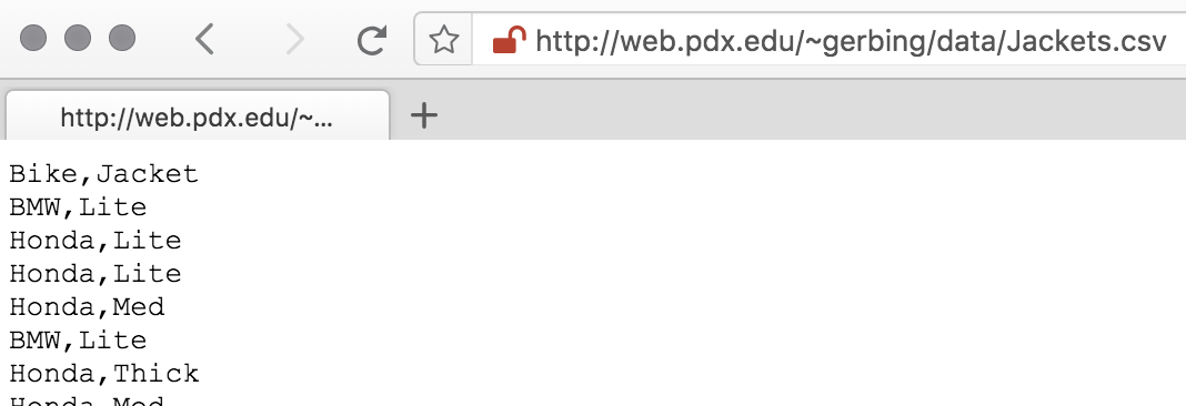
- List the variable names and first six lines of data.
head(d) Bike Jacket
1 BMW Lite
2 Honda Lite
3 Honda Lite
4 Honda Med
5 BMW Lite
6 Honda Thick- Just by looking at the data directly, without any R or Excel analysis, how many variables are in the data file? What are their names? What is the relevant variable for this analysis?
There are two variables in this data file, Bike and Jacket. Here we are only concerned with Jacket, which indicates the style of jacket sold.
Describe the distribution of Jacket Types with a:
- bar chart and e. frequency table
Note that the BarChart() function displays both the bar chart and the frequency table it computes from which the bar chart is created.
BarChart(Jacket)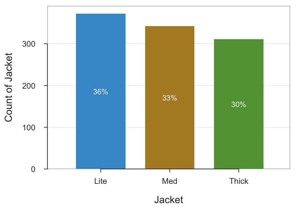
--- Jacket ---

Missing Values: 0

                Lite    Med  Thick      Total
Frequencies:     372    342    311       1025
Proportions:   0.363  0.334  0.303      1.000

Chi-squared test of null hypothesis of equal probabilities
Chisq = 5.446, df = 2, p-value = 0.066 - Pie (ring) chart
PieChart(Jacket)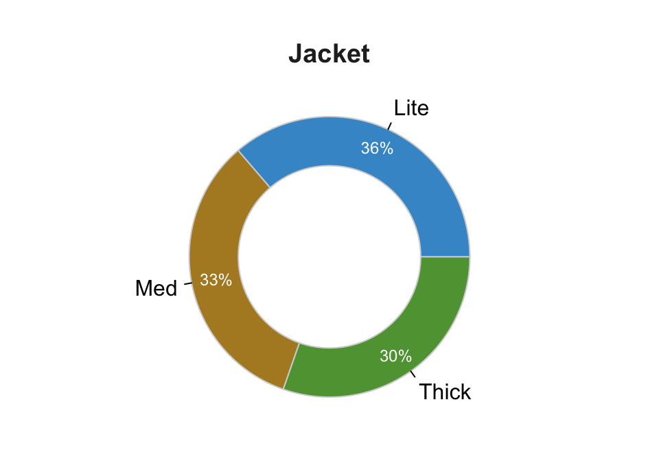
--- Jacket ---

                Lite    Med  Thick      Total
Frequencies:     372    342    311       1025
Proportions:   0.363  0.334  0.303      1.000

Chi-squared test of null hypothesis of equal probabilities
  Chisq = 5.446, df = 2, p-value = 0.066
This version of a pie chart is called a doughnut chart or a ring chart. If you want to see the entire pie (not part of the actual question), set the size of the hole by entering any value from 0 to 1 for the hole parameter. The default value is 0.65. Here we do not need the frequency table yet again, so turn off the text output to the console with the quiet parameter (not needed as part of your homework).
pc(Jacket, hole=0, quiet=TRUE)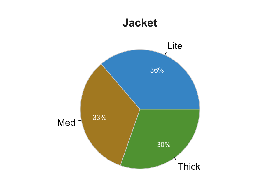
- What do these results mean (as you would explain to management)?
Almost the same amount of Light, Medium and Thick jackets are sold, though there is a slight tendency in the data for the lighter the jacket the more sales. (A future homework will extend this analysis by relating to the second variable in the data set, Motorcycle Type.)
4. Bar Chart from Data as a Summary Table
Oregon produces many different wine varieties, but five varieties predominate. A summary table of the production in tons of the top five varietals is available on the web.
d <- Read("http://web.pdx.edu/~gerbing/data/WineOR2021.xlsx")[with the read.xlsx() function from Schauberger and Walker's openxlsx package]
Data Types
------------------------------------------------------------
character: Non-numeric data values
integer: Numeric data values, integers only
------------------------------------------------------------
Variable Missing Unique
Name Type Values Values Values First and last values
------------------------------------------------------------------------------------------
1 Variety character 7 0 7 Cabernet Sauvignon ... Other
2 Production integer 7 0 7 2633 7825 1858 ... 69936 3745 9381
------------------------------------------------------------------------------------------
For the column Variety, each row of data is unique. Are these values
a unique ID for each row? To define as a row name, re-read the data file
with the following setting added to your Read() statement: row_names=1- a. Display this summary (pivot) table from R after you read it into the d data frame (table).
d Variety Production
1 Cabernet Sauvignon 2633
2 Chardonnay 7825
3 Merlot 1858
4 Pinot Gris 19299
5 Pinot Noir 69936
6 Syrah 3745
7 Other 9381How many rows of “data”? 7
How many columns? 2
How many times does each value of the categorical variable occur in the summary table? Once
The original data table from which the summary table of production by varietal was computed is not available on the oregonwine.org website. Describe the structure of this data table. That is, what are the variables (columns)? What data is in each row?
The collect data was organized into a table. Likely the first column would be the individual wine grower. Each successive column would be a grape varietal. Each row of data would be the amount produced, in tons, for each varietal. Probably most of the cells in a row would be blank or 0 because most wine growers focus on just a few types of grapes.Create the bar chart of the production by varietal directly from the summary table.
When we read the summary table, we read the name of each category and the corresponding numerical variable that determines the height of the corresponding bar, generically, \(x\) and \(y\). (That is, instead of having BarChart() compute \(y\) as counts, we read the numerical value for each bar directly.)
BarChart(Variety, Production)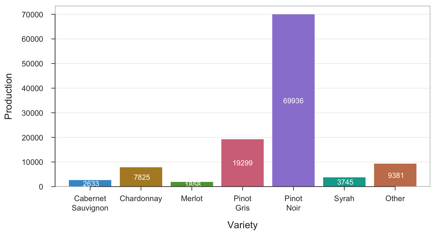
--- Variety ---

Missing Values: 0

           Variety    Count   Prop
-----------------------------------
Cabernet Sauvignon     2633   0.023
        Chardonnay     7825   0.068
            Merlot     1858   0.016
        Pinot Gris    19299   0.168
        Pinot Noir    69936   0.610
             Syrah     3745   0.033
             Other     9381   0.082
-----------------------------------
             Total   114677   1.000

Chi-squared test of null hypothesis of equal probabilities
Chisq = 217211.470, df = 6, p-value = 0.000 - The
BarChart()parametervaluesspecifies how the values are displayed on the bars, including the value “off”. The value “%” specifies to display the values displayed on the bars as percentages. Create the bar chart with these percentages displayed on the bars. Follow the general form of
parameter name = value
BarChart(Variety, Production, values="%")
--- Variety ---

Missing Values: 0

           Variety    Count   Prop
-----------------------------------
Cabernet Sauvignon     2633   0.023
        Chardonnay     7825   0.068
            Merlot     1858   0.016
        Pinot Gris    19299   0.168
        Pinot Noir    69936   0.610
             Syrah     3745   0.033
             Other     9381   0.082
-----------------------------------
             Total   114677   1.000

Chi-squared test of null hypothesis of equal probabilities
Chisq = 217211.470, df = 6, p-value = 0.000 - The
Rparameterylabspecifies a custom y-axis label [not the variable name for analysis, just the label on the y-axis]. The default label is the variable name, which is Production. However, the variable name does not indicate the units. Take your bar chart function call from b) or c) above, leave as it is except add theylabparameter to the function call, setting a custom label to the bar chart, “Production (tons)”. Note that the variables for analysis do not change, just the label on the y-axis.
BarChart(Variety, Production, values="%", ylab="Production (Tons)")
--- Variety ---

Missing Values: 0

           Variety    Count   Prop
-----------------------------------
Cabernet Sauvignon     2633   0.023
        Chardonnay     7825   0.068
            Merlot     1858   0.016
        Pinot Gris    19299   0.168
        Pinot Noir    69936   0.610
             Syrah     3745   0.033
             Other     9381   0.082
-----------------------------------
             Total   114677   1.000

Chi-squared test of null hypothesis of equal probabilities
  Chisq = 217211.470, df = 6, p-value = 0.000
5. Histogram
The data for this exercise are included with lessR, obtained when the package was downloaded. To read, just enter the data set name. Or, read from the web. You get the same data set either way.
Read the Employee data set from within lessR.
d <- Read("Employee")Data Types
------------------------------------------------------------
character: Non-numeric data values
integer: Numeric data values, integers only
double: Numeric data values with decimal digits
------------------------------------------------------------
Variable Missing Unique
Name Type Values Values Values First and last values
------------------------------------------------------------------------------------------
1 Years integer 36 1 16 7 NA 7 ... 1 2 10
2 Gender character 37 0 2 M M W ... W W M
3 Dept character 36 1 5 ADMN SALE FINC ... MKTG SALE FINC
4 Salary double 37 0 37 53788.26 94494.58 ... 56508.32 57562.36
5 JobSat character 35 2 3 med low high ... high low high
6 Plan integer 37 0 3 1 1 2 ... 2 2 1
7 Pre integer 37 0 27 82 62 90 ... 83 59 80
8 Post integer 37 0 22 92 74 86 ... 90 71 87
------------------------------------------------------------------------------------------- Obtain the default histogram for Salary.
As an option just to demonstrate, here change the default color theme to orange and add a black background such as might be appropriate for a slide presentation. Setting the style() function is not part of class requirements, but shown here in case you are interested.
style("orange", sub_theme="black")
Histogram(Salary)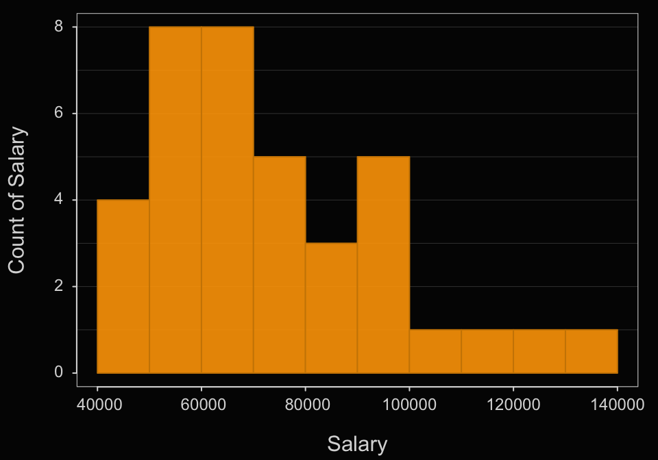
>>> Suggestions
bin_width: set the width of each bin
bin_start: set the start of the first bin
bin_end: set the end of the last bin
Histogram(Salary, density=TRUE)  # smoothed curve + histogram
Plot(Salary)  # Violin/Box/Scatterplot (VBS) plot

--- Salary ---

     n   miss         mean           sd          min          mdn          max
     37      0    73795.557    21799.533    46124.970    69547.600   134419.230


--- Outliers ---     from the box plot: 1

Small      Large
-----      -----
            134419.2


Bin Width: 10000
Number of Bins: 10

             Bin  Midpnt  Count    Prop  Cumul.c  Cumul.p
---------------------------------------------------------
  40000 >  50000   45000      4    0.11        4     0.11
  50000 >  60000   55000      8    0.22       12     0.32
  60000 >  70000   65000      8    0.22       20     0.54
  70000 >  80000   75000      5    0.14       25     0.68
  80000 >  90000   85000      3    0.08       28     0.76
  90000 > 100000   95000      5    0.14       33     0.89
 100000 > 110000  105000      1    0.03       34     0.92
 110000 > 120000  115000      1    0.03       35     0.95
 120000 > 130000  125000      1    0.03       36     0.97
 130000 > 140000  135000      1    0.03       37     1.00
Again, this is not part of the assignment, but here go back to the lessR default style.
style()theme set to "colors"- What is the default bin width? Starting point of the first bin?
The obtained frequency distribution shows a bin width of $10,000 with the first bin starting at $40,000.
- Interpret the histogram.
Most of the salaries occur in the lower range of Salaries, with $40,000 to $60,000 being the most frequently occurring salaries. The distribution is skewed with a tail of less frequently occurring salaries in the upper end. The largest salary is $124,419.23 and the smallest is $63,795.55.
- How could you change the bin width to a more optimal setting? Why?
The histogram is a bit irregular. Those little jags of up and down most likely do not represent the true underlying distribution, which is likely smooth. So the bins appear to be a little too narrow for the available sample size. Best to widen bin width a little to smooth out the histogram.
- Using the bin_width parameter, change the bin width to this more optimal setting and re-run.
Histogram(Salary, bin_width=12000, quiet=TRUE)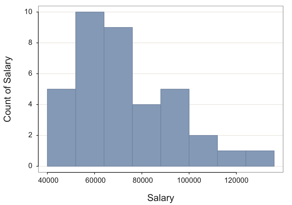
- Using the bin_width option deliberately over-smooth the histogram (bins too wide). What is wrong with this histogram?
Choose any large value for bin width. Set with the parameter bin_width. Again, not necessary, but turn off console output to save space.
Histogram(Salary, bin_width=40000, quiet=TRUE)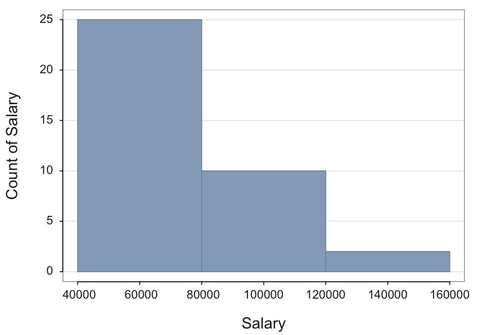
The problem is that the over-smoothed histogram “wastes” information in the sense that the given sample size allows for a smaller bin width and thus more information to be displayed in the histogram. This histogram does not match the data in that it starts high and then just lowers over three bins. In actuality, the distribution begins lower in frequency, achieves a peak around $40,000 to $60,000 and then gradually descends.
- Using the bin_width option deliberately under-smooth the histogram (bins too narrow). Why is the resulting display not optimal?
Here, suppress the output of the frequency distribution because it is so long, and not needed. Do so with the parameter quiet, set to TRUE.
Histogram(Salary, bin_width=2000, quiet=TRUE)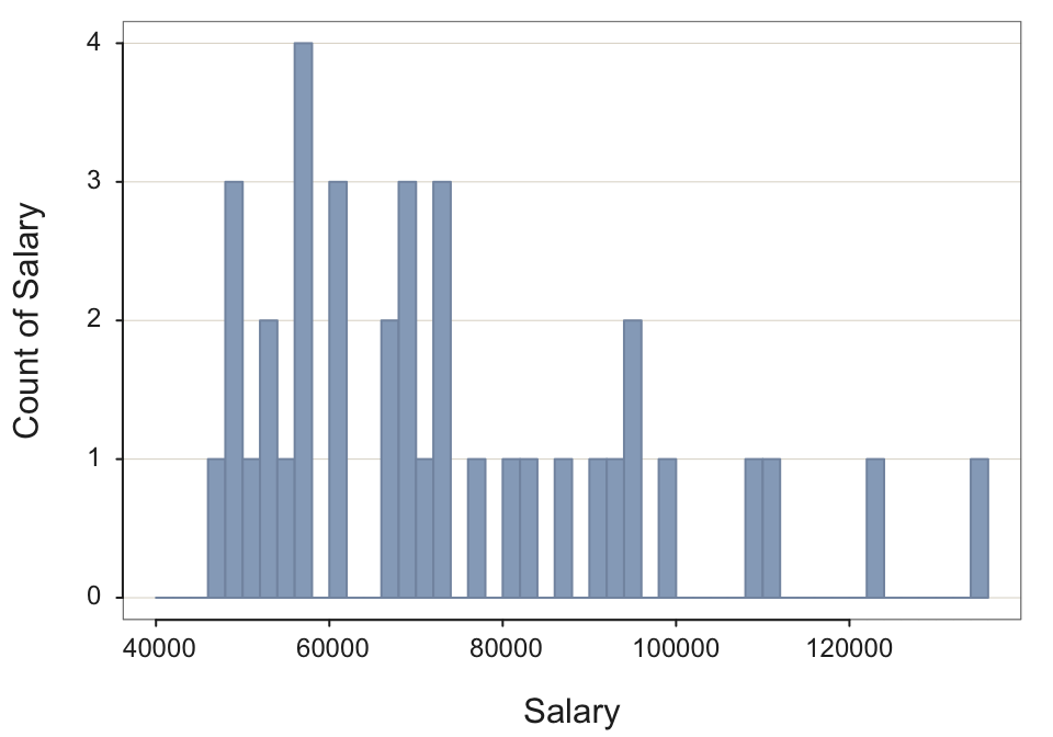
The bin width for the under-smoothed histogram is too small for the available sample size. The result are sampling fluctuations illustrated by the zigging and zagging of the histogram that only represent random fluctuations, which would not replicate in future samples.