Doing data analysis is analyzing variables. We use the term “variables” because their data values vary. Co-variability, or relatedness, of two or more variables is the topic addressed here.
The analysis of variability applies to the values of a single variable. The analysis of co-variability is the extent to which the values of two or more variables vary together.
The methods for analyzing variability and co-variability differ for categorical and continuous variables. We begin with the analysis of categorical variables.
Categorical Variables
Joint Distributions
From lessR version 4.4.1.
Visualizations for two categorical variables express the relation between the two variables regarding a numerical variable. For example, how is salary related to an employee’s gender and the department in which they work? If there is no relation between the categorical variables regarding salary, then each group would have the same mean salary. If there are real differences in salary across the groups, then these differences will be evident by comparing the group means, such as visually with a bar chart.
As with the bar chart of a single variable, a bar chart for two categorical variables associates a numerical value for each group. The distinction is that a combination of levels of the two categorical variables defines each group. As with the one-variable chart, the bar chart is constructed from that summary table, either entered directly as the data into the bar chart function or implicitly computed by the function from the original, raw data.
The source of the numeric values associated with the groups can be anything, including random nonsense. However, the summary table is usually computed from a data aggregation for the specified numerical variable. As with the one categorical variable bar chart, compute the numerical value as an aggregation of either:
- the count of the membership in each group
- a statistic such as the mean of another numerical variable
An example summary (pivot) table follows of the 10 groups defined by the combination of two levels of Gender and 5 levels of Dept. The summary table has its own name.
A summary table of two variables, which for categorical variables, lists the numerical value associated with each group.
Each group is associated with its mean Salary. Table 1 shows the joint distribution with three variables presented in what is called long format, the format in which the data can be read into a data analysis application for analysis, such as from a corresponding Excel data file. In this format, data values for a single variable are organized into a single column, and each row contain the values are for a single entity, such as one employee.
| Gender | Dept | Salary_mean |
|---|---|---|
| M | ACCT | 59626.20 |
| W | ACCT | 63237.16 |
| M | ADMN | 80963.34 |
| W | ADMN | 81434.00 |
| M | FINC | 72967.60 |
| W | FINC | 57139.90 |
| M | MKTG | 99062.66 |
| W | MKTG | 64496.02 |
| M | SALE | 86150.97 |
| W | SALE | 64188.25 |
When presenting the results, comparing the numbers that define the joint distribution becomes more straightforward in an alternative table organization. This organization arranges one variable’s group means horizontally and the other group means vertically. Each value is represented by a separate column, resulting in a wide format data table. However, without additional programming, this horizontal tabular presentation in Table 2 is not a data table that can be directly imported into a data analysis application.
Visualizations such as the bar chart display descriptive statistics. To evaluate if the differences likely generalize beyond a single sample requires inferential statistics. The inferential chi-square test of independence evaluates the independence of two categorical variables with the null hypothesis that the variables are unrelated or independent.
| Dept | M | W |
|---|---|---|
| ACCT | 59626.19 | 63237.16 |
| ADMN | 80963.35 | 81434.00 |
| FINC | 72967.60 | 57139.90 |
| MKTG | 99062.66 | 64496.02 |
| SALE | 86150.97 | 64188.25 |
The descriptive statistics in Table 2 communicate the relationship between gender and department. We can clearly see the average salary in each department separately for men and women. For example, we can see that the highest earning group is men in marketing, with an average salary of $99,063. To do better evaluating this relationship, visualize the data. The corresponding bar chart constructed from that table of statistics more effectively communicates the underlying relationship.
Bar Charts
Stacked Bar Chart
Different forms of the bar chart exist. Here, consider the stacked of our chart.
For each level of the first categorical variable, the levels of the second categorical variable are stacked, one on top of the other.
A stacked bar chart shows are the two categorical variables are related regarding the numerical, continuous variable.
Directly compare the levels of the first categorical variable across levels while observing the sub-division of the second categorical variable within each level of the first variable.
Directly from the Summary Table
Figure 1 shows a bar chart of mean salary for the employees in each department for men and women constructed entirely from the information in Table 1. Figure 1 is the visual representation of Table 1. All three variables present in the summary table are processed by the bar chart function, in this example: categorical variables Gender and Dept, and continuous variable Salary_mean, the mean for each department.
As such, read the data shown in Table 1 from a data file that contains the data for the three variables and then create the bar chart.
d <- Read("web.pdx.edu/~gerbing/data/GenDptSalary.xlsx")
BarChart(Dept, Salary_mean, by=Gender)
The name of the data frame that contains the variables of interest is not specified with the data parameter in the call to the BarChart() function, so we are relying on the default data frame name, d. The x-axis variable in the function call is the categorical variable Dept and the y-axis variable is the continuous variable Salary_mean.
by: The second categorical variable. The by= is either required or it is suggested to include for clarity.
Note: This specification for the call to BarChart() is the same as the function call for the one categorical variable visualization except that the by variable is also specified.
Note: Experiment interactively with different parameter settings of the two-variable bar chart for your chosen data with the lessR function interact(“BarChart”).
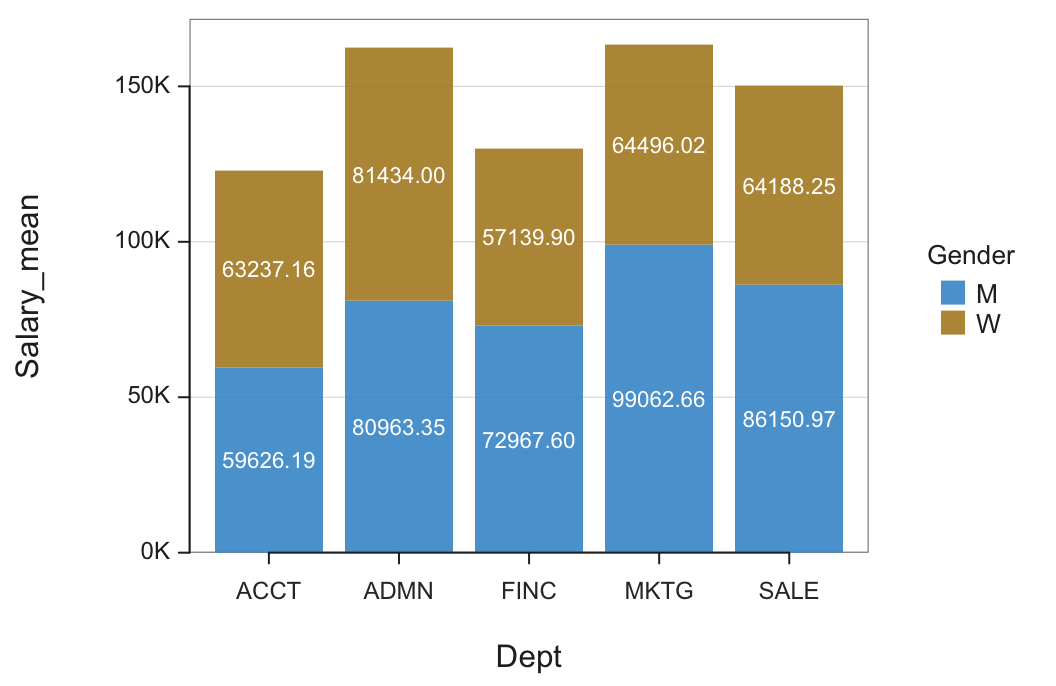
Each bar in the stacked bar chart has the same height as if there were no by variable, but each bar’s interior is now divided into the relative proportions of each by level or category. In this example, the height of each bar for Dept is the same as for the one variable plot of Dept, but the bars are now subdivided according to Gender.
From the Original Data
The raw, original data table of measurements can also be entered into the bar chart function. The function then implicitly computes the summary (pivot) table from the original measurements to display the same bar chart. However, in this situation, we need a parameter that instructs the bar chart function for the chosen statistic to compute the aggregation. Here, compute the mean salary.
d <- Read("Employee")
BarChart(Dept, Salary, by=Gender, stat="mean")
by: Identify the second categorical variable. The parameter name is either required or suggested to include.
stat: Specify the statistic by which to aggregate the specified numerical variable. Applicable values: “sum”, “mean”, “sd”, “dev” for mean deviations, “min”, “median”, and “max”.
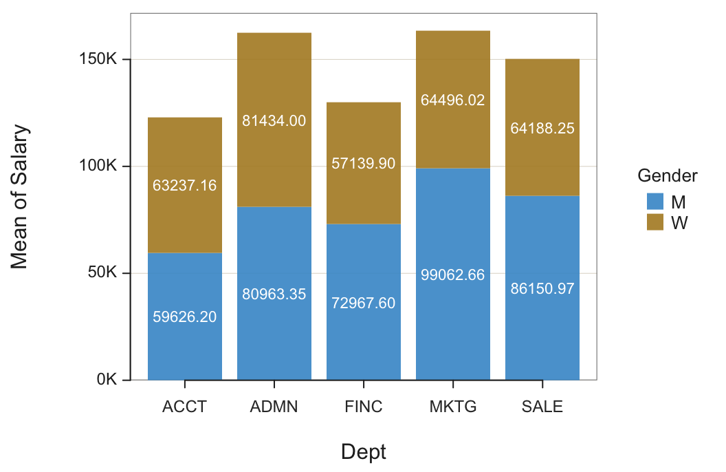
The only distinction between the bar chart from which the summary table was entered as the data, Figure 1, and from when it was computed from the original data of measurements, Figure 2, is the label on the vertical, y-axis. The previously computed mean is entered as data in the summary table as Salary_mean. In the bar chart from the original data, the output signals that the mean was computed for Salary. Of course, the data analysis application will also allow custom axis labels.
Unstacked Bar Chart
The alternative to the stacked bar chart is the unstacked version. The unstacked bar chart presents the same information as the stacked bar chart but with a different emphasis.
For each level of the first categorical variable, plot the levels of the second categorical variable as separate bars grouped together.
The unstacked bar chart presents the levels of the second categorical variable, the sub-categories, side-by-side.
Directly visualize the differences between the levels of the second categorical variable at each level of the first variable.
Figure 3 shows a bar chart of counts for the employees in each department, each bar displaying the relative numbers of men and women. The comparison of average men’s and women’s salaries in each department is straightforward, just compare the height of the adjacent bars.
BarChart(Dept, Salary, by=Gender, stat="mean", beside=TRUE, labels="off")
beside: If set to TRUE, indicates to create the unstacked version.
Note: If the bars are too thin to properly display the corresponding values, turn off the display by setting labels="off".
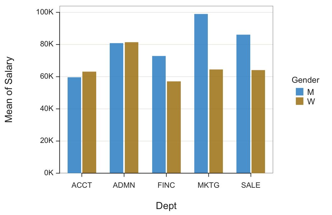
The unstacked bar chart explicitly compares the mean Salary of each Gender for each department.
Interpretation. Men and women employees in accounting and administration, on average, have about the same salaries. However, in finance and sales and even more so in marketing, on average, men make considerably more. This discrepancy should be further investigated. The result may be benign, for perhaps many men have worked longer at the company. Or, there may be overt or covert discrimination.
Charts from Counts
When constructing a bar chart from counts, the numerical variable referenced in the visualization is the count of the number of occurrences in each group.
Do men and women employees differ in their job satisfaction? Are gender and job satisfaction related? To answer this question, employees were administered a self-report survey in which they rated their own job satisfaction on a scale with three response categories: low, med, and high.
The resulting summary table of counts in Table 3 follows for the 35 employees with data recorded for both corresponding variables, Gender and JobSat.
| JobSat | M | W |
|---|---|---|
| low | 11 | 2 |
| med | 4 | 7 |
| high | 3 | 8 |
The joint distribution of counts, that is, frequencies, has its own name.
A table that lists the number of occurrences for each group defined by two or more categorical variables.
The table’s name comes from the meaning of the word tabulate, which means to count. When creating a bar chart of counts, the bar chart is constructed from the numbers in this cross-tabulation table.
Figure 4 shows the two categorical variable bar chart for the number of employees in each department, for both men and women.
BarChart(Gender, by=JobSat)
Note: No third variable, the numerical variable, is entered into the analysis, only the two categorical variables. The numerical variable for the analysis, the Count of employees in each group, is obtained directly from an analysis of the two categorical variables without reference to a third variable.
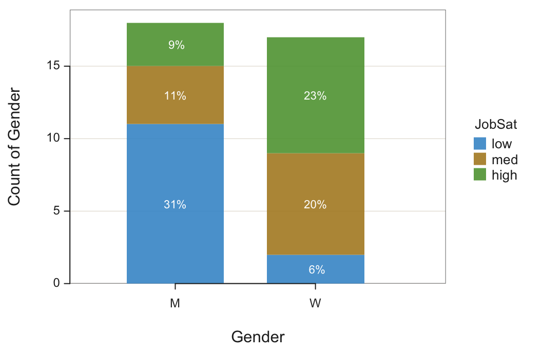
The largest response category is men with low job satisfaction, 11 or 31% of all employees. The next largest response category is women with high job satisfaction, 8 or 23% of all employees. The smallest response category is a woman with low job satisfaction, only 2 or 6% of all employees.
Interpretation. Job satisfaction and gender are related for the employees of this company. Men tend to have lower job satisfaction than women among the 35 employees for whom data for both variables were recorded.
How to explain the relationship between gender and job satisfaction? That question cannot be answered by these data but it is clearly a topic for further investigation by management.
100% Stacked Bar Chart
In general, there are different numbers of observations in each category or level on the x-axis. In this example, the numbers of men and women are almost the same, but the numbers can vary dramatically in other situations. To compensate for unequal sample sizes, the 100% stacked bar chart compares the percentage of the distribution of the by variable within each level of the x-variable.
A motorcycle clothing manufacturer sells jackets in three different thicknesses: Lite, Medium, or Thick. One venue for selling is the motorcycle rally, which features a specific motorcycle company. The clothing manufacturer must decide on the product mix to bring to a rally, a motorcycle show. Different rallies have different levels of attendance. The manufacturer must estimate attendance at a rally and then base the inventory brought to the rally on the percentage of jacket types customers purchase at the rally?
To compare the product mix across different motorcycle brands, levels of the x variable, is difficult for different sample sizes.
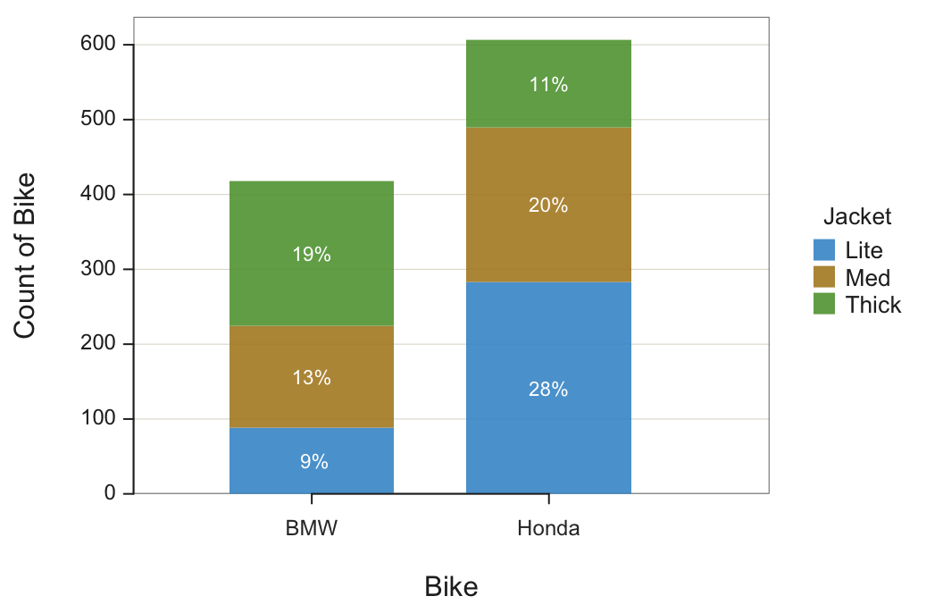
Consider how many Lite jackets to inventory at a BMW rally. The bar chart in Figure 5 shows that 9% of all purchases are made by BMW owners buying a Lite jacket. However, this 9% applies to all the purchases in the entire cross-tabulation table, also impacted by the number jackets purchased by Honda owners.
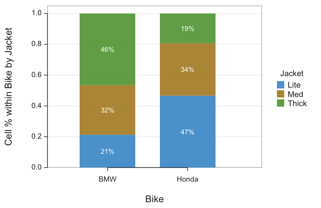
Instead, the interest is the percentage of observations within each level of the first categorical variable, each motorcycle brand. The 100% stacked version of the bar chart facilitates the comparison of the second categorical variable value across the different levels of the first variable by gathering the percentages computed only within a single level.
Each bar’s height for this analysis accounts for the full 100% of all elements within each category of the first categorical variable. Figure 6 shows both the traditional and the 100% stacked bar charts for past sales of rallies for two motorcycle brands. The data are from the lessR file Jackets.
BarChart(Bike, by=Jacket, stack100=TRUE)
stack100: Set to TRUE to display the stacked 100% bar chart.
As with the traditional bar chart of two categorical variables, the analysis begins with the table of joint frequencies, also including the row and column sums shown in Table 4.
| Jacket | BMW | Honda | Sum |
|---|---|---|---|
| Lite | 89 | 283 | 372 |
| Med | 135 | 207 | 342 |
| Thick | 194 | 117 | 311 |
| Sum | 418 | 607 | 1025 |
To construct the 100% stacked bar chart from the joint frequencies, calculate each cell proportion not as divided by the overall sum but instead the corresponding column sum, the column marginal sum. For example, the proportion of BMW riders who buy a Lite jacket:
\[ \frac{89}{418} \approx 0.2129 \]
Find the corresponding value of 21% at the bottom of the first bar in Figure 6, the percentage of Lite jacket purchases at BMW rallies.
Interpretation. When going to a motorcycle rally with most or all attendees BMW owners, bring about 21% of total inventory for Lite jackets, 32% Medium jackets, and the remaining 46% Thick jackets.
The different product mixes likely follow from the riding style. The BMW bike is more of a sport bike than the Honda bikes. The thicker jacket provides more protection in case of a spill.
BarChart Alternatives
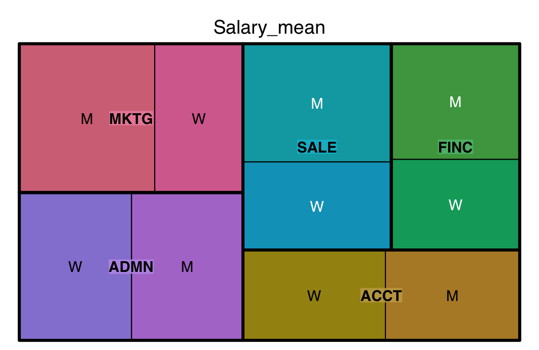
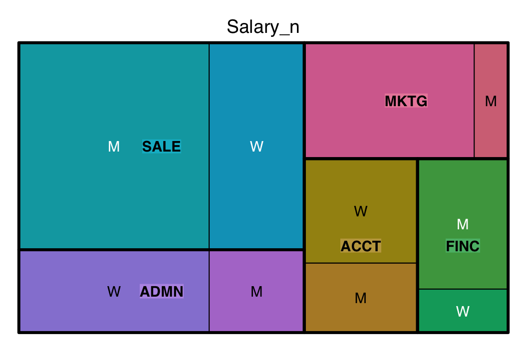
To illustrate alternatives to the bar chart for visualizing the same data, return to Table 1 computed from the Employee data table that contains two categorical variables, Dept and Gender, and the continuous variable Salary_mean. Table 5 expands this table by including the number of employees for each group, the variable Salary_n (and also Salary_na for the number of missing values in each group).
| Gender | Dept | Salary_n | Salary_na | Salary_mean |
|---|---|---|---|---|
| M | ACCT | 2 | 0 | 59626.20 |
| W | ACCT | 3 | 0 | 63237.16 |
| M | ADMN | 2 | 0 | 80963.34 |
| W | ADMN | 4 | 0 | 81434.00 |
| M | FINC | 3 | 0 | 72967.60 |
| W | FINC | 1 | 0 | 57139.90 |
| M | MKTG | 1 | 0 | 99062.66 |
| W | MKTG | 5 | 0 | 64496.02 |
| M | SALE | 10 | 0 | 86150.97 |
| W | SALE | 5 | 0 | 64188.25 |
The following sections apply this data table to the tree map and a bubble plot visualizations.
Treemap
Similar to how the one categorical variable bar chart generalizes to a bar chart of two categorical variables, a treemap visualization also generalizes.
The values of the categorical variables determine the structure, the rectangular boxes that together define the tree map, one box for each group. The numerical variable with a value for each group defines the size of the corresponding box.
First, as in Figure 7, create the treemap of the mean of salary distributed across departments according to gender within each department.
library(treemap)
treemap(b, c("Dept", "Gender"), "Salary_mean")
- First parameter: Data frame in summary table form. You have to have an existing data frame named b in this example for your tree map to work and b must be a summary table.
- Second parameter: One or more categorical variables. If more than one, combine the variables as a vector with the
c()function, in this example c(“Dept”, “Gender”). - Third parameter: Numeric variable that sets the size of the rectangles within the treemap, Salary_mean in this example.
Note: The treemap() function is from the package of the same name.
Note: Unlike most R functions, enclose all variable names in quotes.
Second, create a treemap of the count of occurrences of each group using the variable n already computed in the given summary table. Find the result in Figure 8.
Bubble Plot
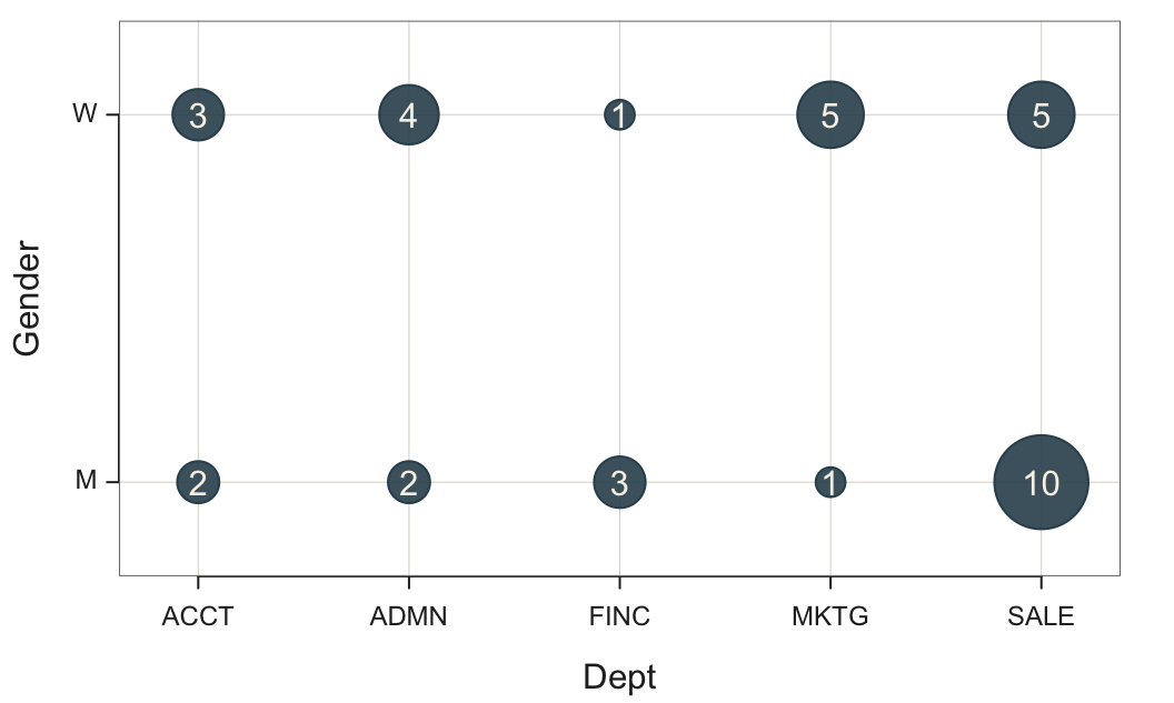
The bubble plot displays a bubble for each group. Figure 9 shows the bubble plot for the count of employees in each combination of department employed and gender.
Plot(Dept, Gender)
Note: Pass two categorical variables to Plot() to automatically create the bubble plot.
Note: Only applies to counts of the groups defined from the combinations of levels of the two variables.
Business Applications
The type of applications that apply to the one-categorical bar chart also applies to the two categorical variable versions, except in this situation, the categorical variables are simultaneously analyzed.
- Sales - Decision focus: Identify how different products perform in different regions.
Plot sales results for each group that define the two categorical variables product and region. - Marketing - Decision focus: Understand which services are favored by different genders and where improvements might be needed.
Plot customer satisfaction by service type, retail vs online, and gender. - Marketing - Decision focus: Understand market share by product category of our company and competitors.
Plot market share by product category and company, our own and competitors. - Marketing - Decision focus: Evaluate when certain online marketing channels are most effective to increase advertising effectiveness.
Plot online sales revenue by origin, such as direct, referral, and social media, with time of day. - HR - Decision focus: Identify departments with high turnover rates and reveal any related gender disparities related to employee turnover by department and gender.
Plot employee turnover by department and gender. - Advertising - Decision focus: Evaluate different ad campaign styles, serious or funny, across multiple online platforms, such as Instagram, Google, and Facebook, for return on investment.
Plot sales revenue by platform and style.
Continuous Variables
Relatedness
Do the values of two variables tend to change together or separately?
As the value of one variable increases, the values of the other tend to either increase or decrease.
Two continuous variables are related if, as the values of one variable increase, the values of the other variable tend to either systematically increase or systematically decrease. Relationships can be positive or negative.
The values of both variables tend to increase together.
For a positive relationship, the values of both variables tend to increase together. The more Years worked at the company, the higher, on average, is the person’s salary.
As the values of one variable increase, the values of the other variable tend to decrease.
Whereas, for a negative relationship, the values of the variables tend in opposite directions. The more a student is absent from class, on average, the lower the student’s grade.
To illustrate the positive relationship of Salary and Years, consider once again the Employee data set. What is the relationship, if any, between the number of Years employed at the company and Salary?
The visual expression of the values of one or more selected variables for each row of data is a scatterplot. The two-variable scatterplot includes two variables plotted with two axes, one for each variable. The scatterplot in Figure 10 shows that working more Years tends to be associated with a higher Salary. Each plotted point represents one employee’s data values for Years and Salary. There are 36 employees with data values for both variables, so the scatterplot consists of 36 points.
Plot(Years, Salary)
Note: Interact with colors and other parameters by entering interact("Plot").
Note: In the lessR visualization system, BarChart() and Histogram plot bars. ScatterPlot() plots points but such a long word to type over and over, so Plot() becomes the convenient abbreviation.
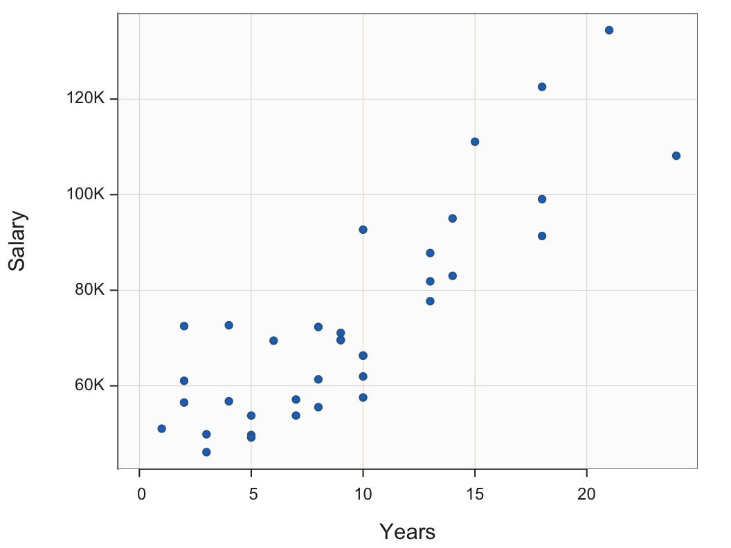
The scatterplot in Figure 10 indicates a strong, linear relationship. As the number of Years employed increases, the annual USD Salary also tends to larger. This concept of a relationship leads to one of the essential concepts in all of statistics and data analysis, including the foundation of the modern pursuit of machine learning.
Two variables are related to the extent that knowledge of the value of one variable provides information regarding the value of the second variable.
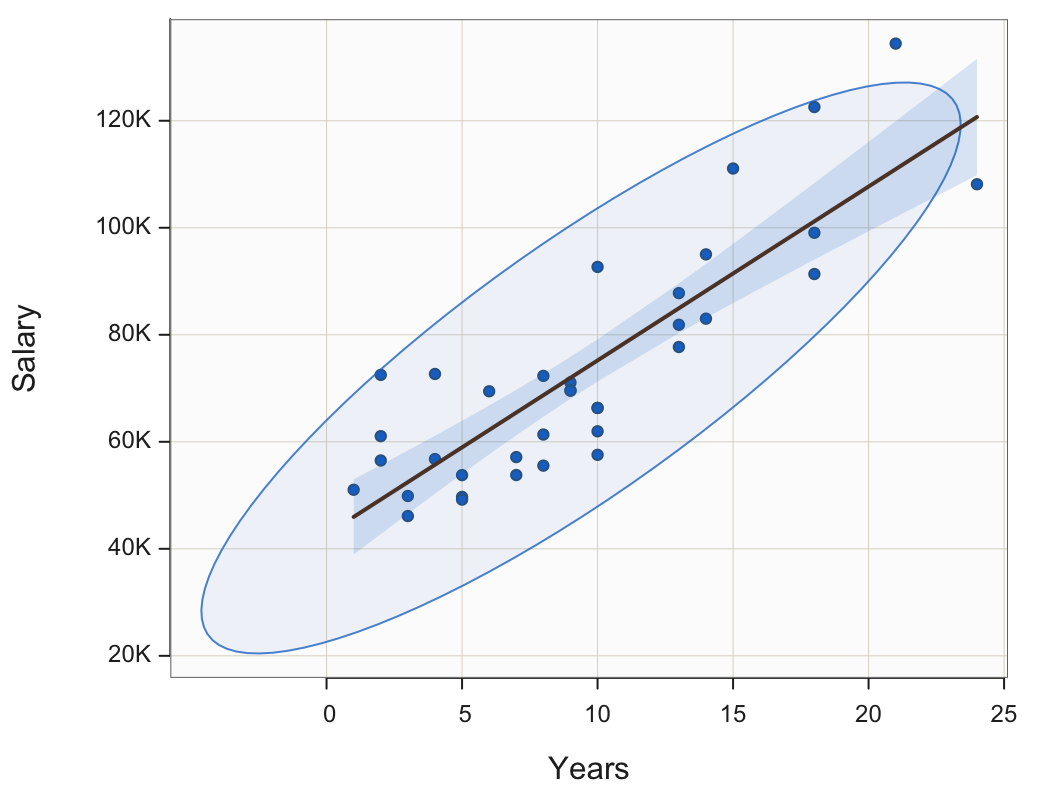
The stronger the relationship, the more information about the value of Variable y is provided regarding the value of Variable x. In this example, knowing how many years an employee worked at the company offers a more accurate estimate of their salary than without this knowledge. To consider this point further, consider the data ellipse. The 95% data ellipse centered over the scatterplot can enhance understanding of this essential concept.
Contains, on average, across multiple samples, 95% of the points in a sample scatterplot of two normally distributed variables.
Plot(Years, Salary, ellipse=0.95, fit="lm")
ellipse: Specify a proportion, usually close to 1, that sets the extent of the data ellipse superimposed on the scatterplot.
fit: Specify the type of line fit through the scatterplot, such as "lm" for linear model, that is, the straight (least-squares) linear regression line.
Note: Other values of fit specify non-linear curves to fit to the data. Available values include loess for a general fit, expfor an exponential curve fit, andquad` for a quadratic fit.
Figure 11 illustrates the same scatterplot from Figure 10, but here with the 95% data ellipse included. A data ellipse can be specified for any percentage with 95% is the typical value.
Building upon the information provided by the ellipse, we can illustrate the strength of the relationship between Years and Salary according to how predictable Salary is from Years. Figure 12 highlights the section of the scatterplot that applies to the value of 10 years.
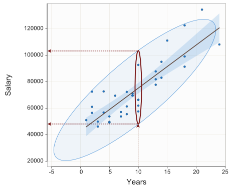
Overall, Salary ranges from a low of $46,124.97 to the highest value of $134,419.20, a range of $88294.26. However, just for employees who have worked 10 years at the company, the 95% expected range of salaries, reading directly from Figure 12, is about from $49,000 to $102,000, a considerably reduced range of $53,000.
Knowing the value of Variable X, Years employed in this example, we have information regarding the value of Variable Y, Salary. If we know the value of X, we do not know the value of Y precisely but we have more knowledge regarding Y. As is always the case, except for trivialities such as converting inches to centimeters, the information is not perfect. Moreover, the stronger the relationship, the narrower the enclosing ellipse, and so the more information provided regarding the value of Y.
Correlation Coefficient
Indicate the most widely encountered correlation coefficient, the Pearson product-moment correlation coefficient, or, more simply, Pearson correlation, with \(r_{xy}\). One feature of the Pearson correlation is that it is impervious to a change in units. Measure Height in inches or measure Height in centimeters. The relationship between Height and Weight is the same relation regardless of the arbitrary measurement units. Accordingly, the Pearson correlation of Height with Weight is the same in either case.
A correlation of +1 denotes a perfect positive association with all points falling on a straight line. “Perfect” means that if the value of X is known, the relationship provides the precise value of Y. A correlation of −1 indicates a perfect negative relationship. A correlation of 0 indicates no relationship between the two variables.
The size of the correlation indicates the magnitude of the correlation. The closer to 1 or -1, the stronger the linear relationship. The direction of the relationship is indicated by the sign of the coefficient, + or -.
Strength and direction are two independent concepts for evaluating a linear relationship with a correlation coefficient. For example, a correlation of -0.7 indicates a stronger linear relationship and a correlation of 0.5.
Linear or straight-line relationships are perhaps the most common but not the only type of relationship.
Variables can be strongly non-linearly related, such as a U pattern, and yet correlate near 0.0, so always examine the scatterplot for linearity before interpreting a correlation coefficient.
There are several types of correlation coefficients not covered here that generalize to beyond linear relationships.
Plot(Years, Salary) also yields text output, which includes the sample correlation coefficient. (Also provided is an hypothesis test and confidence interval generalizing to the population.)
--- Pearson's product-moment correlation ---

Number of paired values with neither missing, n = 36
Sample Correlation of Years and Salary: r = 0.852

Hypothesis Test of 0 Correlation:  t = 9.501,  df = 34,  p-value = 0.000
95% Confidence Interval for Correlation:  0.727 to 0.923
The correlation between Years employed and annual Salary in USD, from the scatterplot in Figure 10, is high, r=0.85, which indicates a strong linear relationship.
Two Unrelated Variables
Consider a scatterplot of two uncorrelated variables, here X and Y. Generate the data by simulating random sampling from a normal distribution. Create these simulated data values for variables X and Y with a population mean of 50 and standard deviation of 10. The values are randomly and separately sampled, without any correlation between X and Y in the population.
The data for each variable were generated by simulating random sampling from a normal distribution using the R function rnorm().
Figure 13 shows the scatterplot, 95% data ellipse, and fit line for two unrelated variables. The obtained sample correlation is r = -0.144, differing from the population value of 0 only by random fluctuations of sampling error. The 95% data ellipse over the scatterplot of variables X and Y in Figure 13 is approximately a circle, indicating that the variables X and Y are unrelated. As a result, the best-fitting line through the scatterplot is nearly flat.
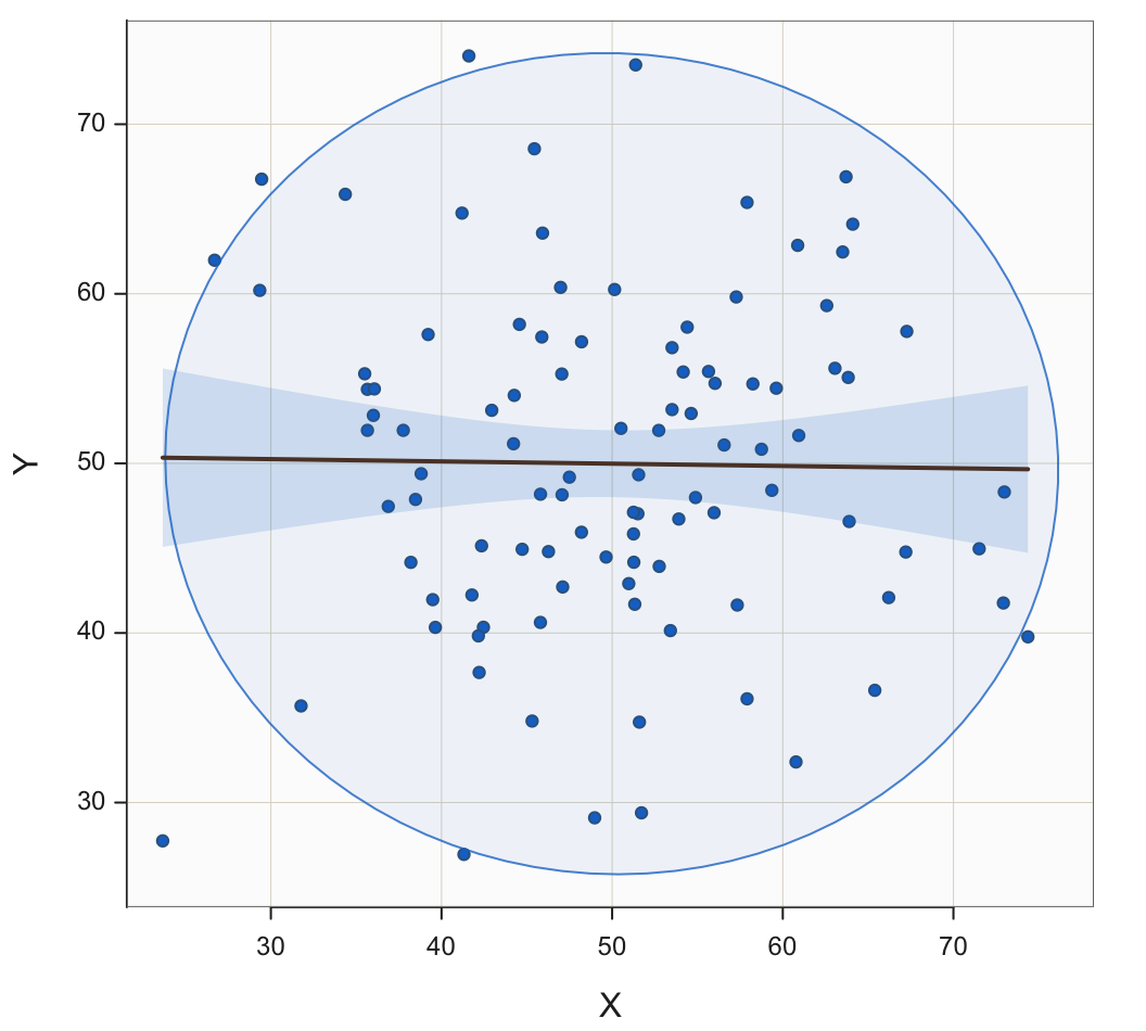
The lack of a linear relationship between the variables indicates that for a specific value of X, the corresponding value of Y is as likely to be larger than its mean near 50 as smaller than its mean. Increasing the value of X leads to no increased predictability regarding the corresponding value of Y. If we know the value of X, we have no information regarding the value of Y.
Add a Third Variable
By including a third variable, the visualization of the relationship between two continuous variables can provide more information. This additional variable may be categorical or continuous. Both possibilities are discussed next.
Stratification
Including one or more categorical analyses in the visualization can enhance the relationship between two continuous variables. By examining relationships at different levels of a categorical variable, stratification facilitates comparison across groups..
Points in a scatterplot can also be plotted with different colors and/or plotting symbol according to different values of a third variable, here a categorical variable. Figure 14 shows the same scatterplot as Figure 10, except that the plotted points for the strata of men and women are differentiated by color.
Plot(Years, Salary, by=Gender, fit="lm")
by: Specify a categorical variable by which to stratify the scatterplot according to its levels, plotting the points of the same level in the same, unique style on the same panel.

A plotted point as a small circle filled with color is only one possibility. Any character, letter of the alphabet or digit, can be plotted as the shape of each point. Most visualization systems also offer special plotting symbols with interiors that can be filled with color. The default symbol is usually the small circle. Figure 15 illustrates other possibilities in which the points from different levels of the categorical variable are represented both by different colors and different shapes.
Plot(Years, Salary, by=Gender, shape=c("triup", "tridown"))
c(): The combine function that groups multiple values together into a single unit, a vector.
shape: The plot symbol. If stratifying on a categorical variable, list one symbol for each level of a categorical variable that is plotted in the order that the levels of the classification variable are defined.
Note: Besides the circle, other symbols that can be filled with color are the square, diamond, bullet, triup, and tridown. To view more available symbols for plotting points, access the points manual, enter: ?points.
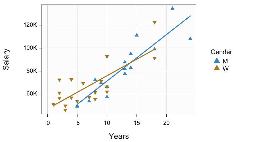
Interpretation
At this company, three of the highest four salaries are by men and three of the lowest four salaries are by women. The scatterplot also reveals that women tend to be concentrated at the lower end of the number of Years employed. The eight employees with the least Years of employment are all women.
The previous example stratified on a categorical variable by plotting all the points on the same panel, that is, the same set of coordinate axes. The alternative plots the points for each level on a separate panel, the Trellis plot.
For categorical variables with four or more levels, the Trellis plot becomes more readable than plotting points and fit lines for all of the levels on the same panel.
Figure 16 illustrates the Trellis scatterplot of Years and Salary stratified by the categorical variable Gender.
Plot(Years, Salary, by1=Gender, fit="lm")
by1: Specify the categorical variable by which to stratify the scatterplot according to its levels, with each group (strata) plotted on a different panel, a Trellis plot.
Note: By default, the panels are displayed in a single column. To create a Trellis plot with the panels displayed in a single row, set the parameter n_row to 1. Specify the desired number of rows or columns with n_row or n_col, respectively.
>>> Parameter by1 will soon stop working. New name: facet1'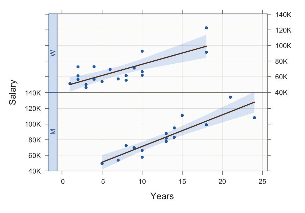
Continuous
The previous examples in this section mapped a categorical variable as a third variable into one or more visual aesthetics. Another possibility introduces a third variable that is continuous. Figure 17 illustrates a scatterplot of a car’s price with horsepower. Bubbles replace the standard filled small circles. The size of the bubbles indicates the car’s fuel mileage expressed as miles per gallon.
Plot(MidPrice, HP, size=MPGcity)
size: Specify the size of the plotted points, with default value of 1. If a variable, then the points plus as bubbles, their sizes determined by the value of the specified variable.
Note: Additional parameters.
radius: Specify the size of the largest bubble.
power: Specify the relative sizes of the bubbles. Larger values provide more separation against the bubble sizes.
transparency: To at least partially overcome the problem of over-plotting, specify the transparency level as a proportion that varies from 0, no transparency, to 1, complete transparency.
The bubbles in the Figure 17 scatterplot have power set at 1.5 and transparency set at 0.5.
Plot(MidPrice, HP, size=MPGcity, power=1.5, transparency=.5)
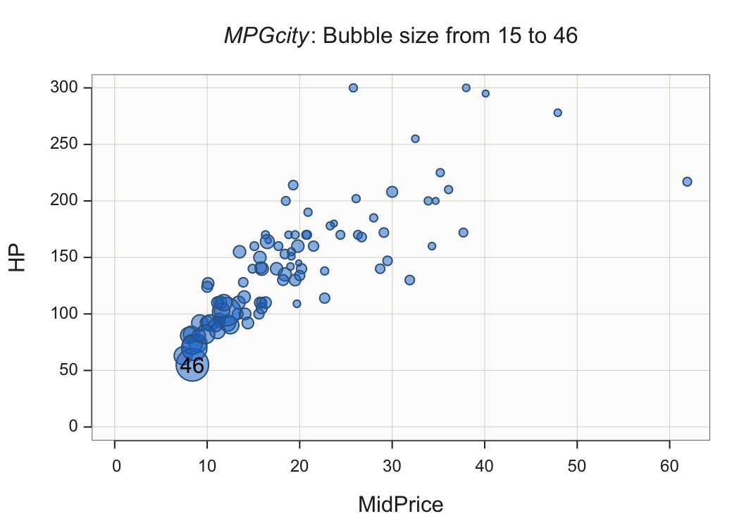
Interpretation
More inexpensive cars tend to have less horsepower but they also have the best fuel mileage. Relatively expensive cars offer more horsepower but considerably less fuel mileage.
Big Data
What happens when there are many data values to plot in a scatterplot, the situation described somewhat colloquially by big data? With big data there are thousands if not hundreds of thousands or millions of data values to plot. The problem encountered with a scatterplot of many data values is overlapping points, illustrated in Figure 18 with 5000 pairs of simulated data values.
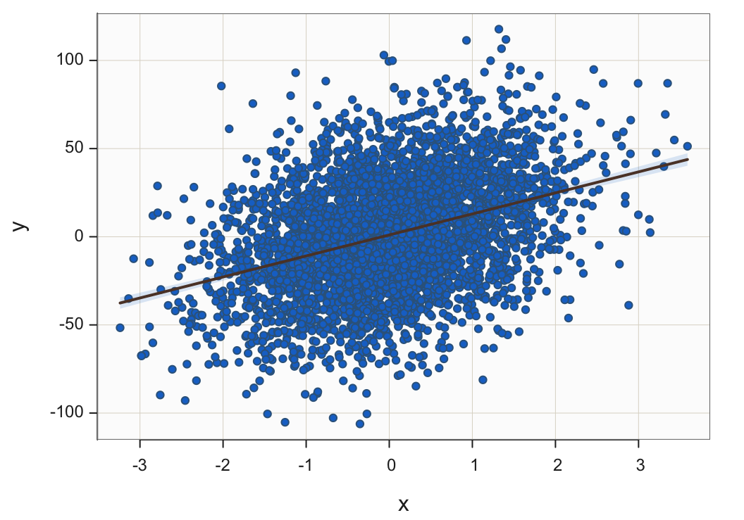
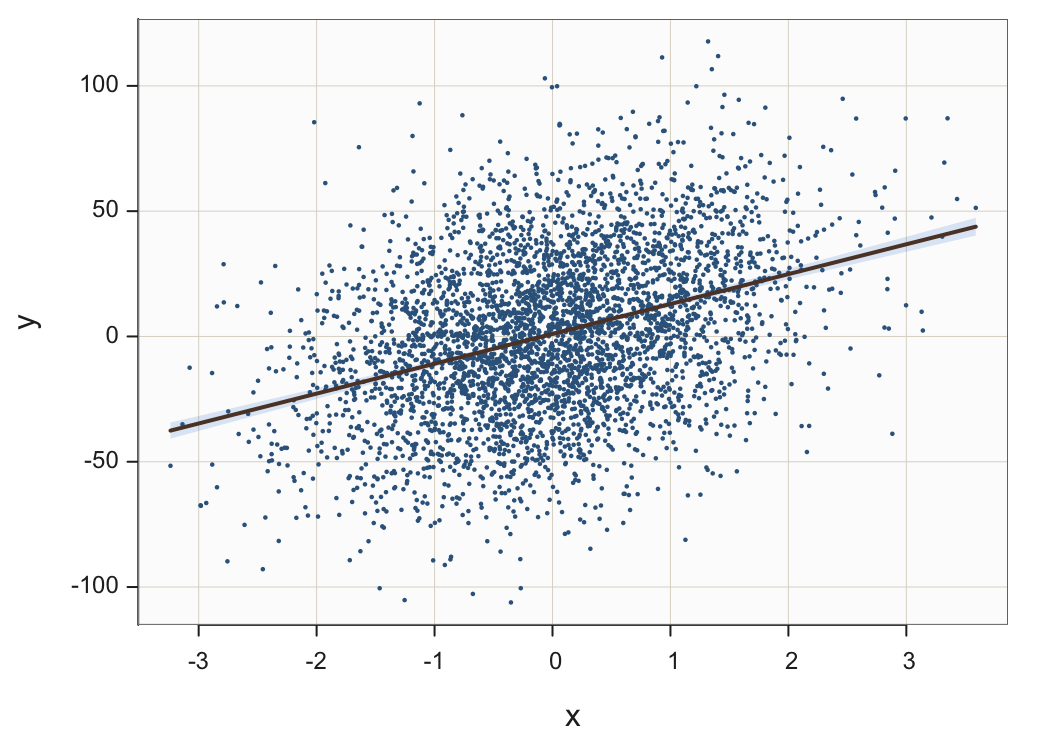
Jittering points, the random vertical and/or horizontal movement of points, can help in moderate situations but not with a massive number of points to plot. Plotting points with varying degrees of transparency can help but again a limit is reached. Figure 19 shows the 5000 points plotted with almost complete transparency of their interiors but still individual points cannot be distinguished from each other.
Plot(x, y, fit="lm", transparency=.95)
transparency: Specify the amount of transparency of the interior of plotted points as a proportion from 0, no transparency, to 1, complete transparency.
One reasonable solution is plotting smaller sized points, shown in Figure 20.
Plot(x, y, fit="lm", size=.25)
size: Specify the size of a plotted point, from 0 to whatever. The setting is 0.25 in Figure 20.
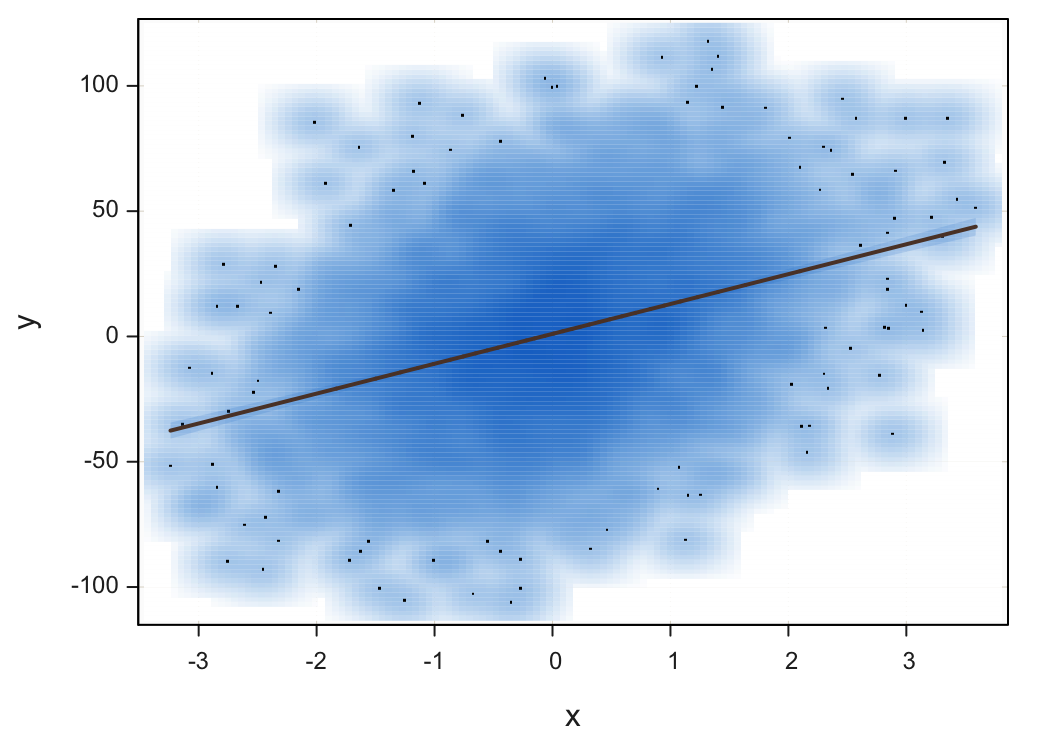
A solution that works well is smoothing.
Transform a scatterplot of plotted points into a two-dimensional smoothed surface.
Analogous to transforming a histogram into a smoothed density curve, a two-dimensional scatterplot can be transformed into a smoothed two-dimensional surface. Plotting outliers as individual points, however, provides useful information.
Plot(x, y, fit="lm", smooth=TRUE)
smooth: Set to TRUE to smooth the scatterplot.
Patterns of Correlations
Scatterplot Matrix
Supervised machine learning is constructing predictive models from information contained in various variables. For example, how does choice of advertising media and number of advertisements impact sales revenue? There are thousands more examples of these predictive models being applied daily across the business spectrum.
The key to building these models is to leverage the relationships of variables. Of particular interest is finding variables related to the target variable of interest, the value that is to be predicted from a set of other variables called predictor variables or features. The key, then, is understanding the relationships of all the variables in a set with each other.
Square matrix with a scatterplot for each pair of variables in the lower-triangular part of the matrix, and here the corresponding correlations in the upper-triangle of the matrix.
Figure 22 shows the scatterplot matrix of the four continuous variables in the d data frame, the Employee data set. Each scatterplot in the matrix corresponds to a specific correlation in the upper-triangle of the matrix. For example, in the first row, the correlation of Salary and Years is shown to be 0.85, corresponding to the first scatterplot in the first column, with the strong least-squares line of best fit, the regression line.
Plot(c(Salary, Years, Pre, Post), fit="lm")
x: To obtain the scatterplot matrix, specify only one expression in the first position, the x parameter. The variable is a vector built with the R combine function, c(). List relevant variables within the combine function, separated by commas.
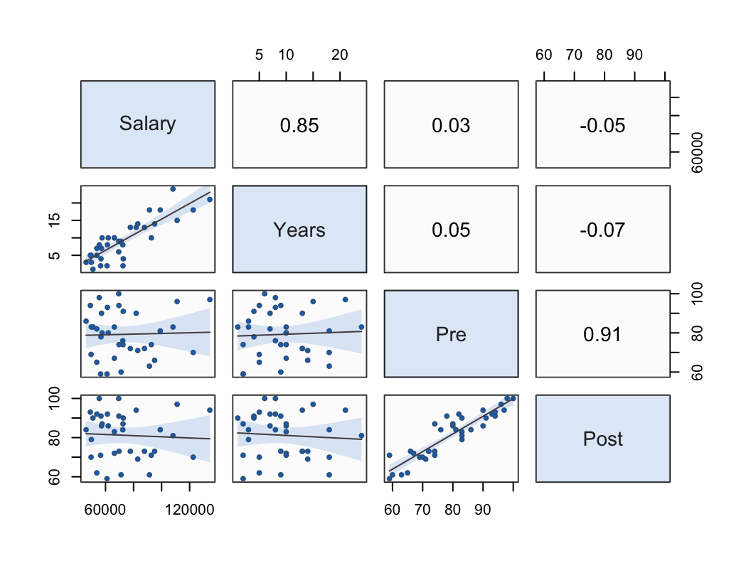
In this 4x4 matrix, Salary and Years correlate strongly with each other, r=0.85. Variables Pre and Post also correlate strongly with each other, r=0.91. The variables in each paired set do not correlate with the variables in the other paired set. For example, Salary only correlates r=.03 with Pre.
Interpretation. If we were to try to build a predictive model of an employee’s salary from the other three variables, only the number of years employed would be a useful predictor of salary. Scores on the pre-test before instruction on some topic and the post-test after the instruction are not related to salary and so would not be effective predictors of that variable.
Heat Map
The heat map substitutes colored squares for individual correlation coefficients. An example appears in Figure 23.
d <- d[, .(Salary, Years, Pre, Post)]
mycor <- cor(d, use="pairwise.complete.obs")
heatmap(mycor, symm=TRUE, Rowv=NA, Colv=NA)
Note: To get the heat map of the correlation matrix we first need the correlation matrix, here stored in the object named mycor. Here the matrix is computed with the R function cor(). The function is not smart enough to filter out the non-numeric variables in the given date frame, here the d data frame of the Employee data set. We must do this selection manually, accomplished with the code between the square brackets [ ], and then pass this smaller data frame to the cor() function. The code is a bit of technical stuff that is not obvious without a background in subsetting data frames. However, to apply to another data table, follow the same form, just changing the data frame name if needed in the first line and the selected variable names.
use: Specifies how to do deal with missing data when computing the correlations. The value of “pairwise.complete.obs” is a good selection unless there is much missing data for a variable, in which case it should not be selected for which to compute the corresponding correlations.
Note: The R heatmap() functions then processes the stored data frame mycor. The symm parameter set to TRUE informs the function that the input matrix is symmetric, which is true of a correlation matrix. The Rowv and Colv parameters are there to tidy up the output.
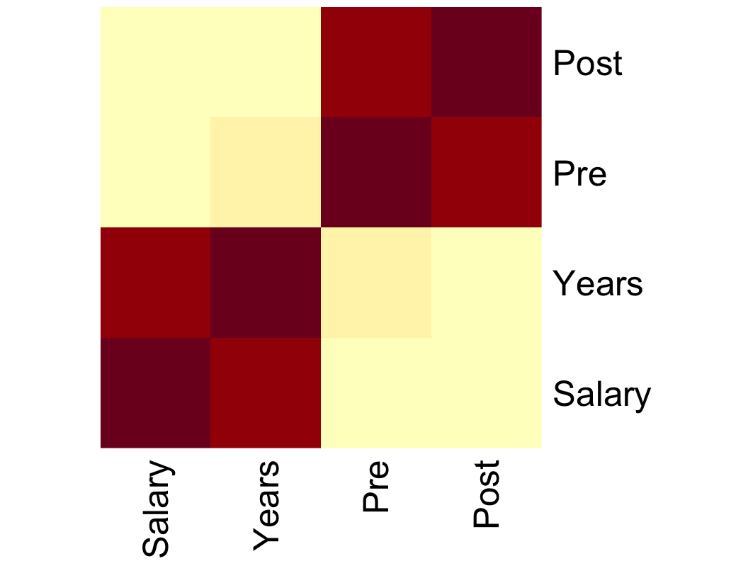
The heat map presents the same information as in the numerical correlation matrix, such as the scatterplot matrix, but with colored squares, the intensity of which indicates the corresponding correlation period. Using the color scheme from Figure 23, the deeper the red color the stronger the correlation. The paler the yellow color, the weaker the correlation. Salary and Years correlate strongly with each other, as do Pre and Post, so these respective correlations are indicated by dark red in the heat map. Other correlations are weak, marked by yellow colors.