This document is the Tableau implementation of the more general, conceptual discussion regarding data visualizations of data values collected over time.
The link to the video that illustrates the run chart follows.
Visualize a Run Chart
The run chart is the value of the variable over time plotted against the Index variable, the sequence of integers from 1, 2, 3, …, to the number of data values to plot. If not present in the data, the Index must be computed.
Data: https://web.pdx.edu/~gerbing/data/Sales07.xlsx
Begin with the data values to plot on the y-axis, Sales, sorted in the proper order from the first collected data value to the last.
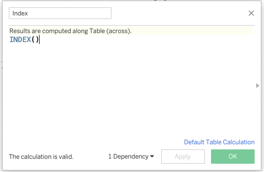
Create the Index variable for the x-axis. Right-click in the open area under the list of variables in the left-side of the window.
- Select: Create –> Calculated Field…
- Name the new variable Index
- Access the INDEX function by typing its name, INDEX()

Figure 1: Create the Index variable. The created Index variable appears in the variable list in the left-side. Drag to the
Columnsshelf.Drag the variable to plot, Sales, to the
Rowsshelf.Under
Marks, select theLinechart.
The link to the video that illustrates the run chart follows.
Video: Plot a Run Chart [1:47]
Visualize a Time Series
The time series chart is the value of the variable over time plotted against the date/time when each data value was created. Both the date and the value to plot are included in the data.
Data: https://web.pdx.edu/~gerbing/data/StockPriceWide.xlsx
Begin with the wide form of a data table for the stock price of three companies: Apple, IBM, Intel. In the white form, each company is it’s own variable, three columns of stock prices. Month is another variable.
Apple Time Series.
- Drag the Apple variable to the
Rowsshelf. - Drag the date variable, Month, to the
Columnsshelf. It will automatically aggregate by Year. - To use all the available space in the Tableau window for your plot, go to the
Standarddrop-down menu at the top of the window and selectFit Width.
- Drag the Apple variable to the
Area chart: For the drop-down mneu under
Marks, selectArea.Trellis multiple plots: To visualize all three times series stock prices on different panels, drag the IBM variable and the Intel variable over to the
Rowsshelf next to the SUM(Apple) variable.Same panel multiple plots:
- Drag the date variable, Month, over to the
Columnsshelf. - Tableau has created a new variable, Measure Values, found in the measures section of the variable (field) list. Drag that variable over to the
Rowsshelf. - Remove the CNT(StockPriceWide) variable from under the
Measure Valuescard below theMarkscard. - To use all the available space, go to the
Standarddrop-down menu at the top of the window and selectFit Width. - To color each time series line differently, drag the Measure Names categorical variable over to the
Colormark in theMarkscard. - To create the stacked area chart version, for the drop-down menu on the
Markscard, selectArea.
- Drag the date variable, Month, over to the
The link to the video that illustrates the time series chart follows.
Video: Plot a Time Series Chart [5:15]
Visualize a Forecast
Tableau estimates an exponential smoothing model of the time series data and then is able to forecast future values from this model. The model can be estimated by default or additive or multiplicative components specified for any combination of the error, trend, and seasonality.
The data are the same as for the run chart but with an added column, the Month, indicated as the first day of each month.
Data: https://web.pdx.edu/~gerbing/data/Sales07date.xlsx
- Time series plot of the data.
- Drag the date variable, Month, to the
Columnsshelf. - Drag the variable to plot, Sales, to the
Rowsshelf. - The result is that the date variable, Month, is automatically aggregated by Year, which hides the quarterly seasonality. To plot by Quarter, click on the icon of the
+sign inside of a square at the beginning of YEAR(Month) on theColumnsshelf, which then disaggregates to QUARTER.
- Drag the date variable, Month, to the
- Exponential smoothing forecast from the data.
- Click on the
Analyticstab next to theDatatab in the top-left corner. - Under
Model, selectForecastand drag to the plot area, dropping the icon on theForecasticon that appears. The forecast for the next quarter appears in a lighter blue color the for the data, complete with the 95% prediction interval. - To customize the underlying exponential smoothing model on which the forecast is based, right-click near the forecasted line segments, select
ForecastthenForecast Options.... - To View the fit indices of the underlying exponential smoothing model on which the forecast is based, right-click near the forecasted line segments, select
ForecastthenDescribe Forecast....
- Click on the
The link to the video that illustrates the exponential smoothing model and subsequent forecast follows.
Video: Forecast [5:24]