The Data Table
Data analysis begins with, well, data. Analyze the data values for at least one variable, such as the company’s employee annual salaries.
An example of a numerical measurement is John’s annual salary for the variable Salary. An example of a classification for John is into the category Male for the variable Gender.
The object of study could be employees, customers, geographical units, or financial performance, among many other possibilities. Generically, refer to any of these possibilities as an entity.
The name variable was chosen because the data values for a variable vary. The natural variation of measurements for different instances motivates their analysis. Two different people have different heights, place differing amounts of trust in others, have different blood pressures and earn different salaries. Height, trustfulness, blood pressure, and income are some of the many variables amenable to measurement. GPA and number of credits completed provide additional examples of measured variables for college students.
Organize the data values by variable into a specific structure from which analysis proceeds. To use a data analysis system such as R, organize the data values into a table. Each column corresponds to a variable.
Video: Data Table [3:24]
Your data organized as a data table exists as a file stored on your computer, a local network, or the web. Encode the data table in one of a variety of computer file formats. Standard formats include Excel files, indicated by a file type of .xlsx, and text files in the form of comma-separated value files (csv). Identify a text file with one of several potential file types, such as .txt, but usually .csv.
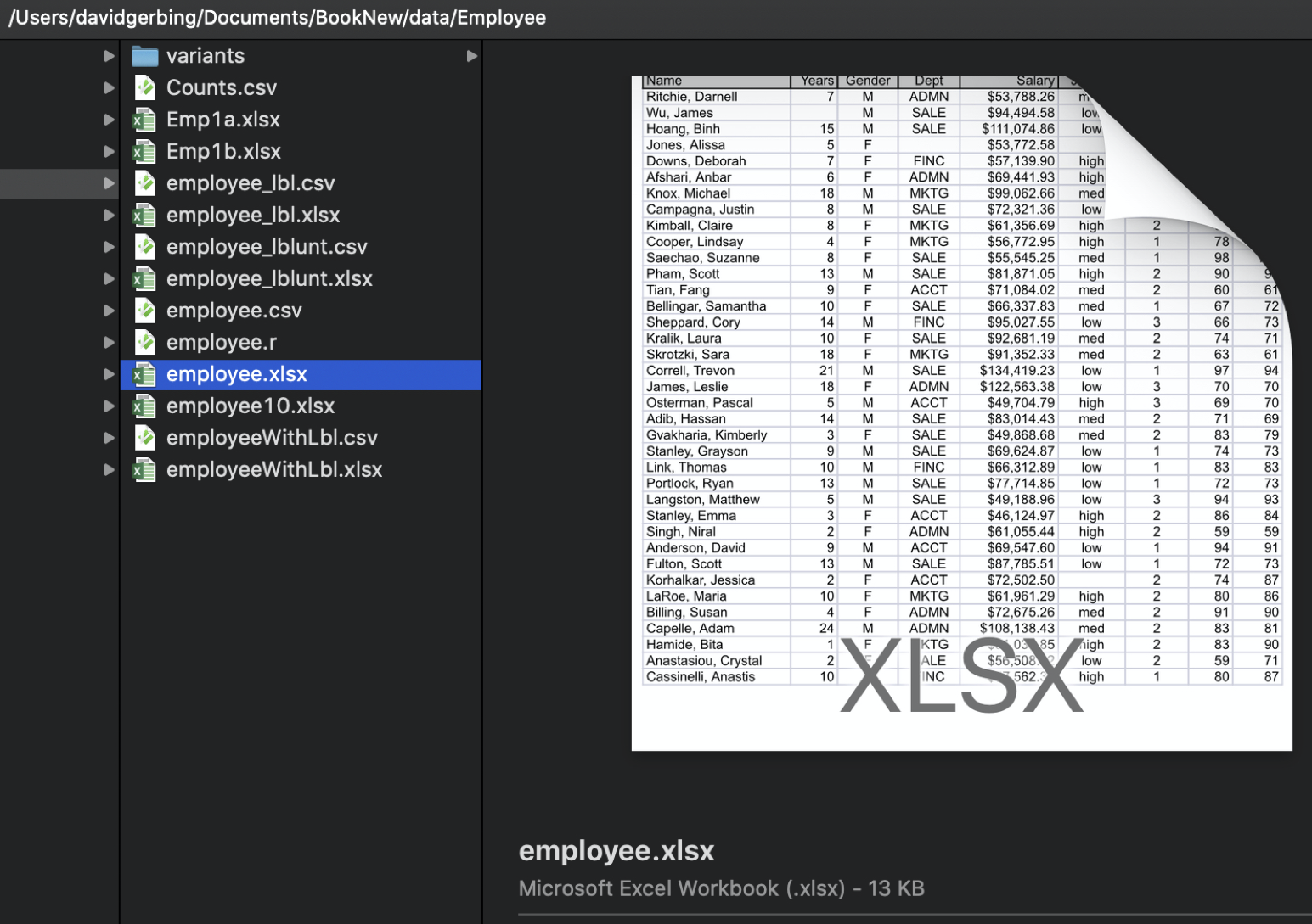
Figure 1 shows a data table as an Excel file named employee.xlsx stored on a (Macintosh) computer.
When analyzing data read into the data analysis app, the same data exists in two locations: a computer file on your computer system and within a current session of the data analysis app: Different locations, different names, but the same data. Identify the data table by its file name and location on your computer system. Within a data analysis app session, identify the same data from the data file by its name as read into the data analysis app, such as d.
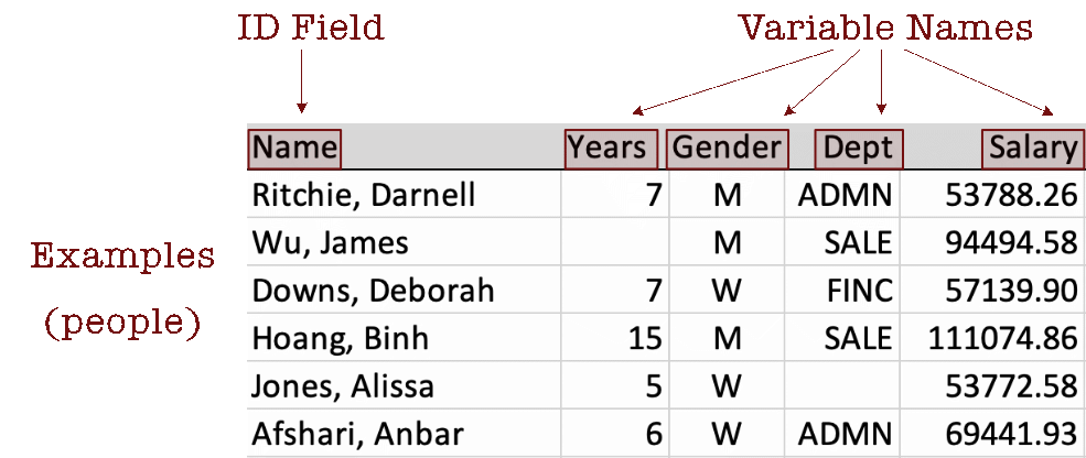
The Excel data table in Figure 1 contains four variables of primary interest: Years, Gender, Dept, and Salary, plus a special type of variable, an ID field called Name, for a total of five columns.
Figure 2 displays the data values for the first six employees.
An ID field with unique data values is called a primary key field in a relational database..
Describe the data table by its columns, rows, and cell entries.
Usually, though not necessarily, find the variable names in the first row of the data table.
Data analysis can only proceed with the data table identified and the relevant variables in the data table columns identified by their names, including the pattern of capitalization. All data analysis functions analyze the data values within a data table for one or more specified variables.
Variables define the columns of a data table. What about the rows?
Unfortunately, the reference for the rows of the data table can be one of several alternatives. Observations are also called cases, examples, samples, and instances.
Consider employee Darnell Ritchie. He has worked at the company for seven years, identifies as a man, and works in administration with an annual salary of $53,788.26. Two data values in this section of the data table are missing. The number of years James Wu has worked at the company is not recorded, nor is the department in which Alissa Jones works.
Visual Aesthetics
Definition
Visualization of any kind depends on visual aesthetics.
What is so intriguing about data visualizations?
To create a visualization, physically express a visual aesthetic such as with a mark drawn on paper or a corresponding digital representation that selectively lights pixels on a computer monitor. Visualizations are typically drawn on two-dimensional surfaces, such as paper or a monitor.
Data visualization is an essential activity of virtually every analysis project. Why? As the opening paragraphs excerpted from my book (2020) on data visualization explain, the history and survival of our species is rooted deeply on visualizing our world. On the contrary, data is a recent invention.
Gerbing, David. 2020. R Visualizations: Derive Meaning from Data. CRC Press.
We are wonderfully competent visual processors. As we move about our daily life, we do what our ancestors back through the distant past did so well: Effortlessly process a panorama of shapes and images that surround us, patterns immersed within the landscape of our visual world. Modern life, however, delivers a new invention for us to consider: data. With data, we search for patterns such as normality, trends, and relationships, and we search for exceptions from these patterns. Examine rows and columns of data to uncover this information? Our distant ancestors never encountered tables of data, so our brains never adapted to evaluate data directly.
The solution? We return to our familiar form: visual images. To visualize data, we use computer technology to transform rows and columns of data into visible objects. We perceive these objects according to their visual aesthetics:
- as different shapes (points, lines, bars)
- displayed at varying sizes (areas, lengths)
- with a palette of different colors (hue, saturation, brightness, transparency)
- which occupy different positions (by axes that define a coordinate system)
Visual aesthetics focus our perception on emergent patterns inherent in the data. We literally see the distributions and relationships.
For example, the lengths of bars on a bar graph could indicate different numbers of employees in each department. Different colors of points in a scatterplot could also represent different employees in different departments. Or, the shapes of the points could vary depending on the department.
Coordinate System
Visualizations are typically, though not necessarily, drawn within a coordinate system defined by one or more axes. Each axis represents a variable. Each plotted coordinate represents a data value for each axis.
A 1-dimensional space is a line with each point determined by a single coordinate and a single axis. A 2-dimensional space is a plane, with each point determined by two coordinates with two axes. A 3-dimensional space is a cube, with each point determined by three coordinates with three axes.
The generic names for the axes are well accepted: x for the first axis, typically horizontal; y for the second axis, usually vertical; and, if there is a third axis, z. Trying to project a two-dimensional surface into three dimensions is problematic, beyond three dimensions is not possible.
One Variable
Some visualizations consist of only a single variable, so they have only a single axis to define the coordinates.
Figure 3 shows a single axis, the x-axis, for plotting values of a single variable, generically x, but within a specific data analysis, a specific name such as categorical variable Gender or continuous variable Salary.

The axis can represent a continuum for a continuous variable or discrete values for a categorical variable. If continuous, the values can potentially represent any value on the real number line, positive, zero, or negative. Or, the values can be restricted, for example, to just zero and positive numbers.
Figure 4 illustrates plotting a single data value for variable x, where a continuous variable is represented by an axis of the real number line in which values all along the axis are possible. In this visualization, assume the following values for the aesthetics.
- shape: point
- size: fixed diameter
- color:: shade of violet red
- position:: 3.5 coordinate relative to the axis
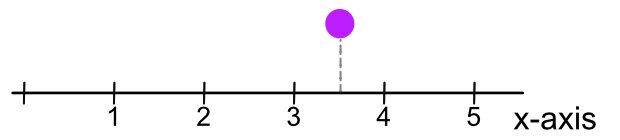
With only one dimension, one axis, the vertical height of the point above that axis is not relevant to the visualization. Choose a height that is visually pleasing and keeps the plot relatively compact. One potential height is zero, plotting the point directly on the x-axis, though that positioning can obscure the labels on the axis.
The variable plotted on the x-axis in Figure 4 represents the variable of interest. Suppose that variable is the number of years since the initiation of an investment. Then, the plotted point represents an investment of 3.5 years in duration.
Two Variables
Most visualizations consist of two variables, plotted in two dimensions. The two axes in Figure 5 represent continuous dimensions on which the data values of generic variables x and y are plotted with potential \(+\) and \(-\) values for each variable. Each plotted point, identified as <x,y>, represents a set of paired data values for x and y for the unit of analysis, such as an employee or a geographic unit.
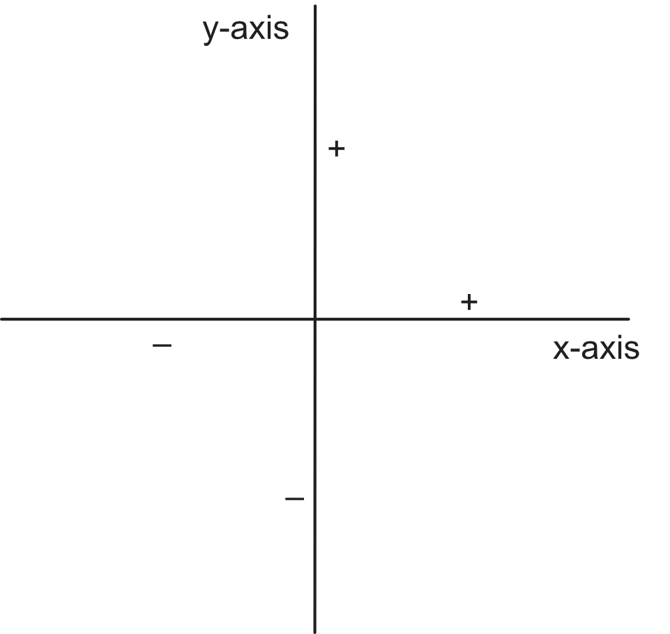
The axes for the continuous variables in Figure 5 accommodate both positive and negative values. Axes can also be defined for categorical variables, or continuous variables with just positive (or negative) values.
An example of plotting a point in a two-dimensional coordinate system includes two variables regarding a person’s financial investment in a company’s stock: the number of years since the purchase of the stock on the x-axis and the investment’s percent return on the y-axis. Negative values on the y-axis are available because the percentage return on that investment, negative returns, losses, are possible, whereas the x-axis is restricted to non-negative values.
Suppose the investor doubled the return on a 3.5 year investment. Figure 6 shows a visualization for a single coordinate defined by the paired data values of variables x and y, Time and Percent_Return, here with respective values of 3.5 and 2. We have the same shape, size, and color aesthetics as in Figure 4 but now specify location with the dual coordinate <3.5,2>.
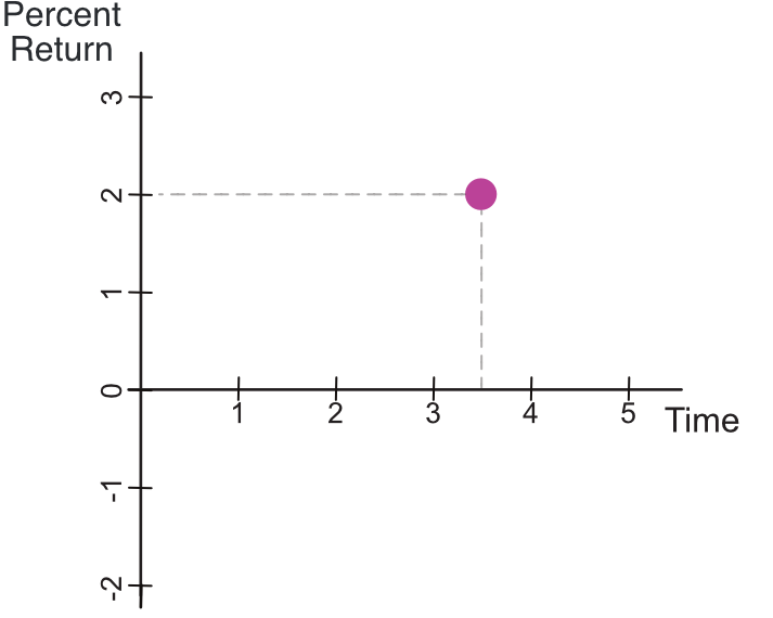
In practice, more than one point would likely be plotted. The investor could visualize investment success over many investments by plotting each investment as a separate point.