This document is the Tableau implementation of the more general, conceptual discussion regarding data visualizations of continuous distributions.
Histogram
Tableau has no histogram function per se. There is no pre-defined histogram plot, just a bar chart. Instead, follow these steps.
- Identify the continuous variable of interest in the list of variables on the left-side of the worksheet.
- Create a new categorical variable version of the continuous variable, a binned version of the original variable.
[Right-click on the variable name and selectCreateand thenBins...] - Create a bar chart of the new categorical variable.
[Drag the(Count)variable to the empty shelf.] - Make the bars wider on the bar chart until they become adjacent to each other with no gaps or very small gaps that act like a border between adjacent bars.
[Select all the bars, go to theSizemark, and drag the slider.]
The link to the video of this process follows.
Video: Histogram [4:31]
Box Plot
The Tableau default box plot is the box plot with the plotted points. There is no jitter option. Create with the following steps.
- Drag the variable name for the continuous variable of interest to the
RowsorColumnsshelf depending on the desired orientation of the box plot.
Be aware of the following potential “gotcha”.
Tableau automatic aggregation
Tableau often aggregates variables by default, identified such as by SUM(name). Unaggregate from the Analysis menu, then deselect Aggregate Measures.
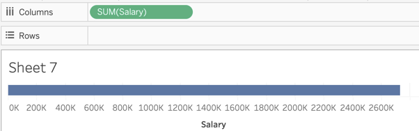
Figure 1 show the result of the automatic aggregation after dragging the Salary variable to the Columns shelf. When you unaggregate from the Analysis menu, the SUM label disappears, leaving only the variable name.
Tableau also remembers how you treat a variable, so once unaggregated it may be remain so with further analysis. So, depending on your recent history of working with Tableau, you may or may not need to unaggregate. For some reason, there is a way to change the aggregation by right-clicking on the variable name when in a shelf but not a way to turn off the aggregation without going to the main menu.
- Click on the small Box Plot icon in the
Show Metab that displays the available plot types, shown in Figure 2.

To create a Trellis plot, drag the categorical variable of interest to the opposite shelf that contains continuous variable upon which the box plot is based.
If desired, start the box plot at the minimum data value instead of 0.
[Select the axis by clicking on it, right-click on the axis and selectEdit Axis, then uncheck the box labeledinclude zero]If desired, if the points overlap, add some transparency to the plotted points by selecting the
Colormark, then slide theOpacityslider to achieve the desired transparency.
The link to the video of this process follows.
Video: Box Plot [3:44]