---
title: "Tableau: Visualize Colors"
---
## Tableau Default Palettes
The link to the video of implementing the Tableau instructions for this section follows.
[Video]{.vid}: [Tableau Colors](https://media.pdx.edu/media/t/1_fibjctui). \[2:32\]
### Create the Bar Chart
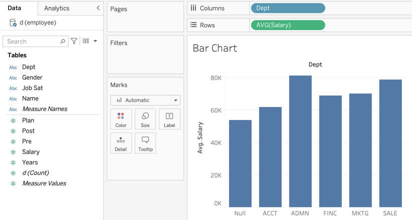
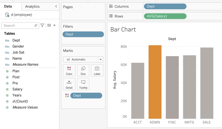
We begin with territory already covered, creating the standard bar chart. Once again, we will return to the employee data set and create the bar chart for the average salary across departments of the company. Open the employee data set Excel file, drag the department variable Dept over to the `Columns` shelf and the created Count variable over to the `Rows` shelf. Our bar chart emerges in @fig-bcDefault with the default darkish blue bar colors.
{#fig-bcDefault fig-align="center" width="780"}
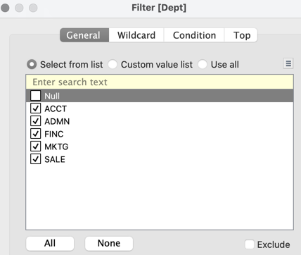
There is one missing value for department in the data set, which Tableau renders as `Null`. As an option, remove the `Null` value. Drag the Dept name to to the `Filters` card, which then opens the dialogue box in @fig-null that lets us retain or delete levels of the categorical variable as we wish.
{#fig-null fig-align="center" width="360"}
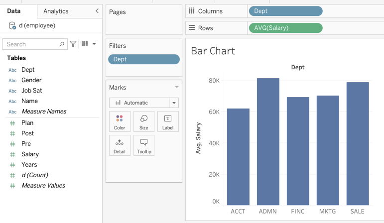
With the `Null` value removed, the five remaining non-missing levels of Department appear in the bar chart, which displays the average salary across the five departments, @fig-NullGone.
{#fig-NullGone fig-align="center"}
### Default Quantitative Palette
There is no consistency of opinion as to whether the bars in a categorical variable bar chart should be the same color or vary in color. An argument for retaining the same color across bars is that different bar colors do not distract the viewer in different ways for the different bars. An argument for different bar colors is that the bar graph is more attractive and visually appealing, perhaps to longer hold the viewers attention.
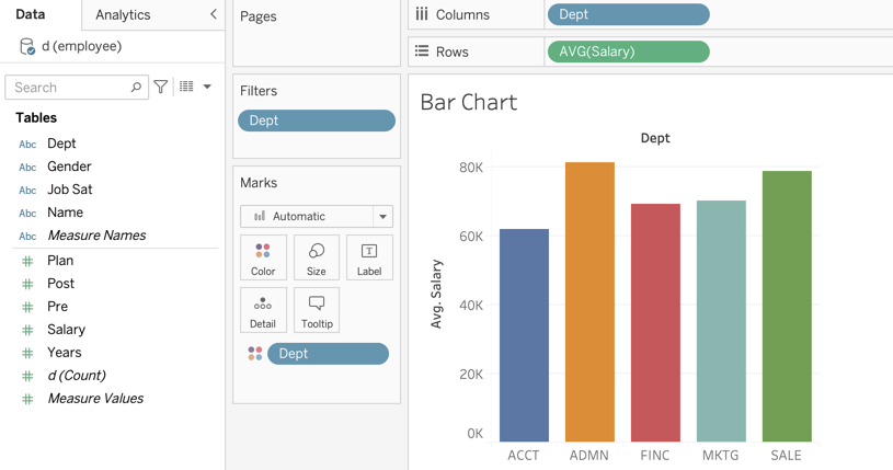
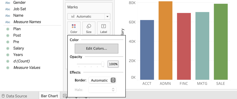
Display the bars of the bar chart in the default tableau qualitative ballet is straightforward. Simply drag the Dept variable name over to the `Color` mark. The result is shown in @fig-defaultQualPal.
{#fig-defaultQualPal fig-align="center" width="780"}
### Additional Palettes
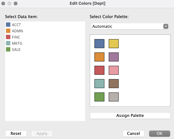
Tableau has several dozen built-in and available qualitative palettes. To access these palettes, double-click on the `Color` mark, which results in the `Edit Colors` prompt shown in @fig-EditColors.
{#fig-EditColors fig-align="center"}
Clicking on `Edit Colors` leads to the access of the built-in palettes. The dropped down menu under `Select Color Palette:` displays the available palettes. The default palette is referenced by the name `Automatic`. This palette can accommodate the10 different colors shown in @fig-EditDefault. Also displayed are the levels of the categorical variable with their assigned colors,
{#fig-EditDefault fig-align="center" width="400"}
If going to choose another palette, after selecting that palette from the drop-down, click `Assign Palette` and then click `Apply`.
## Highlight a Bar
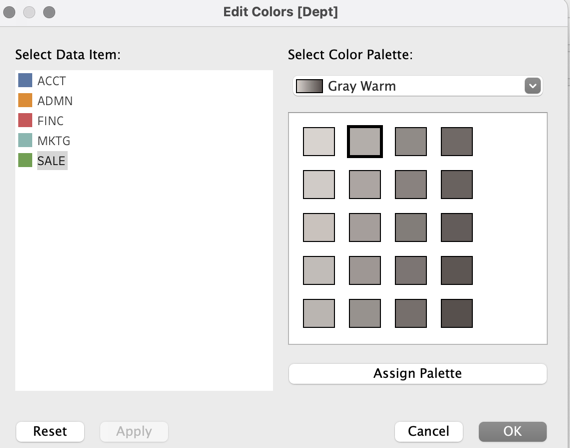
Another way to display a visualization, such as a bar chart, is to highlight one specific level of the categorical variable. Usually, the non-highlighted bars are displayed in a neutral color, such as a light-medium gray. In this example, select the `Gray Warm`\` palette. Select one of the non-highlighted levels, here of Dept, then click on the desired color in the palette, shown in @fig-mod1.
{#fig-mod1 fig-align="center" width="400"}
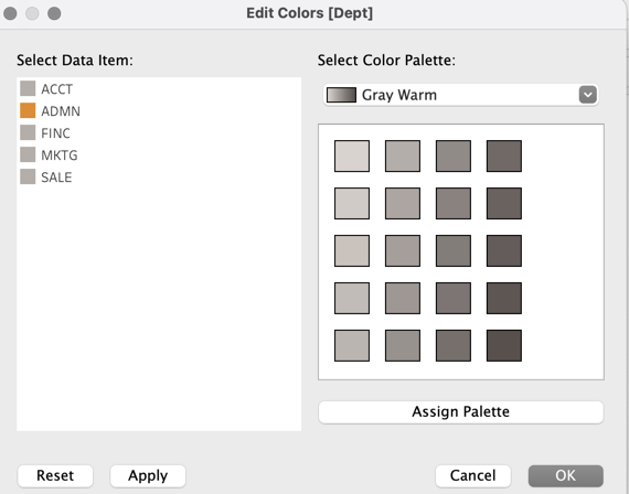
Repeat that procedure for all non-highlighted bars, resulting in @fig-mod2.
{#fig-mod2 fig-align="center" width="400"}
Click on `Assign Palette` and then `Apply` to obtain the bar chart shown in @fig-mod3.
{#fig-mod3}
Of course, this procedure could be repeated for each level of the categorical variable, with each corresponding bar highlighted a different color that does not conform to any built-in palettes.
## Add a Custom Palette
The link to the video of implementing the Tableau instructions for adding a custom palette follows.
[Video]{.vid}: [Tableau Custom Palette](https://media.pdx.edu/media/t/1_wdebe0p5). \[5:03\]
### Create the Palette
In this example, we add the `lessR` qualitative palette to Tableau. First, we need the palette obtained from the `lessR` function `getColors()`.
``` r
pal <- getColors()
pal
```
```
[1] "#4398D0" "#B28B2A" "#5FA140" "#D57388" "#9A84D6" "#00A898"
"#C97E5B" "#909711" "#00A3BA" "#D26FAF" "#00A76F" "#BD76CB"
```
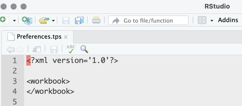
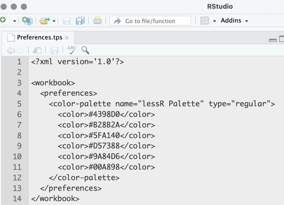
How do we enter this palette into Tableau? Within your `Documents` folder is the `My Tableau Repository` folder. Inside that folder, find the `Preferences.tps` file. That file is in `XML` format, a generalization of HTML that allows for custom tags. We will need to add some HTML-like instructions in a text editor such as RStudio. If not modified before, opening that file in RStudio shows the following in @fig-addPal1.
{#fig-addPal1 fig-align="center" width="430"}
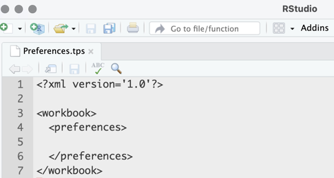
The first task is to insert the begin `` and close `` tags, resulting in the following layout, shown in @fig-addPal2.
{#fig-addPal2 fig-align="center" width="430"}
Between the preferences tags create a new `color-palette` tags as follows:
followed by the closing tag shown in @fig-addPal3.
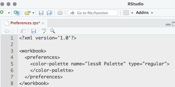{#fig-addPal3 fig-align="center" width="500"}
Whatever you specify for the `name` becomes the palette name in the Tableau system. Also, the specified value of `type` is `"regular"`, which denotes the creation of a categorical color palette.
Between the `color-palette` tags, now define the color palette. For *each* color in your palette, create an open and closed `color` tag, with its defining hexidecimal code inbetween. For example, a fully formed color palette looks like this, here with the first six colors from the `lessR` default quantitative palette as in @fig-addPal4.
{#fig-addPal4 fig-align="center" width="500"}
When your color palette is complete, save the `Preferences.tps` file and restart Tableau.
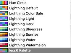
### Access the Palette
When back in Tableau, you will be able to locate your custom palette at the bottom of the drop-down list of palettes. As before, to access the palettes, click on the `Colors` mark and then the `Select Color Palette:` drop-down menu as in @fig-access1.
{#fig-access1 fig-align="center"}
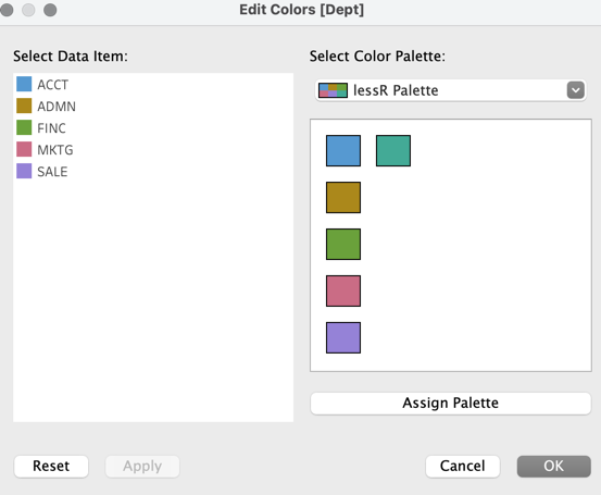
Select at the bottom of the palette list the defined custom palette, here named `lessR palette`, as shown in @fig-access2.
{#fig-access2 fig-align="center" width="480"}
Click on `Assign Palette` and then `Apply` to display the Dept bar chart in native `lessR` colors shown in @fig-lessRbc.
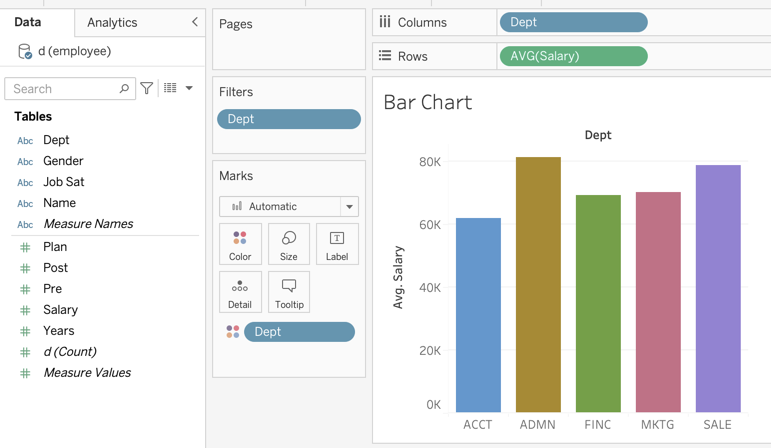{#fig-lessRbc}