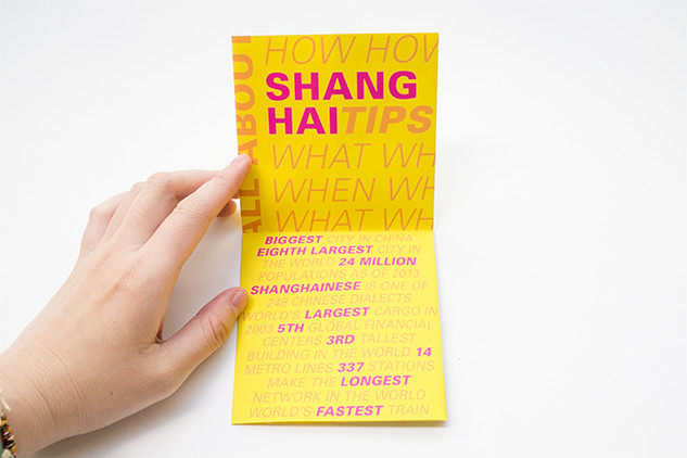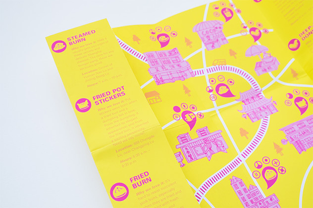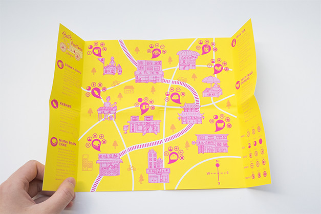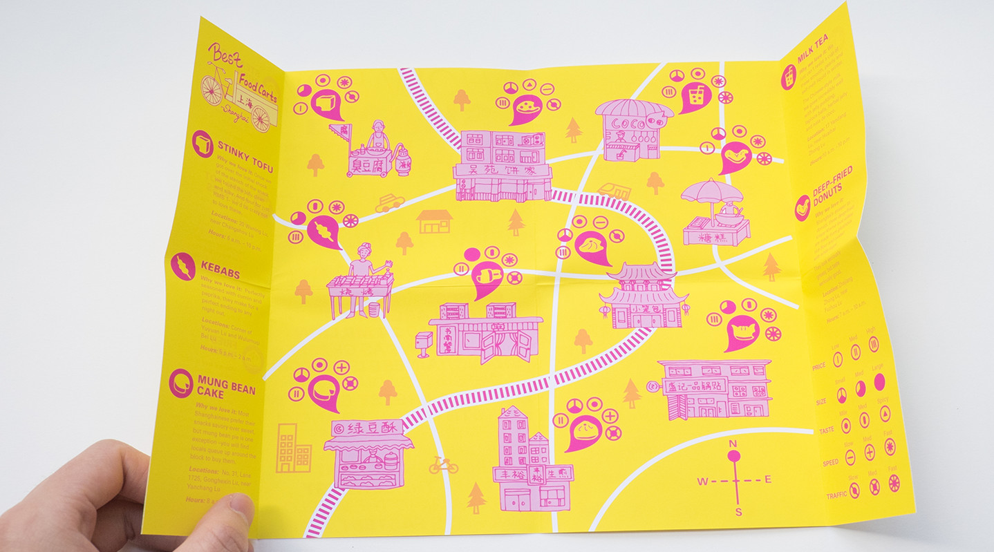
I did the Best Food Carts In shanghai for my map project. I chose the vector direction that is very neat and modern. My purpose is to make my map easy for first time experience people to use and understand, also with fun. My audience are those travelers who are not familiar with shanghai but want to have the traditional, cheap and yummy Chinese street food. With the purpose of my audience can hold this map easily when they are traveling around the city. Therefore, I designed it to finally fold into a small square. At the same time, I want my audience can have a map that is fun not only words and easier to follow and read. So hand-drawing buildings and houses to help audience find their destinies more by following the illustrations. Yellow and hot pink encourages people to act faster and attract people’s attention. And hot pink can arouse people’s appetites and makes map more interesting. I want people notice this map when they first time see it. I use the typeface univers because it is modern and read well when it is in small size. Also, it has a great type family for me to create more hyerarchy.


