G 424/524 GIS for the
Natural Sciences
D. Percy
e-mail: percyd@pdx.edu
Assignment 4
Due7th Week
Raster analysis with Spatial Analyst
Part 1
Read through the accompanying handout on "precision farming" (analyzing surfaces.pdf) for an explanation of why you would want to do this...
Load Spatial Analyst Extension
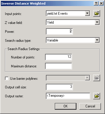
Add XY data from I:\Projects\Geodata\gisclass\gis_nat_sci_year_term\assignment4\SPATIAL\yield.txt
(x_coord and y_coord are the x and y fields!!!)Add thefarm.shp from same directory
From the Geoprocessing menu, choose Environments and set the Processing Extent to Same as Layer "thefarm"From the ArcToolbox->Spatial Analyst Tools->Interpolation menu select IDW and set the parameters as shown below.
Do the same interpolation with spline, using the parameters in the handout (Regularized and 0.01). what's the difference? Specifically identify some problem areas where the spline creates artificial highs and/or lows! An exported map in your report would be a good way to show this. Label a couple of points to illustrate your observations.
After this continue just using IDW for all further interpolations in this assignment.
From the Spatial Analyst menu, choose Reclass-Reclassify, make sure the right raster is in the input raster dropdown, click Classify, choose Equal Interval, and 5 classes.
Choose a color ramp from Symbology, under Layer Properties. The darker colors should show areas of higher yield.
Add the grid file called DEM. This is the elevation data.
From the Spatial Analyst menu, choose Surface - > Contour. Make sure DEM is selected in the Input Surface dropdown, the rest of the parameters should be accepted as defaults (set Interval to 1). Keep track of where the Output features are being created! You might need to change this location...
OPTIONAL (only needed for "mind warp" version): From the Spatial Analyst menu, choose Surface Analysis - > Slope. Do the same with Aspect.
Add the soilsamp.shp file
Interpolate organic matter (this is your Z Field) using the same parameters (IDW) as you used for yield above, make this a permanent raster, keeping track of where you save it.
Summarize organic matter with respect to the zones of Reclassed yield using Spatial Analyst->Zonal->Zonal Statistics as Table (your Reclassified Yield is the Zonal data). Create a graph using Mean as the Value field, and Value as the X field.
Repeat the above 2 steps (Interpolate and then Summarize) for the SOILSAMP field potasium
Fun things to try:
Use the raster calculator to subtract a surface created with one interpolation method (IDW versus Spline) from another, creating a sort of residual or "difference surface". This will show where one surface is above or below the other one...
Part 2
Since you changed the Processing Extent in Part 1, START WITH A NEW PROJECT FILE FOR PART 2
Copy the Lab 4 folder to your C:\temp folder
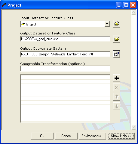
Load your landslides data (joined with newgeol, ie LS_GEOL, from excercise 2), reproject to Statewide Oregon NAD83 Int'l Feet
Load the 90m DEM (decimal degrees) for the Metro area from I:\Students\Projects\geodata\gisclass\metro_dem_90m\
(Alternatively, download a 1/3 arc second higher resolution NED from the NationalMap of a much smaller area that you are interested in, maybe part of the West Hills?)
Reproject it to Statewide Oregon NAD83 Int'l Feet to match your landslides. Use an appropriate resampling method for this data type.
Generate a Slope surface from this DEM. Look at the range of values to verify that they make sense. If necessary, use the Z-factor...
JOINING SURFACE DATA
Aggregate the data from the slope map to the landslides by using the Extract Values to Points tool (in the Spatial Analysis->Extraction toolbox)
Now look at this data set. What does it tell you? Can you make any interesting charts? How can you summarize this data to characterize average slope according some some other aggregating attribute (ptype for example)?
This is another nice example of gathering data from multiple data sets into one place so that you can analyze them. You should graph a relationship in Excel between some of the Slope data and some of the landslide data to show that you understand this. You could use the Histogram tool from Analysis Toolpack...Remember, that we are trying to build understanding and analytical capabilities, so try to make sure you understand what's going on, rather than just blithely following the steps.Turn in the following, with a brief description of what each "means":
- Side by side map of IDW vs Spline of yield data
- Overlay of contours on Reclass of IDW yield surface
- Yield vs Potassium graph
- Yield vs Organic Matter graph
- Graph of Ptype vs Slope or something else that interests you from Part 2
If you'd like a real mind warp (or this bored you), do part 2 of the 2004 version, a multiple regression model.