
A POCKET GUIDE TO THE US CONSTITUTION
Georgetown University Press
PROJECT
This project was completed during my internship at Faceout Studio. During my internship I was given a number of book cover projects to work on. One of the studio’s full time designers would work on the same book cover and we would both present out cover designs to the Art Director. They chose which covers would be submitted to the client. For “A Pocket Guide to the US Constitution” two of my cover designs were sent to the client for review. The client chose the first round of the above design. Once that design was chosen I worked with the client on a variety of revisions until we reached the final design.
CONCEPT
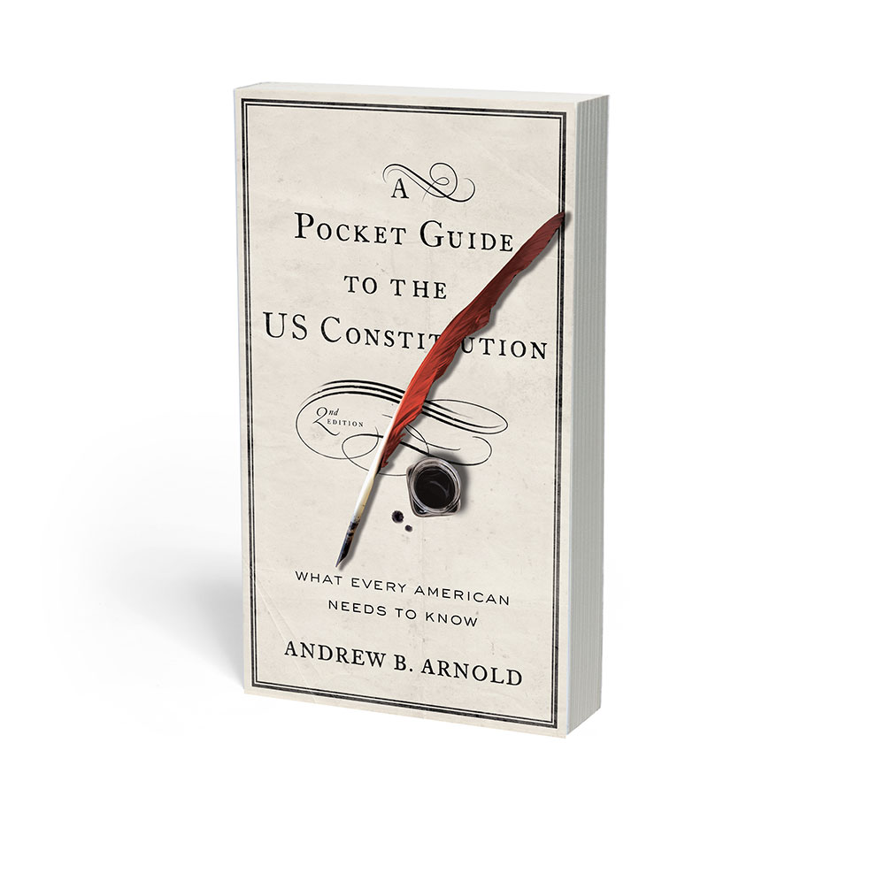
For each project I recived a brief with information about the book and preferences of the Publisher. Georgetown University Press wanted this book cover to represent the historical apsects of the US Constitution without making the book look outdated. I created two cover options for the client. The first option focused soley on the writting of the US Constitution and design elements that remind viewers of the 1700s. I used FCaslon 12 ITC for the title and author name because Caslon is an Old-Style serif that was created during the 1700s. FCaslon 12 ITC also has inconsistant strokes that make the type appear handwritten. I mistakingly chose a silver nibbed pen for my first cover round before looking indepth at what utensils would have actually been used to write the Constitution. After review, I selected the quil and ink bottle because the US Constitution was actually written with a quil. Even though the paper would not have looked so worn out when written, using the rustic paper texture helps modern day viewers quickly understand what time period this book is referencing. Using sans serif type was not my first choice for the subhead but eas asked for by the client. In the end I am happy with the sans serif, ATSackersGoth because it ties into the modern relvence of the book and its contents.
PROCESS
I worked entirely in Photoshop CS5 for this project. I had access to a variety of stock image sites from which I took the paper texture, flourishes, feather, ink bottle and ink drops. Using Photoshop I began taking out and editing elements of different stock images to create one cohesive design.
CHALLENGES
The most difficult design challenge was to create a concept that strongly tied to the US Constitution but appealed to all audiences today. The cover could not look dated or modern. While the overall final design is strongly based on 18th century characteristics, the subtle sans serif and final book size, 4x6 inches, does create and outdated book cover.