![]()
The increase in human population or other activity (such as energy use) is often described as a extreme exponential curve. These are described as a "J" or "hockey stick" to emphasize a flat portion followed by a drammatic rise. It may be that there is a drammatic rise in population that has an impact but that doesn't mean that there was a recent acceleration of the growth rate. The graphical representations exploit the weakness in arithmetic curves to represent a range of values, i.e. they are biased toward the highest value and don't show the changes in the smaller, historical values. This is more of a cautionary note on using graphics and imagery than any counter argument that we don't have a problem with human impact on the planet.
|
|||||||||||||||||||||||
| Textbook representations focus on drammatic increase such as this one from Miller. |  |
||||||||||||||||||||||
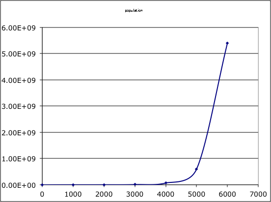
| Can show this with an curve of human population over the last 7000 years with a constant growth rate of 0.0022 per year. |
|
||||||||||||||||||||||
| An artithmetic representation of this data shows the "J" feature. |
|
||||||||||||||||||||||
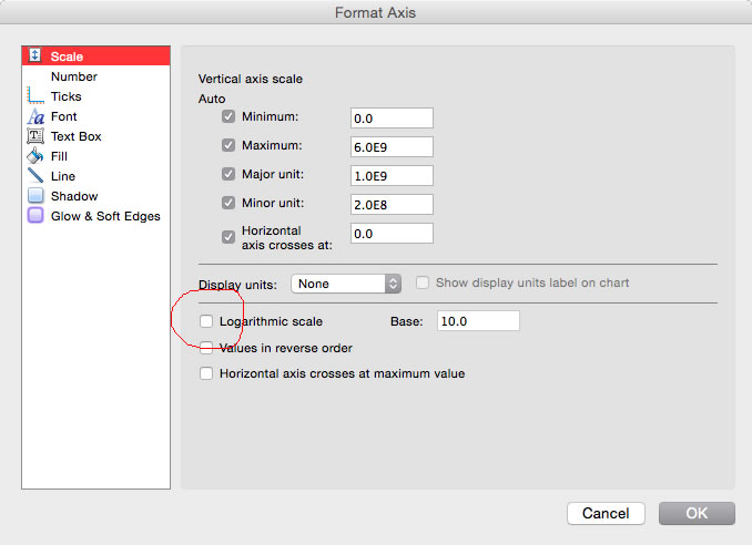
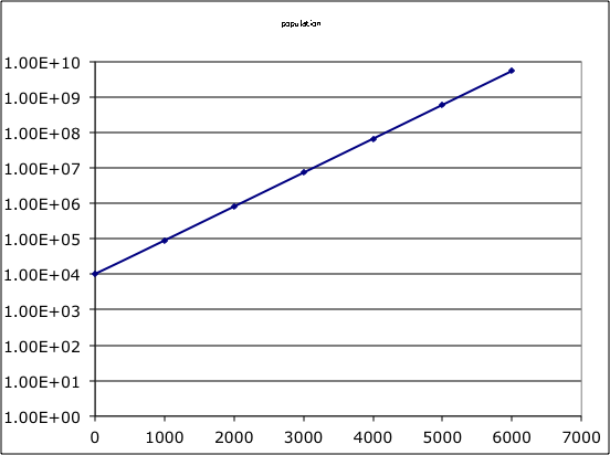
| But this can be changed to a semi-log scale in Excel which will show that the growth rate was constant over those 6000 years. |
|
||||||||||||||||||||||
| Leads to semi-log chart with same data as displayed above in the table and the arithmetic chart. This is log of the population vs. years. |
|
||||||||||||||||||||||
John Rueter - October 1, 2017