Data Analysis
Cross-tabulation example
RQ1: Do men and women differ in the way they tend to organize their groups?
There are two types of argument I might want to make for this example: Men and women tend to organize their groups in different ways, or men and women do not tend to organize their groups in different ways.
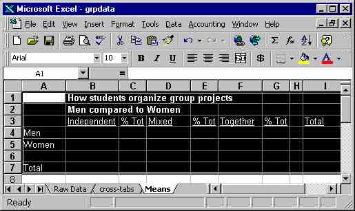
Either way, I will find it convenient to have a table that compares
the proportion of men who organize their groups in each way to the proportion
of women who organize their groups in each way. The table will look
something like the example to the left.
I have shown the table as I created it in Excel, but you could just
as easily prepare it on columnar paper.
Now that I have the table, as soon as I have gathered data (see the example
on how to gather and tabulate data), I can fill out my table in a couple
of ways. I could do it by hand - make a copy of the table, then go
through the tabulated data and put a hash mark in the appropriate cell
for each subject.
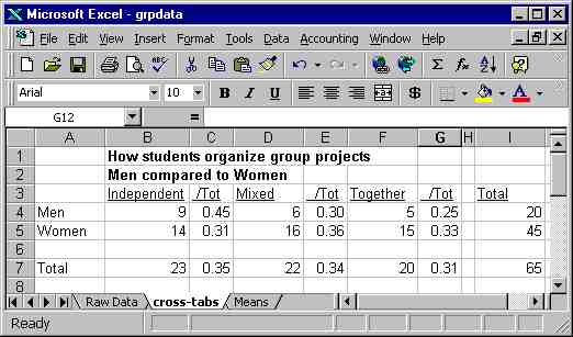
For example, the first subject in my data set is a male who usually organizes group work in a mixed fashion, working independently on some parts of the project and working together on other parts. So I would put a hash mark across from "Men" in the column headed "Mixed." Then I would continue on through the entire data set, count up the hash marks in each cell, write the totals in the appropriate box on another copy of the table, add up the rows and columns, and calculate the percentages.
Fortunately, I can use Excel to do much of this work for me.
On the "toolbar" at the top of the illustration, you will notice the word, "Data." If you click on it, a menu will drop down, including the word, "Sort." " Click on "Sort," click the button that says "My worksheet has a header row," then ask it to sort by Gender (gendr on my worksheet) and Work Organization (Orgwrk on my worksheet).
 From that point, it is a simple task to count the number of cases in each
cell. (There may be a simple way to get Excel to do this automatically
but the only way I found was not simple - and the sorting method is.)
Finally, compute the percentages, and you will have a table that looks
like the one to the left.
From that point, it is a simple task to count the number of cases in each
cell. (There may be a simple way to get Excel to do this automatically
but the only way I found was not simple - and the sorting method is.)
Finally, compute the percentages, and you will have a table that looks
like the one to the left.
Notice that I set the decimals to two - any more would just be distracting. It is also easy to create a graphic, now that you have a table - first, copy the table and erase the "/Tot" columns. Then highlight the labels and data - but not the title (you will have a chance to enter a title later).
 Now,
in the tools line at the top of the Excel worksheet, you will see a little
icon of a bar graph; when you put the cursor on it, the label is "chart
wizard." (This shows up only when you have the program expanded
to full-screen; if you don't see it, click on "Chart.")
Now,
in the tools line at the top of the Excel worksheet, you will see a little
icon of a bar graph; when you put the cursor on it, the label is "chart
wizard." (This shows up only when you have the program expanded
to full-screen; if you don't see it, click on "Chart.")
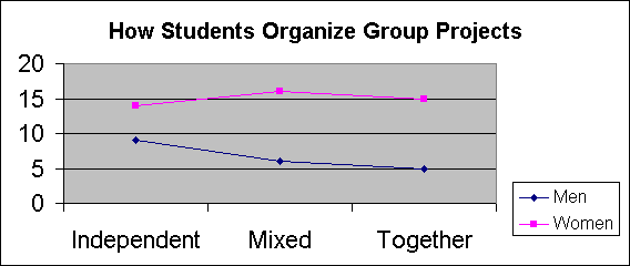
The Chart Wizard gives you several options; feel free to play with them to see what works best. But as you do so, remember, the point of drawing a chart is to display your data in a way that readers can easily make sense of it! (Don't go for aesthetics at the sake of clarity.)
I have prepared two separate charts, a bar chart and a line chart.
Note that you can edit these charts after they have been drawn, by clicking
the cursor on different parts of the chart you wish to edit. 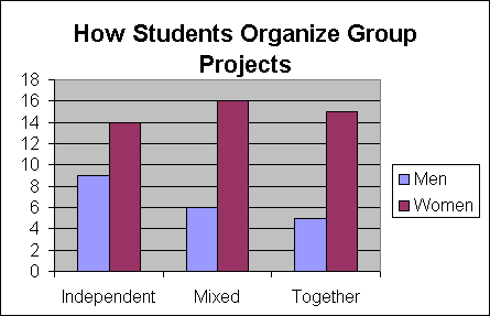
Also note that you can save your charts as graphic images, for use in HTML
documents, Power Point, or other documents. Click on "File,"
then "Save as HTML," and follow the instructions from there.
That is how I created the images included above and to the right.
Interpreting the data
Now: Which argument should I make? What can I conclude from these data. At first glance, it does seem that there is some difference between men and women. Women in the sample are about equally divided among the three ways of organizing group work, but among men there seems to be a preference for working independently: Nine men expressed a preference for Independent work, compared to five for working together and six for mixed work - and this pattern is consistent with stereotypes about the differences between men and women.
Before I get too hasty, I need to determine how strong this evidence is: After all, if only two of the twenty men in the sample had expressed a preference for working together, there would be no discernable difference. How likely is it that I would see a pattern like this if there really are no differences between men and women?
Those who have studied a little statistics will immediately see a way to test the strength of this evidence by using a test such as chi-squared. For those who have not yet studied statistics, I will lay out the logic of the test, and demonstrate that, in fact, the observed differences are too slight to build much of a case on them. In fact, I would want to see a much more pronounced difference before I would stick my neck out and claim that these data support the conventional stereotype that men prefer to work alone and women prefer to work in groups.
In order to test the quality of my evidence, I want to compare the observed pattern of preferences with the pattern I would expect to observe if men and women have exactly the same preferences. So, first, I compute the "expected value" for each of the six cells in the table. I know the proportion of total subjects who prefer each of the three types of group organization (the total number of subjects in each category divided by the total number of subjects) and I know the total number of men and the total number of women in the sample.
For example, to compute the expected number of men in the first cell, "Independent," I multiply the share of total subjects who prefer Independent group organization by the total number of men, .35 X 20 = 7. To be slightly more accurate, the share of total subjects is slightly over .35, .3538, so the expected value of men is 7.08. The expected values for all six cells are shown in the figure below.
It is also possible to use Excel to compute the Chi-squared statistic,
and to find the probability. Type the label "Chi-square"
(or an abbreviation, as I have done in the example), and enter your formula
in the box next to it. To have the formula entered by Excel, click on the
f(x) button on the Excel toolbar, then click on CHITEST. Enter the coordinates
of the observed table on the first line and the coordinates of the expected
table on the second line - or just enter the formula as follows in the
box following the label "Chi-square" (which you can locate anywhere
on the worksheet:
=CHITEST(B4:D5,H4:J5)
Excel will compute the Chi-square statistic and enter it in the formula
box automatically, as shown in the following illustration:
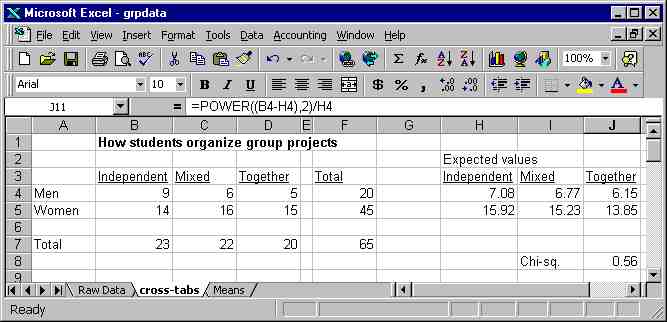
Notice that Excel does not return the actual value of the Chi-square statistic.
However, that is easy to compute by hand. For each cell in the table, subtract
the expected frequency from the observed frequency and square the difference.
Divide the squared difference by the expected frequency. Sum the results
for every cell in the table - that is your chi-squared statistic, a measure
of the overall discrepancy between the observed distribution in the sample
and the distribution we would expect by chance. You can then find the probability
of observing a discrepancy this large or large as a result of random chance
by looking the statistic up in a chi-squared table (found in the back of
most statistics textbooks. You will need one more number, the "degrees
of freedom," which is equal to the number of rows minus one times
the number of columns minus one: (R-1) x (C-1).
For students lacking a background in statistics, it suffices to know
that it turns out that the observed difference between men and women is
in fact quite small: It is quite likely that a difference this large could
be observed because of random fluctuations in the sample. This doesn't
prove that there is not a difference between men and women - but
it does lead me to be extremely cautious in interpreting my data. Accordingly,
I will choose to make the argument that there is no evidence of a difference
between men and women in my data.
Communication Studies
Mainpage
![]() (PSU
Home Page)
(PSU
Home Page)
This page is maintained by David Ritchie, e-mail:
cgrd@odin.cc.pdx.edu
Last updated on July 29, 1999.